Identification of Human Splenic White Pulp from CODEX Spatial Proteomics

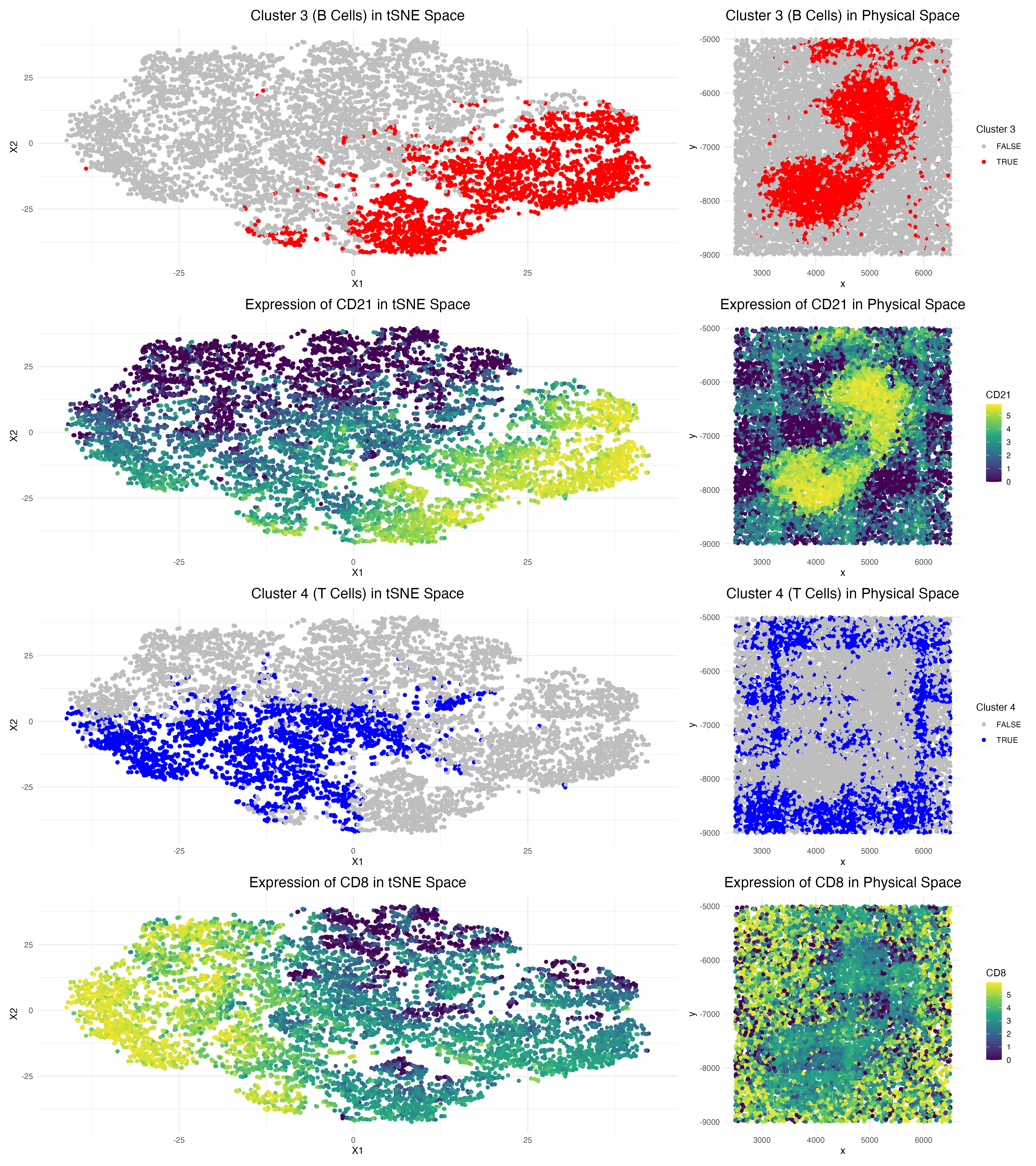
This data visualization of a spleen CODEX dataset highlights two cell clusters, B cells and T cells, identifying the tissue as white pulp based on protein markers and physical organization of cells.
In order to identify what the tissue structure represents, I began by running differential expression analysis on all 5 clusters (as determined by the optimal within sum of squares calculation). From there, I annotated the cell types by their highly differentially expressed genes.
Notably, here, Cluster 3 is characterized by high expression of protein markers CD20 and CD21, which are known B cell markers [1][2]. Visualizing CD21 in physical space demonstrates strong overlap with the Cluster 3 region, confirming that Cluster 3 indeed represents B cells.
Additionally, Cluster 4 expresses CD8 and CD45RO, which are established T cell markers [3]. By focusing on the physical space, CD8 and Cluster 4 overlap well, confirming that Cluster 4 indeed represents T cells. It is also important to note that the B cells tend to stay centralized in the tissue sample, while the T cell population appears to be distributed around them.
Considering the presence of B cell and T cell markers within this tissue sample, I then conducted a literature review to identify which spleen tissue structure highly correlates with this composition. According to Steiniger et al., white pulp satisfies these conditions as it is composed of a mixture of T and B cells organized around a central arteriole [4]. Steiniger et al. also note that in human splenic white pulp, T and B cell compartments often intermingle. The physical space plots above are consistent with this characteristic, as the T cells don’t form a perfect ring around the B cells, but rather surround them in an irregular pattern.
Overall, considering both the marker expression and spatial architecture of the T and B cell distribution in the spleen CODEX dataset, we can conclude that this is indeed splenic white pulp.
Sources: [1] https://www.neobiotechnologies.com/product/cd21-mature-b-cell-follicular-dendritic-cell-marker-5/#:~:text=The%20CR2%20marker%2C%20also%20known%20as%20CD21%2C,markers%2C%20complement%20system%2C%20and%20dendritic%20cell%20marker
[2] https://pmc.ncbi.nlm.nih.gov/articles/PMC7271567/
[3] https://www.biocompare.com/Editorial-Articles/569888-A-Guide-to-T-Cell-Markers/
[4] https://pubmed.ncbi.nlm.nih.gov/12704213/
Code
1
2
3
4
5
6
7
8
9
10
11
12
13
14
15
16
17
18
19
20
21
22
23
24
25
26
27
28
29
30
31
32
33
34
35
36
37
38
39
40
41
42
43
44
45
46
47
48
49
50
51
52
53
54
55
56
57
58
59
60
61
62
63
64
65
66
67
68
69
70
71
72
73
74
75
76
77
78
79
80
81
82
83
84
85
86
87
88
89
90
91
92
93
94
95
96
97
98
99
100
101
102
103
104
105
106
107
108
109
110
111
112
113
114
115
116
117
118
119
120
121
122
123
124
125
126
127
128
129
130
131
132
133
134
135
136
137
138
139
140
141
142
143
144
145
146
147
148
149
150
151
152
153
154
155
156
157
158
159
160
161
162
163
164
165
166
167
168
169
170
171
172
173
174
175
176
177
178
179
180
181
182
183
184
185
186
187
188
189
190
191
192
193
194
195
196
197
198
199
200
201
202
203
204
205
206
207
208
209
210
211
212
213
214
215
## HW5 - CODEX DATASET ANALYSIS ##

# load in CODEX data
data <- read.csv('/Users/gracexu/genomic-data-visualization-2026/data/codex_spleen2.csv')
data[1:8, 1:8] # note that proteins are quantified by their intensity

dim(data) # check dimensions of data
# 10,000 cells and different features

# load in packages
library(ggplot2)
library(patchwork)

pos <- data[, 2:3]
head(pos)
pexp <- data[, 5:ncol(data)]
head(pexp)
rownames(pos) <- rownames(pexp) <- data[,1]
area <- data[,4]
names(area) <- data[,1]
head(area)

## Quality Control --------------------------------------------------------------------------------------------------------------------------------------------
# Normalize Data (Library-size normalization --> Counts per million --> Log transformation)
totpexp <- rowSums(pexp)
head(pexp)
head(sort(totpexp, decreasing = TRUE))
mat <- log10(pexp / totpexp * 1e6 + 1)
dim(mat)

## Dimension Reduction ----------------------------------------------------------------------
# PCA (Linear dimension reduction)
pcs <- prcomp(mat, center = TRUE, scale = FALSE)
names(pcs)
head(pcs$sdev)
plot(pcs$sdev[1:50])
toppcs <- pcs$x[, 1:10] # Keep top PCs as the top 10 PCs

# Run tSNE
set.seed(0)

tsne <- Rtsne::Rtsne(toppcs, dims = 2, perplexity = 30)
emb <- tsne$Y
df <- data.frame(emb, totpexp)
names(df)
ggplot(df, aes(x=X1, y=X2, col=totpexp)) + geom_point(size = 1)

## k-means Clustering ----------------------------------------------------------------------
# find optimal center value from an elbow plot
wss <- numeric(10)
for (k in 1:10) {
  wss[k] <- kmeans(toppcs, centers = k, nstart = 25)$tot.withinss
}
plot(1:10, wss, type = "b") # use a center value of 5

set.seed(0)

km <- kmeans(toppcs, centers = 5)
names(km)

cluster <- as.factor(km$cluster)

df <- data.frame(pos, emb, cluster, toppcs)
# tSNE
ggplot(df, aes(x=X1, y=X2, col=cluster)) + geom_point(size = 0.5)
# PCA
ggplot(df, aes(x=PC1, y=PC2, col=cluster)) + geom_point(size = 0.5)
# Spatial Plot of Clusters
ggplot(df, aes(x = x, y = y, col = cluster)) +
  geom_point(size = 0.5) +
  coord_fixed() +
  theme_minimal()

## Differential Expression Analysis ----------------------------------------------------------------------
# Create an empty list to store the results
results_list <- list()

for (clus in levels(df$cluster)) {

  in_cluster <- df$cluster == clus

  mean_in  <- colMeans(mat[in_cluster, ])
  mean_out <- colMeans(mat[!in_cluster, ])

  # Since mat is already log-transformed
  logFC <- mean_in - mean_out

  pvals <- sapply(colnames(mat), function(gene) {
    wilcox.test(mat[in_cluster, gene],
                mat[!in_cluster, gene])$p.value
  })

  pvals_adj <- p.adjust(pvals, method = "BH")

  results_list[[clus]] <- data.frame(
    gene = colnames(mat),
    logFC = logFC,
    pval_adj = pvals_adj,
    cluster = clus
  )
}

# Print the top upregulated genes for each cluster
for (clus in names(results_list)) {

  cat("\n--- Cluster", clus, "top markers ---\n")

  res <- results_list[[clus]]

  res_sig <- res[res$logFC > 0.6 & res$pval_adj < 0.05, ]
  res_sig <- res_sig[order(-res_sig$logFC), ]

  print(head(res_sig[, c("gene", "logFC", "pval_adj")], 10))
}

## Data Visualization ----------------------------------------------------------------------
## 1. Cluster 3 (B Cells) in reduced dimensional space ------------------------------------------------------------------------------------------
### tSNE
p1 <- ggplot(df, aes(x = X1, y = X2, col = cluster == 3)) +
  geom_point(size = 1.5) +
  scale_color_manual(values = c("grey", "red")) +
  labs(color = paste("Cluster 3")) +
  theme_minimal() +
  ggtitle("Cluster 3 (B Cells) in tSNE Space") +
  theme(plot.title = element_text(hjust = 0.5, size = 16), legend.position = "none")
p1

## 2. Cluster 3 (B Cells) in physical space ------------------------------------------------------------------------------------------
p2 <- ggplot(df, aes(x = x, y = y, col = cluster == 3)) +
  geom_point(size = 1.5) +
  scale_color_manual(values = c("grey", "red")) +
  labs(color = paste("Cluster 3")) +
  theme_minimal() +
  ggtitle("Cluster 3 (B Cells) in Physical Space") +
  coord_fixed()  +
  theme(plot.title = element_text(hjust = 0.5, size = 16))
p2

## 3. DEG in reduced dimensional space
### tSNE
### gene of interest = CD21
df_expr <- df
df_expr$CD21 <- mat[, 'CD21']
p3 <- ggplot(df_expr, aes(x = X1, y = X2, col = CD21)) +
  geom_point(size = 1.5) +
  scale_color_viridis_c() +
  theme_minimal() +
  ggtitle(paste("Expression of CD21 in tSNE Space"))  +
  theme(plot.title = element_text(hjust = 0.5, size = 16), legend.position = "none")
p3

## 4. Visualizing one of these DEG in space
p4 <- ggplot(df_expr, aes(x = x, y = y, col = CD21)) +
  geom_point(size = 1.5) +
  scale_color_viridis_c() +
  theme_minimal() +
  ggtitle(paste("Expression of CD21 in Physical Space")) +
  coord_fixed()  +
  theme(plot.title = element_text(hjust = 0.5, size = 16))
p4

## 5. Cluster 4 (T Cells) in reduced dimensional space ------------------------------------------------------------------------------------------
### tSNE
p5 <- ggplot(df, aes(x = X1, y = X2, col = cluster == 4)) +
  geom_point(size = 1.5) +
  scale_color_manual(values = c("grey", "blue")) +
  labs(color = paste("Cluster 4")) +
  theme_minimal() +
  ggtitle("Cluster 4 (T Cells) in tSNE Space") +
  theme(plot.title = element_text(hjust = 0.5, size = 16), legend.position = "none")
p5


## 6. Cluster 4 (T Cells) in physical space ------------------------------------------------------------------------------------------
p6 <- ggplot(df, aes(x = x, y = y, col = cluster == 4)) +
  geom_point(size = 1.5) +
  scale_color_manual(values = c("grey", "blue")) +
  labs(color = paste("Cluster 4")) +
  theme_minimal() +
  ggtitle("Cluster 4 (T Cells) in Physical Space") +
  coord_fixed()  +
  theme(plot.title = element_text(hjust = 0.5, size = 16))
p6

## 7. DEG in reduced dimensional space
### tSNE
### gene of interest = CD8
df_expr <- df
df_expr$CD8 <- mat[, 'CD8']
p7 <- ggplot(df_expr, aes(x = X1, y = X2, col = CD8)) +
  geom_point(size = 1.5) +
  scale_color_viridis_c() +
  theme_minimal() +
  ggtitle(paste("Expression of CD8 in tSNE Space"))  +
  theme(plot.title = element_text(hjust = 0.5, size = 16), legend.position = "none")
p7

## 8. Visualizing one of these DEG in space
p8 <- ggplot(df_expr, aes(x = x, y = y, col = CD8)) +
  geom_point(size = 1.5) +
  scale_color_viridis_c() +
  theme_minimal() +
  ggtitle(paste("Expression of CD8 in Physical Space")) +
  coord_fixed()  +
  theme(plot.title = element_text(hjust = 0.5, size = 16))
p8

# Combine all plots
(p1 | p2) / (p3 | p4) / (p5 | p6) / (p7 | p8)

# Save plot
ggsave("/Users/gracexu/genomic-data-visualization-2026/homework_submission/hw5_gxu36.png", width = 16, height = 18, dpi = 300)

## AI Prompts
# How can I perform differential expression analysis for each cluster versus all other cells using a wilcox test, then print the top upregulated markers per cluster?