HW5
Instructions
- Perform a full analysis (quality control, dimensionality reduction, kmeans clustering, differential expression analysis) on your data. Your goal is to figure out what tissue structure is represented in the CODEX data. Options include: (1) Artery/Vein, (2) White pulp, (3) Red pulp, (4) Capsule/Trabecula.
- You will need to visualize and interpret at least two cell-types. Create a data visualization and write a description to convince me that your interpretation is correct.
- Your description should reference papers and content that allowed you to interpret your cell clusters as a particular cell-types. You must provide attribution to external resources referenced. Links are fine; formatted references are not required.
- You must include the entire code you used to generate the figure so that it can be reproduced.
Description & cell type analysis
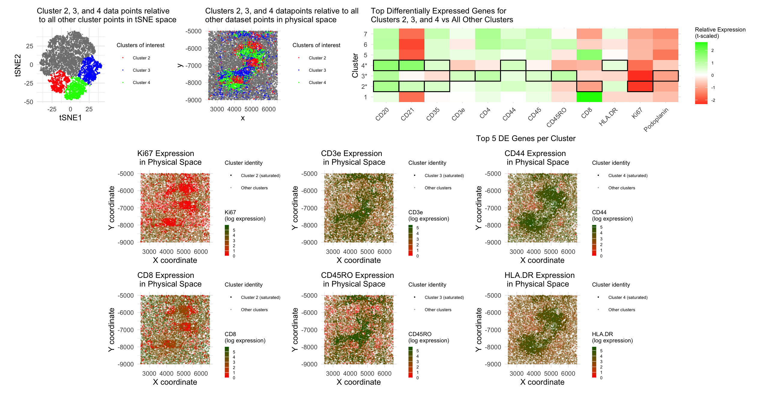
To identify cell types within the CODEX data, I began by log-10 normalizing the gene expression data. I then conducted dimensionality reduction by first performing PCA, where I determined the optimal number of PCs to move forward with by plotting standard deviation captured by each PC and identifying the “elbow” at which most of the variance was captured. Using this information, I fed the top 8 PCs into a second, tSNE dimensionality reduction. After that, I conducted k-means clustering with this tSNE output, where I also determined the optimal number of clusters by plotting total withinness for each number of clusters and identifying the “elbow” number of clusters; based on the plot, I ended up making 7 clusters. In order to select which clusters to try to identify cell types for, I plotted each cluster in tSNE and physical space; upon doing this, it was clear that clusters 2, 3, and 4 conferred transcriptionally-different cell types, so I decided to move forward with differential expression analysis for these three clusters of interest. I did a Wilcox test to identify the top 5 differentially-expressed genes for cluster 2 vs. all other clusters, cluster 3 vs. all other clusters, and cluster 4 vs. all other clusters. The top 5 differentially-expressed genes for each cluster of interest was as follows:
- Cluster 2: Ki67, CD8, CD35, CD20, CD21
- Cluster 3: CD3e, CD4, CD5RO, CD45, Podoplanin
- Cluster 4: CD20, CD21, CD35, CD44, HLA.DR
In order to visually plot these differentially-expressed genes, I created a heatmap-style plot showing t-scaled gene expression of each of these differentially-expressed genes for each of the clusters, outlining which genes were differentially-expressed by each of our clusters of interest. I also decided to visually represent these differentially-expressed genes for each of the clusters of interest by plotting gene expression data for Ki67, CD8, CD3e, CD45RO, CD44, and HLA.DR in physical space, using hue to encode log-10 normalized gene expression level and saturation to highlight the datapoints belonging to the cluster of interest that differentially-expressed each gene.
I then used this differential expression data to identify which cell types are included in clusters 2, 3, and 4. CD45RO is expressed specifically on memory T cells (1, 2), and CD3e helps form a complex with T cell receptors and thus is expressed on T cells (3), leading us to believe that cluster 3 is comprised of memory T cells. HLA-DR was found to be expressed on antigen-presenting cells (4), specifically lymphocytes and macrophages (5), and CD21 has been found to be expressed on B cells (6). Additionally, CD20 (7) and CD35 (8) have been found to be expressed on B cells, and CD44 has been found to confer B cell activation (9). Thus, since cluster 4 showed high differential expression of CD20, CD21, CD35, CD44, and HLA-DR, we conclude that cluster 4 is comprised of activated B cells. Finally, cluster 2 had high differential expression of CD20, CD21, and CD35, but lower differential expression of CD8 and Ki67, which confer cytotoxic T cells (10) and cell proliferation (11), respectively. Based on these results, we conclude that cluster 2 is comprised of B cells that are undergoing low levels of proliferation/stuck mostly in G0, as low Ki67 expression has been associated with G0 “resting” cells (12). Based on the T and B cell types we identified with clusters 2, 3, and 4, we conclude that the CODEX data overall aligns with the white pulp tissue structure of the spleen, which is known to contain T and B cells in separate regions (13, 14).
Sources:
- https://www.lsbio.com/targets/cd45ro/b1429
- https://pmc.ncbi.nlm.nih.gov/articles/PMC3762710/
- https://www.abcam.com/en-us/technical-resources/target-tips/t-cell-surface-glycoprotein-cd3-epsilon-chaincd3e
- https://www.beckman.com/reagents/coulter-flow-cytometry/antibodies-and-kits/single-color-antibodies/hla-dr
- https://pubmed.ncbi.nlm.nih.gov/3522732/
- https://www.sciencedirect.com/science/article/abs/pii/S1567576900000461
- https://pubmed.ncbi.nlm.nih.gov/14688067/
- https://rupress.org/jem/article/208/12/2497/41113/Follicular-dendritic-cells-help-establish-follicle
- https://www.sciencedirect.com/science/article/abs/pii/S1521661623004734
- https://www.immunology.org/public-information/bitesized-immunology/cells/cells-t-cd8
- https://www.sciencedirect.com/topics/medicine-and-dentistry/monoclonal-antibody-ki-67
- https://pmc.ncbi.nlm.nih.gov/articles/PMC5945335/
- https://pmc.ncbi.nlm.nih.gov/articles/PMC6495537/
- https://pmc.ncbi.nlm.nih.gov/articles/PMC3912742/
Code:
```r
#Sofia Arboleda - HW 5 - 2/18/2026
data <- read.csv(“~/Desktop/codex_spleen2.csv.gz”) head(data)
library(patchwork) library(ggplot2) library(dplyr) library(tidyr)
#Using code we discussed together in the in-class examples:
positions <- data[,c(‘x’, ‘y’)] rownames(positions) <- data[,1] area <- data[, c(‘area’)] gene_exp <- data[, 5:ncol(data)] rownames(gene_exp) <- data[,1]
#Normalizing total gene expression data total_gene_exp <- rowSums(gene_exp) hist(total_gene_exp) #seeing distribution of total gene expression per cell mat <- log10(gene_exp/total_gene_exp * 1e6 + 1) #Log transform to make more Gaussian distributed and interpretable, get rid of NaN points df <- data.frame(positions, total_gene_exp)
#Dimensionality reduction
#Linear DR: PCA PCs <- prcomp(mat) print(PCs$rotation[1:5,1:5]) #show 1st 5 PC’s gene loading for 1st 5 genes; rotation = loading plot(PCs$sdev[1:35]) #dips at some point where PC’s are not capturing much more variance in the data; we see plateau at around PC 8
#Nonlinear DR: tSNE on top 8 PCs top_PCs <- PCs$x[, 1:8] set.seed(100) tsne <- Rtsne::Rtsne(top_PCs, dims = 2, perplexity = 30) emb <- tsne$Y colnames(emb) <- c(‘tSNE1’, ‘tSNE2’) rownames(emb) <- rownames(mat)
#K means clustering of tSNE data #With help from Chat GPT (prompt = “For this code, how can I create a apply loop to plot the total withinness (y axis) for k means clustering analysis with cluster numbers ranging from 1 to 25 (x axis)?”) k_vals <- 1:25 set.seed(123) tot_withinss <- sapply(k_vals, function(k) { #Total withinness for each # of clusters km <- kmeans(emb, centers = k, iter.max = 100) km$tot.withinss }) plot(k_vals, tot_withinss, #Plotting total withinness for each # of clusters to determine optimal cluster # xlab = “Number of Clusters (k)”, ylab = “Total Within-Cluster Sum of Squares”, main = “Elbow Plot for K-means Clustering”) #Based on plot, inflection point @ k = 7 –> selected 7 clusters clusters <- as.factor(kmeans(emb, centers = 7)$cluster) #centers = selected k; there is 1 cluster that is separate from all the other clusters entirely and looks quite transcriptionally different cell_data <- data.frame(emb, clusters, top_PCs, positions) ggplot(cell_data, aes(x=tSNE1, y=tSNE2, col=clusters)) + geom_point(size = 0.7) ggplot(cell_data, aes(x=x, y=y, col=clusters)) + geom_point(size = 0.7)
#Modifying work from HW 3 and 4 to conduct differential expression analysis to identify cell types and overall tissue structure #We see two to three distinct cell clusters emerge in physical space: cluster 2, cluster 3, and cluster 4 –> conducting differential expression analysis for these clusters cluster2 <- cell_data[cell_data$clusters == 2, ] #Creating new cluster dataframes to isolate clusters 2, 3, and 4 for differential expression analysis and graphing cluster3 <- cell_data[cell_data$clusters == 3, ] cluster4 <- cell_data[cell_data$clusters == 4, ]
Plotting clusters 2, 3, and 4 in reduced dimensional space (tSNE X1 vs. X2)
#With help from ChatGPT (prompt = “How to add legend for clusters 2, 3, and 4”) cluster_tSNE_plot <- ggplot(cell_data, aes(x = tSNE1, y = tSNE2)) + geom_point(aes(color = factor(clusters)), size = 0.2, alpha = 0.6) + scale_color_manual( values = c( “2” = “red”, “3” = “blue”, “4” = “green” ), breaks = c(“2”, “3”, “4”), labels = c(“Cluster 2”, “Cluster 3”, “Cluster 4”), name = “Clusters of interest” ) + theme_minimal() + coord_fixed() + labs(subtitle = “Cluster 2, 3, and 4 data points relative\n to all other cluster points in tSNE space”) + theme(plot.title = element_text(hjust = 0.5, size = 9), legend.title = element_text(size = 8), legend.text = element_text(size = 6)) cluster_tSNE_plot
Plotting our clusters of interest in physical space (x coordinate vs. y coordinate)
#With help from ChatGPT (prompt = “How to change title size”, “How to add legend for clusters 2, 3, and 4”) cluster_xy_plot <- ggplot(cell_data, aes(x = x, y = y)) + geom_point(aes(color = factor(clusters)), size = 0.2, alpha = 0.6) + scale_color_manual( values = c( “2” = “red”, “3” = “blue”, “4” = “green” ), breaks = c(“2”, “3”, “4”), labels = c(“Cluster 2”, “Cluster 3”, “Cluster 4”), name = “Clusters of interest” ) + theme_minimal() + coord_fixed() + labs(subtitle = “Clusters 2, 3, and 4 datapoints relative to all \nother dataset points in physical space”) + theme(plot.title = element_text(hjust = 0.5, size = 9), legend.title = element_text(size = 8), legend.text = element_text(size = 6)) cluster_xy_plot
Differential expression analysis for top-5 DE genes for clusters 2, 3, 4
#With help from in-class code from lecture 6 & ChatGPT (prompt = “In order to run a Wilcox test, separate our normalized cell expression data into that which belongs to our center cluster and that which belongs to all the other cells/clusters”) #With help from ChatGPT (prompt = “Given this code for applying a Wilcox test to all genes in the dataset, how can I extract the top 5 genes with the lowest p-value from the Wilcox test?”)
cluster2_cells <- rownames(cluster2) non_2_cells <- rownames(cell_data)[!rownames(cell_data) %in% cluster2_cells] out2 <- sapply(colnames(mat), function(gene) { x1 <- mat[cluster2_cells, gene] x2 <- mat[non_2_cells, gene] wilcox.test(x1, x2, alternative=’two.sided’)$p.value }) wilcox_p_values <- data.frame( gene = names(out2), p_value = out2, stringsAsFactors = FALSE ) DE_2 <- wilcox_p_values[order(wilcox_p_values$p_value), ][1:5, ] DE_2
cluster3_cells <- rownames(cluster3) non_3_cells <- rownames(cell_data)[!rownames(cell_data) %in% cluster3_cells] out3 <- sapply(colnames(mat), function(gene) { x1 <- mat[cluster3_cells, gene] x2 <- mat[non_3_cells, gene] wilcox.test(x1, x2, alternative=’two.sided’)$p.value }) wilcox_p_values <- data.frame( gene = names(out3), p_value = out3, stringsAsFactors = FALSE ) DE_3 <- wilcox_p_values[order(wilcox_p_values$p_value), ][1:5, ] DE_3
cluster4_cells <- rownames(cluster4) non_4_cells <- rownames(cell_data)[!rownames(cell_data) %in% cluster4_cells] out4 <- sapply(colnames(mat), function(gene) { x1 <- mat[cluster4_cells, gene] x2 <- mat[non_4_cells, gene] wilcox.test(x1, x2, alternative=’two.sided’)$p.value }) wilcox_p_values <- data.frame( gene = names(out4), p_value = out4, stringsAsFactors = FALSE ) DE_4 <- wilcox_p_values[order(wilcox_p_values$p_value), ][1:5, ] DE_4
#Plotting top 5 differentially-expressed genes for our clusters of interest (2, 3, 4) #With help from ChatGPT (prompt = “Can you create a heatmap-style plot showing the relative (t-scaled) average expression level for the top 5 most differentially-expressed genes for clusters 2, 3, and 4 compared to all the other clusters, placing an asterisk next to the cluster 2, 3, and 4 labels to indicate they are our clusters of interest? Make relative low expression levels red and relative high expression levels green.”) #With help from ChatGPT (prompt = “Can you add a black outline around the boxes representing the DE genes for each cluster? Ex. for cluster 2’s top 5 DE genes, add a box for those genes in the cluster 2 row, and repeat for clusters 3 and 4.”)
top_genes <- unique(c(DE_2$gene, DE_3$gene, DE_4$gene)) #Placing each of the top 5 differentially-expressed genes from each cluster together in a list mat_df <- as.data.frame(mat) #Normalized matrix converted to data frame and now includes cluster information mat_df$cluster <- cell_data$clusters cluster_means <- mat_df %>% #Mean expression levels for each cluster for each of the DE genes group_by(cluster) %>% summarise(across(all_of(top_genes), mean)) cluster_means <- as.data.frame(cluster_means) rownames(cluster_means) <- cluster_means$cluster cluster_means$cluster <- NULL
scaled_means <- t(scale(t(cluster_means))) #T-scaling average DE gene expression level so it’s relative to each cluster
cluster_labels <- rownames(scaled_means) cluster_labels[cluster_labels %in% c(“2”,”3”,”4”)] <- paste0(cluster_labels[cluster_labels %in% c(“2”,”3”,”4”)], “*”) #Adding an asterisk to the labels of our clusters of interest (2, 3, 4) to highlight when plotting rownames(scaled_means) <- cluster_labels
heatmap_df <- as.data.frame(scaled_means) #Modifying data so it’s plottable using ggplot heatmap_df$cluster <- rownames(heatmap_df) heatmap_long <- tidyr::pivot_longer( heatmap_df, cols = -cluster, names_to = “gene”, values_to = “scaled_expression” )
outline_df <- rbind( data.frame(cluster = “2”, gene = DE_2$gene), #Matching each cluster to it’s DE genes in order to add outline in plot data.frame(cluster = “3”, gene = DE_3$gene), data.frame(cluster = “4*”, gene = DE_4$gene) ) heatmap_long$cluster <- factor(heatmap_long$cluster, levels = unique(heatmap_long$cluster)) outline_df$cluster <- factor(outline_df$cluster, levels = levels(heatmap_long$cluster))
#Plotting relative/t-scaled average DE gene expression for each cluster, where red = low expression, green = high expression
DE_plot <- ggplot(heatmap_long, aes(x = gene, y = cluster, fill = scaled_expression)) +
geom_tile() +
scale_fill_gradient2(
low = “red”,
mid = “white”,
high = “green”,
midpoint = 0,
name = “Relative Expression\n(t-scaled)”
) +
geom_tile(data = outline_df, #Adding outline around each cluster’s DE gene to highlight which gene is DE in which cluster
aes(x = gene, y = cluster),
fill = NA,
color = “black”,
linewidth = 0.6) +
theme_minimal() +
labs(subtitle = “Top Differentially Expressed Genes for \nClusters 2, 3, and 4 vs All Other Clusters”,
x = “Top 5 DE Genes per Cluster”,
y = “Cluster”) +
guides(color = guide_colorbar(
barheight = 3,
barwidth = 0.4
)) +
theme(
axis.text.x = element_text(angle = 45, hjust = 1),
plot.title = element_text(hjust = 0.5, size = 10), legend.title = element_text(size = 8), legend.text = element_text(size = 6)
)
DE_plot
#Visualizing uniquely DE genes for each cluster #We saw from the heatmap-style plot that cluster 2 uniquely differentially-expresses CD8 and Ki67, cluster 3 uniquely differentially-expresses CD3e, CD4, CD45, CD45RO, and Podoplanin, and cluster 4 uniquely differentially-expresses CD44 and HLA.DR #Of these uniquely DE genes, here are the genes that had the lowest p-value for each cluster: #2: Ki67, CD8 #3: CD3e, CD45RO #4: CD44 and HLA.DR #We want to visualize gene expression for each of these genes, highlighting which cluster they are differentially-expressed for #With help from ChatGPT (prompt = “How can I make a ggplot of each datapoint in physical space (x vs. y coordinate) where each spot is color-coded by Ki67 log-scaled gene expression data from the “mat” matrix and the cells belonging to cluster 2 are color-coded with a higher saturation than the non-cluster 2 cells? Also how can we add a legend indicating the saturated data points belong to cluster 2”) #With help from ChatGPT (prompt = “How to make the gene expression scale/legend smaller when creating patchwork plots”) #With help from Google AI output (search = “ggplot2 labs”)
cell_data$Ki67 <- mat[rownames(cell_data), “Ki67”]
cell_data$cluster2_status <- ifelse(cell_data$clusters == 2, “Cluster 2 (saturated)”, “Other clusters”)
Ki67_2 <- ggplot(cell_data, aes(x = x, y = y)) +
geom_point(aes(color = Ki67,
alpha = cluster2_status),
size = 0.2) +
scale_color_gradient(
low = “red”,
high = “darkgreen”,
name = “Ki67\n(log expression)”
) +
scale_alpha_manual(
values = c(“Cluster 2 (saturated)” = 1,
“Other clusters” = 0.25),
name = “Cluster identity”
) +
labs(
subtitle = “Ki67 Expression\n in Physical Space”,
x = “X coordinate”,
y = “Y coordinate”
) +
coord_fixed() +
theme_minimal() +
guides(color = guide_colorbar(
barheight = 3,
barwidth = 0.4
)) +
theme(plot.title = element_text(hjust = 0.5), legend.title = element_text(size = 8), legend.text = element_text(size = 6))
cell_data$CD8 <- mat[rownames(cell_data), “CD8”]
cell_data$cluster2_status <- ifelse(cell_data$clusters == 2, “Cluster 2 (saturated)”, “Other clusters”)
CD8_2 <- ggplot(cell_data, aes(x = x, y = y)) +
geom_point(aes(color = CD8,
alpha = cluster2_status),
size = 0.2) +
scale_color_gradient(
low = “red”,
high = “darkgreen”,
name = “CD8\n(log expression)”
) +
scale_alpha_manual(
values = c(“Cluster 2 (saturated)” = 1,
“Other clusters” = 0.25),
name = “Cluster identity”
) +
labs(
subtitle = “CD8 Expression\n in Physical Space”,
x = “X coordinate”,
y = “Y coordinate”
) +
coord_fixed() +
theme_minimal() +
guides(color = guide_colorbar(
barheight = 3,
barwidth = 0.4
)) +
theme(plot.title = element_text(hjust = 0.5), legend.title = element_text(size = 8), legend.text = element_text(size = 6))
cell_data$CD3e <- mat[rownames(cell_data), “CD3e”]
cell_data$cluster3_status <- ifelse(cell_data$clusters == 3, “Cluster 3 (saturated)”, “Other clusters”)
CD3e_3 <- ggplot(cell_data, aes(x = x, y = y)) +
geom_point(aes(color = CD3e,
alpha = cluster3_status),
size = 0.2) +
scale_color_gradient(
low = “red”,
high = “darkgreen”,
name = “CD3e\n(log expression)”
) +
scale_alpha_manual(
values = c(“Cluster 3 (saturated)” = 1,
“Other clusters” = 0.25),
name = “Cluster identity”
) +
labs(
subtitle = “CD3e Expression\n in Physical Space”,
x = “X coordinate”,
y = “Y coordinate”
) +
coord_fixed() +
theme_minimal() +
guides(color = guide_colorbar(
barheight = 3,
barwidth = 0.4
)) +
theme(plot.title = element_text(hjust = 0.5), legend.title = element_text(size = 8), legend.text = element_text(size = 6))
cell_data$CD45RO <- mat[rownames(cell_data), “CD45RO”]
cell_data$cluster3_status <- ifelse(cell_data$clusters == 3, “Cluster 3 (saturated)”, “Other clusters”)
CD45RO_3 <- ggplot(cell_data, aes(x = x, y = y)) +
geom_point(aes(color = CD45RO,
alpha = cluster3_status),
size = 0.2) +
scale_color_gradient(
low = “red”,
high = “darkgreen”,
name = “CD45RO\n(log expression)”
) +
scale_alpha_manual(
values = c(“Cluster 3 (saturated)” = 1,
“Other clusters” = 0.25),
name = “Cluster identity”
) +
labs(
subtitle = “CD45RO Expression\n in Physical Space”,
x = “X coordinate”,
y = “Y coordinate”
) +
coord_fixed() +
theme_minimal() +
guides(color = guide_colorbar(
barheight = 3,
barwidth = 0.4
)) +
theme(plot.title = element_text(hjust = 0.5), legend.title = element_text(size = 8), legend.text = element_text(size = 6))
cell_data$CD44 <- mat[rownames(cell_data), “CD44”] cell_data$cluster4_status <- ifelse(cell_data$clusters == 4, “Cluster 4 (saturated)”, “Other clusters”) CD44_4 <- ggplot(cell_data, aes(x = x, y = y)) + geom_point(aes(color = CD44, alpha = cluster4_status), size = 0.2) + scale_color_gradient( low = “red”, high = “darkgreen”, name = “CD44\n(log expression)” ) + scale_alpha_manual( values = c(“Cluster 4 (saturated)” = 1, “Other clusters” = 0.25), name = “Cluster identity” ) + labs( subtitle = “CD44 Expression\n in Physical Space”, x = “X coordinate”, y = “Y coordinate” ) + coord_fixed() + theme_minimal() + guides(color = guide_colorbar( barheight = 3, barwidth = 0.4 )) + theme(plot.title = element_text(hjust = 0.5), legend.title = element_text(size = 8), legend.text = element_text(size = 6))
cell_data$HLA.DR <- mat[rownames(cell_data), “HLA.DR”]
cell_data$cluster4_status <- ifelse(cell_data$clusters == 4, “Cluster 4 (saturated)”, “Other clusters”)
HLA.DR_4 <- ggplot(cell_data, aes(x = x, y = y)) +
geom_point(aes(color = HLA.DR,
alpha = cluster4_status),
size = 0.2) +
scale_color_gradient(
low = “red”,
high = “darkgreen”,
name = “HLA.DR\n(log expression)”
) +
scale_alpha_manual(
values = c(“Cluster 4 (saturated)” = 1,
“Other clusters” = 0.25),
name = “Cluster identity”
) +
labs(
subtitle = “HLA.DR Expression\n in Physical Space”,
x = “X coordinate”,
y = “Y coordinate”
) +
coord_fixed() +
theme_minimal() +
guides(color = guide_colorbar(
barheight = 3,
barwidth = 0.4
)) +
theme(plot.title = element_text(hjust = 0.5), legend.title = element_text(size = 8), legend.text = element_text(size = 6))
top_row_plots <- (cluster_tSNE_plot + cluster_xy_plot + DE_plot) middle_row_plots <- (Ki67_2 + CD3e_3 + CD44_4) bottom_row_plots <- (CD8_2 + CD45RO_3 + HLA.DR_4) top_row_plots / middle_row_plots / bottom_row_plots
’’’