HW5-Interpreting Spleen Tissue Structure from CODEX Spatial Proteomics Data

1. Describe your figure briefly.
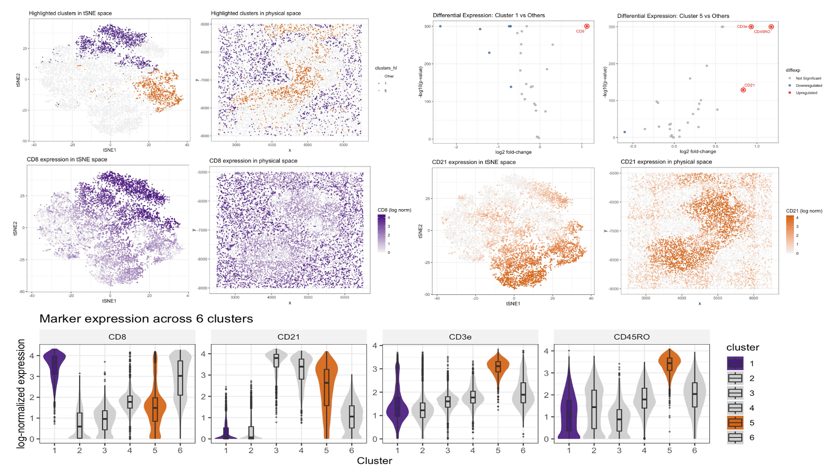
I performed a full CODEX analysis to infer which spleen tissue structure is represented. After loading the dataset, I separated spatial coordinates (x, y), cell area, and protein expression features, then applied a basic quality-control filter by removing low-signal protein channels (keeping markers with total signal > 1000 across cells). To make cells comparable despite differences in overall staining intensity, I normalized each cell’s protein profile by its total signal , rescaled by the global mean total signal, and applied a log10 transform. I then selected the clustering resolution using the elbow method based on within-cluster sum of squares (WSS) for k = 1–10 and chose k = 6 as a balance between over- and under-partitioning. Using k-means (k = 6), I visualized clusters in a low-dimensional embedding by running PCA on the normalized matrix and applying t-SNE to the first 20 PCs (perplexity = 30), and I also mapped the same clusters back to physical space to assess whether they form coherent spatial structures.
Among the six clusters, clusters 1 and 5 showed clear separation in t-SNE space and non-random spatial organization, so I focused on these two for detailed interpretation. To identify marker proteins defining each cluster, I performed cluster-vs-rest differential expression using Wilcoxon rank-sum tests for each marker and computed log2 fold-changes, summarizing results with volcano plots and highlighting key markers. Cluster 1 showed strong upregulation of CD8, consistent with a CD8 T cell–rich population[1], while cluster 5 showed strong upregulation of CD21 and elevated CD3e/CD45RO, consistent with a lymphocyte-rich immune compartment with prominent B cell–associated signal and T cell–associated markers[2]. To validate that these signatures correspond to tissue organization rather than purely statistical clusters, I plotted continuous marker expression for CD8 and CD21 in both t-SNE space and physical space, demonstrating spatially patterned enrichment, and I further compared CD8, CD21, CD3e, and CD45RO across all six clusters using violin plots (highlighting clusters 1 and 5). Taken together, the presence of spatially organized, lymphocyte-associated compartments—one enriched for CD8 T cells and another enriched for CD21 with additional T cell markers—most strongly supports the interpretation that the imaged structure corresponds to spleen white pulp (immune-rich regions with T- and B-cell–associated zones), rather than vascular, red pulp, or capsule/trabecular structures[3].
[1]Martin, Matthew D., and Vladimir P. Badovinac. “Defining memory CD8 T cell.” Frontiers in immunology 9 (2018): 416271. [2]Thorarinsdottir, Katrin, et al. “CD21–/low B cells in human blood are memory cells.” Clinical & Experimental Immunology 185.2 (2016): 252-262. [3]Nolte, Martijn A., et al. “Isolation of the intact white pulp. Quantitative and qualitative analysis of the cellular composition of the splenic compartments.” European journal of immunology 30.2 (2000): 626-634.
2. Code (paste your code in between the ``` symbols)
1
2
3
4
5
6
7
8
9
10
11
12
13
14
15
16
17
18
19
20
21
22
23
24
25
26
27
28
29
30
31
32
33
34
35
36
37
38
39
40
41
42
43
44
45
46
47
48
49
50
51
52
53
54
55
56
57
58
59
60
61
62
63
64
65
66
67
68
69
70
71
72
73
74
75
76
77
78
79
80
81
82
83
84
85
86
87
88
89
90
91
92
93
94
95
96
97
98
99
100
101
102
103
104
105
106
107
108
109
110
111
112
113
114
115
116
117
118
119
120
121
122
123
124
125
126
127
128
129
130
131
132
133
134
135
136
137
138
139
140
141
142
143
144
145
146
147
148
149
150
151
152
153
154
155
156
157
158
159
160
161
162
163
164
165
166
167
168
169
170
171
172
173
174
175
176
177
178
179
180
181
182
183
184
185
186
187
188
189
190
191
192
193
194
195
196
197
198
199
200
201
202
203
204
205
206
207
208
209
210
211
212
213
214
215
216
217
218
219
220
221
222
223
224
225
226
227
228
229
230
231
232
233
234
235
236
237
238
239
240
241
242
243
244
245
246
247
248
249
250
251
252
253
254
255
256
257
258
259
260
261
262
263
264
265
266
267
268
269
270
271
272
273
274
275
276
277
278
279
280
281
282
283
284
285
286
287
288

library(ggplot2)
library(Rtsne)
library(dplyr)
library(cluster)
library(reshape2)
library(ggrepel)

# Load dataset
codex_file <- '/Users/xl/Desktop/JHU2026Spring/Genomic-Data-Visualization/Homework/HW5/codex_spleen2.csv.gz'
codex_data <- read.csv(codex_file, row.names = 1)

# Separate spatial coordinates, cell area, and protein expressions
spatial_coords <- codex_data[, 1:2]
cell_area <- codex_data[, 3]
protein_data <- codex_data[, 4:ncol(codex_data)]

# Filter and normalize gene expression
protein_data_filter <- protein_data[, colSums(protein_data) > 1000]
protein_data_norm <- log10(protein_data_filter / rowSums(protein_data_filter) * mean(rowSums(protein_data_filter)) + 1)

# Determine optimal k
wss <- sapply(1:20, function(k) {
  kmeans(protein_data_norm, centers = k, nstart = 10, iter.max=50)$tot.withinss
})

optimal_k_plot <- ggplot(data.frame(k = 1:20, wss = wss), aes(x = k, y = wss)) +
  geom_line() +
  geom_point() +
  theme_minimal() +
  ggtitle("Determine optimal K")

# We use k=6
optimal_k_plot

# Clustering using k-means
set.seed(123)
k <- 6
kmeans_result <- kmeans(protein_data_norm, centers = 6)
clusters <- as.character(kmeans_result$cluster)
table(clusters)

pcs <- prcomp(protein_data_norm, center = TRUE, scale. = FALSE)
set.seed(123)
tsne_result <- Rtsne(pcs$x[, 1:20], perplexity = 30)

tsne_df <- data.frame(
  tSNE1 = tsne_result$Y[, 1],
  tSNE2 = tsne_result$Y[, 2],
  cluster = clusters
)


pos_df <- data.frame(
  x = spatial_coords$x,
  y = spatial_coords$y,
  cluster = clusters
)


# ---------------------------------------------------------
# 6) Explore ALL clusters first (before choosing focus ones)
# ---------------------------------------------------------
p_all_tsne <- ggplot(tsne_df, aes(tSNE1, tSNE2, color = cluster)) +
  geom_point(alpha = 0.6, size = 0.5) +
  theme_bw() +
  ggtitle(paste0("All clusters (k=", k, ") in tSNE space"))

p_all_space <- ggplot(pos_df, aes(x, y, color = cluster)) +
  geom_point(alpha = 0.8, size = 0.5) +
  coord_fixed() +
  theme_bw() +
  ggtitle(paste0("All clusters (k=", k, ") in physical space"))

(p_all_tsne | p_all_space)

focus_clusters <- c("1", "5")
make_highlight <- function(clusters, keep) {
  clusters_chr <- as.character(clusters)
  hl <- ifelse(clusters_chr %in% keep, clusters_chr, "Other")
  factor(hl, levels = c("Other", keep))
}

clusters_hl <- make_highlight(clusters, focus_clusters)

pos_df <- data.frame(spatial_coords, clusters_hl)
colnames(pos_df)[1:2] <- c("x", "y")

tsne_df$clusters_hl <- clusters_hl
pos_df$clusters_hl <- clusters_hl
# colors: no red/green
hl_colors <- c(
  "Other" = "grey92",
  "1" = "#3F007D",
  "5" = "#D55E00"
)


p1 <- ggplot(tsne_df, aes(x = tSNE1, y = tSNE2, color = clusters_hl)) +
  geom_point(alpha = 0.6, size = 0.5) +
  scale_color_manual(values = hl_colors) +
  ggtitle("Highlighted clusters in tSNE space") +
  theme_bw()
p1
p2 <- ggplot(pos_df, aes(x = x, y = y, color = clusters_hl)) +
  geom_point(alpha = 0.8, size = 0.5) +
  scale_color_manual(values = hl_colors) +
  ggtitle("Highlighted clusters in physical space") +
  theme_bw()


run_de <- function(target_cluster, protein_mat, clusters_raw) {
  pv <- sapply(colnames(protein_mat), function(g) {
    wilcox.test(protein_mat[clusters_raw == target_cluster, g],
                protein_mat[clusters_raw != target_cluster, g])$p.value
  })
  logfc <- sapply(colnames(protein_mat), function(g) {
    log2(mean(protein_mat[clusters_raw == target_cluster, g]) /
           mean(protein_mat[clusters_raw != target_cluster, g]))
  })

  df <- data.frame(gene = colnames(protein_mat),
                   logfc = logfc,
                   logpv = -log10(pv + 1e-300))

  df$diffexp <- "Not Significant"
  df[df$logpv > 2 & df$logfc > 0.6, "diffexp"] <- "Upregulated"
  df[df$logpv > 2 & df$logfc < -0.6, "diffexp"] <- "Downregulated"
  df$diffexp <- factor(df$diffexp, levels = c("Not Significant", "Downregulated", "Upregulated"))
  df
}

clusters_raw <- as.character(kmeans_result$cluster)
tsne_df$hl <- ifelse(clusters_raw %in% c("1","5"), clusters_raw, NA)
pos_df$hl  <- ifelse(clusters_raw %in% c("1","5"), clusters_raw, NA)


df_de_1 <- run_de("1", protein_data_norm, clusters_raw)
df_de_5 <- run_de("5", protein_data_norm, clusters_raw)
get_top_up <- function(df_de, top_n = 10) {
  df_de %>%
    filter(diffexp == "Upregulated") %>%
    arrange(desc(logpv)) %>%
    head(top_n)
}
top_up_1 <- get_top_up(df_de_1, top_n = 10)
top_up_5 <- get_top_up(df_de_5, top_n = 10)
top_up_1
top_up_5


# Genes to label on each volcano plot
label_genes_p3 <- c("CD8")                           # Cluster 1: label CD8 only
label_genes_p4 <- c("CD21", "CD3e", "CD45RO") # Cluster 5: label these three

# Volcano plot helper: recolor points and circle + label selected markers
volcano_custom <- function(df_de, title, label_genes) {
  df_lab <- df_de[df_de$gene %in% label_genes, ]

  ggplot(df_de, aes(x = logfc, y = logpv, color = diffexp)) +
    geom_point(size = 2, alpha = 0.9) +
    # Circle selected markers (black outline)
    geom_point(
      data = df_lab,
      aes(x = logfc, y = logpv),
      inherit.aes = FALSE,
      shape = 21, stroke = 1.1, color = "red", fill = NA, size = 4
    ) +
    # Label selected markers
    geom_text_repel(
      data = df_lab,
      aes(x = logfc, y = logpv, label = gene),
      inherit.aes = FALSE,
      color = "red",
      size = 3.2,          # smaller text for tight panels
      box.padding = 0.5,  # less whitespace around labels
      point.padding = 0.5,# less whitespace around points
      force = 1.2,         # gentler repulsion (less jumping)
      max.overlaps = Inf,
      min.segment.length = 0,
      segment.size = 0.25  # thinner connector line
    ) +
    # Color scheme: Downregulated = blue, Upregulated = orange
    scale_color_manual(values = c(
      "Not Significant" = "grey70",
      "Downregulated"   = "#4C78A8",
      "Upregulated"     = "red"
    )) +
    theme_bw() +
    ggtitle(title) +
    xlab("log2 fold-change") +
    ylab("-log10(p-value)")
}

# P3: Cluster 1 vs Others (label CD8 only)
p3 <- volcano_custom(df_de_1, "Differential Expression: Cluster 1 vs Others", label_genes_p3)
# P4: Cluster 5 vs Others (label CD21, CD3e, CD45RO)
p4 <- volcano_custom(df_de_5, "Differential Expression: Cluster 5 vs Others", label_genes_p4)


# ---------------------------------------------------------
# 7) Marker expression maps (tSNE + physical space)
#    - CD8: tSNE + physical
#    - CD21: tSNE + physical
# ---------------------------------------------------------

plot_marker <- function(gene, low_col = "grey90", high_col = "#4C78A8") {
  tsne_df$gene_expression <- protein_data_norm[, gene]
  pos_df$gene_expression  <- protein_data_norm[, gene]

  p_tsne <- ggplot(tsne_df, aes(tSNE1, tSNE2, color = gene_expression)) +
    geom_point(size = 0.5) +
    scale_color_gradient(name = paste0(gene, " (log norm)"),
                         low = low_col, high = high_col) +
    ggtitle(paste(gene, "expression in tSNE space")) +
    theme_bw() +
    theme(legend.position = "right")

  p_space <- ggplot(pos_df, aes(x, y, color = gene_expression)) +
    geom_point(size = 0.5) +
    scale_color_gradient(name = paste0(gene, " (log norm)"),
                         low = low_col, high = high_col) +
    ggtitle(paste(gene, "expression in physical space")) +
    theme_bw() +
    theme(legend.position = "right")
  list(p_tsne = p_tsne, p_space = p_space)
}

# CD8 (cluster 1 marker): deep purple
pm_cd8  <- plot_marker("CD8",  low_col = "#F2F2F2", high_col = "#3F007D")

# CD21 (cluster 5 marker): deep orange
pm_cd21 <- plot_marker("CD21", low_col = "#F2F2F2", high_col = "#D55E00")


# -----------------------------
# Violin plots: All clusters
# -----------------------------
markers <- c("CD8", "CD21", "CD3e", "CD45RO")  # CD45RO (letter O)
clusters_all <- sort(unique(as.character(clusters_raw)))
df_all <- data.frame(
  cluster = factor(clusters_raw, levels = clusters_all),
  protein_data_norm[, markers, drop = FALSE]
)
df_all_long <- reshape2::melt(
  df_all,
  id.vars = "cluster",
  variable.name = "marker",
  value.name = "expr"
)

cluster_cols6 <- c(
  "1" = "#3F007D",
  "2" = "grey80",
  "3" = "grey80",
  "4" = "grey80",
  "5" = "#D55E00",
  "6" = "grey80"
)

p_violin_all <- ggplot(df_all_long, aes(x = cluster, y = expr, fill = cluster)) +
  geom_violin(trim = TRUE, scale = "width", color = NA, alpha = 0.9) +
  geom_boxplot(width = 0.18, outlier.size = 0.3, alpha = 0.6) +
  facet_wrap(~ marker, nrow = 1, scales = "free_y") +
  scale_fill_manual(values = cluster_cols6) +
  theme_bw() +
  theme(
    strip.background = element_rect(fill = "grey95", color = NA)
  ) +
  xlab("Cluster") +
  ylab("log-normalized expression") +
  ggtitle("Marker expression across 6 clusters")

p1
p2
p3
p4
pm_cd8$p_tsne
pm_cd8$p_space
pm_cd21$p_tsne
pm_cd21$p_space
p_violin_all

#AI prompts used
#“How can I create violin plots in ggplot2 to compare the expression of multiple markers across six k-means clusters, while highlighting two clusters of interest with distinct colors and displaying the remaining clusters in gray?”