Using animation to visualize the importance of data normalization and log-transformation for quality control

1. Figure description
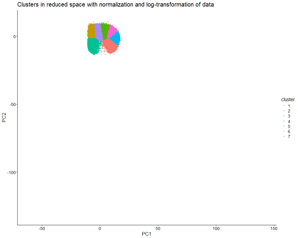
This data visualization uses animation to visualize the effect of data normalization and log-transformation before performing principal component analysis (PCA) and k-means clustering. The data being analyzed is an imaging-based data set. The visualization shows cells in reduced dimensional space using PCA and colored by cluster identity. First, the animation starts with the resulting plot after obtaining the proportional representation of each gene’s expression in each cell as well as applying a log-transform and normalizing by counts per million with a pseudo-count of one. Then, the animation fades into the plot that results from a lack of normalization and log-transformation.
As seen in the visualization, the clusters start compact and close together before they are stretched apart. This makes sense because normalization and log-transformation make the data more Gaussian, so variance is more evenly distributed. When cell segmentation is performed on an imaging-based data set, cells can be merged or partially captured, which increases or decreases the amount of transcripts within the cell’s boundaries. Quality control allows us to lower the influence of very highly expressed genes. Without normalization and log-transformation, the gene expression data is extremely skewed. Thus, it makes sense that the clusters are stretched apart because PCA now captures the huge variation in gene expression counts.
PCA looks for directions of largest variance. Without normalization and log-transformation, the biggest difference in this data set is the total magnitude of expression, not the specific patterns of expression. Even if two cells have similar expression patterns (and thus transcriptional profiles), they can be separated in reduced dimensional space if one cell simply expresses every gene in a higher amount. Therefore, normalization and log-transformation are essential for ensuring that dimensionality reduction and clustering focus on capturing biological differences in gene expression patterns.
2. Code
1
2
3
4
5
6
7
8
9
10
11
12
13
14
15
16
17
18
19
20
21
22
23
24
25
26
27
28
29
30
31
32
33
34
35
36
37
38
39
40
41
42
43
44
45
46
47
48
49
50
51
52
53
54
55
56
57
58
59
60
61
62
63
64
65
66
67
68
69
70
71
72
73
74
75
76
77
78
79
80
81
82
83
84
85
86
87
88
89
90
91
92
93
94
95
96
97
98
99
100
101
102
103
104
105
106
107
108
109
110
111
112
113
114
115
116
117
118
119
120
121
122
123
124
125
126
127
128
129
130
131
132
133
134
135
136
137
138
139
140
141
142
143
144
145
146
147
148
149
150
151
# Load necessary packages
library(dplyr)
library(gganimate)
library(ggplot2)
library(gifski)

# Read data
data <- read.csv('C:/Users/jamie/OneDrive - Johns Hopkins/Documents/Genomic Data Visualization/Xenium-IRI-ShamR_matrix.csv.gz')

# Each row represents one cell
# First column represents cell names
# Second and third columns represent x and y spatial positions of cells
# Fourth and beyond columns represent expression of specific genes in cells
data[1:5,1:5]

# Separate and preview spatial data
pos <- data[,c('x','y')]
rownames(pos) <- data[,1]
head(pos)

# Separate and preview gene expression data
gexp <- data[,4:ncol(data)]
rownames(gexp) <- data[,1]
gexp[1:5,1:5]

# How many total genes are detected per cell?
# Since rows represent cells, add all gene expression counts for each row
totgexp <- rowSums(gexp)
head(totgexp)

# Cells with highest total gene expression counts
head(sort(totgexp, decreasing = TRUE))

# Cells with lowest total gene expression counts
head(sort(totgexp, decreasing = FALSE))

# Data has high variation in total gene expression counts per cell
# We may have captured different proportions of cell volume, thus affecting total expression counts

# Obtain proportional representation of each gene's expression in each cell
# Normalize by counts per million with pseudo-count of 1 to avoid getting undefined values
# Log-transform makes data more Gaussian
mat <- log10(gexp/totgexp * 1e6 + 1)
head(mat)
newtotgexp <- rowSums(mat)

# Cells with highest total gene expression counts
head(sort(newtotgexp, decreasing = TRUE))

# Cells with lowest total gene expression counts
head(sort(newtotgexp, decreasing = FALSE))

# Variation in data has been reduced
# Make PCs with default settings
pcs <- prcomp(mat, center = TRUE, scale = FALSE)
df_pcs <- data.frame(pcs$x, pos)
ggplot(df_pcs, aes(x=x, y=y, col=PC1)) + geom_point(size=0.5)

# Make PCs with default settings - NO NORMALIZATION OR LOG TRANSFORMATION
pcs2 <- prcomp(gexp, center = TRUE, scale = FALSE)
df_pcs2 <- data.frame(pcs2$x, pos)
ggplot(df_pcs2, aes(x=x, y=y, col=PC1)) + geom_point(size=0.5)

# Create elbow plot for number of clusters vs. total within-cluster sum of squares
centers <- 1:20
tot_withinss <- numeric(length(centers))

for (i in centers) {
  km <- kmeans(mat, centers = i)
  tot_withinss[i] <- km$tot.withinss
}

plot(centers, tot_withinss, type = "b",
     xlab = "Number of centers (k)",
     ylab = "Total within-cluster sum of squares",
     main = "Elbow Plot for k-means")

# Variation in total within-cluster sum of squares starts to decrease around cluster 7

# K means clustering
# First set centers to 7 due to the results of the elbow plot, then check plots
# Set seed to any number to keep cluster of interest labeled the same color
set.seed(123)
clusters <- as.factor(kmeans(pcs$x[,1:2], centers=7)$cluster)
df_clusters <- data.frame(pcs$x, pos, cluster=clusters) %>%
  mutate(state='Clusters in reduced space with normalization and log-transformation of data', x_plot=PC1, y_plot=PC2)
ggplot(df_clusters, aes(x=PC1, y=PC2, col=clusters)) + geom_point(size=0.9) + labs(x='PC1', y="PC2", title='Clusters in reduced dimensional space', color='Clusters') + theme_classic()

# K means clustering - NO NORMALIZATION OR LOG TRANSFORMATION
# First set centers to 7 due to the results of the elbow plot, then check plots
# Set seed to any number to keep cluster of interest labeled the same color
set.seed(123)
clusters2 <- as.factor(kmeans(pcs2$x[,1:2], centers=7)$cluster)
df_clusters2 <- data.frame(pcs2$x, pos, cluster=clusters2) %>%
  mutate(state='Clusters in reduced space without normalization and log-transformation of data', x_plot=PC1, y_plot=PC2)
ggplot(df_clusters2, aes(x=PC1, y=PC2, col=clusters2)) + geom_point(size=0.9) + labs(x='PC1', y="PC2", title='Clusters in reduced dimensional space', color='Clusters') + theme_classic()

df_clusters$cell  <- rownames(df_clusters)
df_clusters2$cell <- rownames(df_clusters2)

# Combine data sets
df_combined <- bind_rows(df_clusters, df_clusters2)
head(df_combined)

df_combined$state <- factor(
  df_combined$state,
  levels = c(
    "Clusters in reduced space with normalization and log-transformation of data",
    "Clusters in reduced space without normalization and log-transformation of data"
  )
)

anim <- ggplot(df_combined,
               aes(x = x_plot,
                   y = y_plot,
                   col = cluster,
                   group = cell)) +
  geom_point(size = 1) +
  transition_states(state,
                    transition_length = 2,
                    state_length = 1) +
  labs(title = "{closest_state}",
       x = "PC1",
       y = "PC2") +
  ease_aes("cubic-in-out") +
  theme_classic() +
  theme(
    plot.title = element_text(size = 20),
    axis.title = element_text(size = 16),
    axis.text  = element_text(size = 14),
    legend.title = element_text(size = 16),
    legend.text  = element_text(size = 14)
  )

# Render animation using gifski
real_anim <- animate(
  anim,
  nframes = 100,
  fps = 10,
  width = 1000,
  height = 800,
  renderer = gifski_renderer()
)

# Save rendered animation
anim_save("Extra Credit 1 Visual.gif", animation = real_anim)

# Prompts to ChatGPT
# How can I have the normalized data show up before the un-normalized data in the animation?
# Why does my animation only show the starting image rather than progressing to the final image?
# How can I increase the text size on my animation?