HW EC1

Instructions
Make a new data visualization of your spatial transcriptomics dataset to explore one of the following questions.
- Selected question: “(4) If I perform non-linear dimensionality reduction on PCs, what happens when I vary how many PCs should I use?”
Write a brief description of your figure so we know what you are visualizing. You do not need to use the vocabulary terms from Lesson 1.
Description
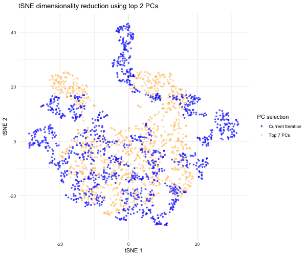
This data visualization shows an animation of the tSNE dimensionality reductions for various selections of principal components (PCs) following PCA. I began by importing the Visium dataset and dividing the dataset into position and gene expression data. I then summed gene expression data for each spot to get total gene expression data for each spot, then log 10-normalized total gene expression data and got rid of NaN datapoints. I then conducted linear dimensionality reduction with PCA on the normalized data and displayed a scree plot showing variance captured by each increasing PC number. Based on the elbow of the scree plot, I did not see significantly more variance being captured by each extra PC after PC 7, so this is the appropriate PC number I would have selected for typical dimensionality reduction. I then conducted non-linear dimensionality reduction with tSNE to 2 dimensions on the top 7 PCs and plotted the spots in tSNE space for the top 7 PCs to get a sense of that the tSNE embedding looks like with proper PC selection.
Since the question I was trying to answer mentioned performing tSNE non-linear dimensionality reduction on varying PC counts, I wanted to see what the tSNE embedding plot would look like if we selected different numbers of PCs besides 7. Based on the scree plot, it looked like the variance captured by the PCs really dropped off after PC 7, so I decided to study the tSNE embedding for the top 2 PCs, top 3 PCs, top 4 PCs, etc. all the way to the top 10 PCs to capture the range of tSNE embeddings produced by different numbers of PCs. To do this, a function was written to help execute tSNE dimensionality reduction from PC1 to PC2, PC3, PC4…PC10. The same seed was used each time in order to produce reproducible, comparable tSNE embeddings for each PC selection. The tSNE data for each of these PC selections was then combined into a data frame for easier plotting and animation. In order to make comparisons between the tSNE embedding for other PC selections and the tSNE embedding for the top 7 PCs, I separated the top 7 PC tSNE data to hold steady in the background of the animation. I then used gganimate to show the transitions between the various tSNE embeddings for the top 2 to 10 PCs we executed tSNE for; for this, the current PC number iteration was plotted in blue and the PC counts used for each frame was displayed in the title. As previously mentioned, the top 7 PC tSNE data was held steady in the background in the color orange to help the audience easily visually compare tSNE embeddings for different PC selections to this “appropriate” PC selection based on the elbow of the scree plot.
As the animation progresses through the tSNE plot for the top 2 PCs all the way to top 10 PCs, we notice that the tSNE points are much more spread out and their locations shift a lot more for/between the lower PC counts. Since the distance on a tSNE plot is often interpreted as transcriptional similarity between spots, we conclude that the fewer PCs that are used, the fewer transcriptional similarities and transcriptionally-similar clusters we are able to identify. We notice that as the number of PCs used for tSNE analysis increases, and thus greater variation is captured, that our spots begin to come closer together (show more transcriptional similarity) and form tighter, more distinct clusters, which would help us more accurately identify cell types based on differential gene expression were we to have done that here.
Code:
```r
library(ggplot2) library(gganimate) library(tidyverse) library(patchwork)
data <- read.csv(“~/Desktop/Visium-IRI-ShamR_matrix.csv.gz”)
#Using code we discussed together in the in-class examples and HWs 3-5:
positions <- data[,c(‘x’, ‘y’)] rownames(positions) <- data[,1] gene_exp <- data[, 4:ncol(data)] rownames(gene_exp) <- data[,1]
#Normalizing total gene expression data total_gene_exp <- rowSums(gene_exp) mat <- log10(gene_exp/total_gene_exp * 1e6 + 1) #Log transform to make more Gaussian distributed and interpretable, get rid of NaN points df <- data.frame(positions, total_gene_exp)
#Dimensionality reduction
#Linear DR: PCA PCs <- prcomp(mat) print(PCs$rotation[1:5,1:5]) #show 1st 5 PC’s gene loading for 1st 5 genes; rotation = loading plot(PCs$sdev[1:25]) #dips at some point where PC’s are not capturing much more variance in the data; we see plateau at around PC 7
#Nonlinear DR: tSNE on top 7 PCs - this is the nonlinear DR we’d expect to do if we properly selected the number of PCs based on the scree plot coded above top_PCs <- PCs$x[, 1:7] set.seed(100) tsne <- Rtsne::Rtsne(top_PCs, dims = 2, perplexity = 30) emb <- tsne$Y colnames(emb) <- c(‘tSNE1’, ‘tSNE2’) rownames(emb) <- rownames(mat)
cell_data <- data.frame(emb, top_PCs, positions) ggplot(cell_data, aes(x=tSNE1, y=tSNE2)) + geom_point() + theme_minimal()
QUESTION BEING EXPLORED: “If I perform non-linear dimensionality reduction on PCs, what happens when I vary how many PCs should I use?”
#We originally performed nonlinear (tSNE) DR on the top 7 PCs based on the inflection point/elbow of the scree plot, but what if we choose a different number of PCs?
Using gganimate documentation (https://gganimate.com/) and Google Gemini (prompt = “How can I combine the results of the tSNE’s for each of the PC combinations in a data frame so as to iterate through the tSNE 1 vs. tSNE 2 plot for each PC combination using gganimate”)
# Executing tSNE analysis on the top 2 PCs, top 3 PCs, etc. until the top 10 PCs (since we see the variance captured by each extra PC diminish after PC 7 based on the scree plot)
tSNE_list <- list()
for (i in 2:10) { #Iterating through top 2, top 3, top 4…top 10 PCs for tSNE analysis set.seed(100) # Helps reproduce comparable tSNE plots for the different PCs tsne_output <- Rtsne::Rtsne(PCs$x[, 1:i], dims = 2, perplexity = 30) #Execute tSNE for specified PCs tSNE_df <- data.frame( #Add results to a tSNE data frame for the specified PCs tSNE1 = tsne_output$Y[,1], tSNE2 = tsne_output$Y[,2], PC_nums = i, # Number of PCs considered will be shown as iteration for each tSNE plot sham_ID = rownames(mat) ) tSNE_list[[i]] <- tSNE_df #Assigning tSNE output to appropriate index in tSNE list for specified PCs }
combined_tSNE <- do.call(rbind, tSNE_list) #Merging all tSNE data into one data frame
# Plotting using gganimate # With help from Google Gemini (prompt = “How to keep grey points for tSNE for top 7 PCs constantly in background (size = 1, alpha = 1) as other tSNE blue points shift for the various PC combinations”) and (prompt = “How to add legend indicating that background dots correspond to tSNE for top 7 PCs”)
top7PC_data <- combined_tSNE[combined_tSNE$PC_nums == 7, ] top7PC_data$PC_nums <- NULL
plot <- ggplot() + geom_point( #Adding points representing tSNE with top 7 PCs (the “proper” number of PCs to select based on elbow of scree plot) data = top7PC_data, aes(x = tSNE1, y = tSNE2, color = “Top 7 PCs”), size = 1, alpha = 0.3 ) + geom_point( #Transitions between tSNEs for various PC combinations data = combined_tSNE, aes(x = tSNE1, y = tSNE2, color = “Current Iteration”), size = 1, alpha = 0.6 ) + theme_minimal() + labs(title = ‘tSNE dimensionality reduction using top {closest_state} PCs’, x = ‘tSNE 1’, y = ‘tSNE 2’) + scale_color_manual( name = “PC selection”, values = c(“Current Iteration” = “blue”, “Top 7 PCs” = “orange”) ) + transition_states(PC_nums, transition_length = 2, state_length = 1) + enter_fade() + exit_shrink() + ease_aes(‘sine-in-out’)
With help from Google Gemini (prompt = “how to save gganimate plot as gif from R”)
library(gifski) animated_plot <- animate(plot, height = 500, width = 600, fps = 10, duration = 10) animated_plot anim_save(“~/Desktop/sarbole1.gif”, animation = animated_plot)
’’’