Using clustering and deconvolution to visualize cell types and upregulated genes in different data sets

1. Figure description
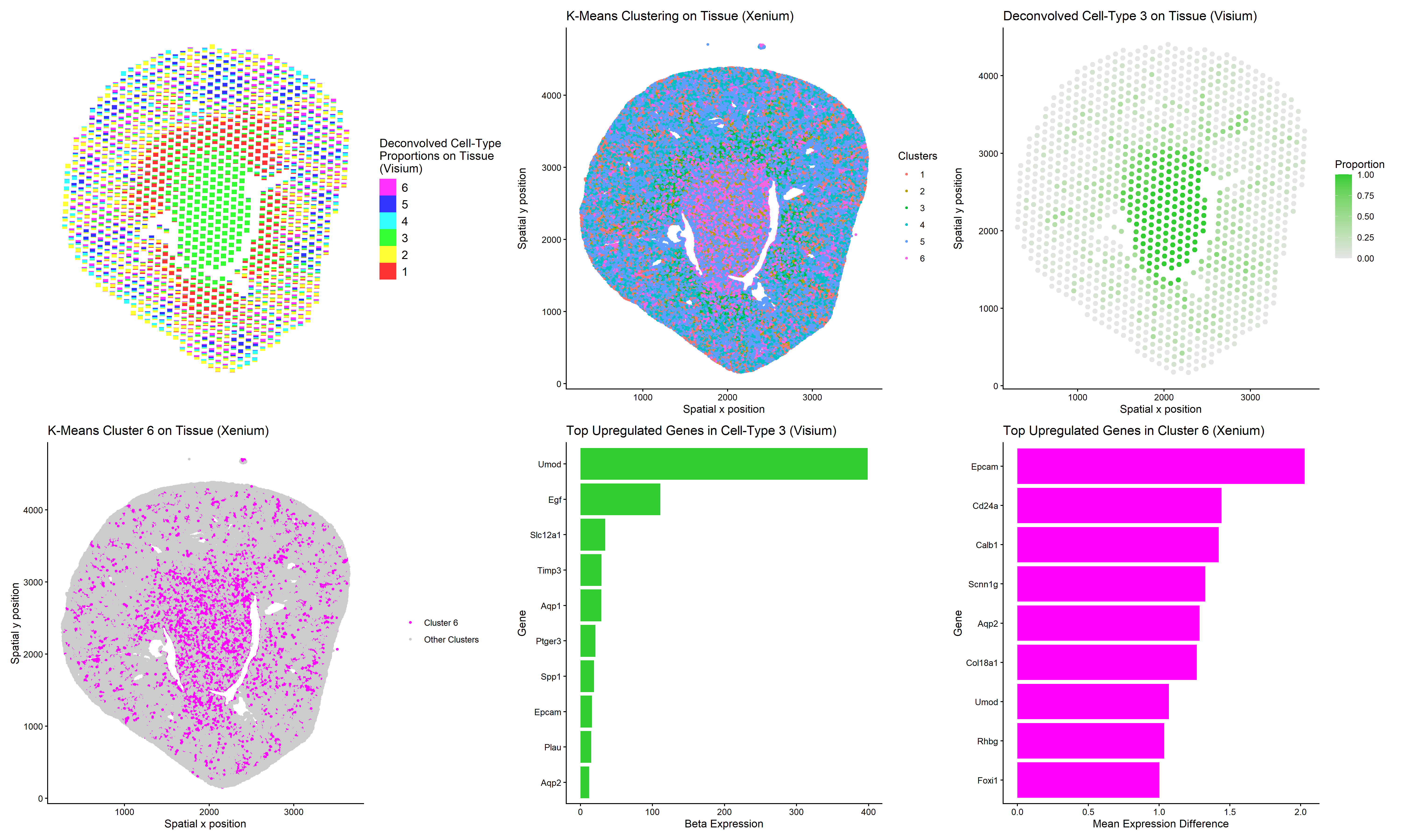
This multi-panel data visualization uses principal component analysis (PCA), t-distributed stochastic neighbor embedding (tSNE), k-means clustering, deconvolution, and differential expression analysis to compare the analyses of different data sets, Xenium and Visium. Xenium refers to an imaging-based data set while Visium refers to a sequencing-based data set.
In the top left plot, deconvolved cell-type proportions are visualized on the tissue using scatterbar (Visium). In the top middle plot, cells are visualized on the tissue and colored by cluster identity (Xenium). In the top right plot, Cell-Type 3 is isolated in lime green on the tissue (Visium).
In the bottom left plot, Cluster 6 is isolated in magenta on the tissue (Xenium). In the bottom middle plot, the top ten upregulated genes in Cell-Type 3 are displayed on a bar graph (Visium). In the bottom right plot, the top nine upregulated genes in Cluster 6 are displayed on a bar graph (Xenium).
In a previous homework assignment, I had performed similar analysis to identify the same cell type (kidney collecting duct principal cells) in both data sets. However, deconvolution had not been applied. I noted that in the imaging data set, my chosen marker genes showed clearer upregulation because gene expression is measured at higher resolution. In the sequencing data set, each spot contains multiple cells, which can reduce the contrast between clusters. Gene expression appear less distinct because each spot contains a mixture of gene expression patterns from different cell types.
Thus, I performed deconvolution to study whether this technique could enhance my analysis of the Visium data set. I was able to identify a deconvoluted cell-type (3) and a k-means cluster (6) that colocalized in space. But upon performing differential expression analysis, I noticed that Cell-Type 3 and Cluster 6 had some differences. While my marker gene of interest, Aqp2, was upregulated in both groups, Cell-Type 3 and Cluster 6 shared little overlap among their top nine to ten most upregulated genes.
It appears that deconvolution cannot fully recover the pure transcriptional profile of single cells though it improves interpretability of the Visium data set. However, I also believe the discrepancy stems from the limitations of the overall analysis approach. I was unable to define a k-means cluster that perfectly matched the same spatial boundaries as Cell-Type 3, meaning some neighboring cells were included and some principal cells were excluded.
2. Code
1
2
3
4
5
6
7
8
9
10
11
12
13
14
15
16
17
18
19
20
21
22
23
24
25
26
27
28
29
30
31
32
33
34
35
36
37
38
39
40
41
42
43
44
45
46
47
48
49
50
51
52
53
54
55
56
57
58
59
60
61
62
63
64
65
66
67
68
69
70
71
72
73
74
75
76
77
78
79
80
81
82
83
84
85
86
87
88
89
90
91
92
93
94
95
96
97
98
99
100
101
102
103
104
105
106
107
108
109
110
111
112
113
114
115
116
117
118
119
120
121
122
123
124
125
126
127
128
129
130
131
132
133
134
135
136
137
138
139
140
141
142
143
144
145
146
147
148
149
150
151
152
153
154
155
156
157
158
159
160
161
162
163
164
165
166
167
168
169
170
171
172
173
174
175
176
177
178
179
180
181
182
183
184
185
186
187
188
189
190
191
192
193
194
195
196
197
198
199
200
201
202
203
204
205
206
207
208
209
210
211
212
213
214
215
216
217
218
219
220
221
222
223
224
225
226
227
228
229
230
231
232
233
234
235
236
237
238
239
240
241
242
243
244
245
246
247
248
249
250
251
252
253
254
255
256
257
258
259
260
261
262
263
264
265
266
267
# Load necessary packages
library(STdeconvolve)
library(scatterbar)
library(ggplot2)

# Read Visium data
data <- read.csv('C:/Users/jamie/OneDrive - Johns Hopkins/Documents/Genomic Data Visualization/Visium-IRI-ShamR_matrix.csv.gz')

# Each row represents one cell
# First column represents cell names
# Second and third columns represent x and y spatial positions of cells
# Fourth and beyond columns represent expression of specific genes in cells
data[1:5,1:5]

# Separate and preview spatial data
pos <- data[,c('x','y')]
rownames(pos) <- data[,1]
head(pos)

# Separate and preview gene expression data
gexp <- data[,4:ncol(data)]
rownames(gexp) <- data[,1]
gexp[1:5,1:5]

# Read Xenium data
data2 <- read.csv('C:/Users/jamie/OneDrive - Johns Hopkins/Documents/Genomic Data Visualization/Xenium-IRI-ShamR_matrix.csv.gz')
genes <- colnames(data2)[4:ncol(data2)]
genes.have <- intersect(genes, colnames(gexp))
length(genes.have)

# Subset Visium data to Xenium genes - some spots end up having 100 total genes or 1000 total genes
gexp.sub <- gexp[, genes.have]
range(rowSums(gexp.sub))

# Perform deconvolution where theta represents cell-type proportions and beta represents cell-type-specific gexp
# Use k value of 6 to match Xenium analysis
set.seed(4)
ldas <- fitLDA(gexp.sub, Ks = 6)
optLDA <- optimalModel(models = ldas, opt = "min")
results <- getBetaTheta(optLDA, perc.filt = 0.05, betaScale = 1000)

head(results$theta)
head(results$beta)

# Highest genes associated with cell-type 3
sort(results$beta[3,], decreasing=TRUE)

deconProp <- results$theta
deconGexp <- results$beta
vizAllTopics(deconProp, pos, r = 40)

# Plot k deconvolved cell-type proportions on tissue (Visium)
deconProp_df <- as.data.frame(deconProp)
plot_df <- cbind(pos, deconProp_df)
g1 <- scatterbar(
  data = deconProp_df,
  xy = pos,
  size_x = 60,
  size_y = 60,
  legend_title = "Deconvolved Cell-Type\nProportions on Tissue\n(Visium)"
)

# Plot isolated cell-type 3 on tissue (Visium)
df_topic3 <- data.frame(pos, topic3 = deconProp[,3])

g3 <- ggplot(df_topic3, aes(x = x, y = y, color = topic3)) +
  geom_point(size = 2) +
  scale_color_gradient(low = "gray90", high = "limegreen") +
  labs(x='Spatial x position', y='Spatial y position', title = "Deconvolved Cell-Type 3 on Tissue (Visium)",
       color = "Proportion") +
  theme_classic()

# Plot top uregulated genes in cell-type 3 (Visium)
topic3_genes <- sort(deconGexp[3, ], decreasing = TRUE)
top_topic3 <- names(topic3_genes)[1:9]
top_topic3 <- unique(c("Aqp2", top_topic3))

bar_topic3 <- data.frame(
  gene = top_topic3,
  value = topic3_genes[top_topic3]
)

g5 <- ggplot(bar_topic3, aes(x = reorder(gene, value), y = value)) +
  geom_bar(stat = "identity", fill = "limegreen") +
  coord_flip() +
  labs(title = "Top Upregulated Genes in Cell-Type 3 (Visium)",
       x = "Gene",
       y = "Beta Expression") +
  theme_classic()

# How many total genes are detected per spot?
# Since rows represent spots, add all gene expression counts for each row
totgexp <- rowSums(gexp.sub)
head(totgexp)

# Spots with highest total gene expression counts
head(sort(totgexp, decreasing = TRUE))

# Spots with lowest total gene expression counts
head(sort(totgexp, decreasing = FALSE))

# Data has high variation in total gene expression counts per spot

# Obtain proportional representation of each gene's expression in each spot
# Normalize by counts per million with pseudo-count of 1 to avoid getting undefined values
# Log-transform makes data more Gaussian
mat <- log10(gexp.sub/totgexp * 1e6 + 1)
head(mat)
newtotgexp <- rowSums(mat)

# Spots with highest total gene expression counts
head(sort(newtotgexp, decreasing = TRUE))

# Spots with lowest total gene expression counts
head(sort(newtotgexp, decreasing = FALSE))

# Variation in data has been reduced

# Make PCs with default settings and set seed to eliminate randomness
set.seed(35)
pcs <- prcomp(mat, center = TRUE, scale = FALSE)
df_pcs <- data.frame(pcs$x, pos, deconProp)
ggplot(df_pcs, aes(x=PC1, y=PC2, col=X3)) + geom_point(size=2.5)

# Run tSNE on first 10 PCs to capture variation of data
tn <- Rtsne::Rtsne(pcs$x[, 1:10], dim=2)
emb <- tn$Y
rownames(emb) <- rownames(mat)
colnames(emb) <- c('tSNE1', 'tSNE2')
head(emb)

# Split up spatial data and gene expression data for Xenium

# Create spatial data frame with second and third columns of old data frame
# Set row names of spatial data frame as first column of old data frame
pos2 <- data2[,c('x','y')]
rownames(pos2) <- data2[,1]
head(pos2)

# Create gene expression data frame with fourth and beyond columns of old data frame
# Set row names of gene expression data frame as first column of old data frame
gexp2 <- data2[,4:ncol(data2)]
rownames(gexp2) <- data2[,1]
gexp2[1:5,1:5]

# How many total genes are detected per cell?
# Since rows represent cells, add all gene expression counts for each row
totgexp2 <- rowSums(gexp2)
head(totgexp2)

# Cells with highest total gene expression counts
head(sort(totgexp2, decreasing = TRUE))

# Cells with lowest total gene expression counts
head(sort(totgexp2, decreasing = FALSE))

# Data has high variation in total gene expression counts per cell
# We may have captured different proportions of cell volume, thus affecting total expression counts

# Obtain proportional representation of each gene's expression in each cell
# Normalize by counts per million with pseudo-count of 1 to avoid getting undefined values
# Log-transform makes data more Gaussian
mat2 <- log10(gexp2/totgexp2 * 1e6 + 1)
head(mat2)
newtotgexp2 <- rowSums(mat2)

# Cells with highest total gene expression counts
head(sort(newtotgexp2, decreasing = TRUE))

# Cells with lowest total gene expression counts
head(sort(newtotgexp2, decreasing = FALSE))

# Variation in data has been reduced

# Make PCs with default settings
# Choose to visualize data on PC1 and PC2 because they capture the greatest proportion of total variance in data
pcs2 <- prcomp(mat2, center = TRUE, scale = FALSE)
df_pcs2 <- data.frame(pcs2$x, pos2)

# Create elbow plot for number of clusters vs. total within-cluster sum of squares
centers <- 1:20
tot_withinss <- numeric(length(centers))

for (i in centers) {
  km <- kmeans(mat2, centers = i)
  tot_withinss[i] <- km$tot.withinss
}

plot(centers, tot_withinss, type = "b",
     xlab = "Number of centers (k)",
     ylab = "Total within-cluster sum of squares",
     main = "Elbow Plot for k-means")

# Variation in total within-cluster sum of squares starts to decrease around cluster 6

# K means clustering
# First set centers to 6 due to the results of the elbow plot, then check plots
# Set seed to any number to keep cluster of interest labeled the same color
set.seed(4)
clusters2 <- as.factor(kmeans(pcs2$x[,1:2], centers=6)$cluster)
df_clusters2 <- data.frame(pcs2$x, pos2, clusters2)

# Plot k-means clustering on tissue (Xenium)
g2 <- ggplot(df_clusters2, aes(x=x, y=y, col=clusters2)) + geom_point(size=0.9) + labs(x='Spatial x position', y='Spatial y position', title='K-Means Clustering on Tissue (Xenium)', color='Clusters') + theme_classic()

# Compare gene expression in cells of cluster of interest vs. cells of all other clusters
clusterofinterest <- names(clusters2)[clusters2 == 6]
othercells <- names(clusters2)[clusters2 != 6]

# Loop to compare expression of all genes in cluster of interest vs. other clusters
out <- sapply(colnames(mat2), function(gene) {
  x1 <- mat2[clusterofinterest, gene]
  x2 <- mat2[othercells, gene]
  wilcox.test(x1, x2, alternative = 'greater')$p.value
})

# Find genes with smallest p values
sort(out, decreasing=FALSE)

# Aqp2 has very low p value and serves as marker for kidney collecting duct principal cells (type of epithelial cell)
df_aqp2 <- data.frame(pcs2$x, pos2, clusters2, gene=mat2[,'Aqp2'])
ggplot(df_aqp2, aes(x=x, y=y, col=gene)) + geom_point(size=1.8) + labs(x='Spatial x position', y="Spatial y position", title='Expression of Aqp2 in physical space', color = "Expression") + theme_classic()

# Plot isolated cluster of interest (Xenium)
df_clusters2$highlight <- ifelse(df_clusters2$clusters2 == 6,
                                 "Cluster 6",
                                 "Other Clusters")

g4 <- ggplot(df_clusters2, aes(x = x, y = y, color = highlight)) +
  geom_point(size = 0.9) +
  scale_color_manual(values = c("Cluster 6" = "magenta",
                                "Other Clusters" = "gray80")) +
  labs(x='Spatial x position', y='Spatial y position', title = "K-Means Cluster 6 on Tissue (Xenium)",
       color = "") +
  theme_classic()

# Plot top upregulated genes in cluster of interest (Xenium)
mean_diff <- colMeans(mat2[clusterofinterest, ]) -
  colMeans(mat2[othercells, ])
top_cluster1 <- names(sort(mean_diff, decreasing = TRUE))[1:9]
top_cluster1 <- unique(c("Aqp2", top_cluster1))

bar_cluster1 <- data.frame(
  gene = top_cluster1,
  value = mean_diff[top_cluster1]
)

g6 <- ggplot(bar_cluster1, aes(x = reorder(gene, value), y = value)) +
  geom_bar(stat = "identity", fill = "magenta") +
  coord_flip() +
  labs(title = "Top Upregulated Genes in Cluster 6 (Xenium)",
       x = "Gene",
       y = "Mean Expression Difference") +
  theme_classic()

# Create and save multi-panel data visualization
library(patchwork)
panel <- g1 + g2 + g3 + g4 + g5 + g6

ggsave("Extra Credit 2 Visual.png", panel,
       width = 20, height = 12, dpi = 300)

# Prompts to ChatGPT
# How can I isolate the top 9 most upregulated genes in both the cluster of interest and the cell-type?
# How can I set the color of the bar graph to a specific color?
# How can I plot one cluster of interest or one cell-type in color and the rest in gray?
# How can I make the text on the scatterbar plot more legible?