Xenium Spatial Transcriptomics: Data Normalization Workflow
Note, the gif is named “oluwadurotimioni.gif” instead of “hwEC1_ooni5.gif” as this is what the assignment powerpoint instructed, that we use “names.gif”.
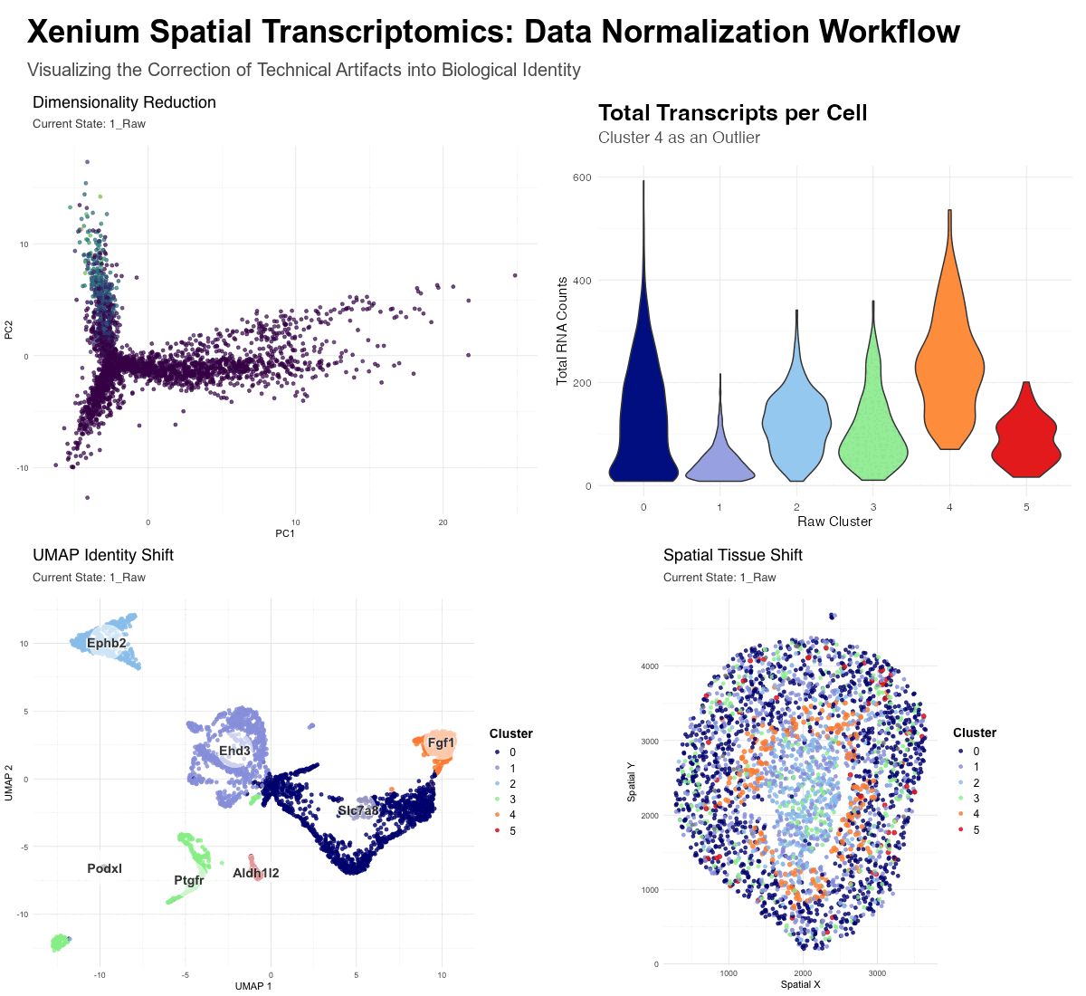
This figure provides a comparative visualization of the impact of data normalization on spatial transcriptomics. It tracks 3,000 cells from a Xenium Kidney when, one, using raw counts(unnormalized) and, two, using log-normalized and scaled data.
Description of Visualizations
The animation consists of four integrated panels that synchronize the “Raw” and “Normalized” workflows:
- Dimensionality Reduction (PCA): Visualizes the global shift from math-driven variance to biology-driven variance. In the raw state, the distribution is heavily skewed by high-count transcripts, while the normalized state reveals distinct biological mappings.
- Total Transcripts per Cell (Violin Plot): Serves as diagnostic evidence—it highlights Cluster 4 as a major outlier, possessing significantly higher total RNA counts (nCount_RNA) than other clusters. This suggests that Cluster 4 in the raw data is a technical artifact rather than a unique cell type.
- UMAP Identity Shift: Displays the “convergence” of cell identities. The enlarged orange dots (Raw Clusters 4, labeled as Fgf1 ) represent cells that were erroneously separated in the raw state due to library size bias. In the raw state these cells represent a distinct cluster, however, upon normalization, these cells move across the UMAP to merge with their true biological neighbors.
- Spatial Tissue Shift: Maps these clusters back to the physical tissue. It demonstrates how “messy” high-count clusters in the raw data are corrected into clean, anatomically consistent niches after the technical noise is removed—the orange cluster 4 can be seen distinctly in the raw data, though it fades in the normalized data.
- Cool colors were used for clusters 0 to 3 in order to make the changes in cluster 4 more salient. Cluster 5 was going to receive greater focus due to some observable change in the Spatial Tissue Map clustering from raw to normalized data within the cluster, however it was unclear what would have driven this change—as the violin plot does not reveal abnormal gene expression rates for Cluster 5.
Without Normalization (Raw State): Dimensionality reduction is dominated by technical variance. The algorithms (PCA/UMAP) group cells based on “how much” signal they have (sequencing depth and library size) rather than “what” signal they have. This results in artifactual clusters, such as the outlier Cluster 4, which is simply a group of high-transcript cells. Certain biological markers are overshadowed by the sheer volume of transcripts in high-density areas.
With Normalization (Normalized State): By applying log-transformation and scaling, we shift the focus to biological variance. Log-transformation squashes the influence of high-count outliers, and scaling ensures that all genes contribute equally to the cell’s “identity profile.” This allows the algorithm to reclassify cells by their gene expression ratios. As seen in the transition, the artifactual Cluster 4 is “dissolved,” and its cells are redistributed into biological clusters based on their specific transcriptomic markers, leading to an accurate anatomical mapping of the kidney tissue.
5. Code (paste your code in between the ``` symbols)
.
library(ggplot2)
library(gganimate)
library(dplyr)
library(magick)
library(viridis)

# ==========================================================
# 1. SETUP & THEME
# ==========================================================
#Set up found via iteration—prompted for a master block at the top.
# CSV reading matches old code exactly (no row.names = 1)
df <- read.csv('Xenium-IRI-ShamR_matrix.csv')
set.seed(42)
df_sample <- df %>% sample_n(3000)
expr_matrix <- df_sample[, 4:ncol(df_sample)]
rownames(expr_matrix) <- df_sample[, 1]
cell_ids <- paste0("cell_", 1:nrow(df_sample))   # old code format

# CONTROL KNOBS
n_frames <- 150
fps_rate <- 10
w_size   <- 600
h_size   <- 500

spatial_colors <- c(
  "0" = "#000E80", "1" = "#97A0E0", "2" = "#95C8EE",
  "3" = "#95EE97", "4" = "#fd8d3c", "5" = "#e31a1c"
)

panel_theme <- theme_minimal() +
  theme(
    plot.title       = element_text(face = "bold",  size = 18, hjust = 0,
                                    family = "sans", margin = margin(b = 5)),
    plot.subtitle    = element_text(face = "plain", size = 13, hjust = 0,
                                    color = "black", family = "sans",
                                    margin = margin(b = 15)),
    plot.background  = element_rect(fill = "white", color = NA),
    panel.background = element_rect(fill = "white", color = NA)
  )

title_lock <- theme(
  plot.title    = element_text(face = "bold",  size = 18, hjust = 0,
                               color = "black", family = "sans",
                               margin = margin(b = 5)),
  plot.subtitle = element_text(face = "plain", size = 13, hjust = 0,
                               color = "grey30", family = "sans",
                               margin = margin(b = 15))
)

# ==========================================================
# 2. SEURAT PROCESSING
#    Order matches old code: Normalized FIRST, Raw SECOND,
#    clustering AFTER both UMAPs are computed.
# ==========================================================
#Asked for assistance in implementing proper use of Seurat, with dif. names for norm and raw in order to effectively do analysis.
seu_norm <- CreateSeuratObject(counts = t(expr_matrix))
seu_norm <- NormalizeData(seu_norm)
seu_norm <- FindVariableFeatures(seu_norm)
seu_norm <- ScaleData(seu_norm)
seu_norm <- RunPCA(seu_norm)
seu_norm <- RunUMAP(seu_norm, dims = 1:20)

seu_raw <- CreateSeuratObject(counts = t(expr_matrix))
seu_raw <- FindVariableFeatures(seu_raw)
seu_raw <- ScaleData(seu_raw, layer = "counts")
seu_raw <- RunPCA(seu_raw)
seu_raw <- RunUMAP(seu_raw, dims = 1:20)

seu_norm <- FindNeighbors(seu_norm, dims = 1:20)
seu_norm <- FindClusters(seu_norm, resolution = 0.05)
seu_raw  <- FindNeighbors(seu_raw, dims = 1:20)
seu_raw  <- FindClusters(seu_raw, resolution = 0.05)

get_top_genes <- function(obj) {
  markers <- FindAllMarkers(obj, only.pos = TRUE, min.pct = 0.25,
                            logfc.threshold = 0.25, verbose = FALSE)
  markers %>% group_by(cluster) %>% top_n(n = 1, wt = avg_log2FC)
}
norm_markers  <- get_top_genes(seu_norm)
raw_markers   <- get_top_genes(seu_raw)
top_raw_genes <- raw_markers$gene

# ==========================================================
# 3. BUILD ALL DATAFRAMES  (old code logic restored)
# ==========================================================
#Prompt:identifying top genes per cluster and using the labels to show changed identified cell type

# --- A. UMAP centroid labels (old code) ---
centroids_norm <- data.frame(
  Embeddings(seu_norm, "umap"),
  Cluster = paste0("Norm_", seu_norm$seurat_clusters)
) %>%
  rename(UMAP_1 = 1, UMAP_2 = 2) %>%
  group_by(Cluster) %>%
  summarise(UMAP_1 = median(UMAP_1), UMAP_2 = median(UMAP_2)) %>%
  mutate(State = "2_Normalized",
         Label = norm_markers$gene[match(gsub("Norm_", "", Cluster),
                                         norm_markers$cluster)])

centroids_raw <- data.frame(
  Embeddings(seu_raw, "umap"),
  Cluster = paste0("Raw_", seu_raw$seurat_clusters)
) %>%
  rename(UMAP_1 = 1, UMAP_2 = 2) %>%
  group_by(Cluster) %>%
  summarise(UMAP_1 = median(UMAP_1), UMAP_2 = median(UMAP_2)) %>%
  mutate(State = "1_Raw",
         Label = raw_markers$gene[match(gsub("Raw_", "", Cluster),
                                        raw_markers$cluster)])
#Prompt, create df for both put the clusters identified into the spatial map
df_labels <- bind_rows(centroids_raw, centroids_norm)

# --- B. UMAP point data (old code: prefixed Cluster + Color_ID) ---
df_umap <- bind_rows(
  data.frame(Cell_ID = cell_ids,
             UMAP_1  = Embeddings(seu_raw, "umap")[,1],
             UMAP_2  = Embeddings(seu_raw, "umap")[,2],
             Cluster = paste0("Raw_", seu_raw$seurat_clusters),
             State   = "1_Raw"),
  data.frame(Cell_ID = cell_ids,
             UMAP_1  = Embeddings(seu_norm, "umap")[,1],
             UMAP_2  = Embeddings(seu_norm, "umap")[,2],
             Cluster = paste0("Norm_", seu_norm$seurat_clusters),
             State   = "2_Normalized")
)
#Prompt: Creating size variation in order to vizualize changes in cluster 4 and 5, the main changes(though analysis ended up focusing on cluster 4 due to violin plot information!)
# Size boost for clusters 4 & 5 (old code)
target_indices  <- which(as.character(seu_raw$seurat_clusters) %in% c("4", "5"))
target_cell_ids <- paste0("cell_", target_indices)

df_umap <- df_umap %>%
  mutate(DotSize  = ifelse(Cell_ID %in% target_cell_ids, 2, 1.5),
         Color_ID = gsub("Raw_|Norm_", "", Cluster))

# --- C. Spatial point data (old code: unprefixed clusters, same palette) ---
df_spatial <- bind_rows(
  data.frame(Cell_ID = cell_ids,
             x       = df_sample$x,
             y       = df_sample$y,
             Cluster = as.factor(seu_raw$seurat_clusters),
             State   = "1_Raw"),
  data.frame(Cell_ID = cell_ids,
             x       = df_sample$x,
             y       = df_sample$y,
             Cluster = as.factor(seu_norm$seurat_clusters),
             State   = "2_Normalized")
) %>%
  mutate(DotSize  = ifelse(Cell_ID %in% target_cell_ids, 2, 1.5),
         Color_ID = as.character(Cluster))

# --- D. PCA data (new panel) ---
umod_col <- grep("^Umod$", colnames(expr_matrix), ignore.case = TRUE, value = TRUE)
if (length(umod_col) == 0) umod_col <- colnames(expr_matrix)[1]
umod_expr <- as.numeric(expr_matrix[[umod_col]])

df_pca <- bind_rows(
  data.frame(Cell_ID = cell_ids,
             PC1 = Embeddings(seu_raw, "pca")[,1],
             PC2 = Embeddings(seu_raw, "pca")[,2],
             Umod_Expression = umod_expr,
             State = "1_Raw"),
  data.frame(Cell_ID = cell_ids,
             PC1 = Embeddings(seu_norm, "pca")[,1],
             PC2 = Embeddings(seu_norm, "pca")[,2],
             Umod_Expression = umod_expr,
             State = "2_Normalized")
)

# ==========================================================
# 4. PLOTS
# ==========================================================
#Prompt: ok two plots, the transition states for plot one are to be the first and second UMAP and the transition states for plot two are to be the first and second spatial clusters(in x and y space), and by first and second I mean non normalized first, then normalized second. I will modify the labels, timing, and tweening if necessary, but make it clear where these "control knobs" are.
#Prompt: we can se a nice ring light up in that outer layer right before the inner section of the cross section, with the raw having that light up ring or orange around the inner section, though this goes away with normalization. maybe we can add some code that finds what the top gene expression in this cluster was and if we can compare its total expression to other top genes in other clusters(this ended up being the violin plot, iterated with the dot plot until I realized violin plot was more effective.)
legend_boost <- theme(
  legend.title = element_text(size = 14, face = "bold"),
  legend.text  = element_text(size = 12),
  legend.key.size = unit(1.2, "lines")
)

p_pca <- ggplot(df_pca, aes(x = PC1, y = PC2, color = Umod_Expression,
                            group = Cell_ID)) +
  geom_point(alpha = 0.7, size = 1.5) +
  scale_color_viridis_c(name = "Umod") +
  labs(title = "Dimensionality Reduction",
       subtitle = "Current State: {closest_state}") +
  panel_theme + title_lock +
  theme(legend.position = "none") +
  transition_states(State, transition_length = 8, state_length = 8, wrap = TRUE) +
  ease_aes('cubic-in-out') +
  view_follow()

# ==========================================================
# UPDATED VIOLIN PLOT (Replaces Dot Plot)
# ==========================================================
# Subset to only show clusters 0-5 to match our narrative and color palette
seu_raw_sub <- subset(seu_raw, idents = c("0", "1", "2", "3", "4", "5"))

p_vln <- VlnPlot(seu_raw_sub, features = "nCount_RNA",
                 group.by = "seurat_clusters", pt.size = 0) +
  scale_fill_manual(values = spatial_colors) +  # Colors match the UMAP/Spatial exactly!
  labs(title = "Total Transcripts per Cell",
       subtitle = "Cluster 4 as an Outlier",
       x = "Raw Cluster", y = "Total RNA Counts") +
  panel_theme +
  title_lock +
  theme(legend.position = "none") # Hide legend since x-axis has the labels

# UMAP — restored from old code (labels, Color_ID, DotSize, halos)
# UMAP — add legend_boost at the end
p_umap <- ggplot() +
  geom_point(data = df_umap,
             aes(x = UMAP_1, y = UMAP_2, color = Color_ID,
                 group = Cell_ID, size = DotSize),
             alpha = 0.8) +
  scale_size_identity() +
  scale_color_manual(values = spatial_colors, name = "Cluster") +
  geom_point(data = df_labels,
             aes(x = UMAP_1, y = UMAP_2, group = Cluster),
             color = "white", size = 18, alpha = 0.6) +
  geom_text(data = df_labels,
            aes(x = UMAP_1, y = UMAP_2, label = Label, group = Cluster),
            color = "white", size = 5.5, fontface = "bold", alpha = 0.8) +
  geom_text(data = df_labels,
            aes(x = UMAP_1, y = UMAP_2, label = Label, group = Cluster),
            color = "black", size = 5, fontface = "bold", alpha = 0.8) +
  labs(title = "UMAP Identity Shift",
       subtitle = "Current State: {closest_state}",
       x = "UMAP 1", y = "UMAP 2") +
  panel_theme + title_lock + legend_boost +
  transition_states(State, transition_length = 8, state_length = 8, wrap = TRUE) +
  ease_aes('cubic-in-out') +
  enter_fade() + exit_fade()

# Spatial — add legend_boost at the end
p_spatial <- ggplot(df_spatial,
                    aes(x = x, y = y, color = Color_ID,
                        group = Cell_ID, size = DotSize)) +
  geom_point(alpha = 0.8) +
  scale_size_identity() +
  scale_color_manual(values = spatial_colors, name = "Cluster") +
  coord_fixed() +
  labs(title = "Spatial Tissue Shift",
       subtitle = "Current State: {closest_state}",
       x = "Spatial X", y = "Spatial Y") +
  panel_theme + title_lock + legend_boost +
  transition_states(State, transition_length = 8, state_length = 8, wrap = TRUE) +
  ease_aes('cubic-in-out')

# ==========================================================
# 5. RENDER PANELS
# ==========================================================
animate(p_pca,     nframes = n_frames, fps = fps_rate,
        width = w_size, height = h_size,
        renderer = gifski_renderer("temp_pca.gif"))
animate(p_umap,    nframes = n_frames, fps = fps_rate,
        width = w_size, height = h_size,
        renderer = gifski_renderer("temp_umap.gif"))
animate(p_spatial, nframes = n_frames, fps = fps_rate,
        width = w_size, height = h_size,
        renderer = gifski_renderer("temp_spatial.gif"))
ggsave("temp_vlnplot.png", plot = p_vln,
       width = w_size/100, height = h_size/100, dpi = 100)

# ==========================================================
# 6. STITCH & EXPORT — SEAMLESS INFINITE LOOP
#
# WHY THE STUTTER IS GONE:
#   wrap=TRUE already makes gganimate produce a full
#   forward-AND-return cycle within n_frames.
#   Frame N (≈ back at State 1) feeds naturally into
#   Frame 1 (State 1) with the same inter-frame gap
#   as every other consecutive pair — no seam.
#   The old ping-pong DOUBLED that cycle, creating
#   a visible splice artifact on the second pass.
# ==========================================================
gif_pca     <- image_read("temp_pca.gif")
gif_umap    <- image_read("temp_umap.gif")
gif_spatial <- image_read("temp_spatial.gif")
# Load the violin plot image instead of the dot plot
png_vln <- image_read("temp_vlnplot.png") %>%
  image_resize(paste0(w_size, "x", h_size, "!"))

total_width  <- w_size * 2
master_title <- image_blank(width = total_width, height = 100, color = "white") %>%
  image_annotate("Xenium Spatial Transcriptomics: Data Normalization Workflow",
                 color = "black", size = 35, weight = 700, location = "+30+15") %>%
  image_annotate(
    "Visualizing the Correction of Technical Artifacts into Biological Identity",
    color = "grey30", size = 20, location = "+30+65")

num_frames_actual <- min(length(gif_pca), length(gif_umap), length(gif_spatial))
frames_list <- vector("list", num_frames_actual)

for (i in 1:num_frames_actual) {
  top_row <- image_append(c(gif_pca[i], png_vln))
  bottom_row <- image_append(c(gif_umap[i], gif_spatial[i]))
  grid       <- image_append(c(top_row, bottom_row), stack = TRUE)
  frames_list[[i]] <- image_append(c(master_title, grid), stack = TRUE)
}

# Uniform delay, infinite loop, no ping-pong
final_animation <- image_animate(
  image_join(frames_list),
  delay = round(100 / fps_rate),
  loop  = 0
)
image_write(final_animation, "Final_Xenium_Master_Analysis???.gif")


# ==========================================================
# EXPRESSION COMPARISON: Aldh1l2 & Podxl vs All Other Genes
# ==========================================================

# Total raw counts per gene across all 3000 sampled cells
gene_totals <- colSums(expr_matrix)

# Sort descending to see where Aldh1l2 and Podxl rank
gene_totals_sorted <- sort(gene_totals, decreasing = TRUE)

# Print top 20
cat("--- Top 20 Genes by Total Raw Counts ---\n")
print(head(gene_totals_sorted, 20))

# Print where the suspects land
suspects <- c("Aldh1l2", "Podxl")
cat("\n--- Suspect Gene Totals ---\n")
print(gene_totals[suspects])

cat("\n--- Suspect Gene Ranks ---\n")
for (g in suspects) {
  rank <- which(names(gene_totals_sorted) == g)
  cat(g, ": rank", rank, "out of", length(gene_totals_sorted),
      "| total counts:", gene_totals[g], "\n")
}

# Quick visual: histogram of all gene totals with suspect lines
library(ggplot2)
df_totals <- data.frame(Gene = names(gene_totals), Total = as.numeric(gene_totals))

p_compare <- ggplot(df_totals, aes(x = Total)) +
  geom_histogram(bins = 50, fill = "grey70", color = "white") +
  geom_vline(xintercept = gene_totals["Aldh1l2"], color = "#e31a1c",
             linewidth = 1.2, linetype = "dashed") +
  geom_vline(xintercept = gene_totals["Podxl"], color = "#fd8d3c",
             linewidth = 1.2, linetype = "dashed") +
  annotate("text", x = gene_totals["Aldh1l2"], y = Inf, label = "Aldh1l2",
           vjust = 2, hjust = -0.1, color = "#e31a1c", fontface = "bold") +
  annotate("text", x = gene_totals["Podxl"], y = Inf, label = "Podxl",
           vjust = 4, hjust = -0.1, color = "#fd8d3c", fontface = "bold") +
  labs(title = "Distribution of Total Raw Counts Across All Genes",
       subtitle = "Dashed lines = suspect cluster-driving genes",
       x = "Total Raw Counts (summed across 3000 cells)",
       y = "Number of Genes") +
  theme_minimal()

print(p_compare)
ggsave("Suspect_Gene_Comparison.png", p_compare, width = 8, height = 5, dpi = 150)


# ==========================================================
# TOP GENES IN RAW CLUSTERS 4 AND 5
# ==========================================================

# Cluster 4 markers
cat("=== RAW CLUSTER 4: Top 10 Markers ===\n")
markers_c4 <- FindMarkers(seu_raw, ident.1 = "4", only.pos = TRUE,
                          min.pct = 0.25, logfc.threshold = 0.25, verbose = FALSE)
markers_c4$gene <- rownames(markers_c4)
print(head(markers_c4[order(-markers_c4$avg_log2FC),
                      c("gene", "avg_log2FC", "pct.1", "pct.2", "p_val_adj")], 10))

cat("\n=== RAW CLUSTER 5: Top 10 Markers ===\n")
markers_c5 <- FindMarkers(seu_raw, ident.1 = "5", only.pos = TRUE,
                          min.pct = 0.25, logfc.threshold = 0.25, verbose = FALSE)
markers_c5$gene <- rownames(markers_c5)
print(head(markers_c5[order(-markers_c5$avg_log2FC),
                      c("gene", "avg_log2FC", "pct.1", "pct.2", "p_val_adj")], 10))

# Also show what these cells express in total vs other clusters
cat("\n=== TOTAL COUNTS PER CELL BY CLUSTER ===\n")
print(tapply(seu_raw$nCount_RNA, seu_raw$seurat_clusters,
             function(x) round(c(mean = mean(x), median = median(x), sd = sd(x)), 1)))


VlnPlot(seu_raw, features = "nCount_RNA", group.by = "seurat_clusters",
        pt.size = 0) +
  ggtitle("Total Transcripts per Cell by Raw Cluster") +
  panel_theme