An Animation to View the Impact of Normalization on Gene Expression

What happens if I do or not not normalize and/or transform the gene expression data (e.g. log and/or scale) prior to dimensionality reduction?
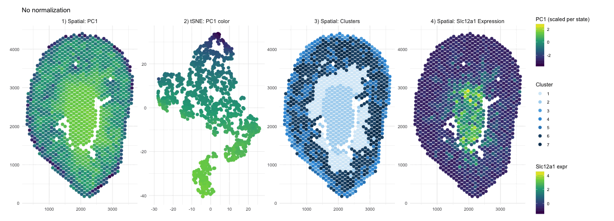
When PCA is run on raw counts, PC1 is largely driven by total expression magnitude, so spots with higher overall RNA counts load higher on PC1. These spots have no spatial pattern as they only depend on sequencing depth. This is why you see a smooth spatial gradient that resembles an intensity map rather than a clearly defined anatomical compartment, because total RNA content varies continuously across the tissue. After normalization and log transformation, that global magnitude effect is reduced, and PCA instead captures relative gene expression differences. As a result, PC1 no longer reflects “how much RNA is present,” but rather transcriptional patterns, leading to a more sharply defined central region that represents a distinct biological compartment.
Without normalization, the tSNE embedding reflects the magnitude driven structure of the PCs, so spots are arranged in a more gradual and diffuse pattern rather than forming clearly separated groups. Distances between points are influenced by overall RNA abundance and gives the embedding a smoother appearance. After normalization and log transformation, the embedding is now based on relative expression patterns, allowing biologically distinct spots to cluster more tightly. This results in clearer separation of a well defined group, because the low dimensional space now reflects transcriptional identity rather than overall count intensity.
The cluster assignments are quite similar with and without normalization, indicating that the major anatomical compartments in the tissue are strong enough to be detected under both conditions. Without normalization, clustering is influenced partly by differences in overall expression magnitude, so boundaries between groups may be slightly less precise. After normalization, clustering is based more on relative gene expression patterns, which refines the separation between groups. In this case however we don’t see a change in their overall spatial organization. In other words, normalization in this scenario improves the clarity of cluster structure rather than redefining the dominant clusters.
In the raw map, Slc12a1 reflects absolute counts, so spots with higher total RNA, likely in the center, appear stronger simply because all genes have higher counts there. This exaggerates the central signal and compresses expression elsewhere. After normalization and log transformation, expression is scaled relative to total counts, so high depth spots lose their magnitude advantage and moderate expression in other regions becomes more visible. As a result, the signal appears more distributed because it now reflects relative gene abundance rather than overall RNA content.
5. Code (paste your code in between the ``` symbols)
1
2
3
4
5
6
7
8
9
10
11
12
13
14
15
16
17
18
19
20
21
22
23
24
25
26
27
28
29
30
31
32
33
34
35
36
37
38
39
40
41
42
43
44
45
46
47
48
49
50
51
52
53
54
55
56
57
58
59
60
61
62
63
64
65
66
67
68
69
70
71
72
73
74
75
76
77
78
79
80
81
82
83
84
85
86
87
88
89
90
91
92
93
94
95
96
97
98
99
100
101
102
103
104
105
106
107
108
109
110
111
112
113
114
115
116
117
118
119
120
121
122
123
124
125
126
127
128
129
130
131
132
133
134
135
136
137
138
139
140
141
142
143
144
145
146
147
148
149
150
151
152
153
154
155
156
157
158
159
160
161
162
163
164
165
166
167
168
169
170
171
172
173
174
175
176
177
178
179
180
181
182
183
184
185
186
187
188
189
190
191
192
193
194
195
196
197
198
199
200
201
202
203
204
205
206
207
208
209
210
211
212
213
214
215
216
217

library(ggplot2)
library(gganimate)
library(dplyr)
library(magick)
library(patchwork)
library(RColorBrewer)
library(ggnewscale)

# load data
data <- read.csv("~/Documents/genomic-data-visualization-2026/data/Visium-IRI-ShamR_matrix.csv.gz")

# position
pos <- data[, c("x", "y")]
rownames(pos) <- data[, 1]

# gene expression
gexp <- data[, 4:ncol(data)]
rownames(gexp) <- data[, 1]

# normalize
totgexp <- rowSums(gexp)
mat <- log10(gexp / totgexp * 1e6 + 1)

# # test
# df_test <- data.frame(
#   pos,
#   gene1= mat[,'Slc12a1'],
#   gene2= gexp[,'Slc12a1']
# )
#
# plot1 <- ggplot(df_test, aes(x=x, y=y, col=gene1))+ geom_point()
# plot2 <- ggplot(df_test, aes(x=x, y=y, col=gene2))+ geom_point()
#
# plot1 + plot2

# PCA
pcs_notnormalized <- prcomp(gexp, center = TRUE, scale. = FALSE)
pcs_normalized    <- prcomp(mat,  center = TRUE, scale. = FALSE)

# tSNE
set.seed(1)
ts_notnormalized <- Rtsne::Rtsne(pcs_notnormalized$x[, 1:10], dims = 2)
emb_notnormalized <- ts_notnormalized$Y
colnames(emb_notnormalized) <- c("tSNE1", "tSNE2")

set.seed(1)
ts_normalized <- Rtsne::Rtsne(pcs_normalized$x[, 1:10], dims = 2)
emb_normalized <- ts_normalized$Y
colnames(emb_normalized) <- c("tSNE1", "tSNE2")

# clustering
set.seed(10)
clusters_notnormalized <- as.factor(kmeans(pcs_notnormalized$x[, 1:5], centers = 7)$cluster)
set.seed(10)
clusters_normalized    <- as.factor(kmeans(pcs_normalized$x[, 1:5], centers = 7)$cluster)

# consistent cluster levels + colors
all_levels <- sort(unique(c(levels(clusters_notnormalized), levels(clusters_normalized))))
clusters_notnormalized <- factor(clusters_notnormalized, levels = all_levels)
clusters_normalized    <- factor(clusters_normalized, levels = all_levels)

cluster_colors <- c(
  "1" = "#D6EAF8",  # very light blue
  "2" = "#AED6F1",
  "3" = "#5DADE2",
  "4" = "#3498DB",
  "5" = "#2E86C1",
  "6" = "#1B4F72",
  "7" = "#0B3C5D"   # deep navy
)

# build dataframe to be used per state
# without normalization
df_no <- data.frame(
  spot = rownames(pos),
  x = pos$x,
  y = pos$y,
  PC1 = pcs_notnormalized$x[, 1],
  tSNE1 = emb_notnormalized[, 1],
  tSNE2 = emb_notnormalized[, 2],
  cluster = clusters_notnormalized,
  gene_expr = gexp[, 'Slc12a1'],
  state = "No normalization",
  stringsAsFactors = FALSE
)

# with normalization
df_yes <- data.frame(
  spot = rownames(pos),
  x = pos$x,
  y = pos$y,
  PC1 = pcs_normalized$x[, 1],
  tSNE1 = emb_normalized[, 1],
  tSNE2 = emb_normalized[, 2],
  cluster = clusters_normalized,
  gene_expr = mat[, 'Slc12a1'],
  state = "With normalization",
  stringsAsFactors = FALSE
)

# combine the panels
make_panels <- function(df) {
  p1 <- dplyr::transmute(df,
                         state = state,
                         panel = "1) Spatial: PC1",
                         x_plot = x,
                         y_plot = y,
                         pc1 = PC1,
                         cl  = NA_character_,
                         gene = NA_real_
  )

  p2 <- dplyr::transmute(df,
                         state = state,
                         panel = "2) tSNE: PC1 color",
                         x_plot = tSNE1,
                         y_plot = tSNE2,
                         pc1 = PC1,
                         cl  = NA_character_,
                         gene = NA_real_
  )

  p3 <- dplyr::transmute(df,
                         state = state,
                         panel = "3) Spatial: Clusters",
                         x_plot = x,
                         y_plot = y,
                         pc1 = NA_real_,
                         cl  = as.character(cluster),
                         gene = NA_real_
  )

  p4 <- dplyr::transmute(df,
                         state = state,
                         panel = "4) Spatial: Slc12a1 Expression",
                         x_plot = x,
                         y_plot = y,
                         pc1 = NA_real_,
                         cl  = NA_character_,
                         gene = as.numeric(gene_expr)
  )

  dplyr::bind_rows(p1, p2, p3, p4)
}

df_combined <- dplyr::bind_rows(make_panels(df_no), make_panels(df_yes))

stopifnot(nrow(df_combined) > 0)

df_combined <- df_combined %>%
  dplyr::group_by(state) %>%
  dplyr::mutate(pc1_scaled = ifelse(is.na(pc1), NA_real_, as.numeric(scale(pc1)))) %>%
  dplyr::ungroup()

df_combined <- df_combined %>%
  group_by(state) %>%
  mutate(
    gene_scaled = ifelse(is.na(gene), NA_real_, as.numeric(scale(gene)))
  ) %>%
  ungroup()

# build animation
anim <- ggplot2::ggplot() +
  # PC1 panels (everything except clusters + gene)
  ggplot2::geom_point(
    data = df_combined %>% dplyr::filter(panel != "3) Spatial: Clusters",
                                         panel != "4) Spatial: Slc12a1 Expression"),
    ggplot2::aes(x = x_plot, y = y_plot, color = pc1_scaled),
    size = 2.5
  ) +
  ggplot2::scale_color_viridis_c(name = "PC1 (scaled per state)", na.value = "transparent", guide = guide_colorbar(order = 1)) +
  ggnewscale::new_scale_color() +

  # Cluster panel
  ggplot2::geom_point(
    data = df_combined %>% dplyr::filter(panel == "3) Spatial: Clusters"),
    ggplot2::aes(x = x_plot, y = y_plot, color = cl),
    size = 2.5
  ) +
  ggplot2::scale_color_manual(values = cluster_colors, name = "Cluster", na.value = "transparent", guide = guide_legend(order = 2)) +
  ggnewscale::new_scale_color() +

  # Gene panel
  ggplot2::geom_point(
    data = df_combined %>% dplyr::filter(panel == "4) Spatial: Slc12a1 Expression"),
    ggplot2::aes(x = x_plot, y = y_plot, color = gene_scaled),
    size = 2.5
  ) +
  ggplot2::scale_color_viridis_c(name = "Slc12a1 expr", na.value = "transparent", guide = guide_colorbar(order = 3)) +

  ggplot2::facet_wrap(~panel, nrow = 1, scales = "free") +
  gganimate::transition_states(state, transition_length = 2, state_length = 1) +
  ggplot2::labs(title = "{closest_state}", x = NULL, y = NULL) +
  ggplot2::theme_minimal() +
  ggplot2::theme(
    legend.position = "right",
    legend.box = "vertical",
    legend.margin = margin(10, 10, 10, 10),
    plot.margin = margin(15, 40, 15, 15),
    strip.text = ggplot2::element_text(size = 11)
  )

gif_anim <- gganimate::animate(
  anim,
  nframes = 120,
  fps = 10,
  width = 1250,
  height = 450,
  renderer = magick_renderer()
)

gif_anim

# save animation
anim_save("sjameel1.gif", animation = gif_anim)
6. Resources
I used R documentation and the ? help function on R itself to understand functions.
I used AI to help combine dataframes and create the animation
- (ex promt) I want 4 panels per state and two states. One for normalized and one for not. Combine these dataframes so I can run gganimate on it.