HW EC2: Integrating Visium, Xenium, and Deconvolution to Identify the Straight Proximal Tubule

Description
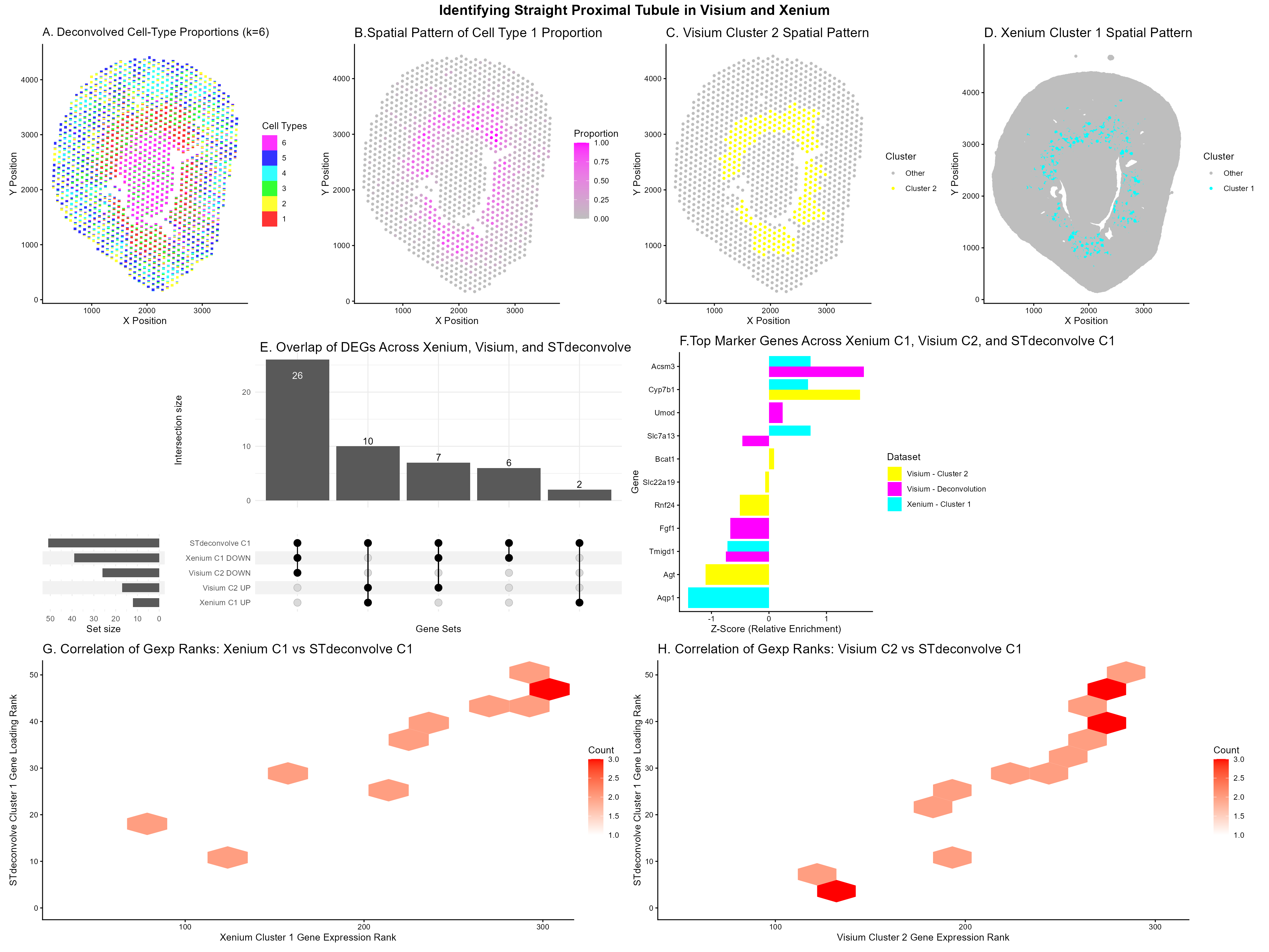
Panel A: Scatterbar plot showing deconvolved cell-type proportions across Visium tissue spots (STdeconvolve, K=6), where each stacked bar represents the mixture of cell types at a given spatial location. I made a perplexity/diagnostic plot to help select the optimal K (K=6), though I did not put this graph in the final figure.
Panel B: Spatial map of deconvolved Cell Type 1 proportions across the Visium tissue, with color intensity indicating relative abundance. This plot isolates Cell Type 1 to examine where it is spatially located across the tissue, helping to show whether it corresponds to the same kidney region as Xenium Cluster 1 and Visium Cluster 2, which were previously identified as the Straight Proximal Tubule (SPT) population in HW4.
Panel C & D: Spatial distributions of Visium K-means Cluster 2 and Xenium K-means Cluster 1, highlighted in yellow and cyan respectively against all other spots in grey. K-means clustering was performed on these datasets, and I wanted to see if the clusters occupy the same tissue regions. These two clusters were selected as the cell types of interest for downstream analysis based on their spatial patterns and they were the clusters I chose in HW4. Xenium Cluster 1 and Visium Cluster 2 were identified as the Straight Proximal Tubule (SPT) population through spatial co-localization and shared marker genes such as Cyp7b1 and Slc7a13.
Panel E: UpSet plot showed overlap among differentially expressed genes from Xenium Cluster 1, Visium Cluster 2, and STdeconvolve Cell Type 1, separated into up and downregulated sets. I already compared the full DE gene sets between Xenium and Visium in homework 4’s upset plot. In this homework, the goal is specifically to examine the effects of incorporating STdeconvolve. Since STdeconvolve operates only on the top 1,000 overdispersed genes selected by restrictCorpus, beta loadings exist for a restricted gene set (51 genes in this dataset). Xenium and Visium DE lists were filtered to this same set to enable a fair, modality‑matched comparison. This plot was trying to assess whether the 51 topic‑defining genes are significantly expressed in Xenium and Visium and whether they are up or downregulated in each modality.
Panel F: Bar chart comparing the top upregulated genes from Xenium Cluster 1, Visium Cluster 2, and STdeconvolve Cell Type 1, with scores z-normalized to enable cross-modality comparison. Xenium and Visium provide log fold‑change values with clear up and downregulation, whereas STdeconvolve produces $\beta$‑loadings that represent gene contributions to a topic rather than true differential expression. Z‑normalization allows these different score types to be placed on a common scale so that relative enrichment of top marker genes can be meaningfully compared across all three analyses. I wanted to highlight genes that consistently show strong contribution or upregulation across methods and to see if they are seen in all 3 methods.
Panel G & H: Hexbin plots showing the correlation between gene expression ranks within Xenium Cluster 1 and Visium Cluster 2 against STdeconvolve Cell Type 1 gene loading ranks, respectively. These plots provide a global, gene-wide view of how well the clustering-based results align with the deconvolution-based results. Since Xenium, Visium, and STdeconvolve operate on different scales (single‑cell targeted counts, spot‑level whole‑transcriptome expression, and topic‑model loadings), a rank–rank comparison provides a way to assess global transcriptional similarity. A positive diagonal trend indicates that genes with high STdeconvolve $\beta$‑loadings also have high expression ranks in Xenium or Visium, suggesting that the clustering‑based and deconvolution‑based methods capture the same cell type. These plots provide gene‑wide evidence that all three methods identify the same Straight Proximal Tubule cell type.
Code
library(ggplot2)
library(patchwork)
library(ComplexUpset)
library(tidyr)
library(dplyr)
library(patchwork)
library(tibble)
library(STdeconvolve)
library(ggrepel)
library(scatterbar)
library(hexbin)

#Note: a lot of my code was copied over form HW4,
#so some of the comments and searches I did in that HW4 are not included

set.seed(123)
xenium <- read.csv('C:/users/lilli/Downloads/Xenium-IRI-ShamR_matrix.csv.gz')
visium <- read.csv('C:/users/lilli/Downloads/Visium-IRI-ShamR_matrix.csv.gz')

#gene expression data
gexp_x <- xenium[, 4:ncol(xenium)]
gexp_v <- visium[, 4:ncol(visium)]
#rownames are the spots
rownames(gexp_x) <- xenium[,1]
rownames(gexp_v) <- visium[,1]
#positions of the data
pos_x <- xenium[, c('x', 'y')]
pos_v <- visium[, c('x', 'y')]

#get gene names (column names) from both datasets
xenium_genes <- colnames(gexp_x)
visium_genes <- colnames(gexp_v)
#find common genes
common_genes <- intersect(xenium_genes, visium_genes)
#filter visium gene expression data to include only common genes
gexp_v <- gexp_v[, common_genes]

#library size normalization
total_genexp_x <- rowSums(gexp_x)
mat_x <- log10(gexp_x/total_genexp_x*1e4+1)
total_genexp_v <- rowSums(gexp_v)
mat_v <- log10(gexp_v/total_genexp_v*1e4+1)

#performing kmeans on the full gene expression data
kmeans_result_x <- kmeans(mat_x, centers = 7)
kmeans_result_v <- kmeans(mat_v, centers = 5)

#perform PCA
pcs_x <- prcomp(mat_x, center=TRUE, scale=FALSE)
pcs_v <- prcomp(mat_v, center=TRUE, scale=FALSE)

df_x <- data.frame(pos_x, mat_x, pcs_x$x, kmeans_result_x$cluster)
df_v <- data.frame(pos_v, mat_v, pcs_v$x, kmeans_result_v$cluster)

#add cluster assignments to position data for both datasets
pos_x_clustered <- cbind(pos_x, cluster = as.factor(kmeans_result_x$cluster), dataset = 'xenium')
pos_v_clustered <- cbind(pos_v, cluster = as.factor(kmeans_result_v$cluster), dataset = 'visium')


#gexp is in spots x genes format; cleanCounts expects genes x spots, so we transpose.
counts <- cleanCounts(t(gexp_v), min.lib.size = 100, verbose = TRUE, plot = TRUE)
#feature selection for genes
# corpus will be a matrix with genes as rows and spots as columns.
corpus <- restrictCorpus(counts, removeAbove = 1.0, removeBelow = 0.05, nTopOD = 1000)

#from https://github.com/JEFworks-Lab/STdeconvolve/blob/devel/docs/getting_started.md
ldas_findK <- fitLDA(t(as.matrix(corpus)), Ks = seq(2, 9, by = 1),
               perc.rare.thresh = 0.05,
               plot=TRUE,
               verbose=TRUE)

#fit LDA models across a range of K values (number of cell types)
#fitLDA expects spots in rows and genes in columns, so we transpose corpus.
ldas <- fitLDA(t(as.matrix(corpus)), Ks = 6)

#opting for K = 7
optLDA <- optimalModel(models = ldas, opt = '6')

#extract deconvolved cell-type proportions (theta) and transcriptional profiles (beta)
results <- getBetaTheta(optLDA, perc.filt = 0.05, betaScale = 1000)
deconProp <- results$theta  # Spots x cell types (clusters)
deconGexp <- results$beta   # Genes x cell types (clusters)
rownames(pos_v) <- rownames(deconProp)

#scatterbar to create a scattered stacked bar chart
p_deconvolve <- scatterbar(
  data = as.data.frame(deconProp),
  xy= pos_v,
  size_x = 50,       # adjust to control bar width in x dimension
  size_y = 50,       # adjust to control bar height in y dimension
  padding_x = 0.5,     # add some padding to the x axis
  padding_y = 0.5,     # add some padding to the y axis
  show_legend= TRUE,
  legend_title= 'Cell Types',
  verbose= TRUE) +
  labs(x = 'X Position', y = 'Y Position') +
  ggtitle('A. Deconvolved Cell-Type Proportions (k=6)') +
  theme_classic()

decon_df<- cbind(pos_v, proportion = deconProp[, 1])

p2<- ggplot(decon_df, aes(x = x, y = y, color = proportion)) +
  geom_point(size = 1) +
  scale_color_gradient(low = 'grey', high = 'magenta') +
  labs(title = paste0('B.Spatial Pattern of Cell Type 1 Proportion'),
       x = 'X Position', y = 'Y Position', color = 'Proportion') +
  theme_classic() +
  theme(plot.title = element_text(size = 15))


p3<- ggplot(df_v, aes(x = x, y = y, color = factor(kmeans_result_v.cluster==2))) +
  geom_point(size = 1) +
  scale_color_manual(values = c('FALSE' = 'grey', 'TRUE' = 'yellow'),
  labels = c('FALSE' = 'Other', 'TRUE' = 'Cluster 2'))+
  labs(title = paste0('C. Visium Cluster 2 Spatial Pattern'),
       x = 'X Position', y = 'Y Position', color = 'Cluster') +
  theme_classic() +
  theme(plot.title = element_text(size = 15))


p4<- ggplot(df_x, aes(x = x, y = y, color = factor(kmeans_result_x.cluster==1))) +
  geom_point(size = 1) +
  scale_color_manual(values = c('FALSE' = 'grey', 'TRUE' = 'cyan'),
  labels = c('FALSE' = 'Other', 'TRUE' = 'Cluster 1'))+
  labs(title = paste0('D. Xenium Cluster 1 Spatial Pattern'),
       x = 'X Position', y = 'Y Position', color = 'Cluster') +
  theme_classic() +
  theme(plot.title = element_text(size = 15))

#repeat of code from HW3
assign_clus_x <- kmeans_result_x$cluster
assign_clus_v <- kmeans_result_v$cluster
#I am interested in cluster 1 for xenium and cluster 2 for visium
in_clus_x <-names(assign_clus_x[assign_clus_x == 1])
out_clus_x <-setdiff(rownames(mat_x), in_clus_x)
in_clus_v <-names(assign_clus_v[assign_clus_v == 2])
out_clus_v <-setdiff(rownames(mat_v), in_clus_v)

#differential expression: t-test for each gene
p_values_x <- numeric(ncol(mat_x))
logFC_x <- numeric(ncol(mat_x))
p_values_v <- numeric(ncol(mat_v))
logFC_v <- numeric(ncol(mat_v))

for (i in 1:ncol(mat_x)) {
  group1_x <- mat_x[in_clus_x, i]
  group2_x <- mat_x[out_clus_x, i]

  #two-way t-test
  test_x <- t.test(group1_x, group2_x)
  p_values_x[i] <- test_x$p.value
  #I logged transformed the original data before
  logFC_x[i] <- mean(group1_x) - mean(group2_x)}

for (i in 1:ncol(mat_v)) {
  group1_v <- mat_v[in_clus_v, i]
  group2_v <- mat_v[out_clus_v, i]

  #two-way t-test
  test_v <- t.test(group1_v, group2_v)
  p_values_v[i] <- test_v$p.value
  #I logged transformed the original data before
  logFC_v[i] <- mean(group1_v) - mean(group2_v)}

results_x <- data.frame(Gene = colnames(mat_x), logFC = logFC_x, p_value = p_values_x)
results_v <- data.frame(Gene = colnames(mat_v), logFC = logFC_v, p_value = p_values_v)

#subset by upregulated and downregulated genes
sig_genes_x_up <- subset(results_x, p_value < 0.05 & logFC > 0)$Gene
sig_genes_x_down <- subset(results_x, p_value < 0.05 & logFC < 0)$Gene
sig_genes_v_up <- subset(results_v, p_value < 0.05 & logFC > 0)$Gene
sig_genes_v_down <- subset(results_v, p_value < 0.05 & logFC < 0)$Gene

#STdeconvolve gene
decon_genes <- colnames(deconGexp)

#filter Xenium and Visium DE genes to only those in STdeconvolve
xenium_filtered_up <- sig_genes_x_up[sig_genes_x_up %in% decon_genes]
visium_filtered_up <- sig_genes_v_up[sig_genes_v_up %in% decon_genes]
xenium_filtered_down <- sig_genes_x_down[sig_genes_x_down %in% decon_genes]
visium_filtered_down <- sig_genes_v_down[sig_genes_v_down %in% decon_genes]

#gene sets
gene_sets <- list('Xenium C1 UP'= xenium_filtered_up,
                  'Xenium C1 DOWN'= xenium_filtered_down,
                  'Visium C2 UP'= visium_filtered_up,
                  'Visium C2 DOWN'= visium_filtered_down,
                  'STdeconvolve C1' = decon_genes)

#copied from hw4 upset plot
upset_data <- gene_sets %>%
  stack() %>%
  mutate(value = 1) %>%
  pivot_wider(
    names_from = ind,
    values_from = value,
    values_fill = 0
  ) %>%
  column_to_rownames('values')

p_upset<-upset(upset_data,
          names(gene_sets),
          name = 'Gene Sets',
          width_ratio = 0.25,
          min_size = 1)+
          ggtitle('E. Overlap of DEGs Across Xenium, Visium, and STdeconvolve')+
          theme(plot.title= element_text(vjust=70, hjust=-1, size=15))


#Xenium: top 5 upregulated genes (cluster 1)
top_xenium_up <- head(results_x[order(-results_x$logFC), ], 5)
xenium_up_df <- data.frame(Gene = top_xen_up$Gene, Score= top_xen_up$logFC, Dataset = 'Xenium - Cluster 1')
#Visium: top 5 upregulated genes (cluster 2)
top_visium_up <- head(results_v[order(-results_v$logFC), ], 5)
visium_up_df <- data.frame(Gene= top_visium_up$Gene, Score= top_visium_up$logFC,Dataset = 'Visium - Cluster 2')

#STdeconvolve: top 5 beta-loadings for cell type 1
decon_loadings <- deconGexp[1, ]
top_decon_up <- sort(decon_loadings, decreasing = TRUE)[1:5]
decon_up_df <- data.frame(Gene= names(top_decon_up), Score= as.numeric(top_decon_up), Dataset = 'Visium - Deconvolution')

#use the z-score because the loading values are at a different scale than the FC
#https://www.statology.org/scale-function-in-r/
xenium_up_df$Score <- scale(xenium_up_df$Score)
visium_up_df$Score <- scale(visium_up_df$Score)
decon_up_df$Score  <- scale(decon_up_df$Score)

combined_de_coi <- rbind(xenium_up_df,visium_up_df,decon_up_df)

p6 <- ggplot(combined_de_coi, aes(x = reorder(Gene, Score), y = Score, fill = Dataset)) +
  geom_bar(stat = 'identity', position = 'dodge') +
  coord_flip() +
  scale_fill_manual(values = c('Xenium - Cluster 1'= 'cyan',
                              'Visium - Cluster 2'= 'yellow',
                                  'Visium - Deconvolution'= 'magenta')) +
  labs(title = 'F.Top Marker Genes Across Xenium C1, Visium C2, and STdeconvolve C1',
       x = 'Gene', y = 'Z-Score (Relative Enrichment)') +
  theme_classic() +
  theme(plot.title = element_text(size = 15))

#idea came from: https://www.researchgate.net/figure/Comparing-clustering-versus-deconvolution-analysis-for-ST-data-a-Overview-of-simulation_fig3_360268892
#https://www.kwanlin.com/docs/domains/data-visualization/hexbin-plot/

#STdeconvolve for cell type 1 ranks
decon_load <- deconGexp[1,]
names(decon_load) <- decon_genes
decon_rank <- rank(decon_load, ties.method = 'average')
decon_newdf <- data.frame(Gene = names(decon_rank), Decon_Rank = decon_rank)

#cluster‑level average expression
#average expression per gene within desired cluster
xen_cluster_avg <- colMeans(mat_x[in_clus_x, , drop = FALSE])
vis_cluster_avg <- colMeans(mat_v[in_clus_v, , drop = FALSE])

#rank genes by expression
xen_rank <- rank(xen_cluster_avg, ties.method = 'average')
names(vis_cluster_avg) <- colnames(mat_v)
vis_rank <- rank(vis_cluster_avg, ties.method = 'average')

xen_df <- data.frame(Gene = names(xen_rank), Xenium_Rank = xen_rank)
vis_df <- data.frame(Gene = names(vis_rank), Visium_Rank = vis_rank)

#Searched: how to merge dataframes together by topic.
#https://stackoverflow.com/questions/1299871/how-to-join-merge-data-frames-inner-outer-left-right
merged <- merge(xen_df, decon_newdf, by = 'Gene')
merged_vis <- merge(vis_df, decon_newdf, by = 'Gene')


p7 <- ggplot(merged, aes(x = Xenium_Rank, y = Decon_Rank)) +
  geom_hex(bins = 12) +
  scale_fill_gradient(low = 'white', high = 'red') +
  theme_classic() +
  labs(title = 'G. Correlation of Gexp Ranks: Xenium C1 vs STdeconvolve C1',
      x = 'Xenium Cluster 1 Gene Expression Rank',
      y = 'STdeconvolve Cluster 1 Gene Loading Rank',
      fill = 'Count') +
  theme(plot.title = element_text(size = 15))

p8 <- ggplot(merged_vis, aes(x = Visium_Rank, y = Decon_Rank)) +
  geom_hex(bins = 12) +
  scale_fill_gradient(low = 'white', high = 'red') +
  theme_classic() +
  labs(title = 'H. Correlation of Gexp Ranks: Visium C2 vs STdeconvolve C1',
      x = 'Visium Cluster 2 Gene Expression Rank',
      y = 'STdeconvolve Cluster 1 Gene Loading Rank',
      fill = 'Count') +
  theme(plot.title = element_text(size = 15))


combined <- (p_deconvolve | p2 | p3 |p4) /
            ((p_upset | p6) +
            plot_layout(widths= c(3,1,1), heights = c(4, 1, 1))) /
            (p7 | p8) +
  plot_annotation(title = 'Identifying Straight Proximal Tubule in Visium and Xenium',
                  theme = theme(plot.title = element_text(hjust = 0.5, size = 16, face = 'bold')))

ggsave('hwEC2_llam9.png', combined, width = 20, height = 15, units = 'in', dpi = 200, limitsize = FALSE)