Xenium t-SNE and Cyp7b1
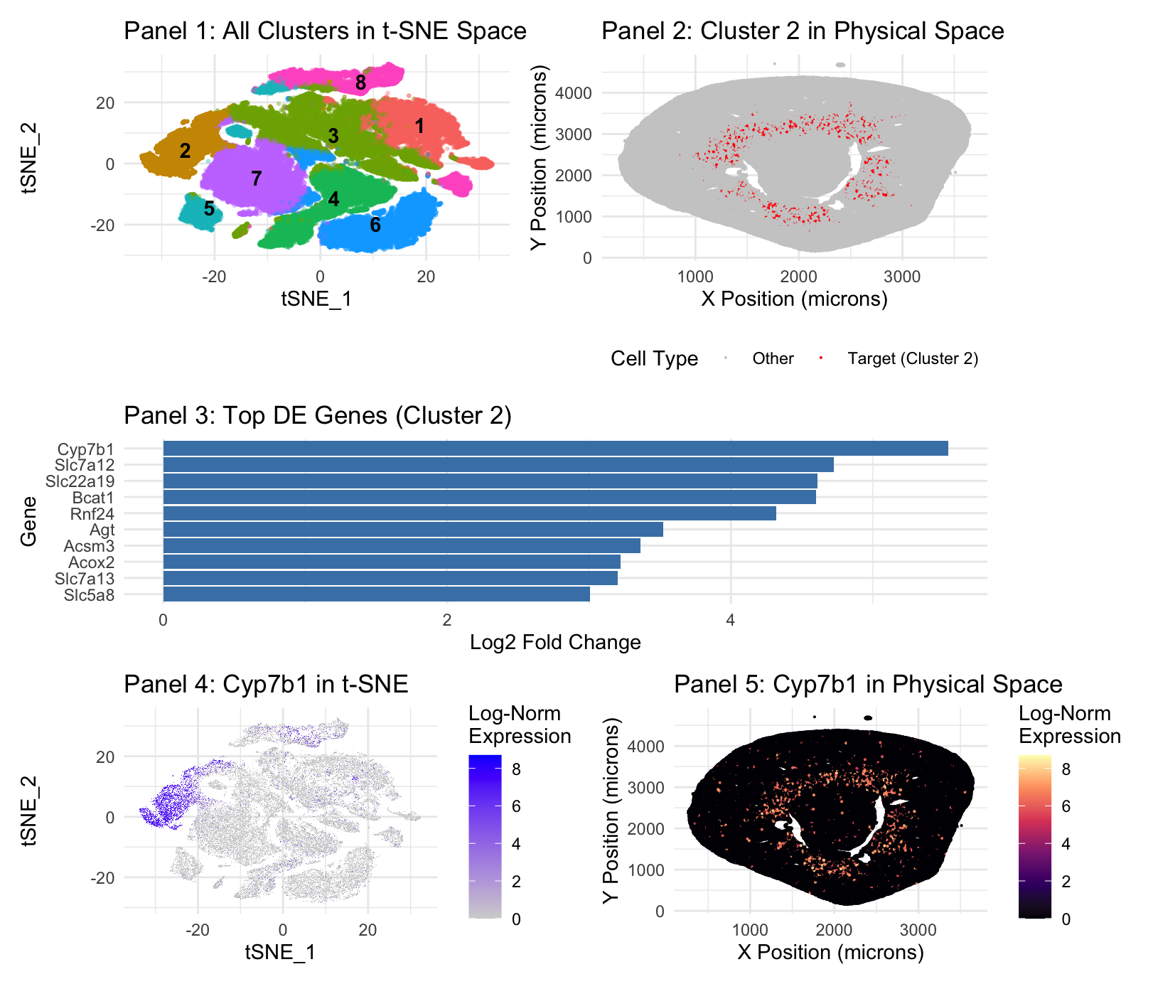
Panel 1 represents t-SNE clustering, Panel 2 represents cluster 2 spatial mapping. Panel 3 is top DE genes in cluster 2. Panel 4 is t-SNE mapping of the top cluster 2 gene, Cyp7b1. Panel 5 is spatial mapping of Cyp7b1.
Panel 1 (t-SNE) and Panel 3 (Differential Expression) demonstrate that Cluster 2 is a cohesive, transcriptionally distinct population. The integration of transcriptional profiling and spatial mapping identifies Cluster 2 as the S3 segment of the proximal tubule, also known as the pars recta(Zhuo & Li, 2013). The top marker, Cyp7b1(Panel 3), is a male-specific marker for the S3 segment, while the presence of Slc7a12 —a female-specific S3 marker—suggests this cluster aggregates from a mixed-sex dataset( Ransick et al., 2019). Proximal tubes are known for bulk reabsorption, but the specific markers here are specialized in their role(Zhuo & Li, 2013). Cyp7b1 encodes oxysterol 7-alpha-hydroxylase, which is critical for the alternative bile acid synthesis pathway and steroid hormone metabolism(MedlinePlus Genetics, 2017). This enzyme prevents the accumulation of toxic oxysterols, maintaining metabolic homeostasis within the renal tissue(MedlinePlus Genetics, 2017). Expression of Slc22a19 identifies this cluster’s role in organic anion transport, a specialized secretory function localized to the apical membrane of the S3 segment(Martinez-Guerrero et al., 2024).
The spatial mapping in Panels 2 and 5 provides anatomical confirmation—S3 segment is situated in the deep renal cortex and outer stripe of the outer medulla(Ransick et al., 2019; Zhuo & Li, 2013). This aligns with known pars recta distribution(Zhuo & Li, 2013).
- Ransick et al., “Single-Cell Profiling Reveals Sex, Lineage, and Regional Diversity in the Mouse Kidney” https://www.sciencedirect.com/science/article/pii/S1534580719308147
- Martinez-Guerrero et al., “Characterization of Human Organic Anion Transporter 4 (hOAT4) and Mouse Oat5 (mOat5)…” https://pmc.ncbi.nlm.nih.gov/articles/PMC11585314/
- MedlinePlus Genetics, “CYP7B1 gene” https://medlineplus.gov/genetics/gene/cyp7b1/
- Zhuo and Li, “Proximal Nephron” https://pubmed.ncbi.nlm.nih.gov/23897681/
Further description included for completeness:
1. What data types are you visualizing?
Plot 1: I am visualizing the quantitative data results of the t-SNE function(tSNE_1 and 2), with color and label as nominal data of the K-means cluster assignments. Plot 2: I am visualizing the spatial/quantitative data of cluster location in the Xenium file, with categorical/binary-nominal data distinguished by the color of the cluster of interest(Target vs other). Plot 3: The quantitative data of log2 Fold Change in Differential Expression analysis, organized by category being the gene. Plot 4: I am visualizing the quantitative data results of the t-SNE function, and the quantitative log-normalized expression level of the target gene. Plot 5: I am visualizing the spatial data of gene expression location in the Xenium file, and the quantitative log-normalized expression level of the target gene.
2. What data encodings (geometric primitives and visual channels) are you using to visualize these data types?
Plot 1: I am using the geometric primitive of points as created by t-SNE, though these points aggregate into areas. Color hue is the visual channel to encode data–differentiating the different clusters. Position is technically an encoding, though only because of the nature of the plot, being generated by t-SNE, though it is a given. Opacity/Alpha is used to de-emphasize non-target clusters, making the target cluster more salient. Plot 2: I am using the geometric primitive of colored points at the x and y location of the cluster in the data. The position of location of the cluster is a visual channel, further encoded by a red color hue for the cluster location, and grey for everything else. Plot 3: I am using the geometric primitive of lines. The size/length(techincally area geometric primitive) of the line along the x axis is the visual channel used to encode the highest Log2 Fold Change. Color is not a visual channel–they are all the same color as a change in color is not necessary to express the necessary quantitative information. Position on the Y axis encodes the category. Plot 4: I am using the geometric primitive of points as created by t-SNE, though these points aggregate into areas. Color saturation is the visual channel for this t-SNE plot to encode data–blue to represent the cluster of interest, grey gradient for expression density. Plot 5: I am using the geometric primitive of colored points at the x and y location of specified gene expression in the data. The position of location of the cluster is a visual channel, further encoded by a white/warm red-orange color hue and luminance/saturation for areas of high location, and a blue-black color for areas of low expression, a gradient.
3. What about the data are you trying to make salient through this data visualization?
Plot 1: My data visualization makes salient the result of the t-SNE mapping after both differential expression analysis and PCA. It labels and identifies the present clusterings, keeping all clusters a different, labeled hue, with all clusters except our cluster of interest(cluster 2), having lowered opacity, in order to improve the saliency of cluster 2.
Plot 2: My visualization seeks to make salient the spatial position of gene expression belonging to cluster 2 on the broader xy map image of the Xenium sample.
Plot 3: My visualization seeks to identify the top DE expressed genes in cluster 2–it does so by assigning gene categories on the y axis and their log2 Fold Change on the x axis. Log2 Fold Change is used because it provides a symmetric and intuitive scale for effect size; a value of 2 represents a 4-fold increase in expression.
Plot 4: My visualization makes salient the location of highest Cyp7b1 expression in cluster 2, which is a representation of the proximal tubes, with Log Expression as a gradient of saturation to signal intensity.
Plot 5: My visualization shows the spatial expression of Cyp7b1, with hue change to represent areas of high and low expression, in order to show alignment with the identified cluster and the known location of the proximal tubules.
4. What Gestalt principles or knowledge about perceptiveness of visual encodings are you using to accomplish this?
Plot 1: Utilizes the gestalt principle of proximity to differentiate between different clusters. Also, similarity of color is used in order to identify different clusters. Plot 2: For plot 2, similarity of color is used in order to make salient those which are red and those which are gray, which makes clear the difference. Plot 3: For plot 3, it’s simply the gestalt principle of continuity, more so just the length of the graph. Plot 4: For plot 4, it is the gestalt principle of proximity and the gestalt principle of similarity in order to show that the blue categorical expression is clustered close together. Plot 5: For plot 5, it is the gestalt principle of similarity, once again, that is used to encode the differences in the data.
5. Code (paste your code in between the ``` symbols)
.
```# =============================================================================
Assignment 3: Final Analysis & Visualization Workflow
=============================================================================
#promp: Part 1, we’re going to filter out those that express zero genes since there’s only 300 genes in total. So that’s, you know, we’re not getting rid of too much. Then we’re going to do the log normalization and z-scoring in order to prepare for PCA. And then what I want you to do is run the PCA at various degrees and create the PCA plots, and from there I’ll decide which PCA we are going to use. Just do that first. this is in R
– Setup: Load all required libraries
suppressPackageStartupMessages({ library(Seurat) library(data.table) library(dplyr) library(ggplot2) library(patchwork) })
– Reproducibility: Set a random seed for k-means and t-SNE
set.seed(42)
—————————————————————————–
User-facing analysis settings
—————————————————————————–
data_path <- “Xenium-IRI-ShamR_matrix.csv” my_cluster <- “2” # Biologically identified as Proximal Tubule from DE table my_gene <- “Cyp7b1” # Swapped to the new #1 marker for Cluster 2 n_pcs <- 17 # Determined from PCA elbow plot k_clusters <- 8 # Determined from K-means WSS elbow plot
—————————————————————————–
Section 1 & 2: Data Loading and Seurat Object Creation
—————————————————————————–
data_raw <- fread(data_path) counts_t <- t(as.matrix(data_raw[, -(1:3)])) colnames(counts_t) <- data_raw$V1 sham_r <- CreateSeuratObject(counts = counts_t, project = “ShamR”)
– Strict Coordinate Matching
current_cells <- Cells(sham_r) match_indices <- match(current_cells, data_raw$V1) sham_r$x <- data_raw$x[match_indices] sham_r$y <- data_raw$y[match_indices] sham_r <- subset(sham_r, cells = Cells(sham_r)[!is.na(sham_r$x)])
—————————————————————————–
Section 3: Normalization, Scaling, and Dimensionality Reduction
—————————————————————————–
sham_r <- NormalizeData(sham_r) sham_r <- FindVariableFeatures(sham_r) sham_r <- ScaleData(sham_r, features = VariableFeatures(sham_r)) sham_r <- RunPCA(sham_r, features = VariableFeatures(sham_r), npcs = 50)
—————————————————————————–
Tuning Plots (Commented Out)
This block was used to determine the optimal n_pcs and k_clusters values.
It is commented out because these are intermediate steps, not part of the
final reported figure. We keep the code here to document our process.
—————————————————————————–
if (FALSE) { # PCA elbow plot print(ElbowPlot(sham_r, ndims = 50))
# K-means WSS elbow plot pca_embeddings_test <- Embeddings(sham_r, reduction = “pca”)[, 1:n_pcs] wss <- sapply(1:20, function(k){ kmeans(pca_embeddings_test, centers = k, nstart = 10)$tot.withinss }) elbow_df <- data.frame(k = 1:20, wss = wss) print(ggplot(elbow_df, aes(x = k, y = wss)) + geom_line() + geom_point()) }
—————————————————————————–
Section 4 & 5: Clustering, t-SNE, and Marker Discovery
—————————————————————————–
#Looks like we start to get diminishing returns around PC17, so I want you to stop it there and create the PC17 plot. Then we’re going to do k-means on the PCA. Again, I want you to put a graph of the various k so I can find the elbow, and then we’ll choose from there and we’ll move on from there, but just do this. #It looks as though we are getting an appropriate k around 7 or 8, it seems. Now, from there, we’re going to apply t-SNE in order to visualize our data properly. Then we’ll do one versus the rest Wilcoxon in order to find the differentially expressed genes. So do that first, or like, just do this section now.
pca_embeddings <- Embeddings(sham_r, reduction = “pca”)[, 1:n_pcs] final_kmeans <- kmeans(pca_embeddings, centers = k_clusters, nstart = 25) sham_r$kmeans_clusters <- factor(final_kmeans$cluster) Idents(sham_r) <- “kmeans_clusters” sham_r <- RunTSNE(sham_r, dims = 1:n_pcs)
cluster_markers <- FindAllMarkers(sham_r, only.pos = TRUE, test.use = “wilcox”)
—————————————————————————–
Section 6: Final 5-Panel Figure (with all requested customizations)
—————————————————————————–
#Prompt: Generate the final plots. We’ll have different color and coatings with opacity variations for panel 1 to make clear the labeling. For panel 2, we’ll just have a grey background with red in order to identify where the gene is in physical space. Panel 3 can just have a bar plot to represent the top DE genes per gene after we identified the best cluster to use. Panel 4 will just be the log-normal expression of the gene we’re seeking on the tSNE map with gray for everything else and just a high saturation color and then panel 5 will do a similar thing as in panel 4, but with the spatial data in panel 2.
– Prepare a master dataframe for ggplot
tsne_coords <- as.data.frame(Embeddings(sham_r, “tsne”)) plot_df <- data.frame( tSNE_1 = tsne_coords$tSNE_1, tSNE_2 = tsne_coords$tSNE_2, x = sham_r$x, y = sham_r$y, Cluster = Idents(sham_r), Gene_Expression = FetchData(sham_r, vars = my_gene)[,1] )
— Panel 1: Multi-color t-SNE with target cluster highlighted via opacity —
Create a column for alpha blending
plot_df$alpha <- ifelse(plot_df$Cluster == my_cluster, 1.0, 0.3)
Calculate cluster centers for labels
cluster_centers <- plot_df %>% group_by(Cluster) %>% summarize(tSNE_1 = median(tSNE_1), tSNE_2 = median(tSNE_2), .groups = ‘drop’)
— Panel 1: Multi-color t-SNE with target cluster highlighted via opacity (Corrected)—
Create a column for alpha blending
plot_df$alpha <- ifelse(plot_df$Cluster == my_cluster, 1.0, 0.3)
Calculate cluster centers for labels
cluster_centers <- plot_df %>% group_by(Cluster) %>% summarize(tSNE_1 = median(tSNE_1), tSNE_2 = median(tSNE_2), .groups = ‘drop’)
p1 <- ggplot(plot_df, aes(x = tSNE_1, y = tSNE_2, color = Cluster)) + # Alpha moved from here… geom_point(aes(alpha = alpha), size = 0.5, raster = TRUE) + # …to here! geom_text(data = cluster_centers, aes(label = Cluster), color = “black”, fontface = “bold”) + scale_alpha_identity() + # Use the alpha values we defined directly theme_minimal() + guides(color = “none”, alpha = “none”) + # No legends needed ggtitle(“Panel 1: All Clusters in t-SNE Space”)
— Panel 2: Spatial plot with Red/Grey and a clear legend —
p2 <- ggplot(plot_df, aes(x = x, y = y, color = Cluster == my_cluster)) + geom_point(size = 0.05, raster = TRUE) + scale_color_manual( name = “Cell Type”, values = c(“TRUE” = “red”, “FALSE” = “grey80”), labels = c(“TRUE” = “Target (Cluster 2)”, “FALSE” = “Other”) ) + theme_minimal() + labs(x = “X Position (microns)”, y = “Y Position (microns)”) + ggtitle(sprintf(“Panel 2: Cluster %s in Physical Space”, my_cluster)) + theme(legend.position = “bottom”)
— Panel 3: Top DE genes for target cluster —
p3 <- cluster_markers %>% filter(cluster == my_cluster) %>% slice_max(order_by = avg_log2FC, n = 10) %>% ggplot(aes(x = reorder(gene, avg_log2FC), y = avg_log2FC)) + geom_col(fill = “steelblue”) + coord_flip() + theme_minimal() + labs(title = sprintf(“Panel 3: Top DE Genes (Cluster %s)”, my_cluster), x = “Gene”, y = “Log2 Fold Change”)
— Panel 4: Gene expression in t-SNE with legend title —
p4 <- FeaturePlot(sham_r, features = my_gene, reduction = “tsne”, raster = TRUE) + theme_minimal() + labs(color = “Log-Norm\nExpression”) + ggtitle(sprintf(“Panel 4: %s in t-SNE”, my_gene))
— Panel 5: Gene expression in physical space —
p5 <- ggplot(plot_df, aes(x = x, y = y, color = Gene_Expression)) + geom_point(size = 0.05, raster = TRUE) + scale_color_viridis_c(option = “magma”, name = “Log-Norm\nExpression”) + theme_minimal() + labs(x = “X Position (microns)”, y = “Y Position (microns)”) + ggtitle(sprintf(“Panel 5: %s in Physical Space”, my_gene))
— Final Assembly: Arrange all panels with proper layout —
final_figure <- (p1 | p2) / (p3) / (p4 | p5) + plot_layout(heights = c(1, 0.8, 1))
– Print the final figure to the plot viewer
print(final_figure)
```