Visium t-SNE and Cyp7b1
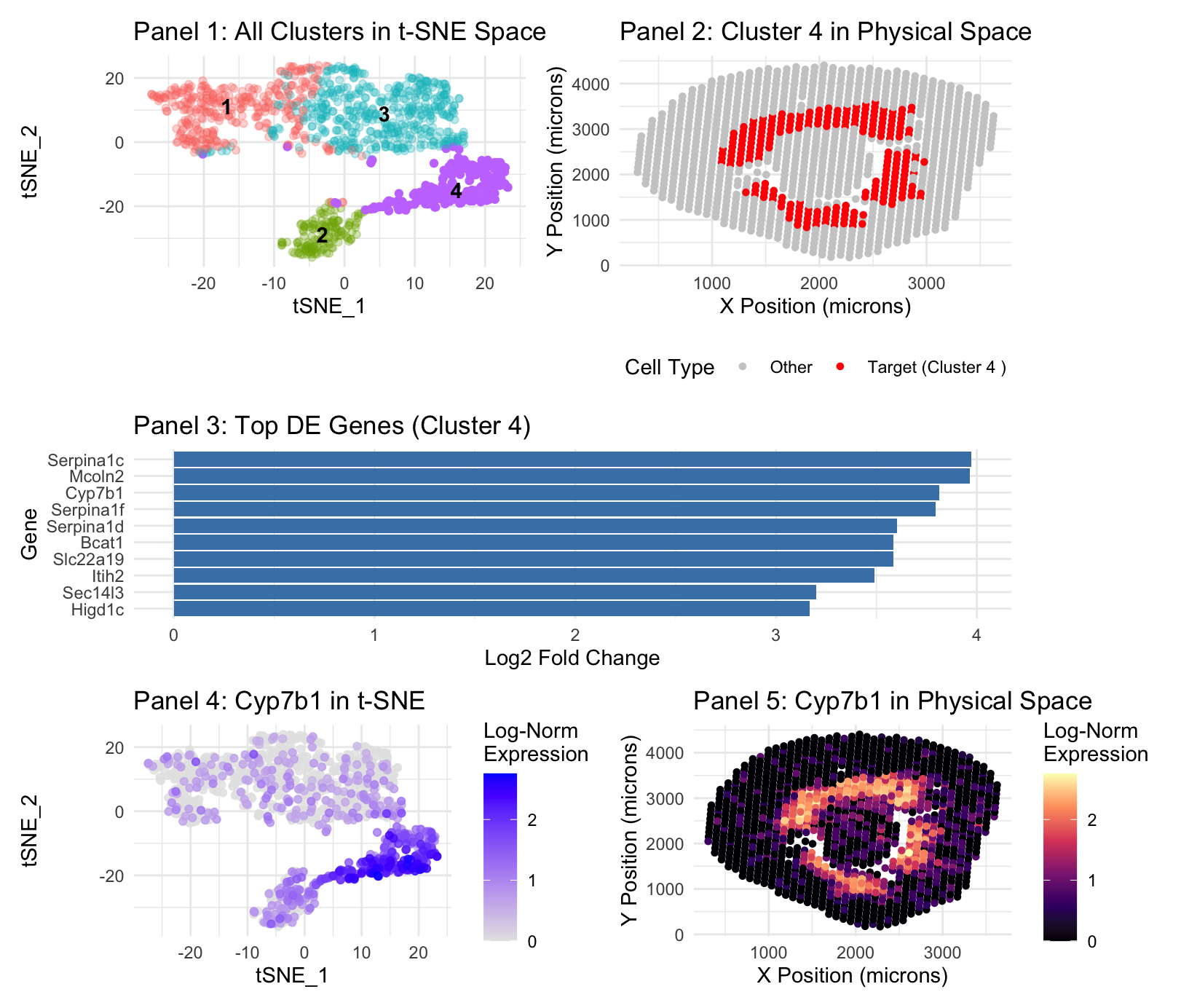
Panel 1 represents t-SNE clustering, Panel 2 represents cluster 4 spatial mapping. Panel 3 is top DE genes in cluster 4. Panel 4 is t-SNE mapping of the top cluster 4 gene, Cyp7b1. Panel 5 is spatial mapping of Cyp7b1.
The cell identified is known to be the same because I focused my analysis on the same gene, Cyp7b1. Both the gene expression and cluster locations occupied the same region in the Visium data as was the case in the Xenium data, at the boundary of the renal cortex and outer medulla. Within the identified cluster 4, where Cyp7b1 was located in the Visium data there is also seen, again, the appearance of gene Slc22a19(Martinez-Guerrero et al., 2024), a marker used for proximal tubes in the previous analysis. Higd1c(Gómez et al.) and Serpina1f(Zhang et al) were also noted to be expressed in the proximal tubes.
- Zhang — https://pmc.ncbi.nlm.nih.gov/articles/PMC4422522/#:~:text=After%20the%20literature%20study%2C%205,expression%20vectors%20to%20HEK293%20cells.
- Gómez — https://pmc.ncbi.nlm.nih.gov/articles/PMC9635879/pdf/elife-78915.pdf
- Martinez-Guerrero et al., “Characterization of Human Organic Anion Transporter 4 (hOAT4) and Mouse Oat5 (mOat5)…” https://pmc.ncbi.nlm.nih.gov/articles/PMC11585314/
In terms of code modifications, Visium data uses 55um spots, meaning cells will occupy more space, being ~10um, making analysis “blurrier”—it is better to reduce PCA and k grouping in order to account for this. I reran a PCs per variance plot and k grouping elbow plot and settled on a decrease from 17 PCs from Xenium to 10 for Visium, and 8 groupings for Xenium to 4 for Visium based on the identified “elbows”. In the graph point sizes were increased where spatially visualized in order to account for “decreased resolution” of Visium data.
Further description included for completeness, it is the same as in HW 3:
1. What data types are you visualizing?
Plot 1: I am visualizing the quantitative data results of the t-SNE function(tSNE_1 and 2), with color and label as nominal data of the K-means cluster assignments. Plot 2: I am visualizing the spatial/quantitative data of cluster location in the Xenium file, with categorical/binary-nominal data distinguished by the color of the cluster of interest(Target vs other). Plot 3: The quantitative data of log2 Fold Change in Differential Expression analysis, organized by category being the gene. Plot 4: I am visualizing the quantitative data results of the t-SNE function, and the quantitative log-normalized expression level of the target gene. Plot 5: I am visualizing the spatial data of gene expression location in the Xenium file, and the quantitative log-normalized expression level of the target gene.
2. What data encodings (geometric primitives and visual channels) are you using to visualize these data types?
Plot 1: I am using the geometric primitive of points as created by t-SNE, though these points aggregate into areas. Color hue is the visual channel to encode data–differentiating the different clusters. Position is technically an encoding, though only because of the nature of the plot, being generated by t-SNE, though it is a given. Opacity/Alpha is used to de-emphasize non-target clusters, making the target cluster more salient. Plot 2: I am using the geometric primitive of colored points at the x and y location of the cluster in the data. The position of location of the cluster is a visual channel, further encoded by a red color hue for the cluster location, and grey for everything else. Plot 3: I am using the geometric primitive of lines. The size/length(techincally area geometric primitive) of the line along the x axis is the visual channel used to encode the highest Log2 Fold Change. Color is not a visual channel–they are all the same color as a change in color is not necessary to express the necessary quantitative information. Position on the Y axis encodes the category. Plot 4: I am using the geometric primitive of points as created by t-SNE, though these points aggregate into areas. Color saturation is the visual channel for this t-SNE plot to encode data–blue to represent the cluster of interest, grey gradient for expression density. Plot 5: I am using the geometric primitive of colored points at the x and y location of specified gene expression in the data. The position of location of the cluster is a visual channel, further encoded by a white/warm red-orange color hue and luminance/saturation for areas of high location, and a blue-black color for areas of low expression, a gradient.
3. What about the data are you trying to make salient through this data visualization?
Plot 1: My data visualization makes salient the result of the t-SNE mapping after both differential expression analysis and PCA. It labels and identifies the present clusterings, keeping all clusters a different, labeled hue, with all clusters except our cluster of interest(cluster 4), having lowered opacity, in order to improve the saliency of cluster 4.
Plot 2: My visualization seeks to make salient the spatial position of gene expression belonging to cluster 4 on the broader xy map image of the Xenium sample.
Plot 3: My visualization seeks to identify the top DE expressed genes in cluster 4–it does so by assigning gene categories on the y axis and their log2 Fold Change on the x axis. Log2 Fold Change is used because it provides a symmetric and intuitive scale for effect size; a value of 2 represents a 4-fold increase in expression.
Plot 4: My visualization makes salient the location of highest Cyp7b1 expression in cluster 4, which is a representation of the proximal tubes, with Log Expression as a gradient of saturation to signal intensity.
Plot 5: My visualization shows the spatial expression of Cyp7b1, with hue change to represent areas of high and low expression, in order to show alignment with the identified cluster and the known location of the proximal tubules.
4. What Gestalt principles or knowledge about perceptiveness of visual encodings are you using to accomplish this?
Plot 1: Utilizes the gestalt principle of proximity to differentiate between different clusters. Also, similarity of color is used in order to identify different clusters. Plot 2: For plot 2, similarity of color is used in order to make salient those which are red and those which are gray, which makes clear the difference. Plot 3: For plot 3, it’s simply the gestalt principle of continuity, more so just the length of the graph. Plot 4: For plot 4, it is the gestalt principle of proximity and the gestalt principle of similarity in order to show that the blue categorical expression is clustered close together. Plot 5: For plot 5, it is the gestalt principle of similarity, once again, that is used to encode the differences in the data.
5. Code (paste your code in between the ``` symbols)
.
1
2
3
4
5
6
7
8
9
10
11
12
13
14
15
16
17
18
19
20
21
22
23
24
25
26
27
28
29
30
31
32
33
34
35
36
37
38
39
40
41
42
43
44
45
46
47
48
49
50
51
52
53
54
55
56
57
58
59
60
61
62
63
64
65
66
67
68
69
70
71
72
73
74
75
76
77
78
79
80
81
82
83
84
85
86
87
88
89
90
91
92
93
94
95
96
97
98
99
100
101
102
103
104
105
106
107
108
109
110
111
112
113
114
115
116
117
118
119
120
121
122
123
124
125
126
127
128
129
130
131
132
133
134
135
# Visium Analysis Workflow (Restored Formatting)
# =============================================================================

suppressPackageStartupMessages({
  library(Seurat)
  library(data.table)
  library(dplyr)
  library(ggplot2)
  library(patchwork)
})

set.seed(42)

# -----------------------------------------------------------------------------
# User-facing analysis settings
# -----------------------------------------------------------------------------
#Prompt to set pcs at 10 and 4 based on elbow graph data. Remaining analysis carried out similar to with Xenium data.
data_path <- "Visium-IRI-ShamR_matrix.csv"
my_gene <- "Cyp7b1"
n_pcs <- 10           # Optimized for Visium
k_clusters <- 4       # Optimized for Visium

# -----------------------------------------------------------------------------
# Section 1 & 2: Data Loading and Seurat Object Creation
# -----------------------------------------------------------------------------
data_raw <- fread(data_path)
counts_t <- t(as.matrix(data_raw[, -(1:3)]))
colnames(counts_t) <- data_raw[[1]]
sham_r <- CreateSeuratObject(counts = counts_t, project = "ShamR_Visium")

# Map coordinates directly from the Visium matrix
sham_r$x <- data_raw$x
sham_r$y <- data_raw$y

# -----------------------------------------------------------------------------
# Section 3: Normalization, Scaling, and Dimensionality Reduction
# -----------------------------------------------------------------------------
sham_r <- NormalizeData(sham_r)
sham_r <- FindVariableFeatures(sham_r)
sham_r <- ScaleData(sham_r, features = VariableFeatures(sham_r))
sham_r <- RunPCA(sham_r, features = VariableFeatures(sham_r), npcs = 30)

# -----------------------------------------------------------------------------
# Section 4 & 5: Clustering, t-SNE, and Marker Discovery
# -----------------------------------------------------------------------------
pca_embeddings <- Embeddings(sham_r, reduction = "pca")[, 1:n_pcs]
final_kmeans <- kmeans(pca_embeddings, centers = k_clusters, nstart = 25)
sham_r$kmeans_clusters <- factor(final_kmeans$cluster)
Idents(sham_r) <- "kmeans_clusters"

# Identify the target cluster for the S3 segment
my_cluster <- names(which.max(tapply(FetchData(sham_r, vars = my_gene)[[1]], Idents(sham_r), mean)))

sham_r <- RunTSNE(sham_r, dims = 1:n_pcs)
cluster_markers <- FindAllMarkers(sham_r, only.pos = TRUE, test.use = "wilcox")
#prompt defined desired gene, search which cluster it belongs to.
my_cluster <- names(which.max(tapply(FetchData(sham_r, vars = my_gene)[[1]], Idents(sham_r), mean)))
print(my_cluster)
# -----------------------------------------------------------------------------
# Section 6: Final 5-Panel Figure (Original Logic & Formatting)
# -----------------------------------------------------------------------------
tsne_coords <- as.data.frame(Embeddings(sham_r, "tsne"))
plot_df <- data.frame(
  tSNE_1 = tsne_coords$tSNE_1,
  tSNE_2 = tsne_coords$tSNE_2,
  x = sham_r$x,
  y = sham_r$y,
  Cluster = Idents(sham_r),
  Gene_Expression = FetchData(sham_r, vars = my_gene)[,1]
)

# --- Panel 1: Multi-color t-SNE with target cluster highlighted via opacity ---
plot_df$alpha <- ifelse(plot_df$Cluster == my_cluster, 1.0, 0.3)
cluster_centers <- plot_df %>%
  group_by(Cluster) %>%
  summarize(tSNE_1 = median(tSNE_1), tSNE_2 = median(tSNE_2), .groups = 'drop')

p1 <- ggplot(plot_df, aes(x = tSNE_1, y = tSNE_2, color = Cluster)) +
  geom_point(aes(alpha = alpha), size = 1.5, raster = TRUE) +
  geom_text(data = cluster_centers, aes(label = Cluster), color = "black", fontface = "bold") +
  scale_alpha_identity() +
  theme_minimal() +
  guides(color = "none", alpha = "none") +
  ggtitle("Panel 1: All Clusters in t-SNE Space")

# --- Panel 2: Spatial plot with Red/Grey ---
p2 <- ggplot(plot_df, aes(x = x, y = y, color = Cluster == my_cluster)) +
  geom_point(size = 1.2, raster = TRUE) +
  scale_color_manual(
    name = "Cell Type",
    values = c("TRUE" = "red", "FALSE" = "grey80"),
    labels = c("TRUE" = paste("Target (Cluster", my_cluster, ")"), "FALSE" = "Other")
  ) +
  theme_minimal() +
  labs(x = "X Position (microns)", y = "Y Position (microns)") +
  ggtitle(sprintf("Panel 2: Cluster %s in Physical Space", my_cluster)) +
  theme(legend.position = "bottom")

# --- Panel 3: Top DE genes for target cluster ---
p3 <- cluster_markers %>%
  filter(cluster == my_cluster) %>%
  slice_max(order_by = avg_log2FC, n = 10) %>%
  ggplot(aes(x = reorder(gene, avg_log2FC), y = avg_log2FC)) +
  geom_col(fill = "steelblue") +
  coord_flip() +
  theme_minimal() +
  labs(title = sprintf("Panel 3: Top DE Genes (Cluster %s)", my_cluster),
       x = "Gene", y = "Log2 Fold Change")

# --- Refined Panel 4: Gene expression in t-SNE ---
#Prompt for optimal point size went with 1.5
p4 <- ggplot(plot_df[order(plot_df$Gene_Expression), ], # Reorders to put high expression on top
             aes(x = tSNE_1, y = tSNE_2, color = Gene_Expression)) +
  geom_point(size = 1.5, alpha = 0.8) +
  scale_color_gradient(low = "grey90", high = "blue", name = "Log-Norm\nExpression") +
  theme_minimal() +
  ggtitle(sprintf("Panel 4: %s in t-SNE", my_gene))

# --- Panel 5: Gene expression in space ---
p5 <- ggplot(plot_df, aes(x = x, y = y, color = Gene_Expression)) +
  geom_point(size = 1.2, raster = TRUE) +
  scale_color_viridis_c(option = "magma", name = "Log-Norm\nExpression") +
  theme_minimal() +
  labs(x = "X Position (microns)", y = "Y Position (microns)") +
  ggtitle(sprintf("Panel 5: %s in Physical Space", my_gene))

# --- Final Assembly ---
final_figure <- (p1 | p2) / (p3) / (p4 | p5) +
  plot_layout(heights = c(1, 0.8, 1))

print(final_figure)