Codex Spleen Analysis

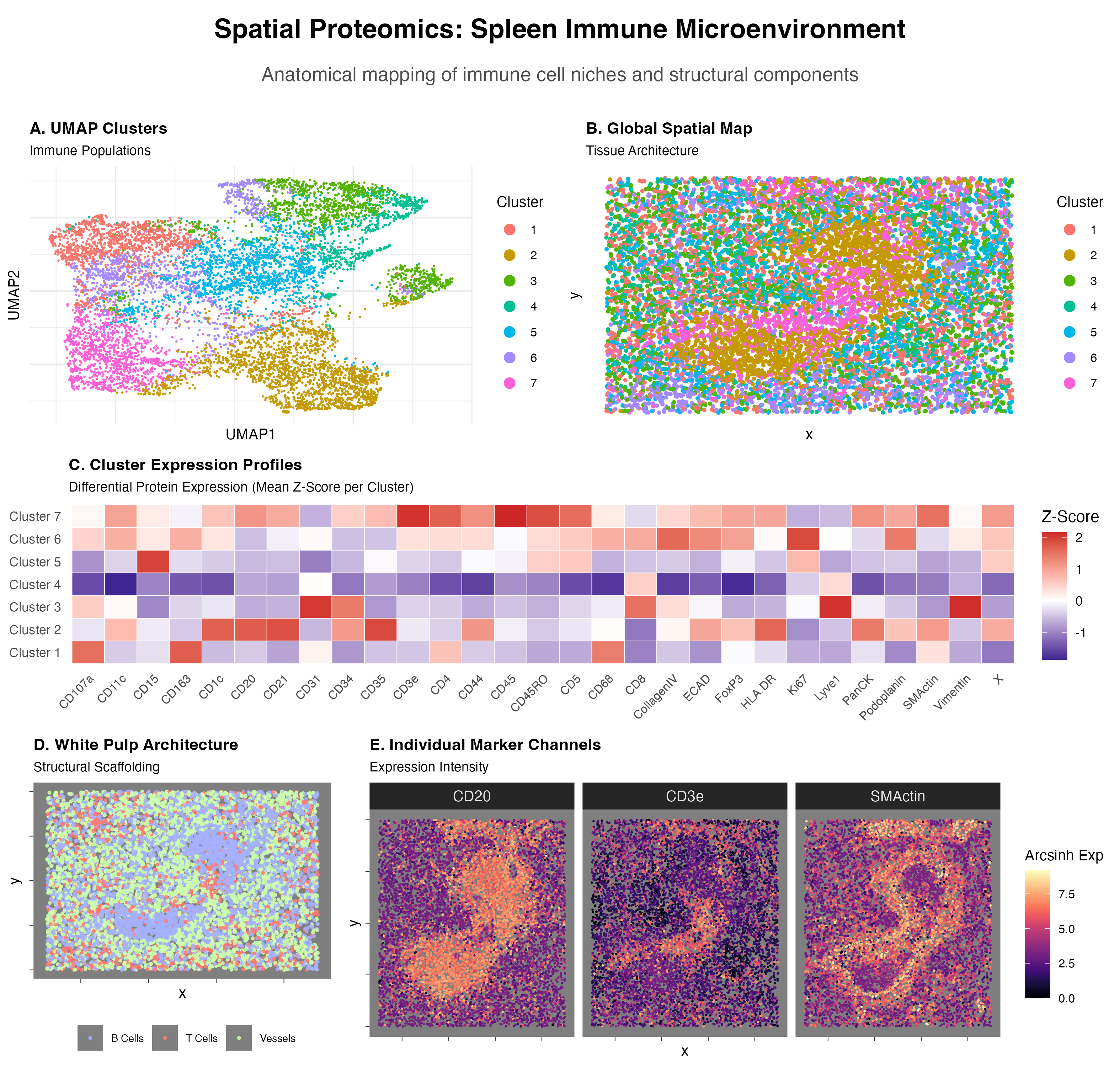
Visualized is a UMAP Cluster graph(A), a Global Spatial Map based on cluster labels(B), a Cluster Expression Profile heatmap(C), a Spatial Map of higlighted cell type(B cells—CD20, T cells—CD3e, Vessels—)(D), and Individual Marker Channels Expressed as a spatial heat map(E).
Cluster 2:
- Marginal Zone and Follicular B cells
- CD20 is a core B lymphocyte marker encoded by MS4A1[1]. HLA-DR is a molecule constitutively expressed on B cells, important for the B cell’s role as a professional antigen-presenting cell[2].
- CD1c is a marker for human B cell sub classification; human marginal zone B cells are uniquely characterized by their expression of CD1c[3, 4]
- CD21 and CD35 are complement receptors found on all mature B cells, and expressed at significantly higher levels on marginal zone B cells[5].
- Sources:
- https://pmc.ncbi.nlm.nih.gov/articles/PMC11531411/#:~:text=Concerning%20the%20relatively%20modest%20GWAS%20for%20immune,identified%20MS4A1%20as%20the%20gene%20encoding%20CD20.
- https://academic.oup.com/jimmunol/article/169/9/5078/8027750?login=true
- https://pubmed.ncbi.nlm.nih.gov/24733829/
- https://pubmed.ncbi.nlm.nih.gov/3264333/
- https://pubmed.ncbi.nlm.nih.gov/9233655/
Cluster 7:
- Memory CD4+ T cell
- CD3e is a subunit of the T-cell receptor (TCR) complex. Definitive marker of T-lineage[1].
- CD4 is a co-receptor identifying the helper subset of T cells. It binds to the invariant region of MHC Class II molecules on antigen-presenting cells, facilitating T-cell activation[2].
- CD45 (LCA) is known as the Leukocyte Common Antigen. It is a a tyrosine phosphatase essential for T-cell activation[3].
- CD45RO is a specific isoform of CD45 and the hallmark of memory T cells. During transition to a memory phenotype T cells undergo alternative splicing of the PTPRC gene, switching from the CD45RA isoform to CD45RO[4].
- Sources:
- https://pubmed.ncbi.nlm.nih.gov/1824636/
- https://pubmed.ncbi.nlm.nih.gov/23885256/
- https://www.pnas.org/doi/10.1073/pnas.88.6.2037
- https://www.sciencedirect.com/science/article/pii/S1074761308005086
The presence of white pulp is specifically gleaned from not only the presence of B and T cells, but their location in the spatial map, primarily the localized, dense B cells that would define the lymphoid follicles of white pulp, a degree of T cells in the same area[1], and the perifollicular envelope marked by SMActin, which acts a structural enclosure[2].
- https://www.ncbi.nlm.nih.gov/books/NBK560905/
- https://pubmed.ncbi.nlm.nih.gov/11485909/
2. Code (paste your code in between the ``` symbols)
.
```# ==============================================================================
SECTION 1: SETUP & DATA LOADING
==============================================================================
library(tidyverse) library(ggplot2) library(patchwork) # Essential for combining plots library(pheatmap) library(umap) library(viridis)
#Prompt: I want you to first run the QC and then give me the elbow plots for the PCs and for the number of K centers. Give me the code for that. Use R
Load Data
df <- read.csv(“codex_spleen2.csv”)
Identify columns
metadata_cols <- c(“Unnamed..0”, “x”, “y”, “area”) markers <- setdiff(colnames(df), metadata_cols)
==============================================================================
SECTION 2: QUALITY CONTROL (QC) & TRANSFORMATION
==============================================================================
1. Filter by Cell Area (remove debris and doublets)
lower_area <- quantile(df$area, 0.01, na.rm = TRUE) upper_area <- quantile(df$area, 0.99, na.rm = TRUE)
df_qc <- df %>% filter(area >= lower_area & area <= upper_area)
2. Remove cells with zero expression
expr_matrix_raw <- df_qc[, markers] keep_cells <- rowSums(expr_matrix_raw, na.rm = TRUE) > 0 df_qc <- df_qc[keep_cells, ] expr_matrix_raw <- expr_matrix_raw[keep_cells, ]
3. Arcsinh Transformation & Scaling
cofactor <- 5 expr_trans <- asinh(expr_matrix_raw / cofactor) expr_scaled <- scale(expr_trans)
==============================================================================
SECTION 3: PCA & ELBOW ANALYSIS (PLOTS HIDDEN)
==============================================================================
Run PCA
pca_res <- prcomp(expr_scaled, center = FALSE, scale. = FALSE)
— CODE FOR ELBOW PLOTS (COMMENTED OUT PER INSTRUCTION) —
var_explained <- (pca_res$sdev^2) / sum(pca_res$sdev^2) * 100
pca_elbow_df <- data.frame(PC = 1:length(var_explained), Variance = var_explained)
p_pca_elbow <- ggplot(pca_elbow_df, aes(x = PC, y = Variance)) + geom_line()
#
# K-Means Elbow Calculation
num_pcs_to_use <- 15
pca_data_for_clustering <- pca_res$x[, 1:num_pcs_to_use]
k_values <- 1:20
wss <- numeric(length(k_values))
set.seed(42)
for (i in k_values) {
km <- kmeans(pca_data_for_clustering, centers = i, nstart = 10, iter.max = 30)
wss[i] <- km$tot.withinss
}
k_elbow_df <- data.frame(K = k_values, WSS = wss)
p_k_elbow <- ggplot(k_elbow_df, aes(x = K, y = WSS)) + geom_line()
————————————————————
#Prompt: Elbows at PC8 and 7 clusters. Okay, now I want you to carry out the differential protein expression and create a cluster heat map in order to analyze the data. Then you’re going to also create a spatial graph of the, you’re gonna create the cluster chart, like the normal one with the different clusters, and you’re also going to create a spatial graph of the cell clusters in space. Then you’re also going to, um, just do that first, and then we’ll see which genes are differentially expressed.
==============================================================================
SECTION 4: CLUSTERING & DIMENSION REDUCTION
==============================================================================
Based on previous analysis: 8 PCs and 7 Clusters
pca_subset <- pca_res$x[, 1:8]
1. Run K-Means
set.seed(42) km_final <- kmeans(pca_subset, centers = 7, nstart = 25) df_qc$cluster <- as.factor(km_final$cluster)
2. Run UMAP (for visualization)
set.seed(42) umap_out <- umap(pca_subset) df_qc$UMAP1 <- umap_out$layout[,1] df_qc$UMAP2 <- umap_out$layout[,2]
==============================================================================
SECTION 5: DIFFERENTIAL EXPRESSION (CALCULATION)
==============================================================================
Calculate mean expression per cluster
cluster_means <- aggregate(expr_trans, by = list(Cluster = df_qc$cluster), FUN = mean) rownames(cluster_means) <- paste(“Cluster”, cluster_means$Cluster) heatmap_matrix <- as.matrix(cluster_means[, -1])
Identify top markers
diff_expr <- as.data.frame(heatmap_matrix) %>% mutate(Cluster = rownames(heatmap_matrix)) %>% pivot_longer(cols = -Cluster, names_to = “Marker”, values_to = “Expression”)
top_markers <- diff_expr %>% group_by(Cluster) %>% slice_max(order_by = Expression, n = 3) %>% arrange(Cluster, desc(Expression))
print(“Top Markers per Cluster:”) print(top_markers)
Optional: Generate Global Heatmap (Note: This plots to a separate device)
pheatmap(heatmap_matrix, scale = “column”, main = “Global Protein Expression by Cluster”, color = colorRampPalette(c(“navy”, “white”, “firebrick3”))(100))
#Prompt: Let’s create a spatial graph for the B cells, which are linked to CD20, the T cells which are linked to CD3E, and then the smooth muscle, which is linked to SM actin. Create heat maps for each of those three cell types.
==============================================================================
SECTION 6: GENERATING PLOTS FOR THE FINAL PANEL
==============================================================================
— PLOT A: UMAP Cluster Chart —
p_umap <- ggplot(df_qc, aes(x = UMAP1, y = UMAP2, color = cluster)) + geom_point(size = 0.1, alpha = 1) + # FIX 1: Alpha set to 1 to match Plot B theme_minimal() + guides(color = guide_legend(override.aes = list(size = 3))) + labs(title = “A. UMAP Clusters”, subtitle = “Immune Populations”, color = “Cluster”) + theme( plot.title = element_text(size = 11, face = “bold”), plot.subtitle = element_text(size = 9), axis.title = element_text(size = 10), axis.text = element_blank(), # FIX 2: Negative margin actively pulls the label to the right axis.title.y = element_text(margin = margin(r = -20)), legend.title = element_text(size = 10), legend.text = element_text(size = 8) )
— PLOT B: Global Spatial Map —
p_spatial_global <- ggplot(df_qc, aes(x = x, y = y, color = cluster)) + geom_point(size = 0.7, alpha = 1) + # FIX 1: Alpha set to 1 to match Plot A theme_minimal() + guides(color = guide_legend(override.aes = list(size = 3))) + labs(title = “B. Global Spatial Map”, subtitle = “Tissue Architecture”, x = “x”, y = “y”, color = “Cluster”) + theme( plot.title = element_text(size = 11, face = “bold”), plot.subtitle = element_text(size = 9), axis.title = element_text(size = 10), axis.text = element_blank(), panel.grid = element_blank(), legend.title = element_text(size = 10), legend.text = element_text(size = 8) )
— PLOT D: White Pulp Architecture —
p_white_pulp <- ggplot(spatial_targeted, aes(x = x, y = y, color = Identity)) + geom_point(size = 0.6, alpha = 0.8) + scale_color_manual(values = c(“B Cells” = “#A5B1FF”, “T Cells” = “#FF7B71”, “Vessels” = “#CDFFAD”)) + theme_dark() + labs(title = “D. White Pulp Architecture”, subtitle = “Structural Scaffolding”, x = “x”, y = “y”) + theme( plot.title = element_text(size = 11, face = “bold”), plot.subtitle = element_text(size = 9), axis.title = element_text(size = 10), # FIX 2: Negative margin actively pulls the label to the right axis.title.y = element_text(margin = margin(r = -200)), axis.text = element_blank(), panel.grid = element_blank(), legend.position = “bottom”, legend.title = element_text(size = 0), legend.text = element_text(size = 7) )
— PLOT E: Faceted Marker Expression —
p_markers <- ggplot(spatial_long, aes(x = x, y = y, color = Expr)) + geom_point(size = 0.1) + scale_color_viridis(option = “magma”, name = “Arcsinh Exp”) + facet_wrap(~Marker, nrow = 1) + # REMOVED coord_fixed() theme_dark() + labs(title = “E. Individual Marker Channels”, subtitle = “Expression Intensity”, x = “x”, y = “y”) + theme( plot.title = element_text(size = 11, face = “bold”), plot.subtitle = element_text(size = 9), axis.title = element_text(size = 10), axis.text = element_blank(), # Hides numbers panel.grid = element_blank(), legend.position = “right”, legend.title = element_text(size = 10), legend.text = element_text(size = 8), strip.text = element_text(size = 10) # Shrinks the facet labels (CD20, CD3e, etc.) )
==============================================================================
SECTION 7: DIFFERENTIAL EXPRESSION HEATMAP (Ggplot version)
==============================================================================
We prepare the cluster-level mean expression data
cluster_means_long <- as.data.frame(heatmap_matrix) %>% mutate(Cluster = rownames(heatmap_matrix)) %>% pivot_longer(cols = -Cluster, names_to = “Marker”, values_to = “Mean_Expression”)
Z-score scaling by Marker (to match the “scale=’column’” look from before)
cluster_means_long <- cluster_means_long %>% group_by(Marker) %>% mutate(ZScore = (Mean_Expression - mean(Mean_Expression)) / sd(Mean_Expression)) %>% ungroup()
Generate the Heatmap Plot
p_heatmap_de <- ggplot(cluster_means_long, aes(x = Marker, y = Cluster, fill = ZScore)) + geom_tile(color = “white”) + scale_fill_gradient2(low = “navy”, mid = “white”, high = “firebrick3”, midpoint = 0, name = “Z-Score”) + theme_minimal() + theme( plot.title = element_text(size = 11, face = “bold”), plot.subtitle = element_text(size = 9), axis.text.x = element_text(angle = 45, vjust = 1, hjust = 1, size = 8), axis.title = element_blank(), panel.grid = element_blank() ) + labs(title = “C. Cluster Expression Profiles”, subtitle = “Differential Protein Expression (Mean Z-Score per Cluster)”)
— PLOT C (Heatmap) quick title shrink to match —
library(cowplot)
——————————————————————————
1. CLEAN UP THE PREVIOUS HACKS
(Run this to remove any negative margins we added trying to fight patchwork)
——————————————————————————
p_umap <- p_umap + theme(axis.title.y = element_text(margin = margin(r = 5))) p_white_pulp <- p_white_pulp + theme(axis.title.y = element_text(margin = margin(r = 5)))
——————————————————————————
2. BUILD THE ROWS (Absolute Width Control)
——————————————————————————
rel_widths controls the horizontal sizes.
c(1, 1) means 50%/50%. If B needs to be wider, change to c(1, 1.2).
row1 <- plot_grid(p_umap, p_spatial_global, nrow = 1, rel_widths = c(1, 1))
row2 <- p_heatmap_de # Stands alone
c(1, 2.8) means Plot E gets roughly 3x the space of Plot D.
row3 <- plot_grid(p_white_pulp, p_markers, nrow = 1, rel_widths = c(1, 2.3))
——————————————————————————
3. STACK THE ROWS (Absolute Height Control)
——————————————————————————
rel_heights controls vertical sizes.
Heatmap (row2) gets 0.8, Spatial rows get 1.5. Adjust these freely!
main_grid <- plot_grid( row1, row2, row3, ncol = 1, rel_heights = c(1.5, 1.25, 1.5) )
——————————————————————————
4. ADD THE MAIN TITLE (Adjusted to prevent cropping)
——————————————————————————
We use ggdraw to create the title area.
Increasing the ‘y’ values and the ‘rel_heights’ prevents cropping.
title_canvas <- ggdraw() + # Main Title: Moved up to y = 0.75 draw_label(“Spatial Proteomics: Spleen Immune Microenvironment”, fontface = ‘bold’, size = 18, y = 0.75) + # Subtitle: Moved up to y = 0.35 to keep it away from the bottom edge draw_label(“Anatomical mapping of immune cell niches and structural components”, color = “grey30”, size = 13, y = 0.35)
Combine the title and the grid
Increased title height from 0.08 to 0.12 to give the text more vertical room
final_panel <- plot_grid(title_canvas, main_grid, ncol = 1, rel_heights = c(0.12, 1))
Display the final fixed result
print(final_panel)
Recommended save to ensure high-resolution and no cropping:
ggsave( filename = “Spleen_Final_Panel_HD.png”, plot = final_panel, width = 10.5, # Make this number bigger (e.g., 24) for a wider image height = 10, # Make this number bigger (e.g., 22) for a taller image dpi = 300, # High resolution (makes the dots crisp) bg = “white”, # Ensures transparent backgrounds don’t turn grey limitsize = FALSE # Allows you to save massive images without R complaining )