Spatial Expression of Slc12a1

1. What data types are you visualizing?
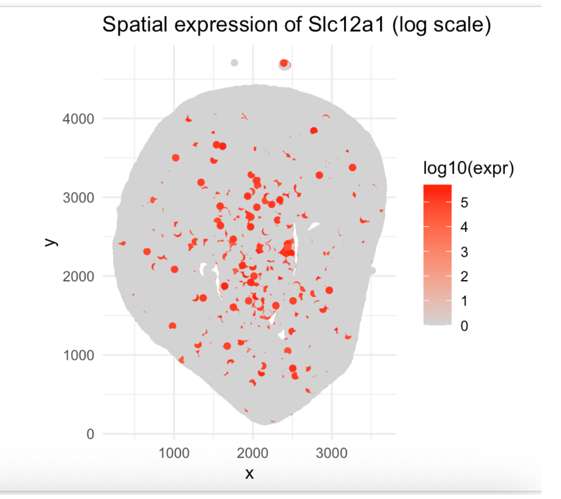
I am visualizing quantitative data, which are normalized gene expressions for Slc12a1 and the x and y coordinates of genes expressed.
2. What data encodings (geometric primitives and visual channels) are you using to visualize these data types?
I am using points as the geometric primitive, with position (x, y) encoding spatial location and hue (gradient from lightgrey to red) encoding gene expression level.
3. What about the data are you trying to make salient through this data visualization?
I am trying to make salient the spatial distribution pattern of Slc12a1 expression, revealing where podocytes are located (glomeruli) within the kidney tissue architecture.
4. What Gestalt principles or knowledge about perceptiveness of visual encodings are you using to accomplish this?
I am using the principle of similarity (red points group together as high-expression regions) and using color contrasts (red is more salient than grey).
5. Code (paste your code in between the ``` symbols)
1
2
3
4
5
6
7
8
9
10
11
12
13
14
15
16
17
18
19
20
21
22
23
24
25
26
27
28
29
30
31
32
33
34
35
36
37
38
39
40
41
42
43
44
45
46
47
48
49
50
51
data <- read.csv('~/Desktop/Github/genomic-data-visualization-2026/data/Xenium-IRI-ShamR_matrix.csv.gz')
pos <- data[, c('x', 'y')]
rownames(pos) <- data[, 1]
gexp <- data[, 4:ncol(data)]
rownames(gexp) <- data[, 1]
head(pos)
gexp[1:5, 1:5]
dim(gexp)


totgexp <- rowSums(gexp)
head(totgexp)
mat <- gexp / totgexp


gene_name <- 'Slc12a1'
df <- data.frame(
 x = pos$x,
 y = pos$y,
 gene = mat[, gene_name]
)
head(df)


library(ggplot2)
ggplot(df, aes(x = x, y = y, col = gene)) +
 geom_point(size = 1.5) +
 scale_color_gradient(low = 'lightgrey', high = 'red') +
 theme_minimal() +
 labs(title = paste('Spatial expression of', gene_name),
      color = 'Expression') +
 coord_equal()


#log scale for better visualization
df$gene_log <- log10(mat[, gene_name] * 1e6 + 1)


ggplot(df, aes(x = x, y = y, col = gene_log)) +
 geom_point(size = 1.5) +
 scale_color_gradient(low = 'lightgrey', high = 'red') +
 theme_minimal() +
 labs(title = paste('Spatial expression of', gene_name, '(log scale)'),
      color = 'log10(expr)') +
 coord_equal()
AI PROMPTS:
Given the following csv.gz file on data from imaging transcriptomic technologies, what is a data visualization (type of plot) that I could feasibly create in R that makes some pattern in the data salient and provides meaningful results? ____________________ I want to do the first option. Can you give me the format of the functions used? how could I be able to maximize salience of the data? ____________________ can you so something more simple? i want a heatmap of only one specific gene, so just choose one. my professor coded this in class, and i kind of want mine to look like hers.