HW1

1. What data types are you visualizing?
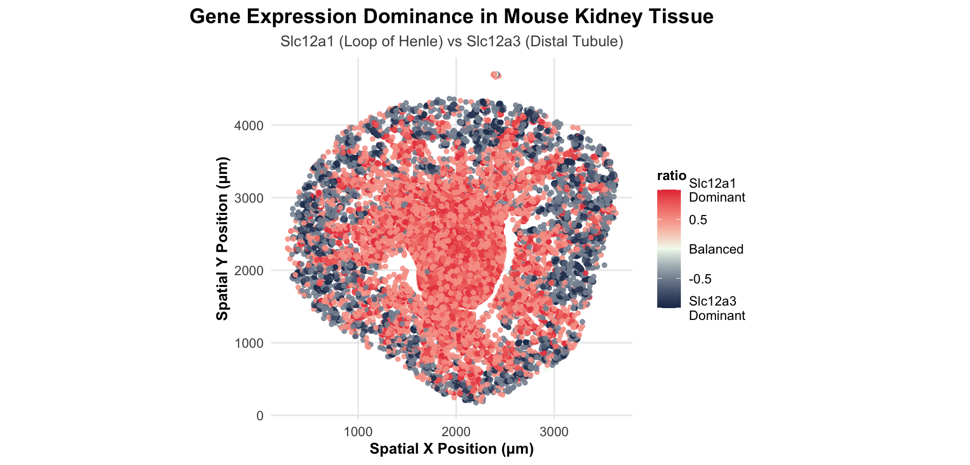
I am visualizing spatial data and quantitative data in this plot. The spatial data consists of the X and Y coordinates in micrometers that represent the physical locations of cells within the mouse kidney tissue section. The quantitative data includes the gene expression counts for Slc12a1 and Slc12a3, which are continuous numerical values representing how much each gene is expressed in each cell. I also created a derived quantitative variable - the dominance ratio - which is calculated as (Slc12a1 - Slc12a3)/(Slc12a1 + Slc12a3 + 1) and represents which gene is more dominant in each cell as a continuous value ranging from -1 to 1.
2. What data encodings (geometric primitives and visual channels) are you using to visualize these data types?
I am using points as the geometric primitive, where each point represents an individual cell in the tissue. For visual channels, I am encoding the spatial X and Y coordinates using position on the plot, which preserves the anatomical structure of the kidney tissue. I am encoding the dominance ratio using color hue through a diverging gradient, where red represents Slc12a1 dominance, blue represents Slc12a3 dominance, and white represents balanced expression between the two genes. The color saturation also indirectly encodes the magnitude of dominance, with more saturated colors indicating stronger dominance of one gene over the other. I used a consistent point size of 1.2 for all cells and set the transparency to 0.85 to help visualize overlapping cells while maintaining overall visibility.
3. What about the data are you trying to make salient through this data visualization?
I want this visualization to make the spatial pattern of gene dominance salient across the kidney tissue. Specifically, I want to highlight where Slc12a1 is the dominant salt transporter, which corresponds to Loop of Henle cells, versus where Slc12a3 dominates, which corresponds to distal tubule cells. Instead of showing two separate expression plots, I’m emphasizing the competition between the two genes cell-by-cell, so you can immediately see how these nephron segments are organized in space and where the transition between them occurs.
4. What Gestalt principles or knowledge about perceptiveness of visual encodings are you using to accomplish this?
I am applying several Gestalt principles to make the spatial organization clear. I’m using similarity - cells with similar dominance ratios are encoded with similar colors, which perceptually groups them together into distinct kidney regions. I’m also using proximity - spatially adjacent cells with similar colors reinforce the perception of continuous anatomical structures. The continuity principle is at work through the smooth color gradients, which create perceived boundaries between different kidney regions without needing explicit lines. In terms of perceptiveness of visual encodings, I’m leveraging the fact that position is the most accurately perceived visual channel. I chose a diverging color scale for the ratio data because it’s perceptually appropriate for data with a meaningful midpoint - the red-white-blue gradient makes it immediately clear which gene dominates and where balanced expression occurs. I selected high-contrast colors (darker blue and red) rather than light pastels to make the expression patterns more salient and easier to distinguish across the tissue.
5. Code
1
2
3
4
5
6
7
8
9
10
11
12
13
14
15
16
17
18
19
20
21
22
23
24
25
26
27
28
29
30
31
32
33
34
35
36
37
38
39
40
41
42
43
44
45
46
47
48
49
50
51
52
53
54
55
56
57
58
59
60
61
# Load libraries
library(ggplot2)

# Set working directory
setwd("~/Desktop/GDV")

# Load data
xenium_data <- read.csv("Xenium-IRI-ShamR_matrix.csv")

# Separate spatial coordinates from gene counts
spatial_coords <- xenium_data[, c('x', 'y')]
gene_counts <- xenium_data[, 4:ncol(xenium_data)]

# Create Data Visualization with help from Claude
# Prompt: I have this spatial transcriptomics dataset from mouse kidney and i'm trying to compare two genes - slc12a1 and slc12a3. they're both salt transporters but one is in the loop of henle and one is in the distal tubule. My dataframe has x and y coordinates for where each cell is located, and then columns for each gene's expression counts. i want to make a visualization that shows which gene is more dominant in different areas. like i'm thinking if slc12a1 is way higher than slc12a3 in a cell it should be red, and if slc12a3 is higher it should be blue, and if they're both equal maybe like white or something in between. Can you help me write ggplot code that: plots cells at their x,y positions, calculates a bounded dominance score using this formula (slc12a1 - slc12a3) / (slc12a1 + slc12a3 + 1), colors the points based on that ratio and only shows cells that actually express at least one of the genes. basically i want a nice gradient color map showing gene dominance across the tissue. also please use a clean theme and fixed aspect ratio so it looks like a tissue map

# Calculate ratio: which gene dominates?
ratio_df <- data.frame(
  x = spatial_coords$x,
  y = spatial_coords$y,
  slc12a1 = gene_counts$Slc12a1,
  slc12a3 = gene_counts$Slc12a3
)

# Calculate dominance ratio
ratio_df$total <- ratio_df$slc12a1 + ratio_df$slc12a3
ratio_df$ratio <- (ratio_df$slc12a1 - ratio_df$slc12a3) / (ratio_df$total + 1)

# Filter to cells expressing at least one gene
ratio_df_expressed <- ratio_df[ratio_df$total > 0, ]

# Create visualization
ggplot(ratio_df_expressed, aes(x = x, y = y, color = ratio)) +
  geom_point(size = 1.2, alpha = 0.85) +
  scale_color_gradient2(
    low = "#1d3557",        # Darker blue for better contrast
    mid = "#f1faee",        # Off-white for neutral
    high = "#e63946",       # Red
    midpoint = 0,
    limits = c(-1, 1),      # Set explicit limits
    breaks = c(-1, -0.5, 0, 0.5, 1),
    labels = c("Slc12a3\nDominant", "-0.5", "Balanced", "0.5", "Slc12a1\nDominant"),
  ) +
  labs(
    title = "Spatial Gene Expression Dominance in Mouse Kidney Tissue",
    subtitle = "Slc12a1 (Loop of Henle) vs Slc12a3 (Distal Tubule)",
    x = "Spatial X Position (μm)",
    y = "Spatial Y Position (μm)",
  ) +
  theme_minimal(base_size = 12) +
  theme(
    aspect.ratio = 1,
    plot.title = element_text(face = "bold", size = 15, hjust = 0.5),
    plot.subtitle = element_text(size = 11, hjust = 0.5, color = "gray30"),
    plot.caption = element_text(size = 8, hjust = 1, color = "gray50"),
    legend.title = element_text(face = "bold", size = 10),
    legend.position = "right",
    panel.grid.minor = element_blank(),
    axis.title = element_text(face = "bold", size = 11)
  )
References: Claude AI for coding help (Prompt included in code as a comment) Papers below for research help to select genes: 1) Hebert, Steven C., et al. “Molecular Physiology of Cation-Coupled Cl? Cotransport: The SLC12 Family.” European Journal of Physiology, vol. 447, no. 5, 1 Feb. 2004, pp. 580–593, https://doi.org/10.1007/s00424-003-1066-3 2) Gagnon, Kenneth B., and Eric Delpire. “Physiology of SLC12 Transporters: Lessons from Inherited Human Genetic Mutations and Genetically Engineered Mouse Knockouts.” American Journal of Physiology-Cell Physiology, vol. 304, no. 8, 2013, pp. C693–C714, https://doi.org/10.1152/ajpcell.00350.2012, doi:10.1152/ajpcell.00350.2012