HW1

1. What about the data would you like to make salient?
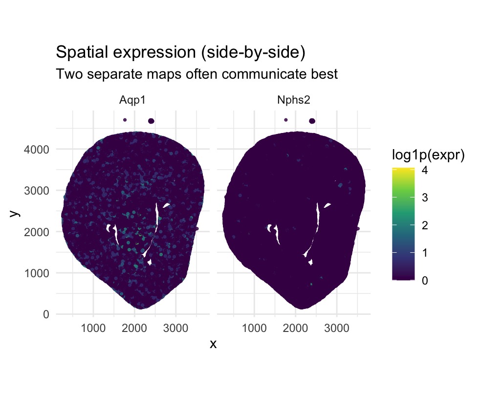
- The visualization is designed to make spatial differences in gene expression patterns salient.
- By placing Aqp1 and Nphs2 in side-by-side spatial maps, the figure emphasizes where each gene is expressed within the tissue.
- This layout facilitates direct visual comparison of spatial localization rather than numerical magnitude.
- The goal is to highlight the anatomical compartmentalization of kidney cell types through spatial expression patterns
2. What data types are represented?
- Spatial data: x and y coordinates encode physical locations of cells in the tissue.
- Quantitative data: log-transformed gene expression values (log1p(expr)).
- Categorical data: gene identity (Aqp1 vs Nphs2) used for faceting.
- Relational data: the relationship between gene expression and spatial location
3. What data encodings (geometric primitives and visual channels) are used?
Geometric primitives
- Points: each point represents an individual cell. Visual channels
- Position (x, y): encodes spatial location (quantitative).
- Hue: encodes gene expression magnitude (quantitative).
- Faceting (enclosure): separates genes into distinct panels for comparison.
4. What Gestalt principles / perceptual principles are used?
- Similarity: cells with similar colors are perceived as having similar expression levels.
- Proximity: spatially nearby cells are perceived as related anatomical structures.
- Enclosure: faceting encloses each gene in its own panel, reinforcing separation by gene identity.
- Continuity: smooth color gradients support perception of spatial expression trends rather than noise
Together, these principles enhance salience and processing, making spatial expression patterns easier to interpret
5. Code
1
2
3
4
5
6
7
8
9
10
11
12
13
14
15
16
17
18
19
20
21
22
23
24
25
26
27
28
29
30
31
32
33
34
35
36
37
38
39
40
41
42
43
44
45
46
47
48
49
50
51
52
53
54
55
56
57
58
59
60
61
62
63
64
65
66
67
68
69
70
71
72
73
74
75
76
77
78
79
80
81
82
83
84
85
86
87
88
89
90
91
92
93
94
library(ggplot2)
library(dplyr)
library(tidyr)
library(scales)
library(viridis)


data <- read.csv(
  "/Users/pmusenge/Desktop/genomic_data_vis/genomic-data-visualization-2026/data/Xenium-IRI-ShamR_matrix.csv.gz"
)

## sanity checks
dim(data)
head(data[, 1:5])

## Extracting spatial coordinates
pos <- data[, c("x", "y")]
rownames(pos) <- data[, 1]

## Extracting gene expression matrix
gexp <- data[, 4:ncol(data)]
rownames(gexp) <- data[, 1]

dim(gexp)
head(gexp[, 1:5])

## Pair of genes to analyze
geneA <- "Nphs2"  # podocyte
geneB <- "Aqp1"   # proximal tubule (Megalin)

## Checking genes exist in data
if (!(geneA %in% colnames(gexp))) stop(paste("Missing gene:", geneA))
if (!(geneB %in% colnames(gexp))) stop(paste("Missing gene:", geneB))

## Building plotting dataframe
df <- data.frame(
  x = pos$x,
  y = pos$y,
  A = gexp[, geneA],
  B = gexp[, geneB]
)

## Help from ChatGPT
## prompt: I have an R data frame called df that contains spatial coordinates (x, y) and gene expression counts for two genes stored in columns A and B. I want to Log-transform both gene expression columns using log1p and Compute a simple dominance score defined as log1p(A) − log1p(B)
## 8) Transforming + defining a simple “dominance” score
## log1p = log(1 + count), robust for sparse counts
df <- df %>%
  mutate(
    A_log = log1p(A),
    B_log = log1p(B),
    score = A_log - B_log,                 # >0 => A dominates, <0 => B dominates
    sumAB = A_log + B_log
  )


## thresholds to play with/tune
thresh_sum <- 0.25   # how much total expression to count as “present”
thresh_dom <- 0.25   # how strong the dominance needs to be

df <- df %>%
  mutate(
    category = case_when(
      sumAB < thresh_sum ~ "Neither/Low",
      score >=  thresh_dom ~ paste0(geneA, " dominant"),
      score <= -thresh_dom ~ paste0(geneB, " dominant"),
      TRUE ~ "Both / Mixed"
    ),
    category = factor(
      category,
      levels = c(paste0(geneA, " dominant"), "Both / Mixed", paste0(geneB, " dominant"), "Neither/Low")
    )
  )


##Visualization: Side-by-side spatial maps for each gene

df_long <- df %>%
  select(x, y, A_log, B_log) %>%
  rename(!!geneA := A_log, !!geneB := B_log) %>%
  pivot_longer(cols = c(all_of(geneA), all_of(geneB)),
               names_to = "gene", values_to = "expr_log")

p4 <- ggplot(df_long, aes(x = x, y = y, color = expr_log)) +
  geom_point(alpha = 0.8, size = 0.6) +
  scale_color_viridis_c(name = "log1p(expr)") +
  coord_fixed() +
  facet_wrap(~ gene, ncol = 2) +
  labs(
    title = "Spatial expression (side-by-side)",
    subtitle = "Two separate maps often communicate best"
  ) +
  theme_minimal()

print(p4)