HW1

1. What about the data would you like to make salient through this data visualization?
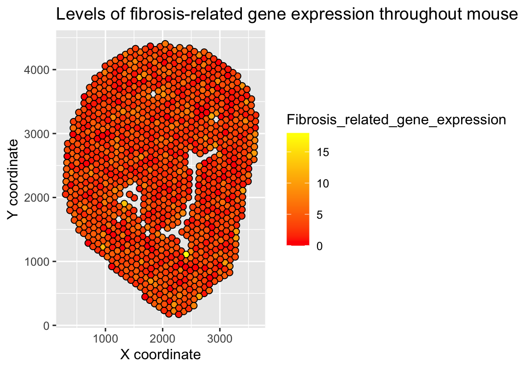
I wanted to make the total level of fibrosis-related gene expression for each spot apparent through this visualization to help understand levels of fibrosis in different regions of the mouse tissue. Since fibrosis can be related to disease states or organ dysfunction, being able to understand the level of fibrosis that may be occurring by understanding the level of expression of fibrosis-related genes being expressed can help us draw conclusions about the health and function of the tissue.
2. What are the data types represented?
Quantitative (gene expression levels for Tgfb1, Smad3, Acta2, Sirt1, Sirt3), spatial (x and y coordinates of each of the spots where gene expression was being measured)
3. What data encodings (geometric primitives and visual channels) are you choosing to visualize these data types?
Points are being used to represent each spot in the spatial transcriptomic dataset, while the points’ position along the x and y axis represents each spot’s x and y coordinates, and each points’ color (hue) represents the total quantitative level of expression of fibrosis-related genes at a given spot.
4. What Gestalt principles and/or knowledge about perceptiveness of visual encodings are you using to accomplish this?
Similarity of color (hue) shows spots in the tissue with similar levels of fibrosis-related gene expression. I also thought that using points and color (hue) would be the data encodings that most clearly communicate findings in spatial and quantitative data in this case.
5. Implement your data visualization. Provide the visualization and share the code.
```r #Imported .csv file into R Studio tab and loaded as a dataframe
#Help from Google AI summary; search prompt = “How to read in .csv from file path in R in a way that is universal” data <- read.csv(“~/Desktop/Visium-IRI-ShamR_matrix.csv.gz”)
#From in-class example code and https://github.com/JEFworks-Lab/genomic-data-visualization-2026/blob/main/resources/code/genomic-data-visualization-Code_1.R.R dim(data) #1224 spots, 19468 genes class(data) #data.frame data[1:5, 1:5]
#Displaying regions with greater fibrosis #Help from Google AI summary; search prompt = “Mouse kidney fibrosis genes” #Fibrosis genes: Tgfb1, Smad3 #Myofibroblast gene: Acta2 #Age-related fibrosis genes: Sirt1, Sirt3 #Help from ChatGPT; prompt = “Given a dataframe with rows depicting different spots and columns denoting different levels of expression for different genes as well as a column for an x coordinate and a column with a y coordinate, create a new dataframe that only includes the x and y coordinate columns and the gene expression data for the following genes for each spot: Tgfb1, Smad3, Acta2, Sirt1, Sirt3” gene_names <- c(“Tgfb1”, “Smad3”, “Acta2”, “Sirt1”, “Sirt3”) relevant_genes <- data[, c(“x”, “y”, gene_names)] head(relevant_genes) #Checking new dataframe was sorted correctly #Creating and labeling plot #From in-class code notes from 1/28/2026, https://rstudio.github.io/cheatsheets/data-visualization.pdf, & help from ChatGPT (prompt = “How to do dot plot with + scale_fill_gradient()”) library(ggplot2) Fibrosis_related_gene_expression = rowSums(relevant_genes[, 3:ncol(relevant_genes)]) #Taking total gene expression of each of the 5 selected fibrosis-related genes for each spot in dataframe #Plotting points at their respective x and y coordinates with different hues representing total fibrosis-related gene expression ggplot(df, aes(x=x, y=y, fill=Fibrosis_related_gene_expression)) + geom_point(shape = 21, size = 2) + scale_fill_gradient(low = “red”, high = “yellow”) + labs(x=”X coorindate”, y=”Y coordinate”, title=”Levels of fibrosis-related gene expression throughout mouse tissue”) ‘’’