A data visualization for sequencing spatial transcriptomics data

1. What data types are you visualizing?
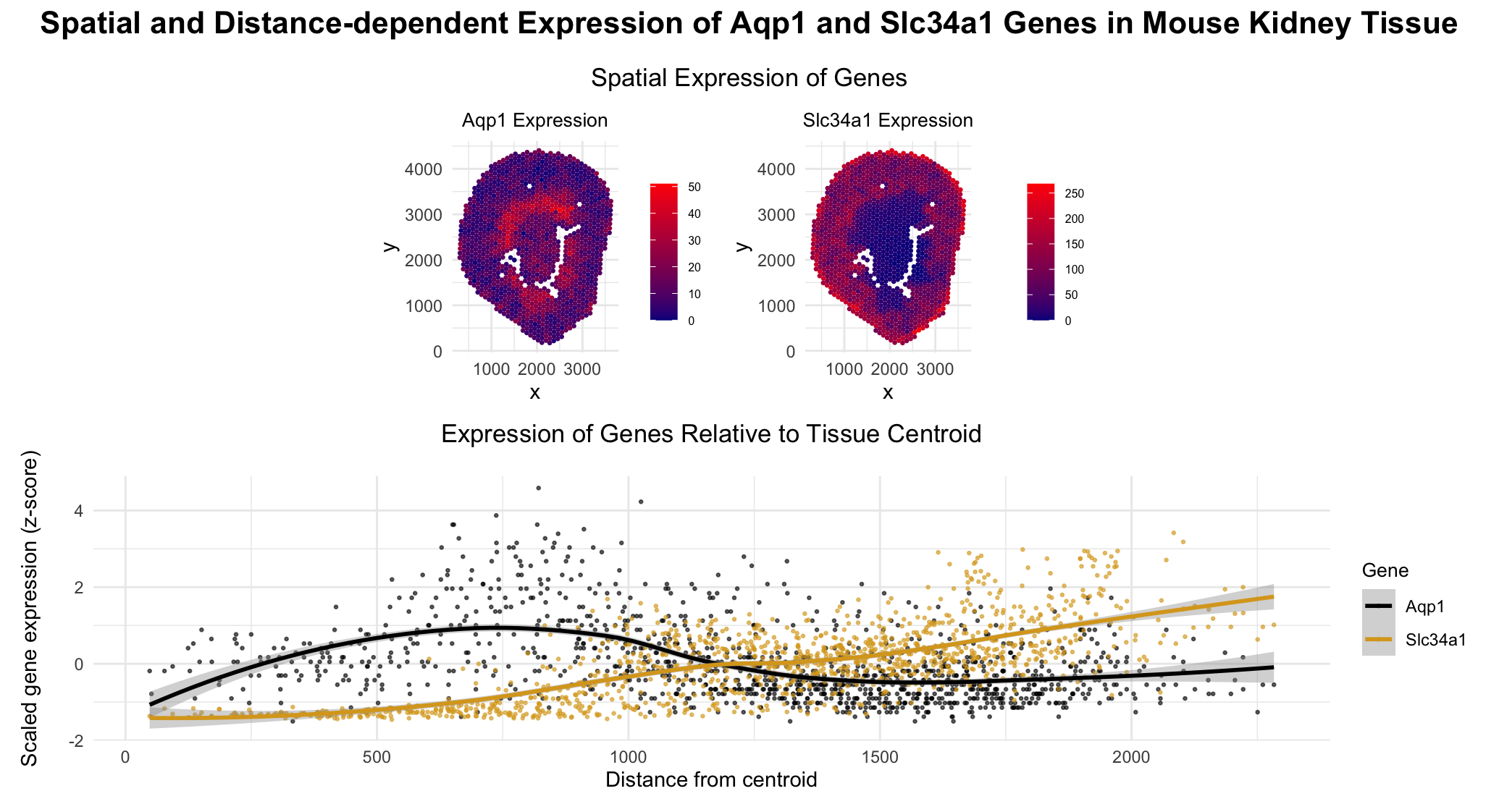
Categorical- Gene type Aqp1, Slc34a1 (in the second plot) Quantitative data- Expression levels of genes Aqp1 and Slc34a1 in each cell The euclidean distance of each cell from the centroid of the tissue Spatial data- The x and y positions of each cell across the tissue
2. What data encodings (geometric primitives and visual channels) are you using to visualize these data types?
Geometric primitives- Points (representing each cell) Visual channels- Colour Saturation (to encode the magnitude of gene expression) Colour hue (to differentiate between the two genes in the expression vs euclidean distance plot) Position along x axis (x position) Position along y axis (y position)
3. What about the data are you trying to make salient through this data visualization?
I am trying to make salient the fact that the gene Aqp1 is highly expressed both near the centroid of the tissue (corresponding to the descending Loop of Henle) and away from the centroid (in the proximal tubule), where as the gene Slc34a1 expression is concentrated primarily in the proximal tubule, farther from the centroid.
4. What Gestalt principles or knowledge about perceptiveness of visual encodings are you using to accomplish this?
In the spatial plot of the spots (cells), color saturation is used to encode quantitative gene expression because humans perceive intensity differences in saturation more accurately than hue variations when it comes to quantitative data.
In the distance vs expression plot, color hue is used to distinguish the two genes, as humans perceive differences in hue effectively for categorical data.
Although the spatial plot highlights that the gene Slc34a1 is expressed highly farther from the centroid, I used the gestalt principle of continuity to help make more salient the patterns across the tissue.
Some might view this as redundant encoding, but I believe it reinforces understanding and allows for both spatial and trend-based comparisons.
5. Code (paste your code in between the ``` symbols)
1
2
3
4
5
6
7
8
9
10
11
12
13
14
15
16
17
18
19
20
21
22
23
24
25
26
27
28
29
30
31
32
33
34
35
36
37
38
39
40
41
42
43
44
45
46
47
48
49
50
51
52
53
54
55
56
57
58
59
60
61
62
63
64
65
66
67
68
69
70
71
72
73
74
75
76
77
78
79
80
81
82
83
84
85
86
87
88
89
90
91
92
93
94
95
96
97
98
99
100
101
102
103
104
105
106
107
108
109
110
111
112
113
114
115
116
117
118
119
120
121
122
123
124
125

# load libraries
install.packages("ggplot2")
install.packages("patchwork")
install.packages("reshape2")
install.packages("dplyr")
library(ggplot2)
library(patchwork)
library(reshape2)
library(dplyr)

# Load data
file_path <- "genomic-data-visualization-2026/data/Visium-IRI-ShamR_matrix.csv.gz"
data <- read.csv(file_path)

# Get cell positions
position <- data[, c("x", "y")]
rownames(position) <- data[,1]

# Get gene expression
gene_exp <- data[, 4:ncol(data)]
rownames(gene_exp) <- data[,1]

# Genes of interest
genes <- c("Aqp1", "Slc34a1")
plots <- list()

for (g in genes) {

  expr <- gene_exp[, g]

  df_plot <- data.frame(
    x = position$x,
    y = position$y,
    expr = expr,
    top10 = top10
  )

  p <- ggplot(df_plot, aes(x = x, y = y)) +
    geom_point(aes(color = expr), size = 0.5) +
    scale_color_gradient(low = "darkblue", high = "red", name = paste0(g, " expression")) +
    coord_fixed() +
    # labs(title = paste0(g, ' expression')) +
    theme_minimal() +
    theme(
      legend.position = "right",
      legend.key.size = unit(0.5, "cm"),   # smaller legend keys
      legend.title = element_text(size = 0),
      legend.text = element_text(size = 6)     # smaller labels
    ) +
    labs(
      title = paste0(g, " Expression")
    ) +
    theme(
      plot.title = element_text(hjust = 0.5, size = 10)  # centers title
    )

  plots[[g]] <- p
}

# the top two plots-  spatial plots for each gene
p1 <- plots[["Aqp1"]]
p2 <- plots[["Slc34a1"]]

# Compute the centroid
centroid_x <- mean(position$x)
centroid_y <- mean(position$y)

# The eucledian distance
distance <- sqrt((position$x - centroid_x)^2 + (position$y - centroid_y)^2)

# Build distance-expression dataframe]
df_dist <- data.frame(
  distance = distance,
  Aqp1 = gene_exp[, "Aqp1"],
  Slc34a1 = gene_exp[, "Slc34a1"]
)

# convert from wide to long format
df_long <- melt(df_dist, id.vars = "distance",
                variable.name = "gene", value.name = "expression")


# Scale expression per gene (z-score)
# this is because the magnitude of expression of the two genes are of different scales and is hard to compare without scaling
df_long <- df_long %>%
  group_by(gene) %>%
  mutate(expression_scaled = as.numeric(scale(expression))) %>%
  ungroup()

# Bottom plot: scaled expression vs distance
p3 <- ggplot(df_long, aes(x = distance, y = expression_scaled, color = gene)) +
  geom_point(alpha = 0.6, size = 0.5) +
  geom_smooth(method = "loess", se = TRUE) +
  scale_color_manual(values = c("Aqp1" = "black", "Slc34a1" = "goldenrod")) +
  labs(
    x = "Distance from centroid",
    y = "Scaled gene expression (z-score)",
    color = "Gene",
    title = "Expression of Genes Relative to Tissue Centroid"
  ) +
  theme_minimal() +
  theme(
    plot.title = element_text(hjust = 0.5, size = 13, margin = margin(b = 15)),  # centers title
    legend.title = element_text(size = 10)
  )

# combine the top and bottom row
top_row <- p1 | p2

# Final layout: top row + bottom row
final_plot <- top_row / p3 +
  plot_layout(heights = c(1.6, 2)) +   # bottom plot taller
  plot_annotation(
    title = 'Spatial and Distance-dependent Expression of Aqp1 and Slc34a1 Genes in Mouse Kidney Tissue',
    subtitle = 'Spatial Expression of Genes',
    theme = theme(
      plot.title = element_text(size = 16, face = 'bold', hjust = 0.5, margin = margin(b = 15)),
      plot.subtitle = element_text(size = 13, hjust = 0.5)
    )
  )

# display all plots in one figure
final_plot
6. Prompts from ChatGpt
While I made the visualization all by myself (with help from R documentation), I used to chantpgt to better organize my plots. The following are some prompts I used.
Think of the plot as having two rows and two columns. In the top two rows Ill have the spatial plot of the two genes, in the bottom row spanning both columns I want the plot where centroid distance vs expression count is plotted. I will give you the two codes for the plots, just merge them. How can I change the width of each subplot in the top row? Apart from the main topic how do I add a subtopic just for the top row? The expression counts in the two genes are of different orders. Scale them to one.