HW1

1. What data types are you visualizing?
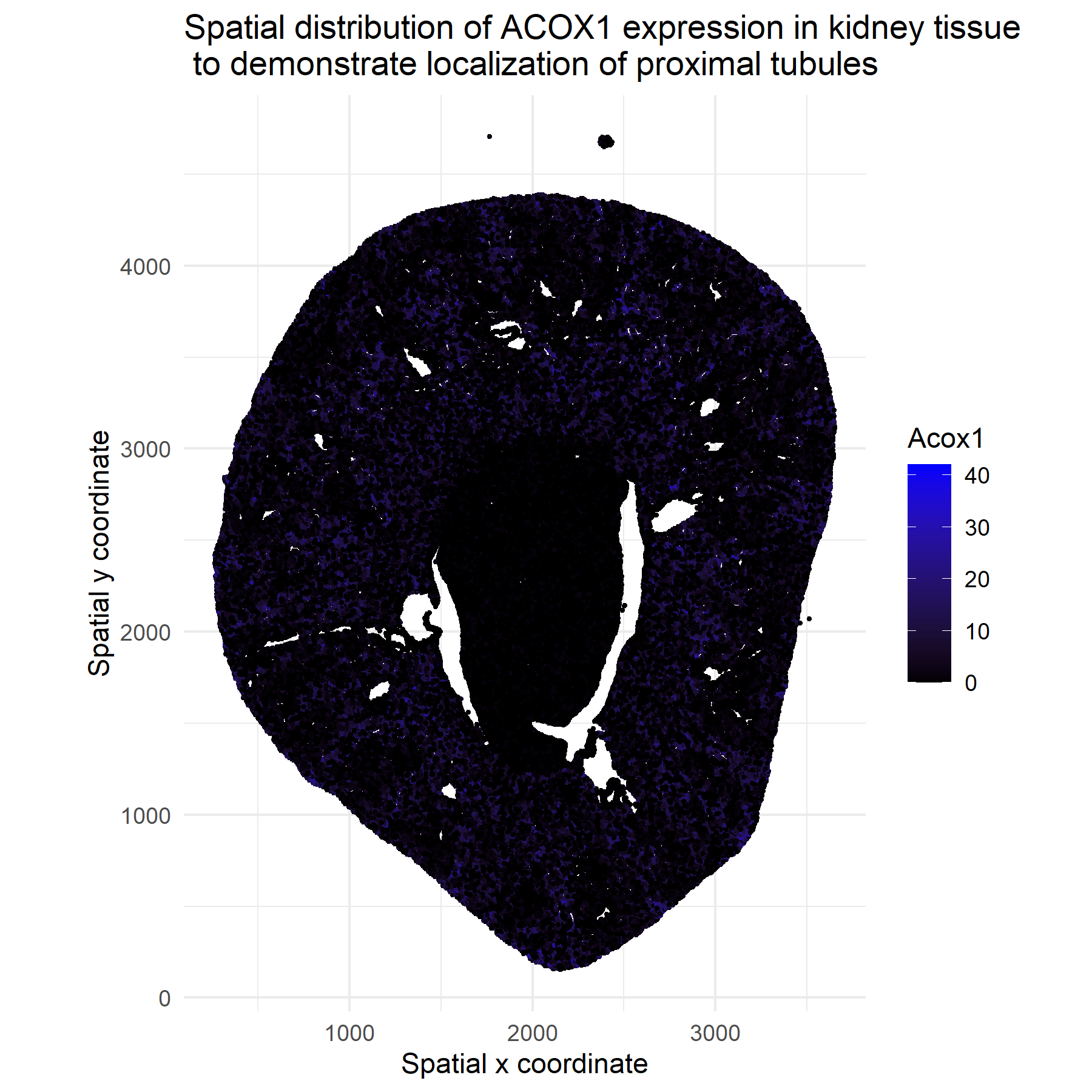
I am plotting 2D spatial coordinates and quantitative data through ACOX1 expression counts.
2. What data encodings (geometric primitives and visual channels) are you using to visualize these data types?
To visualize the data, I am using points on a scatter plot and position on the x and y-axis. Additionally, I’ll be using color/hue to encode ACOX1 magnitude.
3. What about the data are you trying to make salient through this data visualization?
I am trying to make salient the spatial clusters and regions with high ACOX1 expression to determine proximal tubule localization and spatial heterogeneity. ACOX1 catalyzes the first step of fatty‑acid β‑oxidationand and is highly expressed in renal proximal tubule cells, which are rich in peroxisomes and rely heavily on fatty‑acid oxidation for ATP generation. Therefore, regions with high ACOX1 signal in kidney tissue tend to localize to proximal tubules. Source: Vamecq, J., Andreoletti, P., El Kebbaj, R., Saih, F. E., Latruffe, N., El Kebbaj, M. H. S., Lizard, G., Nasser, B., & Cherkaoui-Malki, M. (2018). Peroxisomal Acyl-CoA Oxidase Type 1: Anti-Inflammatory and Anti-Aging Properties with a Special Emphasis on Studies with LPS and Argan Oil as a Model Transposable to Aging. Oxidative medicine and cellular longevity, 2018, 6986984. https://doi.org/10.1155/2018/6986984
4. What Gestalt principles or knowledge about perceptiveness of visual encodings are you using to accomplish this?
Similarity I will utilize similarity to help the audience perceive the different hues of dots as different groups to better visualize the localization of proximal tubules. Additionally, I will use the proximity of similarly colored dots to reinforce the related groups (tubule presence or not).
5. Code
# import and load load libraries
install.packages("dplyr")
install.packages("ggplot2")

library(dplyr)
library(ggplot2)

# load data
data <- read.csv("C:/Users/32ava/Downloads/genomic-data-visualization-2026-main/genomic-data-visualization-2026-main/data/Xenium-IRI-ShamR_matrix.csv.gz")

# exploratory analysis
data[1:10, 1:10]
# X = cell?; x, y = spatial coordinates; other columns are gene names

# determine which genes are most present
genes <- setdiff(names(data), c("X", "x", "y"))
expr <- as.matrix(data[genes])
present_per_gene <- colSums(expr > 0, na.rm = TRUE)
present_sorted <- sort(present_per_gene, decreasing = TRUE)
head(present_sorted, 20) # Timp3, Calr, Calm1, Acox1, Calm3

# choose the ACOX1 column
gene <- grep("Acox1", names(data), ignore.case = TRUE, value = TRUE)
gene <- gene[1]

# graph
plot <- ggplot(data, aes(x = x, y = y, color = .data[[gene]])) +
  geom_point(size = 0.6) +
  scale_color_gradient(low = "black", high = "blue", name = gene) +
  coord_equal() +
  theme_minimal() +
  labs(title = paste("Spatial distribution of ACOX1 expression in kidney tissue", "\n", "to demonstrate localization of proximal tubules"), x = "Spatial x coordinate", y = "Spatial y coordinate")

ggsave("hw1_avarga11.png", plot, width = 6, height = 6, dpi = 300)