How do tSNE coordinates change as increasing the number of PCs?

1. What data types are you visualizing?
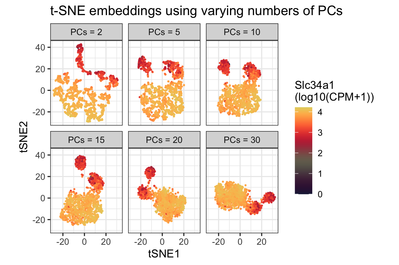
I am answering how do tSNE coordinates change as increasing the number of PCs. I computed PCA on the log-transformed, normalized gene expression matrix. I then ran tSNE multiple times using different numbers of input PCs and displayed the resulting embeddings as small panels. Each panel visualizes numerical 2D tSNE coordinates of each spot. Additionally, I visualized a quatatitive continuous gene expression variable (Slc34a1) across the same observations.
2. What data encodings (geometric primitives and visual channels) are you using to visualize these data types?
I use points as the geometric primitive, with x and y position encoding tSNE1 and tSNE2. I additionally encode a continuous gene expression variable (Slc34a1) using color hue and keep a single shared color legend across panels so that color values are comparable.
3. What about the data are you trying to make salient through this data visualization?
This visualization makes salient how the t-SNE embedding structure changes as more PCs are included as input. With very few PCs (PCs = 2), the embedding shows weaker separation and a more diffuse spread. As the number of PCs increases (PCs = 5–15), the embedding exhibits more stable groupings, with points forming tighter clusters overall. Beyond 15 PCs, the overall grouping becomes relatively stable, which suggests diminishing marginal returns from adding additional PCs. In addition, coloring Slc34a1 provides a reference that helps interpret whether separated groups correspond to distinct expression patterns as a validation on the grouping patterns.
4. What Gestalt principles or knowledge about perceptiveness of visual encodings are you using to accomplish this?
I use the Gestalt principle of similarity that spots with similar colors are perceived as related. Keeping a single shared color legend across panels supports consistent comparison of expression intensity across the six embeddings.
5. why you believe your data visualization is effective?
This visualization is effective because based on perceptual chart from class, position is the most accurate visual channels for encoding quantitative values, so using x and y position to show tSNE1 and tSNE2 supports reliable comparison across panels. In addition, mapping Slc34a1 expression (continuous variable) to color intensity provides an visual cue for expression patterns, and the shared legend and small pannel layout make comparisons across different numbers of PCs interpretable.
The normalization and the PCA to tSNE workflow were adapted from Dr. Fan’s in-class code examples. The choice of the highlighted gene was inspired by my homework1 results on spatial variability.
6. Code
1
2
3
4
5
6
7
8
9
10
11
12
13
14
15
16
17
18
19
20
21
22
23
24
25
26
27
28
29
30
31
32
33
34
35
36
37
38
39
40
41
42
43
44
45
46
47
48
49
50
51
52
53
54
55
56
57
58
59
60
61
62
63
64
65
library(Rtsne)
library(patchwork)
library(dplyr)
library(ggplot2)
library(gridExtra)
library(jcolors)
library(Seurat)
library(tidyverse)

setwd("/Users/tiya/Desktop/BME\ program\ info/Spring\ 2026/gemonic_data_visal")

## data
dat = read_csv("data/Visium-IRI-ShamR_matrix.csv")

str(dat) #tibble, need to convert dat
dat = data.frame(dat)

pos = dat[,c('x', 'y')]
rownames(pos) = dat[,1]
gexp = dat[, 4:ncol(dat)]
rownames(gexp) = dat[,1]

## nor
totgexp = rowSums(gexp)
mat = log10(gexp/totgexp * 1e6 + 1)
dim(mat)

## PCA
pcs <- prcomp(mat, center=TRUE, scale=FALSE)
names(pcs)
head(pcs$sdev)
length(pcs$sdev)
plot(pcs$sdev[1:50])

# tSNE
## what happens if we use more PCs?
pc_vec = c(2, 5, 10, 15, 20, 30)
df_all = data.frame()
for (i in pc_vec) {
  toppcs = pcs$x[, 1:i]

  set.seed(2026201)
  tsne = Rtsne::Rtsne(toppcs, dims = 2, perplexity = 30)

  emb = as.data.frame(tsne$Y)
  rownames(emb) = rownames(mat)
  colnames(emb) = c("tSNE1", "tSNE2")

  df_i = data.frame(pos, emb, Slc34a1 = mat[, "Slc34a1"], PCs_used = paste0("PCs = ", i) )

  df_all = rbind(df_all, df_i)
}

df_all$PCs_used = factor(df_all$PCs_used,
                          levels = paste0("PCs = ", pc_vec))
ggplot(df_all, aes(x = tSNE1, y = tSNE2, color = Slc34a1)) +
  geom_point(size = 0.3) +
  theme_bw() +
  facet_wrap(~ PCs_used, ncol = 3) +
  scale_color_jcolors_contin("pal4") +
  coord_fixed() +
  theme(legend.position = "right") +
  labs(title = "t-SNE embeddings using varying numbers of PCs",
       color = "Slc34a1\n(log10(CPM+1))")