Influence of Gene Mean and Gene Variance on PC1

1. What data types are you visualizing?
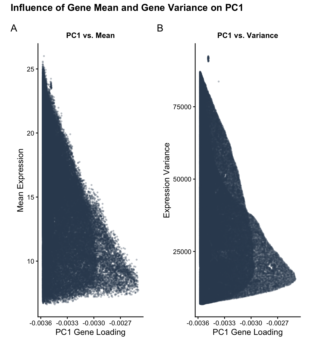
I am visualizing quantitative data of: 1) the mean expression of each gene, averaged across all of all spatial spots within the data set; 2) the variance of the expression of each gene, averaged across all of all spatial spots within the data set; and 3) the PC1 loading value associated with each gene.
2. What data encodings (geometric primitives and visual channels) are you using to visualize these data types?
The geometric primitive I am leveraging in both panels of this data visualization are points.
The visual channels I am using in the left panel are: X_position: to encode the PC1 loading value of each gene. Y_position: to encode the mean gene expression of each gene.
The visual channels I am using in the right panel are: X_position: to encode the PC1 loading value of each gene. Y_position: to encode the variance of the gene expression of each gene.
3. What about the data are you trying to make salient through this data visualization?
My data visualization aims to make salient the relationship between gene mean expression and gene expression variance and PC1 gene loading. The primary goal is to show how genes with higher variances tend to have higher PC1 loading values (causation, the PCA linear dimensionality reduction assigns higher loading values to the information with the most variance in order to ‘capture’ the most information) and to show how genes with higher means also tend to have higher PC1 loading values (correlation, genes that have higher expression will naturally have more variance).
4. What Gestalt principles or knowledge about perceptiveness of visual encodings are you using to accomplish this?
I used the Gestalt principle of similarity between the left and right panels. Because the left and right panel have the same color for the datapoints (same in hue and saturation) and follow a similar positional spread, the user quickly visually identifies that there is some sort of reason why plotting mean gene expression versus PC1 loading and gene expression variance versus PC1 loading yield very similar distributions (I explain that this similarity stems from how high expression means correspond to high expression variances). I use the Gestalt principle of continuity in both panels, which show an upwards trend in both mean expression and expression variance as the magnitude of the PC1 loading value increases leftward. I used x_position and y_position as my visual channels because position ranks highest for visual perceptiveness for quantitative data.
5. Code (paste your code in between the ``` symbols)
Code begins with a summary of prompts given to google gemini to aid in constructing the data visualization.
```# PROMPT 1:
I’m using RStudio and want help writing R code to make a clean, simple plot using ggplot2.
Please write R code that:
Automatically installs and loads ggplot2
Uses base R only for PCA (prcomp)
Does not use Seurat or any other external libraries
Use this dataset (download it directly in the code):
https://raw.githubusercontent.com/JEFworks-Lab/genomic-data-visualization-2026/main/data/Xenium-IRI-ShamR_matrix.csv.gz
The data is a gene expression matrix where:
Rows are genes
Columns are spatial spots
The code should:
Read in the data
Transpose it so spots are observations and genes are features
Run PCA using prcomp() with centering and scaling
Extract the PC1 gene loadings
For each gene, compute:
Mean expression across spots
Variance across spots
Then make a two-panel figure using ggplot2:
Left panel: scatter plot of PC1 loading (x-axis) vs gene mean expression (y-axis)
Right panel: scatter plot of PC1 loading (x-axis) vs gene variance (y-axis)
Plot styling:
Use theme_classic()
Small points (e.g. size = 0.5–1)
Slight transparency (alpha < 0.5)
Neutral single-color points (no grouping or coloring)
Clear axis labels and simple titles
Keep the code straightforward and well-commented. Don’t add extra features or complexity.
Please store all of my prompts verbatim as a comment at the beginning of the code.
Add a brief (2-10 word) summary of your output for each.
PROMPT 2:
I have the following errors. Please help me fix them: Error in make.names(col.names, unique = TRUE) :
invalid multibyte string 1
In addition: Warning messages:
1: In read.table(file = file, header = header, sep = sep, quote = quote, :
line 1 appears to contain embedded nulls
2: In read.table(file = file, header = header, sep = sep, quote = quote, :
line 3 appears to contain embedded nulls
3: In read.table(file = file, header = header, sep = sep, quote = quote, :
line 5 appears to contain embedded nulls
PROMPT 3:
Include all of my prompts in the comments. Add a chart title that says: “Influence of Gene Mean and Gene Variance on PC1 Loading”
PROMPT 4:
can we make the chart more research paper-esque (prettier)
PROMPT 5:
remove “loading” from the title
Summary 1: Initial PCA and ggplot2 visualization script.
Summary 2: Fixed file encoding/compression errors using gzcon.
Summary 3: Integrated prompt history and assigned custom title.
Summary 4: Enhanced aesthetics with patchwork and research-grade styling.
Summary 5: Final title refinement for clarity and conciseness.
1. Setup
if (!require(“ggplot2”, quietly = TRUE)) install.packages(“ggplot2”) if (!require(“patchwork”, quietly = TRUE)) install.packages(“patchwork”)
library(ggplot2) library(patchwork)
2. Load Data (Robust method for compressed URLs)
url_path <- “https://raw.githubusercontent.com/JEFworks-Lab/genomic-data-visualization-2026/main/data/Xenium-IRI-ShamR_matrix.csv.gz” con <- gzcon(url(url_path)) raw_data <- read.csv(text = readLines(con), row.names = 1, check.names = FALSE)
3. PCA & Stats
PCA expects observations as rows (spots) and features as columns (genes)
data_transposed <- t(raw_data) pca_results <- prcomp(data_transposed, center = TRUE, scale. = TRUE)
Extraction
plot_df <- data.frame( pc1_loading = pca_results$rotation[, 1], mean_expr = rowMeans(raw_data), variance = apply(raw_data, 1, var) )
4. Visualization
Research-esque theme
paper_theme <- theme_classic(base_size = 12) + theme( plot.title = element_text(hjust = 0.5, face = “bold”, size = 11), axis.title = element_text(color = “black”), plot.margin = margin(10, 10, 10, 10) )
Left Panel
p1 <- ggplot(plot_df, aes(x = pc1_loading, y = mean_expr)) + geom_point(size = 0.6, alpha = 0.25, color = “#34495e”) + paper_theme + labs(title = “PC1 vs. Mean”, x = “PC1 Gene Loading”, y = “Mean Expression”)
Right Panel
p2 <- ggplot(plot_df, aes(x = pc1_loading, y = variance)) + geom_point(size = 0.6, alpha = 0.25, color = “#34495e”) + paper_theme + labs(title = “PC1 vs. Variance”, x = “PC1 Gene Loading”, y = “Expression Variance”)
Final Assembly
final_plot <- (p1 | p2) + plot_annotation( title = “Influence of Gene Mean and Gene Variance on PC1”, tag_levels = ‘A’, theme = theme(plot.title = element_text(size = 14, face = “bold”)) )
print(final_plot) ```