Using PCA to visualize spatial patterns in high-dimensional gene expression within coronal kidney section

1. What data types are you visualizing?
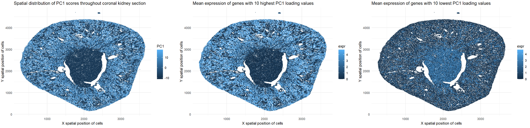
The represented data type is quantitative. I am visualizing the x and y spatial positions of cells in the coronal kidney section (all plots). I am also visualizing PC1 scores per cell (leftmost plot) and mean expression data for genes with the top 10 highest and lowest PC1 loading values (center and rightmost plots).
2. What data encodings (geometric primitives and visual channels) are you using to visualize these data types?
I have visualized this quantitative data by using the geometric primitive of points to represent cells within the coronal kidney section (all plots). I have used the visual channel of position along the x- and y-axes to encode the x and y spatial positions, respectively, of these cells (all plots). Furthermore, I have used the visual channel of color saturation on the blue scale to encode the PC1 scores of the cells on the log scale (leftmost plot). I have also used the visual channel of color saturation on the blue scale to encode mean expression data for genes with the top 10 highest and lowest PC1 loading values (center and rightmost plots). Light blue points represent cells with higher PC1 scores/expression levels while dark blue points represent cells with lower PC1 scores/expression levels.
3. What about the data are you trying to make salient through this data visualization?
I would like to make salient the relationship between genes with high vs. low loading values, as well as their spatial patterns relative to each other within the tissue. Prior to generating the plots, I identified genes with the top 10 highest and lowest loading values for PC1, then averaged their levels of expression. Genes with high PC1 loadings tend to be co-expressed in cells with high PC1 scores. The leftmost and center plots have high PC1 scores and high levels of gene expression, respectively, in the same outer regions of tissue. Thus, genes with high loading values are enriched in tissue regions corresponding to high PC1 scores. On the other hand, genes with low loading values exhibit opposing or inversely related spatial patterns, with higher expression in tissue regions where genes with high loading values are less expressed. The center plot has higher levels of gene expression in the outer regions of tissue while the rightmost plot has higher levels of gene expression in the center of the tissue. PCA enables this inverse relationship to be visualized by reducing high-dimensional gene expression data into a single PC1 score per cell.
4. What Gestalt principles or knowledge about perceptiveness of visual encodings are you using to accomplish this?
I relied on the Gestalt Principle of Similarity to encourage viewers to perceive darker and lighter points as separate groups. This allows the viewer to distinguish between magnitudes of PC1 scores (leftmost plot) and levels of gene expression (center and rightmost plots) within the tissue. The viewer can also notice localized patterns of expression by searching for regions with a higher number of light blue points. Moreover, the perception chart states that human viewers can more easily understand quantitative data when it is encoded using position. Therefore, I used position along the x- and y-axes to encode the x and y spatial positions, respectively, of the cells (all plots).
5. Code
1
2
3
4
5
6
7
8
9
10
11
12
13
14
15
16
17
18
19
20
21
22
23
24
25
26
27
28
29
30
31
32
33
34
35
36
37
38
39
40
41
42
43
44
45
46
47
48
49
50
51
52
53
54
55
56
57
58
59
60
61
62
63
64
65
66
67
68
# Read data
data <- read.csv('C:/Users/jamie/OneDrive - Johns Hopkins/Documents/Genomic Data Visualization/Xenium-IRI-ShamR_matrix.csv.gz')

# Each row represents one cell
# First column represents cell names
# Second and third columns represent x and y spatial positions of cells
# Fourth and beyond columns represent expression of specific genes in cells
data[1:5,1:5]

# Split up spatial data and gene expression data

# Create spatial data frame with second and third columns of old data frame
# Set row names of spatial data frame as first column of old data frame
pos <- data[,c('x','y')]
rownames(pos) <- data[,1]
head(pos)

# Create gene expression data frame with fourth and beyond columns of old data frame
# Set row names of gene expression data frame as first column of old data frame
gexp <- data[,4:ncol(data)]
rownames(gexp) <- data[,1]
gexp[1:5,1:5]

# How many total genes are detected per cell?
# Since rows represent cells, add all gene expression counts for each row
totgexp <- rowSums(gexp)
head(totgexp)

# Normalize by counts per million with pseudo-count of 1 to avoid getting undefined values
mat <- log10(gexp/totgexp * 1e6 + 1)
rowSums(mat)

# Make PCs with default settings
# Outputs include standard deviation, gene loading values, and PC scores
pcs <- prcomp(mat, center = TRUE, scale = FALSE)
names(pcs)
head(pcs$sdev)
pcs$rotation[1:5,1:5]

# Identify top 10 genes with highest PC1 loading values
# First column of loading matrix represents gene loading values for PC1
# Set decreasing to true so that highest loading value is on top
top_genes <- names(sort(pcs$rotation[,1], decreasing = TRUE))[1:10]
top_genes

# Identify bottom 10 genes with lowest PC1 loading values
# Set decreasing to false so that lowest loading value is on top
bottom_genes <- names(sort(pcs$rotation[,1], decreasing = FALSE))[1:10]
bottom_genes

# Type install.packages("ggplot2")
library(ggplot2)

# Visualize PC1 scores throughout tissue section
df_pc1 <- data.frame(pos, PC1 = pcs$x[,1])
ggplot(df_pc1, aes(x = x, y = y, col = PC1)) + geom_point(size = 0.4) + labs(x = "X spatial position of cells", y = "Y spatial position of cells", title = "Spatial distribution of PC1 scores throughout coronal kidney section") + theme_minimal()

# Visualize spatial patterns of high vs low PC1 gene sets
df_high <- data.frame(pos, expr = rowMeans(mat[, top_genes]))
df_low <- data.frame(pos, expr = rowMeans(mat[, bottom_genes]))

ggplot(df_high, aes(x = x, y = y, col = expr)) + geom_point(size = 0.4) + labs(x = "X spatial position of cells", y = "Y spatial position of cells", title = "Mean expression of genes with 10 highest PC1 loading values") + theme_minimal()
ggplot(df_low, aes(x = x, y = y, col = expr)) + geom_point(size = 0.4) + labs(x = "X spatial position of cells", y = "Y spatial position of cells", title = "Mean expression of genes with 10 lowest PC1 loading values") + theme_minimal()

# Prompts to ChatGPT
# After sorting gene loadings from highest to lowest, how do I select only the top 10?
# How do I calculate the average expression levels of a set of genes for each cell?
# How can I combine my PC1 scores with spatial coordinates in one brand new data frame so that I can plot PC1 across the entire tissue?