HW2

## In this homework, I wanted to explore the following question: How do the genes with high versus low loadings relate to each other? How are they patterned relative to each other in the tissue?
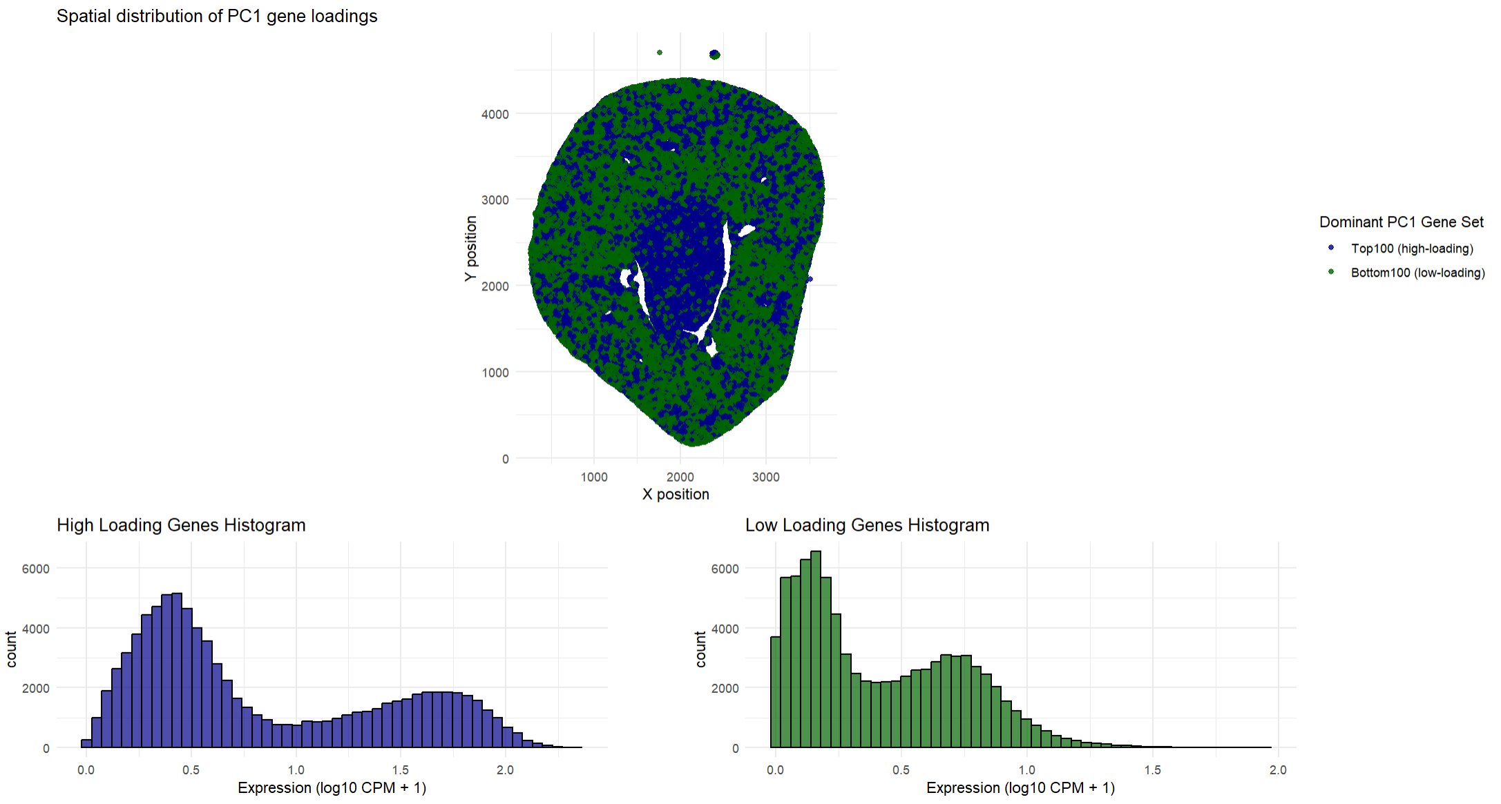
This data visualization shows how high loading and low loading cells on PC1 relate to each other in a spatial distribution across the tissue. To find where they were spatially located, I found the type of gene that dominated in that location (high loading vs low loading). This helped me determine which type of gene was expressed more at that specific location so I could plot the type of gene. Having both the high loading genes and the low loading genes on the same plot allows one to quickly determine where these genes are expressed and determine if there are any spatial differences in where these genes are expressed. My spatial plot shows that the low loading genes tend to dominate in the outer regions of the tissue while the high loading genes are primarily found in the middle of the tissue. This suggests that the high loading and low loading gene sets tend to show opposing expression patterns across the tissue. I decided to choose the top 100 high loading and low loading genes so I could focus on the genes that most strongly defined PC1. In addition to the spatial plots, the histograms show the average expression of the high and low loading genes and how they are distributed across the cells. The histograms show that the high loading genes and low loading genes are almost opposite. As one set is strongly expressed, the other set is usually weaker. Ultimately, both the spatial plots and the histograms show that these two gene sets have contrasting gene expression patterns in the tissue.
## The goal of this visualization was to make salient the difference between high and low loading genes, both spatially in the tissue and their expression values. The spatial plots for each set depicts where the high and low loading genes are expressed on the tissue. This allows for patterns of expression to be visible. The histograms quantitatively describe the expression values, showing that high loading genes are more strongly expressed across the cells while low loading genes are expressed at lower levels. Overall, this visualization helps gain an understanding that PC1 does reflect a spatially organized biological difference in the way the genes are expressed. The data types represented in the spatial plots are spatial coordinates (x, y) which are quantitative data. The gene expression values (the average expression of the selected genes) is also quantitative data. The type of gene (high loading and low loading) is categorical data. The data types represented in the histograms are quantitative for both the expression (x-axis) and count (y-axis).
## The geometric primitives used for the spatial plot are points that represent the spatial locations of the genes. The visual channels used are position (in both the x and y direction) for the spatial location of the genes. Color, specifically hue to distinguish the different gene sets (dark green for high loading and dark blue for low loading). Saturation is also used as areas of high expression are fully saturated in dark green or dark blue (depending on the type of gene). The geometric primitives used for the histogram are lines and areas to depict the total count and expression of the genes. The visual channels used are hue to distinguish between the type of gene (dark green for high loading and dark blue for low loading), size for the height of the bars to encode the frequency, and position (both in the x and y direction).
## The spatial plots use the Gestalt principles of similarity and proximity. Similarity is seen with the consistent color gradients and how it groups regions of similar expression. Proximity is also used as regions that are close together are considered to be part of the same tissue region. The histograms use the Gestalt principles of proximity, similarity, and continuity. Proximity is seen as the bars that are close together are perceived to belong to the same group. Similarity is seen in the consistent color gradients for the specific type of gene. Continuity is seen as the bars from a continuous progression of expression values even though the bars are discrete numbers. This leads one to perceive a smooth distribution curve.
Code
```r library(ggplot2) library(patchwork)
read in the data
data <- read.csv(‘C:/Users/gtbud/Downloads/Xenium-IRI-ShamR_matrix.csv.gz’)
split data into positions and gene expression
pos <- data[, c(‘x’, ‘y’)] rownames(pos) <- data[, 1] gexp <- data[, 4:ncol(data)] rownames(gexp) <- data[, 1]
normalize for PCA
totgexp <- rowSums(gexp) mat <- log10(gexp / totgexp * 1e6 + 1)
PCA
pcs <- prcomp(mat, center = TRUE, scale. = FALSE)
get the loadings
pc1_loadings <- pcs$rotation[, 1]
find the high loading and low loading genes
high_loading_genes <- names(sort(pc1_loadings, decreasing = TRUE)[1:100]) low_loading_genes <- names(sort(pc1_loadings, decreasing = FALSE)[1:100])
find the average expression for the high and low loading genes
avg_high <- rowMeans(mat[, high_loading_genes]) avg_low <- rowMeans(mat[, low_loading_genes])
dataframe to find the dominant gene at any point so there is no overlap between the points
plot_df <- data.frame( x = pos$x, y = pos$y, Dominant = ifelse(avg_high > avg_low, “Top100”, “Bottom100”) )
spatial plot
p1 <- ggplot(plot_df, aes(x = x, y = y, color = Dominant)) + geom_point(size = 1.5, alpha = 0.8) + scale_color_manual( values = c(“Top100” = “darkgreen”, “Bottom100” = “darkblue”), name = “Dominant PC1 Gene Set”, labels = c(“Top100 (high-loading)”, “Bottom100 (low-loading)”) ) + coord_fixed() + theme_minimal() + labs( title = “Spatial distribution of PC1 gene loadings”, x = “X position”, y = “Y position” )
histograms
max_count <- max( ggplot_build(ggplot(data.frame(Expression = avg_high), aes(x = Expression)) + geom_histogram(bins = 50))$data[[1]]$count, ggplot_build(ggplot(data.frame(Expression = avg_low), aes(x = Expression)) + geom_histogram(bins = 50))$data[[1]]$count )
p2 <- ggplot(data.frame(Expression = avg_high), aes(x = Expression)) + geom_histogram(bins = 50, fill = “darkblue”, color = “black”, alpha = 0.7) + theme_minimal() + ggtitle(“High Loading Genes Histogram”) + xlab(“Expression (log10 CPM + 1)”) + ylim(0, max_count)
p3 <- ggplot(data.frame(Expression = avg_low), aes(x = Expression)) + geom_histogram(bins = 50, fill = “darkgreen”, color = “black”, alpha = 0.7) + theme_minimal() + ggtitle(“Low Loading Genes Histogram”) + xlab(“Expression (log10 CPM + 1)”) + ylim(0, max_count)
combining the plots so the titles are not overlapping with each other
combined_plot <- p1 / (p2 + plot_spacer() + p3 + plot_layout(widths = c(1, 0.1, 1), guides = ‘collect’)) + plot_layout(heights = c(2, 1))
combined_plot
The beginning part of the code came from the in-class activity with Dr. Fan.
AI was used for R sytnax and assistance with figuring out how to get rid of the overlap that
was occuring when I tried to overlay my orginal two plots. AI was also used to figure out how to combine
the plots so that the title of the histograms did not overlap with each other.