HW 3

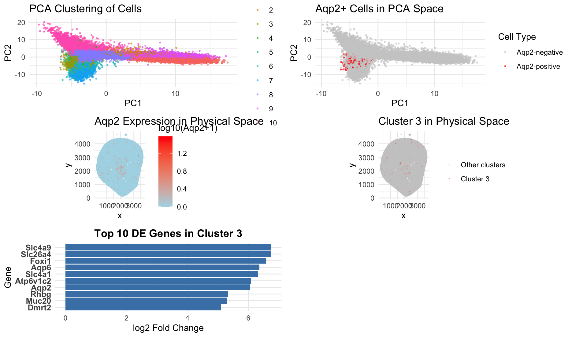
Figure Description and Interpretation
This figure integrates dimensionality reduction, spatial mapping, and differential expression analysis to characterize an Aqp2-positive cell population. In PCA space, cells form distinct clusters, with Cluster 3 separating from other groups and overlapping strongly with Aqp2-positive cells. Highlighting Aqp2-expressing cells shows that they occupy a specific region of PCA space. This indicates a transcriptionally distinct population. In physical tissue space, Aqp2 expression is spatially forming a pattern that closely matches the spatial distribution of Cluster 3. This suggests that this cluster represents a coherent anatomical and functional unit. Differential expression analysis further supports this interpretation. The top marker genes for Cluster 3 include Aqp2, Aqp6, Slc4a1, Slc26a4, Atp6v1c2, and Foxi1, which are well-established markers of renal collecting duct intercalated cells (https://esbl.nhlbi.nih.gov/Databases/MouseWK/WKMarkers.html ). In particular, Aqp2 is a canonical marker of principal cells in the collecting duct, while Slc4a1, Atp6v1c2, and Foxi1 are associated with acid-base regulation in intercalated cells. The co-expression of these transporters and proton pump components indicates that Cluster 3 corresponds to a specialized epithelial population involved in water and ion homeostasis. Previous studies have shown that Aqp2 is specifically expressed in collecting duct principal cells (https://pubmed.ncbi.nlm.nih.gov/7523157/) and that Foxi1 and Atp6v1 subunits define intercalated cells in the kidney (https://www.ncbi.nlm.nih.gov/pmc/articles/PMC3012266/). The presence of these markers, combined with the cluster’s distinct position in PCA space and its spatial localization, supports the conclusion that Cluster 3 represents a collecting duct cell population, likely enriched for Aqp2-positive principal cells with associated intercalated cell features. Together, the clustering, spatial distribution, and marker gene expression provide consistent evidence that Cluster 3 corresponds to an Aqp2-positive renal epithelial cell type rather than merely a technical artifact.
Code (paste your code in between the ``` symbols)
1
2
3
4
5
6
7
8
9
10
11
12
13
14
15
16
17
18
19
20
21
22
23
24
25
26
27
28
29
30
31
32
33
34
35
36
37
38
39
40
41
42
43
44
45
46
47
48
49
50
51
52
53
54
55
56
57
58
59
60
61
62
63
64
65
66
67
68
69
70
71
72
73
74
75
76
77
78
79
80
81
82
83
84
85
86
87
88
89
90
91
92
93
94
95
96
97
98
99
100
101
102
103
104
105
106
107
108
109
110
111
112
113
114
115
116
117
118
119
120
121
122
123
124
125
126
127
128
129

data <- read.csv("~/Desktop/Xenium-IRI-ShamR_matrix.csv.gz")
library(ggplot2)
library(dplyr)
library(stats)
library(gridExtra)

pos <- data[, c("x", "y")]
rownames(pos) <- data$X
gene_start_col <- which(colnames(data) == "y") + 1
gexp <- data[, gene_start_col:ncol(data)]
rownames(gexp) <- data$X
loggexp <- log10(gexp + 1)

# Scale
scaled_gexp <- scale(loggexp)

# PCA
pca <- prcomp(scaled_gexp)
df_pca <- data.frame(pca$x)
df_pca$cell_id <- rownames(gexp)

# K-means clustering
set.seed(42)
kmeans_res <- kmeans(scaled_gexp, centers = 10)
clusters <- as.factor(kmeans_res$cluster)
names(clusters) <- rownames(gexp)
df_pca$cluster <- clusters

#help from AI for this part: from the given dataset and code, get the aqp2 expression and find which cluster expresses most aqp2
# ============================================================================
# FOCUS ON AQP2 (Collecting Duct Principal Cells)
# ============================================================================

# Get Aqp2 expression
aqp2_exp <- gexp[, "Aqp2"]
aqp2_log_exp <- loggexp[, "Aqp2"]

# Find which cluster(s) express Aqp2 most
cluster_aqp2 <- data.frame(
  cluster = 1:10,
  mean_exp = tapply(aqp2_exp, clusters, mean),
  pct_positive = tapply(aqp2_exp > 0, clusters, mean) * 100,
  n_cells = table(clusters))


# Identify the cluster with highest Aqp2 expression
aqp2_cluster <- which.max(cluster_aqp2$mean_exp)
cat(sprintf("\nCluster %d has highest Aqp2 expression\n", aqp2_cluster))

# VISUALIZATION

df_pca$aqp2_exp <- aqp2_log_exp
pos$cluster <- clusters
pos$aqp2_exp <- aqp2_log_exp
aqp2_threshold <- 0.5
df_pca$aqp2_positive <- aqp2_log_exp > aqp2_threshold
pos$aqp2_positive <- aqp2_log_exp > aqp2_threshold

# Plot 1: PCA with clusters
p1 <- ggplot(df_pca, aes(x = PC1, y = PC2, col = cluster)) +
  geom_point(size = 0.5, alpha = 0.6) + ggtitle("PCA Clustering of Cells") + theme_minimal() + theme(legend.position = "right")


# Plot 2: Aqp2-positive cells in PCA space
p2 <- ggplot(df_pca, aes(x = PC1, y = PC2, col = aqp2_positive)) + geom_point(size = 0.5, alpha = 0.6) + scale_color_manual(values = c("gray80", "red"), labels = c("Aqp2-negative", "Aqp2-positive"),name = "Cell Type") + ggtitle("Aqp2+ Cells in PCA Space") +  theme_minimal()

# Plot 3: aqp2 expression in physical space (continuous)
p3 <- ggplot(pos, aes(x = x, y = y, col = aqp2_exp)) +
  geom_point(size = 0.3, alpha = 0.3) +
  scale_color_gradient2(low = "navy", mid = "lightblue", high = "red", midpoint = quantile(aqp2_log_exp, 0.75), name = "log10(Aqp2+1)") +
  ggtitle("Aqp2 Expression in Physical Space") + theme_minimal() + coord_fixed()

plot_data <- data.frame(x = pos$x,y = pos$y, cluster = clusters, is_cluster3 = clusters == 3)

p5 <- ggplot(plot_data, aes(x = x, y = y, col = is_cluster3)) +
  geom_point(size = 0.3, alpha = 0.3) +
  scale_color_manual(values = c("gray80", "red"),labels = c("Other clusters", "Cluster 3"), name = "") +
  ggtitle("Cluster 3 in Physical Space") + theme_minimal() + coord_fixed() + theme(legend.position = "right")

#last plot with top 10 DE genes in cluster 3

#help from AI in this part:
#write code that identifies the cluster of cells with the highest aqp2 expression group. then compare gene expression in this cluster to all other cells using a wilcoxon statistical test to find genes that are significantly more highly expressed in Aqp2+ cells. for each gene, calculate average expression, the percentage of cells expressing it, and fold change between groups. then ranks the top 10 genes
# Find Aqp2+ cluster
aqp2_cluster <- which.max(cluster_aqp2$mean_exp)
cellsOfInterest <- names(clusters)[clusters == aqp2_cluster]
otherCells <- names(clusters)[clusters != aqp2_cluster]

# Run DE tests
p_values <- sapply(colnames(gexp), function(g)
  tryCatch(wilcox.test(gexp[cellsOfInterest, g],
                       gexp[otherCells, g],
                       alternative = "greater")$p.value,
           error = function(e) 1)
)

# Build results table
p_values_df <- data.frame(
  gene = names(p_values),
  p_value = p_values,
  mean_in = colMeans(gexp[cellsOfInterest, ]),
  mean_out = colMeans(gexp[otherCells, ]),
  pct_in = colMeans(gexp[cellsOfInterest, ] > 0) * 100,
  pct_out = colMeans(gexp[otherCells, ] > 0) * 100
) %>%
  mutate(adj_p = p.adjust(p_value, "fdr"),
         fc = (mean_in + 0.01)/(mean_out + 0.01),
         log2_fc = log2(fc)) %>%
  arrange(desc(log2_fc))

# Top 10
plot_data <- head(p_values_df, 10)

#Plot
p4 <- ggplot(plot_data,
             aes(log2_fc, reorder(gene, log2_fc))) +
  geom_col(fill = "steelblue") +
  labs(x = "log2 Fold Change",
       y = "Gene",
       title = paste("Top 10 DE Genes in Cluster", aqp2_cluster)) +
  theme_minimal() +
  theme(axis.text.y = element_text(size = 10, face = "bold"),
        plot.title = element_text(size = 13, face = "bold", hjust = 0.5))

# Arrange all plots
grid.arrange(p1, p2, p3, p5, p4, ncol = 2)