Identification of Proximal Tubule Cells in Kidney Tissue

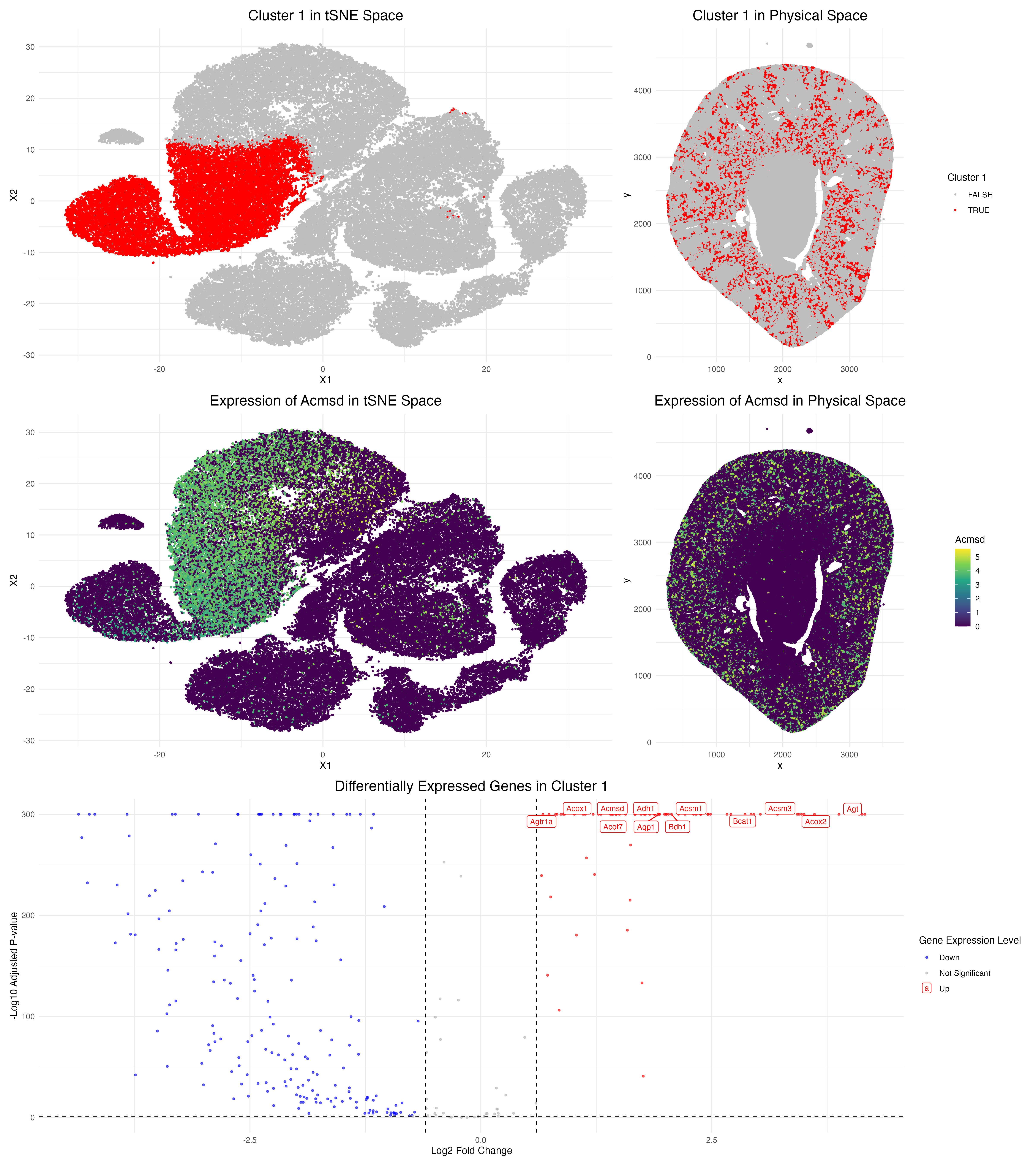
In this data visualization, I explored the gene expression of Cluster 1 from a single-cell resolution spatial kidney tissue sample. The two uppermost plots highlight this cluster of interest by representing Cluster 1 cells through red colored points in tSNE and physical space, respectively. I identified 5 clusters overall through k-means clustering, with a k value of 5 determined by optimizing the within-cluster sum of squares.
The middle visualizations focus specifically on a top marker gene characteric to Cluster 1, Acmsd, in both tSNE and physical space. A color gradient is utilized to view expression levels, where yellow/green colors correspond to higher expression, and purple corresponds to lower expression. Comparing these middle plots to the upper plots, it can be seen that Acsmd strongly localizes to the location of Cluster 1.
The bottom-most plot is a volcano plot that visualizes the differentially expressed genes in Cluster 1 compared to all of the other clusters. In this plot, each point represents a gene with color encoding its specific category. Upregulated genes are represented by the color red, and downregulated genes by the color blue. The x-axis encodes the log fold change (the ratio of expression of a gene between cluster 1 and other cells), and the y-axis represents the adjusted p-values from the Wilcox rank-sum test. The top-most statistically significant genes are also labeled in this plot. Meanwhile, dashed lines represent the thresholds for the adjusted p-value < 0.05 and a log fold change > 0.6.
From my analysis, I believe that Cluster 1 represents proximal tubular cells in the kidney based on the high upregulation of the marker gene Acmsd. Using the Human Protein Atlas, I found that Acmsd expression is highly enriched in kidney proximal tubule cells. Other top upregulated genes in my Cluster 1 include Aqp1, Acox2, and Acsm3, which are also consistent with proximal tubule function. Moreover, the spatial plots of this cluster and Acmsd expression show that cells are concentrated in the cortex region of the kidney, which is where proximal tubules are located anatomically, further supporting this cell-type annotation.
Resources: https://www.proteinatlas.org/ENSG00000153086-ACMSD/single+cell https://www.proteinatlas.org/ENSG00000168306-ACOX2/single+cell https://www.proteinatlas.org/ENSG00000005187-ACSM3/single+cell
Code
1
2
3
4
5
6
7
8
9
10
11
12
13
14
15
16
17
18
19
20
21
22
23
24
25
26
27
28
29
30
31
32
33
34
35
36
37
38
39
40
41
42
43
44
45
46
47
48
49
50
51
52
53
54
55
56
57
58
59
60
61
62
63
64
65
66
67
68
69
70
71
72
73
74
75
76
77
78
79
80
81
82
83
84
85
86
87
88
89
90
91
92
93
94
95
96
97
98
99
100
101
102
103
104
105
106
107
108
109
110
111
112
113
114
115
116
117
118
119
120
121
122
123
124
125
126
127
128
129
130
131
132
133
134
135
136
137
138
139
140
141
142
143
144
145
146
147
148
149
150
151
152
153
154
155
156
157
158
159
160
161
162
163
164
165
166
167
168
169
170
171
172
173
174
175
176
177
178
179
180
181
182
183
184
185
186
187
188
189
190
191
192
193
194
195
196
197
198
199
200
201
202
203
204
205
206
207
208
209
210
211
212
213
214
# Load in Data (Single-cell Resolution Xenium Data) ---------------------------------------------
data <- read.csv('/Users/gracexu/genomic-data-visualization-2026/data/Xenium-IRI-ShamR_matrix.csv')
pos <- data[,c('x', 'y')]
rownames(pos) <- data[,1]
gexp <- data[, 4:ncol(data)]
rownames(gexp) <- data[,1]
gexp[1:5,1:5]
dim(gexp)

# Load in required packages ------------------------------------------------------------------------------------------
library(ggplot2)
library(patchwork)

# Normalize Data (Library-size normalization --> Counts per million --> Log transformation) ---------------------------------------------
totgexp <- rowSums(gexp)
head(totgexp)
head(sort(totgexp, decreasing = TRUE))
mat <- log10(gexp / totgexp * 1e6 + 1)
dim(mat)

# PCA (Linear dimension reduction) ------------------------------------------------------------------------------------------
pcs <- prcomp(mat, center = TRUE, scale = FALSE)
names(pcs)
head(pcs$sdev)
plot(pcs$sdev[1:50])
toppcs <- pcs$x[, 1:10]

# Run tSNE ------------------------------------------------------------------------------------------------------------------------
set.seed(123) # for reproducibility

tsne <- Rtsne::Rtsne(toppcs, dims = 2, perplexity = 30)
emb <- tsne$Y
df <- data.frame(emb, totgexp)
names(df)
ggplot(df, aes(x=X1, y=X2, col=totgexp)) + geom_point(size = 0.5)

# k-Means Clustering ------------------------------------------------------------------------------------------------------------------------

## Find optimal k value by computing within sum of squares (wss)
k_vals <- 1:20
wss <- numeric(length(k_vals))

for (i in seq_along(k_vals)) {
  km <- kmeans(toppcs, # run on top 10 PCs
               centers = k_vals[i],
               nstart = 20, #nstart reduces randomness
               iter.max = 100)
  wss[i] <- km$tot.withinss
}

# make a dataframe holding k values & corresponding wss scores
df <- data.frame(
  k = k_vals,
  wss = wss
)

# make an elbow plot --> k = 5 seems like the best choice
ggplot(df, aes(x = k, y = wss)) +
  geom_line() +
  geom_point() +
  labs(
    title = "Elbow Plot for Determining Optimal k",
    x = "Number of Clusters (k)",
    y = "Total Within Sum of Squares"
  ) +
  theme_minimal()

## Run k means with center of 4
km <- kmeans(toppcs, centers = 5)
names(km)

cluster <- as.factor(km$cluster)

df <- data.frame(pos, emb, cluster, toppcs)
# tSNE
ggplot(df, aes(x=X1, y=X2, col=cluster)) + geom_point(size = 0.5)
# PCA
ggplot(df, aes(x=PC1, y=PC2, col=cluster)) + geom_point(size = 0.5)
# Spatial Plot of Clusters
ggplot(df, aes(x = x, y = y, col = cluster)) +
  geom_point(size = 0.5) +
  coord_fixed() +
  theme_minimal()

# Differential Expression Analysis ------------------------------------------------------------------------------------------------------------------------
## Select a cluster of interest --> Cluster 1
clusterofinterest <- 1
df_cluster <- df[df$cluster == clusterofinterest, ]
gexp_cluster <- mat[rownames(df_cluster), ]

# First check distribution of data by checking a random gene
hist(gexp_cluster[,1], breaks = 50) # the first gene in our cluster's data
# Data is very right-skewed --> use Wilcox test

# Identify which cells belong to cluster 1
in_cluster <- rownames(mat) %in% rownames(df_cluster)

# Run Wilcox Test for all genes in cluster 1
pvals <- sapply(colnames(mat), function(gene) {
  wilcox.test(mat[in_cluster, gene], mat[!in_cluster, gene])$p.value
})

# adjust p-values for multiple testing (Benjamini-Hochberg)
pvals_adj <- p.adjust(pvals, method = "BH")

# top 20 marker genes
top_genes <- names(sort(pvals_adj))[1:20]
top_genes

# Visualization Creation ------------------------------------------------------------------------------------------
## 1. Cluster of interest in reduced dimensional space ------------------------------------------------------------------------------------------
### tSNE
p1 <- ggplot(df, aes(x = X1, y = X2, col = cluster == clusterofinterest)) +
  geom_point(size = 0.5) +
  scale_color_manual(values = c("grey", "red")) +
  labs(color = paste("Cluster 1")) +
  theme_minimal() +
  ggtitle("Cluster 1 in tSNE Space") +
  theme(plot.title = element_text(hjust = 0.5, size = 16), legend.position = "none")
p1

## 2. Cluster of interest in physical space ------------------------------------------------------------------------------------------
p2 <- ggplot(df, aes(x = x, y = y, col = cluster == clusterofinterest)) +
  geom_point(size = 0.5) +
  scale_color_manual(values = c("grey", "red")) +
  labs(color = paste("Cluster 1")) +
  theme_minimal() +
  ggtitle("Cluster 1 in Physical Space") +
  coord_fixed()  +
  theme(plot.title = element_text(hjust = 0.5, size = 16))
p2

## 3. Differentially expressed genes for your cluster of interest ------------------------------------------------------------------------------------------
# create a volcano plot visualizing differentially expressed genes in cluster 1

library(ggrepel)

## categorize expression for the cluster of interest
in_cluster <- df$cluster == clusterofinterest

# calculate fold change
mean_in  <- colMeans(mat[in_cluster, ]) # gexp in the cluster
mean_out <- colMeans(mat[!in_cluster, ]) # gexp not in the cluster
logFC <- log2((mean_in + 1e-6) / (mean_out + 1e-6)) # log fold change

# test which genes are significantly different
pvals <- sapply(colnames(mat), function(gene) {
  wilcox.test(mat[in_cluster, gene], mat[!in_cluster, gene])$p.value
})
pvals_adj <- p.adjust(pvals, method = "BH")

# make a dataframe for the volcano plot
volcano_df <- data.frame(
  gene = colnames(mat),
  logFC = logFC,
  neglog10p = -log10(pvals_adj + 1e-300)
)

# categorize genes based on statistical significance
volcano_df$express <- "Not Significant"
volcano_df$express[volcano_df$logFC > 0.6 & pvals_adj < 0.05] <- "Up"
volcano_df$express[volcano_df$logFC < -0.6 & pvals_adj < 0.05] <- "Down"

# identify the top genes to label on the plot
top_genes <- volcano_df[order(pvals_adj)[1:12], ]

# create volcano plot
p3 <- ggplot(volcano_df, aes(x = logFC, y = neglog10p, col = express)) +
  geom_point(alpha = 0.6, size = 0.8) +
  geom_hline(yintercept = -log10(0.05), linetype = "dashed") +
  geom_vline(xintercept = c(-0.6, 0.6), linetype = "dashed") +
  geom_label_repel(data = top_genes, aes(label = gene), size = 3, max.overlaps = 20) +
  scale_color_manual(values = c("Up" = "red", "Down" = "blue", "Not Significant" = "grey70")) +
  labs(title = "Differentially Expressed Genes in Cluster 1",
       x = "Log2 Fold Change",
       y = "-Log10 Adjusted P-value",
       col = "Gene Expression Level") +
  theme_minimal()  +
  theme(plot.title = element_text(hjust = 0.5, size = 16))
p3

## 4. DEG in reduced dimensional space
### tSNE
### gene of interest = Acsmd
df_expr <- df
df_expr$Acsm3 <- mat[, 'Acsmd']
p4 <- ggplot(df_expr, aes(x = X1, y = X2, col = Acsmd)) +
  geom_point(size = 0.5) +
  scale_color_viridis_c() +
  theme_minimal() +
  ggtitle(paste("Expression of Acsmd in tSNE Space"))  +
  theme(plot.title = element_text(hjust = 0.5, size = 16), legend.position = "none")
p4

## 5. Visualizing one of these DEG in space
p5 <- ggplot(df_expr, aes(x = x, y = y, col = Acsmd)) +
  geom_point(size = 0.5) +
  scale_color_viridis_c() +
  theme_minimal() +
  ggtitle(paste("Expression of Acsmd in Physical Space")) +
  coord_fixed()  +
  theme(plot.title = element_text(hjust = 0.5, size = 16))
p5

# Combine all plots
(p1 | p2) / (p4 | p5) / p3

# Save plot
ggsave("/Users/gracexu/genomic-data-visualization-2026/homework_submission/HW3_Plots.png", width = 16, height = 18, dpi = 300)

# AI Help Prompts:
## How can I create an elbow plot to visualize the total within sum of squares against different k values to find the optimal k value for my spatial transcriptomics data?
## I have identified a cluster of interest in my spatial transcriptomics data. How can I approach finding the top marker genes of this cluster using a Wilcox testing approach?
## How can I make a volcano plot to visualize differentially expressed genes in a specific cluster of interest, with color coding to represent downregulated and upregulated genes based on log fold change and adjusted p-values?