Visualization of Proximal Tubule Cells in Kidney Tissue Sample

Description of Data Visualization:
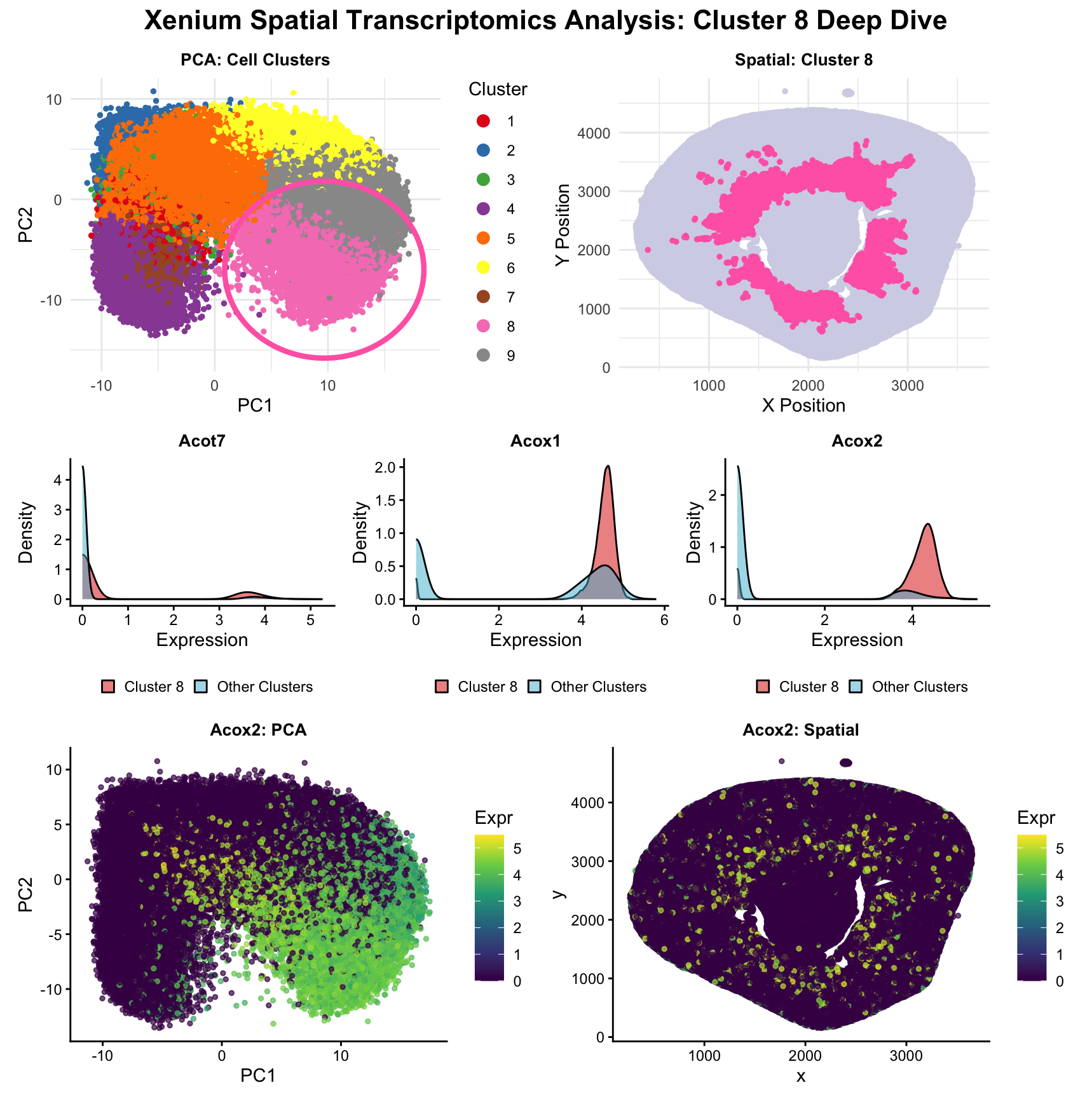
The raw Xenium dataset was normalized according to library size and log normalization before having its dimensionality reduced using principal component analysis.
After reducing the dataset into 2 dimensions (PC1 and PC2), k means clustering was conducted with 9 clusters. 9 clusters were used because the scree plot of withinness for k=1-15 showed a plateau after k=9 clusters. The k=9 k means clustering was conducted multiple times with different seeds yielding similar clusterings, validating the chosen number for k.
The chosen cluster of interest was cluster 8. This cluster was chosen mainly because it had an interesting spatial spread where cells in cluster 8 formed a ring in the center of the tissue with rays, with little-to-no cells on the outside edge of the tissue.
A looped 1-tailed Mann Whitney U-Test was used to distinguish cell expression between cluster 8 (the cluster of interest) and all other clusters for all 299 genes. The three most differentially expressed genes (3 lowest p-values) were graphed in density plots comparing their expression in cluster 8 and in other clusters. Acox2 was chosen as the gene to be further analyzed because it displayed a high level of expression in cluster 8, while having very little overlap between its expression level in cluster 8 and the other clusters.
The PCA plot for Acox2 shows significant overlap with cluster 8 in PC space, strengthening the case that its expression is correlated to this particular cluster. Although the association is more loose in the spatial visualization for Acox2, the case can still be made that concentrations of higher Acox2 expression tend to group around the inner ring of the tissue sample.
Using the methodology described above, a multi-panel data visualization was created to determine the cell type of the cells captured in cluster 8, the inner ring of the tissue sample. Given that this dataset is derived from a kidney tissue sample, I focused my search on cell types within the kidney with high expression of Acox2. The Human Protein Atlas cited proximal tubule cells as cells with high expression of Acox2, which is also supported by Okamura et al., which explains that renal Acox2 serves a role in the oxidation of fatty acids in the renal medulla. Based on these findings from literature review, and combined with the expression of Acox2 being concentrated most highly around the gaps in the center of the tissue sample that seem to follow the size and shape of renal tubules, it is reasonable to conclude that cell cluster 8 represents proximal tubule cells in this renal tissue sample.
Sources:
https://www.proteinatlas.org/ENSG00000168306-ACOX2#:~:text=Proximal%20tubule%20cells%2C%20Fibro%2Dadipogenic%20progenitors&text=ACOX2%20is%20a%20prognostic%20marker%20in%20Kidney%20renal%20clear%20cell%20carcinoma%2C%20Lung%20adenocarcinoma
Okamura, M., Ueno, T., Tanaka, S., Murata, Y., Kobayashi, H., Miyamoto, A., Abe, M., & Fukuda, N. (2021). Increased expression of acyl-CoA oxidase 2 in the kidney with plasma phytanic acid and altered gut microbiota in spontaneously hypertensive rats. Hypertension research : official journal of the Japanese Society of Hypertension, 44(6), 651–661. https://doi.org/10.1038/s41440-020-00611-z
Code:
1
2
3
4
5
6
7
8
9
10
11
12
13
14
15
16
17
18
19
20
21
22
23
24
25
26
27
28
29
30
31
32
33
34
35
36
37
38
39
40
41
42
43
44
45
46
47
48
49
50
51
52
53
54
55
56
57
58
59
60
61
62
63
64
65
66
67
68
69
70
71
72
73
74
75
76
77
78
79
80
81
82
83
84
85
86
87
88
89
90
91
92
93
94
95
96
97
98
99
100
101
102
103
104
105
106
107
108
109
110
111
112
113
114
115
116
117
118
119
120
121
122
123
124
125
126
127
128
129
130
131
132
133
134
135
136
137
138
139
140
141
142
143
144
145
146
147
148
149
150
151
152
153
154
155
156
157
158
159
160
161
162
163
164
165
166
167
168
169
170
171
172
173
174
175
176
177
178
179
180
181
182
183
184
185
186
187
188
189
190
191
192
193
194
195
196
# import
library(ggplot2)

# read in the data
data <- read.csv('/Users/henryaceves/Desktop/JHU/S2/GDV/GDV datasets/Xenium-IRI-ShamR_matrix.csv.gz')
# dim(data)
# head(data)

# build the dataframe
pos <- data[,c('x','y')]
rownames(pos) <- data[,1]
gexp <- data[,4:ncol(data)]
rownames(gexp) <- data[,1]

# Normalization (Library size + log transformation)
totgexp <- rowSums(gexp)
mat <- log10(gexp / totgexp * 1e6 + 1)

# PCA (to reduce data size for tSNE)
pcs <- prcomp(mat, center = TRUE, scale = FALSE)
plot(pcs$sdev)
toppcs <- pcs$x[, 1:10]

# kmeans
# set.seed(123)
# clusters <- as.factor(kmeans(toppcs, centers=9)$cluster)
# df <- data.frame(pcs$x, pos, clusters)
# ggplot(df, aes(x=PC1, y=PC2, col=clusters)) + geom_point(cex=0.5)
# ggplot(df, aes(x=x, y=y, col=clusters)) + geom_point(cex=0.5)

# deeper dive of clusters, asked Claude to make the colors more readable on the plots
set.seed(123)
clusters <- as.factor(kmeans(toppcs, centers = 9, nstart = 25)$cluster)
df <- data.frame(pcs$x, pos, clusters)

# PC plot with pink circle around cluster 8
# Calculate center and radius of cluster 8
cluster8_cells <- df[clusters == 8, ]
center_x <- mean(cluster8_cells$PC1)
center_y <- mean(cluster8_cells$PC2)
radius <- max(sqrt((cluster8_cells$PC1 - center_x)^2 + (cluster8_cells$PC2 - center_y)^2)) * 0.8  # Smaller

ggplot(df, aes(x = PC1, y = PC2, col = clusters)) +
  geom_point(size = 0.5) +
  annotate("path",
           x = center_x + radius * cos(seq(0, 2*pi, length.out = 100)),
           y = center_y + radius * sin(seq(0, 2*pi, length.out = 100)),
           color = "#FF69B4",
           linewidth = 1) +
  scale_color_brewer(palette = "Set1") +
  labs(title = "PCA: Cell Clusters",
       x = "PC1",
       y = "PC2",
       col = "Cluster") +
  theme_minimal() +
  theme(
    plot.title = element_text(hjust = 0.5, face = "bold"),
    legend.position = "right"
  ) +
  guides(color = guide_legend(override.aes = list(size = 3)))

# Spatial plot
ggplot(df, aes(x = x, y = y, col = clusters)) +
  geom_point(size = 0.5) +
  scale_color_brewer(palette = "Set1") +
  labs(title = "Spatial: Cell Clusters",
       x = "X Position",
       y = "Y Position",
       col = "Cluster") +
  theme_minimal() +
  theme(
    plot.title = element_text(hjust = 0.5, face = "bold"),
    legend.position = "right"
  ) +
  guides(color = guide_legend(override.aes = list(size = 3)))

# Help from Claude "Help me create a withinness graph"
tot_withinss <- sapply(1:15, function(k) {
  kmeans(toppcs, centers = k, nstart = 10)$tot.withinss
})

elbow_df <- data.frame(
  k = 1:15,
  withinss = tot_withinss
)

ggplot(elbow_df, aes(x = k, y = withinss)) +
  geom_line() +
  geom_point(size = 3) +
  scale_x_continuous(breaks = 1:15) +
  labs(x = "Number of Clusters (k)",
       y = "Total Within-Cluster Sum of Squares",
       title = "Elbow Plot") +
  theme_minimal()
# upon visual inspection, k should probably be between 7-9, went back up to change it


# deeper dive of clusters..
# Create highlight column
df$cluster_highlight <- ifelse(clusters == 8, "8", "Other")

# Get cluster 8 color from science palette
science_colors <- c("#E64B35", "#4DBBD5", "#00A087", "#3C5488",
                    "#F39B7F", "#8491B4", "#91D1C2", "#DC0000", "#7E6148")
cluster8_color <- science_colors[8]

ggplot(df, aes(x = x, y = y, col = cluster_highlight)) +
  geom_point(size = 0.5) +
  scale_color_manual(values = c("8" = cluster8_color, "Other" = "#D4D4E8"),
                     name = "Cluster") +
  labs(title = "Spatial: Cluster 8",
       x = "X Position",
       y = "Y Position") +
  theme_classic() +
  theme(
    plot.title = element_text(hjust = 0.5, face = "bold"),
    axis.text = element_text(color = "black"),
    legend.position = "right"
  ) +
  guides(color = guide_legend(override.aes = list(size = 3)))

# between cells of cluster 8 vs all others (copied from classwork)
clusterofinterest <- names(clusters)[clusters == 8]
othercells <- names(clusters)[clusters != 8]
out <- sapply(colnames(mat), function(gene) {
  x1 <- mat[clusterofinterest, gene]
  x2 <- mat[othercells, gene]
  wilcox.test(x1, x2, alternative='greater')$p.value
})
head(sort(out))

# Help from Claude, create density plots to compare distributions of
# top3 differentially regulated genes in Cluster 8 versus other clusters
# with the intent of choosing the gene with the least overlap
# to create further visualizations
# in this case it was 'Acox2' because of the small overlap and
# large expression in Cluster 8
library(patchwork)

top3_genes <- names(sort(out))[1:3]
hist_plots <- list()

for(i in 1:3) {
  gene <- top3_genes[i]

  df_hist <- data.frame(
    expression = mat[, gene],
    group = ifelse(clusters == 8, "Cluster 8", "Other Clusters")
  )

  hist_plots[[i]] <- ggplot(df_hist, aes(x = expression, fill = group)) +
    geom_density(alpha = 0.5) +
    scale_fill_manual(values = c("Cluster 8" = "#DC0000", "Other Clusters" = "#4DBBD5")) +
    labs(title = gene, x = "Expression", y = "Density", fill = "") +
    theme_classic() +
    theme(
      plot.title = element_text(hjust = 0.5, face = "bold", size = 12),
      axis.text = element_text(color = "black"),
      legend.position = "bottom"
    )
}

hist_plots[[1]] + hist_plots[[2]] + hist_plots[[3]] +
  plot_layout(guides = "collect") +
  plot_annotation(title = "Expression Distribution: Cluster 8 vs Others",
                  theme = theme(plot.title = element_text(hjust = 0.5, face = "bold", size = 14))) &
  theme(legend.position = "bottom")

# plots of Acox2 <- asked Claude to create side-by-side plots for Acox 2 expression in PCA and spatial space
library(patchwork)

df_gene <- data.frame(pcs$x, pos, clusters, gene = mat[, "Acox2"])

p1 <- ggplot(df_gene, aes(x = PC1, y = PC2, col = gene)) +
  geom_point(size = 0.5, alpha = 0.5) +
  scale_color_viridis_c() +
  labs(title = "PCA", col = "Expr") +
  theme_classic() +
  theme(
    plot.title = element_text(hjust = 0.5, face = "bold"),
    axis.text = element_text(color = "black")
  )

p2 <- ggplot(df_gene, aes(x = x, y = y, col = gene)) +
  geom_point(size = 0.5, alpha = 0.5) +
  scale_color_viridis_c() +
  labs(title = "Spatial", col = "Expr") +
  theme_classic() +
  theme(
    plot.title = element_text(hjust = 0.5, face = "bold"),
    axis.text = element_text(color = "black")
  )

p1 + p2 +
  plot_annotation(title = "Acox2",
                  theme = theme(plot.title = element_text(hjust = 0.5, face = "bold", size = 14)))