HW3

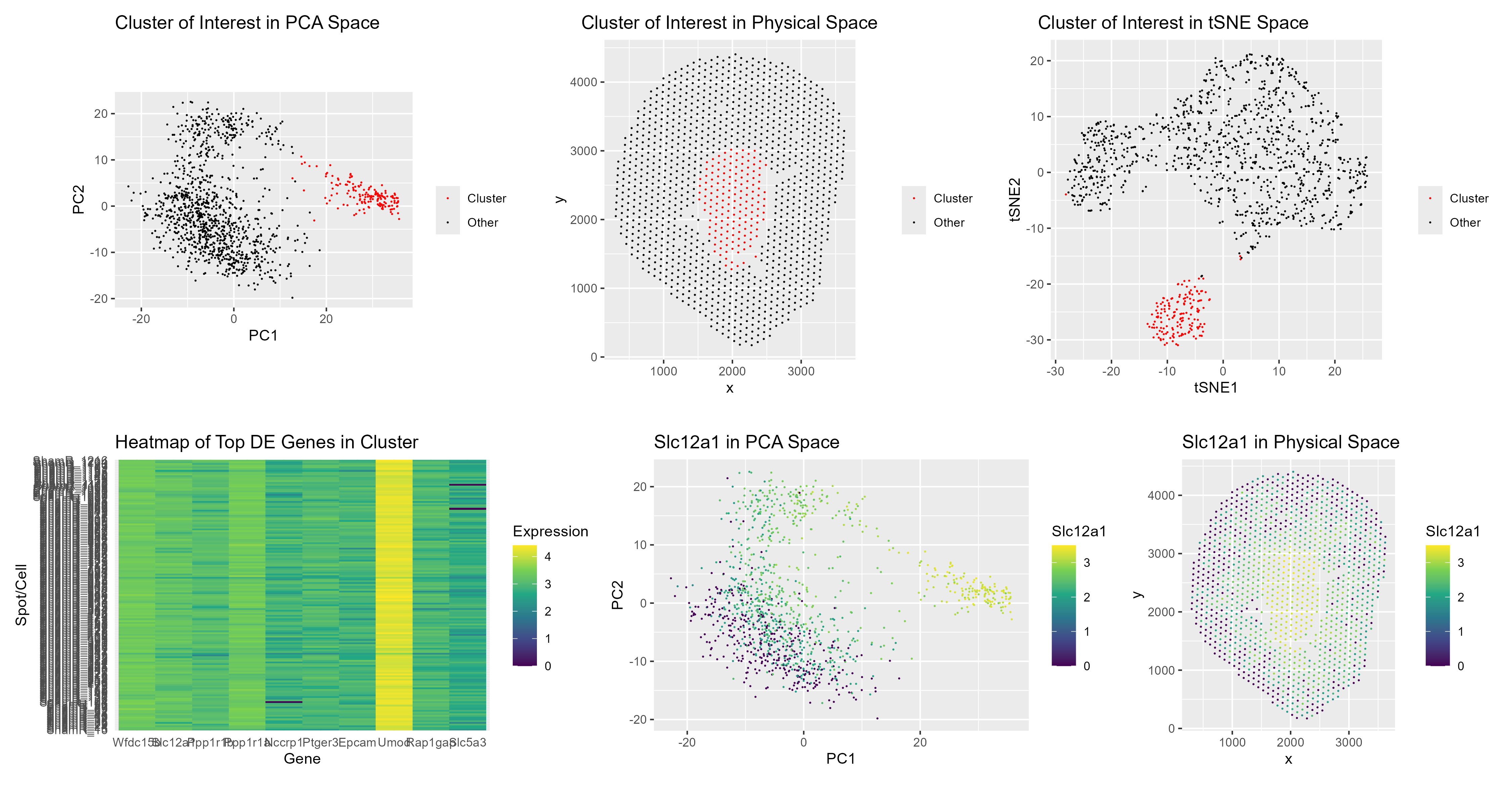
- Describe your figure briefly so we know what you are depicting (you no longer need to use precise data visualization terms as you have been doing). Write a description to convince me that your cluster interpretation is correct. Your description may reference papers and content that allowed you to interpret your cell cluster as a particular cell-type. The figures collectively show the clustering patterns and spatial organization of cells within the Visium dataset, using PCA and tSNE to visualize how cells group together in reduced dimensional space, and then mapping those same clusters back onto the physical tissue. In other words, I am showing both how the cells relate to each other transcriptionally and where they sit anatomically. The heatmap further highlights the differentially expressed genes within my cluster of interest, making it clear which genes define this group relative to the others.
The final two visualizations focus specifically on the expression of Slc12a1, which is a well-established marker for cells in the thick ascending limb of the Loop of Henle (Park et al., 2018). By displaying Slc12a1 expression in PCA space and in physical tissue space, I demonstrate that this gene is not randomly expressed, but instead is strongly enriched in a specific, coherent cluster of cells.
Importantly, Slc12a1 is not acting alone. Other genes such as Ptger3, Umod, and Slc5a3 are also highly expressed in this same cluster. Slc12a1 (NKCC2) and Umod (uromodulin) are classic and widely cited markers of the thick ascending limb in kidney single-cell atlases (Balzer et al., 2022; Tang et al., 2021; Park et al., 2018). The coordinated, high-level expression of these markers within this cluster, alongside their relatively low expression in other clusters, strongly supports the interpretation that this group represents Loop of Henle cells.
Additionally, the presence of Epcam, a general epithelial marker, is consistent with the identity of renal tubular epithelial cells. At the same time, the low or absent expression of markers associated with other kidney cell types further strengthens the specificity of this assignment.
Taken together, the clustering structure, spatial localization, and coordinated expression of well-established Loop of Henle markers provide converging evidence that this cluster represents cells from the thick ascending limb segment. This interpretation aligns closely with published kidney single-cell transcriptomic studies, which use these same markers to define Loop of Henle populations (Park et al., 2018; Wu et al., 2018; Balzer et al., 2022).
References Balzer MS, Rohacs T, Susztak K. How Many Cell Types Are in the Kidney and What Do They Do? Annu Rev Physiol. 2022 Feb 10;84:507-531. doi: 10.1146/annurev-physiol-052521-121841. Epub 2021 Nov 29. PMID: 34843404; PMCID: PMC9233501 Tang R, Meng T, Lin W, Shen C, Ooi JD, Eggenhuizen PJ, Jin P, Ding X, Chen J, Tang Y, Xiao Z, Ao X, Peng W, Zhou Q, Xiao P, Zhong Y, Xiao X. A Partial Picture of the Single-Cell Transcriptomics of Human IgA Nephropathy. Front Immunol. 2021 Apr 16;12:645988. doi: 10.3389/fimmu.2021.645988. PMID: 33936064; PMCID: PMC8085501 Park J, Shrestha R, Qiu C, Kondo A, Huang S, Werth M, Li M, Barasch J, Suszták K. Single-cell transcriptomics of the mouse kidney reveals potential cellular targets of kidney disease. Science. 2018 May 18;360(6390):758-763. doi: 10.1126/science.aar2131. Epub 2018 Apr 5. PMID: 29622724; PMCID: PMC6188645 Fendler A, Bauer D, Busch J, Jung K, Wulf-Goldenberg A, Kunz S, Song K, Myszczyszyn A, Elezkurtaj S, Erguen B, Jung S, Chen W, Birchmeier W. Inhibiting WNT and NOTCH in renal cancer stem cells and the implications for human patients. Nat Commun. 2020 Feb 17;11(1):929. doi: 10.1038/s41467-020-14700-7. PMID: 32066735; PMCID: PMC7026425 Wu H, et al. (2018). Comparative Analysis and Refinement of Human PSC-Derived Kidney Organoid Differentiation with Single-Cell Transcriptomics. JASN, 29(10), 2345–2360
- Code ``` setwd(“C:/Users/John-Paul/Documents/Doctoral_Doctor/PhD/LEARN/Gene_Data_Viz/genomic-data-visualization-2026”) data <- read.csv(gzfile(“data/Visium-IRI-ShamR_matrix.csv.gz”))
pos <- data[,c(‘x’, ‘y’)] rownames(pos) <- data[,1] gexp <- data[, 4:ncol(data)] rownames(gexp) <- data[,1]
Normalize
totgexp = rowSums(gexp) mat <- log10(gexp/totgexp * 1e6 + 1)
Dimensionality reduction PCA & tSNE
pcs <- prcomp(mat, center=TRUE, scale=FALSE) library(Rtsne) tSNE <- Rtsne::Rtsne(pcs$x[, 1:10], dim=2) emb <- tSNE$Y colnames(emb) <- c(“tSNE1”, “tSNE2”)
K-means clustering
set.seed(123)
km <- kmeans(pcs$x[, 1:10], centers = 4)
cluster <- as.factor(km$cluster)
table(cluster)
Choose your cluster of interest
cluster_of_interest <- 3
Find DE genes: compare expression in cluster_of_interest vs. others
in_cluster <- cluster == cluster_of_interest de_stats <- apply(mat, 2, function(gene) { wilcox.test(gene[in_cluster], gene[!in_cluster])$statistic }) de_genes <- names(sort(abs(de_stats), decreasing = TRUE))[1:10]
df <- data.frame( pos, pcs$x[, 1:10], cluster, mat[, de_genes], emb)
library(ggplot2) library(patchwork) cluster_of_interest <- 3
VIsualizations
df$Group <- ifelse(cluster == cluster_of_interest, “Cluster”, “Other”) p1 <- ggplot(df, aes(x = PC1, y = PC2, color = Group)) + geom_point(size=0.05) + labs(title = “Cluster of Interest in PCA Space”, color = “”) + scale_color_manual(values = c(“Other” = “black”, “Cluster” = “red”)) + coord_fixed() p6 <- ggplot(df, aes(x = tSNE1, y = tSNE2, color = Group)) + geom_point(size=0.05) + labs(title = “Cluster of Interest in tSNE Space”, color = “”) + scale_color_manual(values = c(“Other” = “black”, “Cluster” = “red”)) + coord_fixed() p2 <- ggplot(df, aes(x = x, y = y, color = Group)) + geom_point(size=0.05) + labs(title = “Cluster of Interest in Physical Space”, color = “”) + scale_color_manual(values = c(“Other” = “black”, “Cluster” = “red”)) + coord_fixed()
mat_cluster <- mat[in_cluster, de_genes] mat_cluster <- as.matrix(mat_cluster) library(reshape2) df_heat <- melt(mat_cluster) colnames(df_heat) <- c(“Spot”, “Gene”, “Expression”) p3 <- ggplot(df_heat, aes(x = Gene, y = Spot, fill = Expression)) + geom_tile(linewidth = 0.05) + scale_fill_viridis_c() + labs(title = “Heatmap of Top DE Genes in Cluster”, x = “Gene”, y = “Spot/Cell”) + theme_minimal()
gene1 <- de_genes[2] p4 <- ggplot(df, aes(x = PC1, y = PC2, color = get(gene1))) + geom_point(size=0.05) + labs(title = paste(gene1, “in PCA Space”), color = gene1) + scale_color_viridis_c() + coord_fixed()
p5 <- ggplot(df, aes(x = x, y = y, color = get(gene1))) + geom_point(size=0.05) + labs(title = paste(gene1, “in Physical Space”), color = gene1) + scale_color_viridis_c() + coord_fixed()
top_row <- p1 | p2 | p6 bottom_row <- p3 | p4 | p5 (top_row + plot_layout(widths = c(1, 1, 1.2))) / bottom_row
ggsave(“hw3_jakinba1.png”, width = 15, height = 8, units = “in”, dpi = 300) ```