Identification of kidney collecting duct principal cells through principal component analysis, k-means clustering, and differential expression analysis

1. Figure description
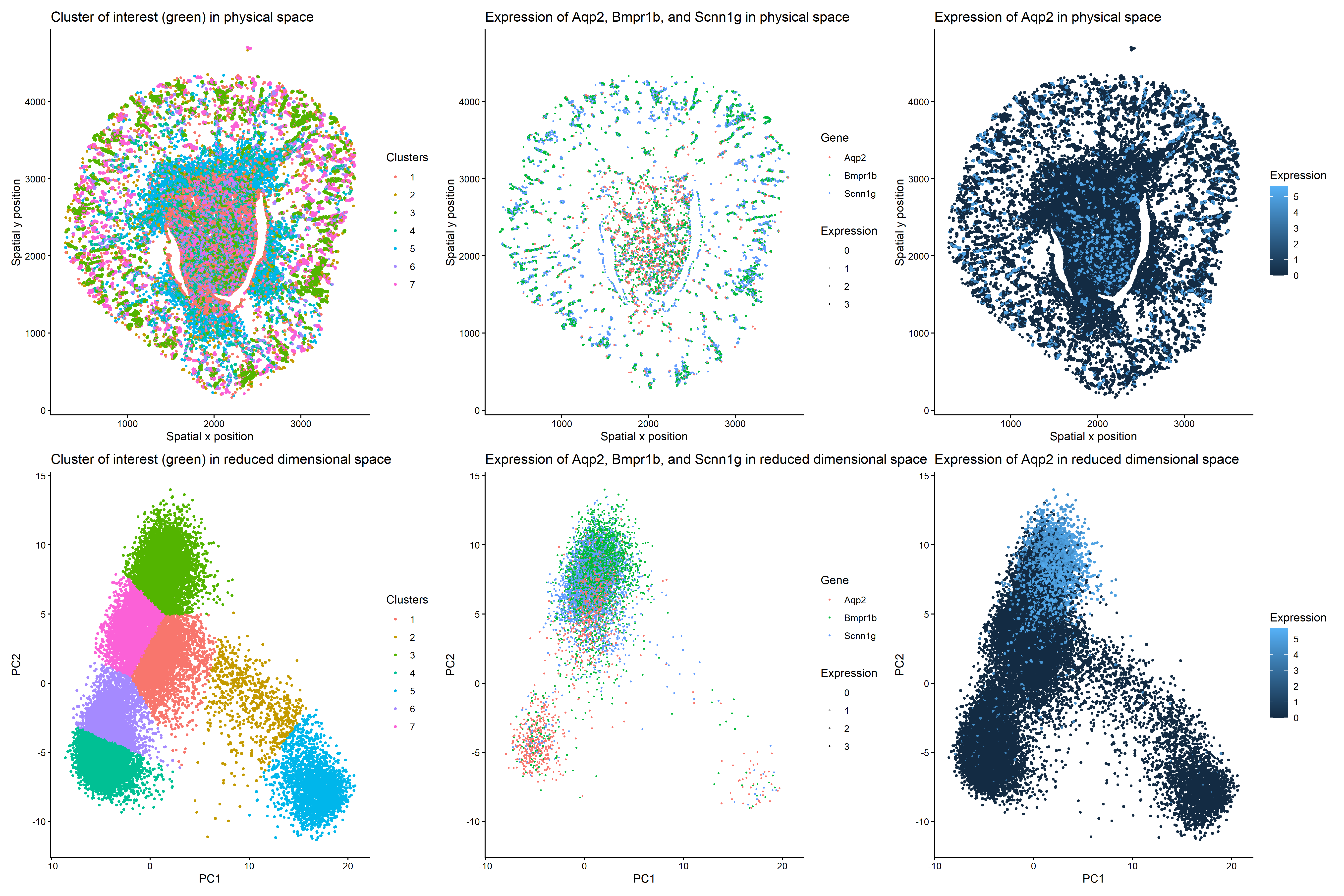
This multi-panel data visualization uses principal component analysis, k-means clustering, and differential expression analysis to characterize a cluster of interest based on gene expression patterns. In the top left plot, cells are visualized in physical tissue space and colored by cluster identity. The chosen cluster of interest, Cluster 3, is labeled with a kelly green hue. In the top middle plot, spatial expression patterns of three genes (Aqp2, Bmpr1b, and Scnn1g) are shown across the tissue. These genes are differentially upregulated in the cluster of interest, showing increased expression in regions overlapping with Cluster 3. In the top right plot, the spatial expression of Aqp2 alone is shown with expression levels encoded by color saturation on a blue scale. Higher levels of expression localize to regions corresponding to the cluster of interest.
In the bottom left plot, cells are visualized in reduced dimensional space using principal component analysis. The cluster of interest, Cluster 3, is once again labeled with a kelly green hue. In the bottom middle plot, expression patterns of Aqp2, Bmpr1b, and Scnn1g are projected onto PCA space, demonstrating increased expression within the same region as Cluster 3. In the bottom right plot, the expression of Aqp2 alone is visualized in PCA space with expression levels encoded by color saturation on a blue scale. Similar to the top plots, higher levels of Aqp2 expression localize to regions corresponding to Cluster 3.
2. Characterization of cluster of interest
Cluster 3 is most consistent with kidney collecting duct principal cells based on the differentially upregulated expression of characteristic genes in regions that correlate with the cluster of interest. Kidney collecting duct principal cells are specialized cells found in the nephron that contribute to homeostasis by regulating water reabsorption [1]. Studies have identified Aqp2, Bmpr1b, and Scnn1g as well-established markers for this specific cell type since they play roles in reabsorption and signaling pathways [1,2,3].
To focus the analysis on epithelial cell populations, cells expressing a widely used surface marker called EpCAM were subsetted prior to dimensionality reduction [4]. This allows for more precise characterization of epithelial cell clusters. Next, in reduced dimensional space, Cluster 3 forms a distinct grouping, suggesting that these cells share transcriptional similarities. Visualizing Aqp2, Bmpr1b, and Scnn1g in PCA space shows that these three genes are strongly enriched within this cluster, and performing differential expression analysis via the Wilcoxon Rank Sum Test confirms this observation. All three genes have p-values of 0, indicating they are highly differentially upregulated in the cluster of interest as compared to all other clusters. Furthermore, spatial mapping shows that expression of all three genes colocalizes with Cluster 3 in physical space, too.
3. List of references
- https://journals.physiology.org/doi/full/10.1152/ajprenal.00053.2009
- https://www.pnas.org/doi/10.1073/pnas.1710964114
- https://cellxgene.cziscience.com/cellguide/CL_1001431
- https://www.biocompare.com/Editorial-Articles/617826-A-Guide-to-Epithelial-Cell-Markers/
4. Code
1
2
3
4
5
6
7
8
9
10
11
12
13
14
15
16
17
18
19
20
21
22
23
24
25
26
27
28
29
30
31
32
33
34
35
36
37
38
39
40
41
42
43
44
45
46
47
48
49
50
51
52
53
54
55
56
57
58
59
60
61
62
63
64
65
66
67
68
69
70
71
72
73
74
75
76
77
78
79
80
81
82
83
84
85
86
87
88
89
90
91
92
93
94
95
96
97
98
99
100
101
102
103
104
105
106
107
108
109
110
111
112
113
114
115
116
117
118
119
120
121
122
123
124
125
126
127
128
129
130
131
132
133
134
135
136
137
138
139
140
141
142
143
144
145
146
147
148
149
150
151
152
153
154
155
156
157
158
159
160
161
162
163
164
165
166
167
168
169
170
171
# Read data
data <- read.csv('C:/Users/jamie/OneDrive - Johns Hopkins/Documents/Genomic Data Visualization/Xenium-IRI-ShamR_matrix.csv.gz')

# Each row represents one cell
# First column represents cell names
# Second and third columns represent x and y spatial positions of cells
# Fourth and beyond columns represent expression of specific genes in cells
data[1:5,1:5]

# Split up spatial data and gene expression data

# Create spatial data frame with second and third columns of old data frame
# Set row names of spatial data frame as first column of old data frame
pos <- data[,c('x','y')]
rownames(pos) <- data[,1]
head(pos)

# Create gene expression data frame with fourth and beyond columns of old data frame
# Set row names of gene expression data frame as first column of old data frame
gexp <- data[,4:ncol(data)]
rownames(gexp) <- data[,1]
gexp[1:5,1:5]

# How many total genes are detected per cell?
# Since rows represent cells, add all gene expression counts for each row
totgexp <- rowSums(gexp)
head(totgexp)

# Cells with highest total gene expression counts
head(sort(totgexp, decreasing = TRUE))

# Cells with lowest total gene expression counts
head(sort(totgexp, decreasing = FALSE))

# Data has high variation in total gene expression counts per cell
# We may have captured different proportions of cell volume, thus affecting total expression counts

# Obtain proportional representation of each gene's expression in each cell
# Normalize by counts per million with pseudo-count of 1 to avoid getting undefined values
# Log-transform makes data more Gaussian
mat <- log10(gexp/totgexp * 1e6 + 1)
head(mat)
newtotgexp <- rowSums(mat)

# Cells with highest total gene expression counts
head(sort(newtotgexp, decreasing = TRUE))

# Cells with lowest total gene expression counts
head(sort(newtotgexp, decreasing = FALSE))

# Variation in data has been reduced

# Identify epithelial cells using EpCAM expression above 0
epicells <- rownames(mat)[mat[,'Epcam'] > 0]
head(epicells)

# Subset gene expression and spatial data to epithelial cells only to narrow down our focus
mat_epi <- mat[epicells, ]
head(mat_epi)
pos_epi <- pos[epicells, ]
head(pos_epi)

# Make PCs with default settings
pcs <- prcomp(mat_epi, center = TRUE, scale = FALSE)
df_pcs <- data.frame(pcs$x, pos_epi)
library(ggplot2)
ggplot(df_pcs, aes(x=x, y=y, col=PC1)) + geom_point(size=0.5)

# Choose to visualize data on PC1 and PC2 because they capture the greatest proportion of total variance in data

# Create elbow plot for number of clusters vs. total within-cluster sum of squares
centers <- 1:20
tot_withinss <- numeric(length(centers))

for (i in centers) {
  km <- kmeans(mat_epi, centers = i)
  tot_withinss[i] <- km$tot.withinss
}

plot(centers, tot_withinss, type = "b",
     xlab = "Number of centers (k)",
     ylab = "Total within-cluster sum of squares",
     main = "Elbow Plot for k-means")

# Variation in total within-cluster sum of squares starts to decrease around number 7

# K means clustering
# First set centers to 7 due to the results of the elbow plot, then check plots
# Set seed to any number to keep cluster of interest labeled the same color
set.seed(123)
clusters <- as.factor(kmeans(pcs$x[,1:2], centers=7)$cluster)
df_clusters <- data.frame(pcs$x, pos_epi, clusters)
g1 <- ggplot(df_clusters, aes(x=x, y=y, col=clusters)) + geom_point(size=0.9) + labs(x='Spatial x position', y='Spatial y position', title='Cluster of interest (green) in physical space', color='Clusters') + theme_classic()
g4 <- ggplot(df_clusters, aes(x=PC1, y=PC2, col=clusters)) + geom_point(size=0.9) + labs(x='PC1', y="PC2", title='Cluster of interest (green) in reduced dimensional space', color='Clusters') + theme_classic()

# Compare gene expression in cells of cluster of interest vs. cells of all other clusters
clusterofinterest <- names(clusters)[clusters == 3]
othercells <- names(clusters)[clusters != 3]

# Loop to compare expression of all genes in cluster of interest vs. other clusters
out <- sapply(colnames(mat_epi), function(gene) {
  x1 <- mat_epi[clusterofinterest, gene]
  x2 <- mat_epi[othercells, gene]
  wilcox.test(x1, x2, alternative = 'greater')$p.value
})
out

# See which genes have p values of 0 and thus are highly upregulated in cluster of interest compared to all other clusters
out[out==0]

# Aqp2 has p value of 0 and serves as marker for kidney collecting duct principal cells (type of epithelial cell)
df_aqp2 <- data.frame(pcs$x, pos_epi, clusters, gene=mat_epi[,'Aqp2'])
g6 <- ggplot(df_aqp2, aes(x=PC1, y=PC2, col=gene)) + geom_point(size=0.9) + labs(x='PC1', y="PC2", title='Expression of Aqp2 in reduced dimensional space', color = "Expression") + theme_classic()
g3 <- ggplot(df_aqp2, aes(x=x, y=y, col=gene)) + geom_point(size=0.9) + labs(x='Spatial x position', y="Spatial y position", title='Expression of Aqp2 in physical space', color = "Expression") + theme_classic()

# Scnn1g has p value of 0 and serves as marker for kidney collecting duct principal cells (type of epithelial cell)
df_scnn1g <- data.frame(pcs$x, pos_epi, clusters, gene=mat_epi[,'Scnn1g'])
# ggplot(df_scnn1g, aes(x=PC1, y=PC2, col=gene)) + geom_point(cex=0.5, alpha=0.5) + labs(color = "Scnn1g")
# ggplot(df_scnn1g, aes(x=x, y=y, col=gene)) + geom_point(size=0.5) + labs(color = "Scnn1g")

# Bmpr1b has p value of 0 and serves as marker for kidney collecting duct principal cells (type of epithelial cell)
df_bmpr1b <- data.frame(pcs$x, pos_epi, clusters, gene=mat_epi[,'Bmpr1b'])
# ggplot(df_bmpr1b, aes(x=PC1, y=PC2, col=gene)) + geom_point(cex=0.5, alpha=0.5) + labs(color = "Bmpr1b")
# ggplot(df_bmpr1b, aes(x=x, y=y, col=gene)) + geom_point(size=0.5) + labs(color = "Bmpr1b")

# Make combined dataframe for all three genes
df_all <- data.frame(
  pcs$x,
  pos_epi,
  clusters,
  Aqp2   = mat_epi[,'Aqp2'],
  Scnn1g = mat_epi[,'Scnn1g'],
  Bmpr1b = mat_epi[,'Bmpr1b']
)

# Convert to long format
library(tidyr)

df_long <- pivot_longer(df_all,
                        cols = c(Aqp2, Scnn1g, Bmpr1b),
                        names_to = "gene",
                        values_to = "expression")

# Plot all genes on same axes with different colors
# Use smaller sized points to better visualize co-localization of all three genes/colors
g5 <- ggplot(df_long, aes(x = PC1, y = PC2, col = gene, alpha = expression)) +
  geom_point(size = 0.6, shape = 16) +
  labs(x='PC1', y='PC2', title='Expression of Aqp2, Bmpr1b, and Scnn1g in reduced dimensional space', color = "Gene", alpha='Expression') +
  scale_alpha_continuous(range = c(0, 1), limits = c(0, 3)) +
  theme_classic()

g2 <- ggplot(df_long, aes(x = x, y = y, col = gene, alpha = expression)) +
  geom_point(size = 0.6, shape = 16) +
  labs(x='Spatial x position', y='Spatial y position', title='Expression of Aqp2, Bmpr1b, and Scnn1g in physical space', color = "Gene", alpha='Expression') +
  scale_alpha_continuous(range = c(0, 1), limits = c(0, 3)) +
  theme_classic()

# Create and save multi-panel data visualization
library(patchwork)
panel <- g1 + g2 + g3 + g4 + g5 + g6

ggsave("hw3_jlim75.png", panel,
       width = 18, height = 12, dpi = 300)

# Prompts to ChatGPT
# How can I create a subset of cells from my data based on the expression of an epithelial cell marker called Epcam?
# How can I write a for-loop in R that calculates tot_withinss for centers 1 through 20 so that I can create an elbow plot using these numbers?
# How can I keep my cluster of interest labeled the same color no matter how many times I re-create the plots by re-running ggplot?
# How can I combine three different data frames into one data frame for the purposes of overlaying data onto one plot?
# How can I set the scale for gene expression levels so that an expression level of 0 corresponds with a completely transparent point?
# How can I increase the dimensions of my saved png file so that the six graphs are not squished together?