Xenium Kidney: Cluster 5 and Marker Gene Slc5a2

##Description
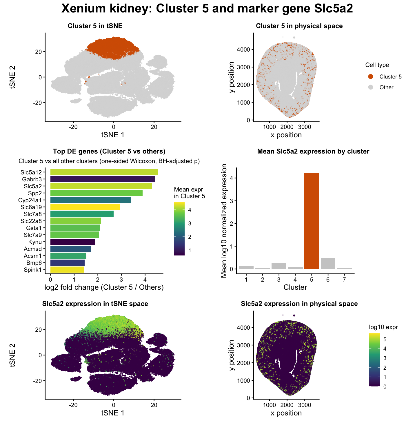
The data visualization I created depicts the identification and characterization of a transcriptionally distinct cell cluster (Cluster 5 in my code) in Xenium spatial transcriptomics data from mouse kidney tissue. The goal of the analysis was to determine whether one of the unsupervised clusters corresponds to a known kidney cell type and to validate that interpretation using both differential gene expression and spatial localization.
The workflow follows the dimensionality reduction and clustering pipeline introduced in lectures 3, 4 and 5 [1]. Raw gene counts were first normalized and log-transformed to make expression comparable across cells. PCA was then used to reduce the dimensionality of the dataset while preserving the dominant sources of transcriptional variation. An elbow analysis of k-means clustering on the top principal components suggested that seven clusters capture the major transcriptional structure of the tissue. These clusters were embedded into 2D using tSNE to visualize relationships between cells in latent space.
Panels 1 and 2 show Cluster 5 highlighted relative to all other cells. In tSNE space (Panel 1), Cluster 5 forms a compact and well-separated region, indicating a distinct transcriptional identity. In physical space (Panel 2), these cells occupy a coherent anatomical region of the kidney tissue. In my opinion, the agreement between transcriptional separation and spatial organization supports the interpretation that Cluster 5 corresponds to a real biological cell population rather than an artifact of clustering.
To characterize the molecular identity of Cluster 5, I performed gene-wise differential expression testing comparing cells inside Cluster 5 to all other cells using a one-sided Wilcoxon rank-sum test, as discussed in lecture 6 [1]. P-values were adjusted using the Benjamini-Hochberg procedure to control the false discovery rate [2]. The resulting ranked list of genes is summarized in Panel 3, which shows the top markers upregulated in Cluster 5.
In Panel 3, bar length represents log2 fold change, which measures how much more strongly a gene is expressed in Cluster 5 relative to all other clusters [3]. Importantly, fold change does not measure absolute expression level [3]. A gene can have a large fold change if it is relatively rare everywhere but still consistently more expressed in Cluster 5. To address this, the color of each bar encodes the mean expression level within Cluster 5. This combination is informative because it distinguishes genes that are both strongly enriched and highly expressed from genes that are statistically enriched but low in absolute abundance. In other words, a long bar (high fold change) does not always imply high expression; the color scale clarifies whether the gene is actually abundant in the cluster.
Among the top differentially expressed genes, through extensive literature review of a few handpicking differentially expressed genes, Slc5a2 emerged as a particularly strong and biologically meaningful marker [4]. Slc5a2 encodes a sodium-glucose cotransporter that is canonically expressed in proximal tubule epithelial cells and is widely used as a marker of this segment of the nephron (specifically, the apical domain of renal proximal tubule cells) [5]. In my data, Slc5a2 is both strongly enriched in Cluster 5 and highly specific to that cluster relative to others. Panels 4 and 5 visualize Slc5a2 expression in tSNE and physical space, respectively. In tSNE space (Panel 4), Slc5a2 expression is concentrated almost exclusively within Cluster 5, reinforcing its specificity. In physical space (Panel 5), the spatial distribution of Slc5a2-positive cells aligns with anatomical regions consistent with proximal tubule localization in the kidney cortex [6].
Panel 6 provides an additional quantitative validation by plotting the mean Slc5a2 expression across all clusters. Cluster 5 shows a pronounced elevation compared to every other cluster, confirming that Slc5a2 is not merely present but is maximally expressed in this population. This cross-cluster comparison strengthens the argument that Cluster 5 represents a proximal tubule cell population rather than a mixed or ambiguous group.
Taken together, the transcriptional distinctness of Cluster 5, the enrichment of canonical proximal tubule marker genes, and the coherent spatial localization of Slc5a2 expression strongly support the interpretation that Cluster 5 corresponds to proximal tubule epithelial cells in the mouse kidney. This interpretation is consistent with prior literature cited above describing Slc5a2 and related transport genes as defining features of proximal tubule identity and function
Also, this interpretation should be understood as a hypothesis rather than a definitive cell type assignment. Spatial transcriptomics and unsupervised k-means clustering do not produce perfectly pure cell populations. Each segmented cell can reflect local microenvironmental signals, and k-means groups cells by dominant transcriptional similarity rather than separating continuous biological gradients. As a result, Cluster 5 likely represents a population whose predominant identity is proximal tubule (PT) epithelial cells, but some heterogeneity is expected. Additional validation using independent single-cell or spatial datasets would further strengthen this assignment.
References
[1] https://jef.works/genomic-data-visualization-2026/course
[2] https://www.r-bloggers.com/2023/07/the-benjamini-hochberg-procedure-fdr-and-p-value-adjusted-explained/
[3] https://www.cores.emory.edu/eicc/_includes/documents/sections/resources/RNAseq_Methodology.html
[4] https://pmc.ncbi.nlm.nih.gov/articles/PMC8722798/
[5] https://maayanlab.cloud/Harmonizome/gene/SLC5A2
[6] https://www.nature.com/articles/s41467-025-62599-9
##Code
1
2
3
4
5
6
7
8
9
10
11
12
13
14
15
16
17
18
19
20
21
22
23
24
25
26
27
28
29
30
31
32
33
34
35
36
37
38
39
40
41
42
43
44
45
46
47
48
49
50
51
52
53
54
55
56
57
58
59
60
61
62
63
64
65
66
67
68
69
70
71
72
73
74
75
76
77
78
79
80
81
82
83
84
85
86
87
88
89
90
91
92
93
94
95
96
97
98
99
100
101
102
103
104
105
106
107
108
109
110
111
112
113
114
115
116
117
118
119
120
121
122
123
124
125
126
127
128
129
130
131
132
133
134
135
136
137
138
139
140
141
142
143
144
145
146
147
148
149
150
151
152
153
154
155
156
157
158
159
160
161
162
163
164
165
166
167
168
169
170
171
172
173
174
175
176
177
178
179
180
181
182
183
184
185
186
187
188
189
190
191
192
193
194
195
196
197
198
199
200
201
202
203
204
205
206
207
208
209
210
211
212
213
214
215
216
217
218
219
220
221
222
223
224
225
226
227
228
229
230
231
232
233
234
235
236
237
238
239
240
241
242
243
244
245
246
247
248
249
250
251
252
253
254
255
256
257
258
259
260
261
262
263
264
265
266
267
268
269
270
271
272
273
274
275
276
277
278
279
280
281
282
283
284
285
286
287
288
289
290
291
292
293
294
295
296
297
298
299
300
301
302
303
304
305
306
307
308
309
310
311
312
313
314
315
316
317
318
319
320
321
322
323
324
325
326
327
328
329
330
331
332
333
334
335
336
337
338
339
340
341
342
343
344
345
346
347
348
349
350
351
352
353
354
355
356
357
358
359
360
361
362
363
364
365
366
367
368
369
370
371
372
373
374
375
376
377
378
379
380
381
382
383
384
385
386
387
388
389
390
391
392
393
394
395
396
397
398
399
400
401
402
403
404
405
406
407
408
409
410
411
412
413
414
415
416
417
418
419
420
421
422
423
424
425
426
427
428
429
430
431
432
433
434
435
436
437
438
439
440
441
442
443
444
445
446
447
448
449
450
451
452
453
454
455
456
# Spatial Transcriptomics Analysis: Xenium Kidney Dataset
# Analyzing spatial gene expression data to identify cell types in kidney tissue

# Setup: Clear workspace and set seed for reproducibility
rm(list = ls())
set.seed(42)

# Load libraries
library(ggplot2)
library(Rtsne)
library(dplyr)
library(patchwork)

# STEP 1: Load and preprocess data

# Load Xenium spatial transcriptomics data
data <- read.csv("~/Desktop/GDV/Xenium-IRI-ShamR_matrix.csv", check.names = FALSE)

# Extract spatial coordinates for each cell
positions <- data[, c("x","y")]
rownames(positions) <- data[,1]

# Extract gene expression matrix (starts at column 4)
gene_exp <- data[, 4:ncol(data)]
rownames(gene_exp) <- data[,1]
gene_exp <- as.matrix(gene_exp)
mode(gene_exp) <- "numeric"

# Normalize gene expression by total counts per cell
total_gene_exp <- rowSums(gene_exp)
total_gene_exp[total_gene_exp == 0] <- 1

# Log-normalize: converts counts to log10(CPM + 1)
mat <- log10(gene_exp/total_gene_exp * 1e6 + 1)

# STEP 2: Principal Component Analysis (PCA)
# Reduces dimensionality from thousands of genes to top principal components

# Run PCA on normalized expression matrix
PCs <- prcomp(mat, center = TRUE, scale = FALSE)

# Create dataframe for scree plot (shows variance explained by each PC)
scree_df <- data.frame(
  PC = 1:25,
  SD = PCs$sdev[1:25]
)

# Plot scree plot to visualize variance captured
ggplot(scree_df, aes(x = PC, y = SD)) +
  geom_point() +
  geom_line() +
  theme_minimal() +
  labs(
    title = "Scree plot",
    x = "Principal Component",
    y = "Standard deviation"
  )

# Keep first 10 PCs for clustering (captures most variance)
n_pcs <- 10
top_PCs <- PCs$x[, 1:n_pcs]

# STEP 3: Determine optimal number of clusters using elbow method

# Help from Claude. Prompt: Write code to calculate total within-cluster sum of squares (TWSS) for K values from 1 to 12 using k-means clustering on the top 10 principal components. For each K, run k-means with nstart=10 and iter.max=50, and store the tot.withinss values in a vector.
twss <- sapply(1:12, function(k) {
  kmeans(top_PCs, centers = k, nstart = 10, iter.max = 50)$tot.withinss
})

# Create dataframe for elbow plot
twss_df <- data.frame(
  K = 1:12,
  TWSS = twss
)

# Plot elbow plot to choose optimal K
ggplot(twss_df, aes(x = K, y = TWSS)) +
  geom_point() +
  geom_line() +
  theme_minimal() +
  labs(
    title = "K-means elbow plot",
    x = "Number of clusters (K)",
    y = "TWSS"
  )

# STEP 4: K-means clustering
# Based on elbow plot, chose K=7 clusters

K <- 7

# Run k-means clustering
km <- kmeans(top_PCs, centers = K, nstart = 50, iter.max = 50)
clusters <- as.factor(km$cluster)

# Check number of cells in each cluster
table(clusters)

# STEP 5: t-SNE for visualization
# Further reduces dimensionality to 2D for visualization

tsne <- Rtsne(top_PCs, dims = 2, perplexity = 30, check_duplicates = FALSE)

# Extract t-SNE coordinates
emb <- tsne$Y
colnames(emb) <- c("tsne1", "tsne2")

# Combine t-SNE, cluster assignments, and spatial positions
cell_data <- data.frame(
  emb,
  clusters,
  positions
)

# Visualize clusters in t-SNE space
p_tsne <- ggplot(cell_data, aes(tsne1, tsne2, col = clusters)) +
  geom_point(size = 0.1, alpha = 0.6) +
  theme_minimal(base_size = 10) +
  theme(panel.grid = element_blank()) +
  guides(colour = guide_legend(
    override.aes = list(size = 4, alpha = 1)
  )) +
  labs(title = "Clusters in tSNE", col = "Cluster")

# Visualize clusters in physical tissue space
p_space <- ggplot(cell_data, aes(x, y, col = clusters)) +
  geom_point(size = 0.1, alpha = 0.6) +
  coord_fixed() +
  theme_minimal(base_size = 10) +
  theme(panel.grid = element_blank()) +
  guides(colour = guide_legend(
    override.aes = list(size = 4, alpha = 1)
  )) +
  labs(title = "Clusters in physical space", col = "Cluster")

p_tsne + p_space

# STEP 6: Differential expression analysis
# Find genes that are upregulated in cluster 5 compared to all other clusters

# Define cluster of interest (cluster 5)
cluster_of_interest <- 5
cluster_of_interest <- as.character(cluster_of_interest)

# Identify cells inside vs outside cluster 5
in_cells <- which(clusters == cluster_of_interest)
out_cells <- which(clusters != cluster_of_interest)

# Help from Claude. Prompt: For each gene in the matrix, perform a one-sided Wilcoxon rank-sum test comparing expression in cluster 5 cells versus all other cells, testing if cluster 5 has greater expression. Store all p-values in a vector.
pvals <- sapply(colnames(mat), function(gene) {
  wilcox.test(
    mat[in_cells, gene],
    mat[out_cells, gene],
    alternative = "greater"
  )$p.value
})

# Adjust p-values for multiple testing using Benjamini-Hochberg correction
padj <- p.adjust(pvals, method = "BH")

# Calculate mean expression inside and outside cluster 5
mean_in <- colMeans(mat[in_cells, , drop = FALSE])
mean_out <- colMeans(mat[out_cells, , drop = FALSE])

# Calculate log2 fold change
log2fc <- log2((mean_in + 0.01) / (mean_out + 0.01))

# Combine results into dataframe
de <- data.frame(
  gene = colnames(mat),
  log2fc = log2fc,
  padj = padj,
  mean_in = mean_in
)

# Sort by strongest upregulation
de_sorted <- de %>%
  arrange(desc(log2fc))

# Print top 15 differentially expressed genes
cat("\nTop 15 DE genes:\n")

print(
  de_sorted %>%
    select(gene, log2fc, padj, mean_in) %>%
    head(15)
)

# Select marker gene for visualization (Slc5a2 is a proximal tubule marker)
marker_gene <- "Slc5a2"

cell_data$gene_expr <- mat[, marker_gene]

# Label cells as cluster 5 or other
cell_data$celltype <- ifelse(
  cell_data$clusters == cluster_of_interest,
  "Cluster 5",
  "Other"
)

table(cell_data$celltype)

# STEP 7: Create individual plots for final figure

# Panel 1: Cluster 5 highlighted in tSNE space
p1 <- ggplot(cell_data, aes(tsne1, tsne2, color = celltype)) +
  geom_point(size = 0.15, alpha = 0.7) +
  scale_color_manual(values = c(
    "Cluster 5" = "#D55E00",
    "Other" = "grey85"
  )) +
  theme_classic(base_size = 11) +
  guides(color = guide_legend(
    override.aes = list(size = 3, alpha = 1)
  )) +
  labs(
    title = "Cluster 5 in tSNE",
    x = "tSNE 1",
    y = "tSNE 2",
    color = "Cell type"
  )

p1

# Panel 2: Cluster 5 in physical tissue space
p2 <- ggplot(cell_data, aes(x, y, color = celltype)) +
  geom_point(size = 0.15, alpha = 0.7) +
  scale_color_manual(values = c(
    "Cluster 5" = "#D55E00",
    "Other" = "grey85"
  )) +
  coord_fixed() +
  theme_classic(base_size = 11) +
  guides(color = guide_legend(
    override.aes = list(size = 3, alpha = 1)
  )) +
  labs(
    title = "Cluster 5 in physical space",
    x = "x position",
    y = "y position",
    color = "Cell type"
  )
p2

# Panel 3: Bar plot of top differentially expressed genes

library(dplyr)
library(ggplot2)

# Number of top markers to display
topN <- 15

# Ensure mean_out column exists
if (!("mean_out" %in% colnames(de))) {
  mean_in_tmp  <- colMeans(mat[in_cells, , drop = FALSE])
  mean_out_tmp <- colMeans(mat[out_cells, , drop = FALSE])
  de$mean_in <- as.numeric(mean_in_tmp)
  de$mean_out <- as.numeric(mean_out_tmp)
}

# Help from Claude. Prompt: Take the top 15 genes by log2 fold change from the differential expression results. Cap extremely small p-values at 1e-300, calculate -log10 p-values, and reorder genes as a factor for plotting from lowest to highest fold change (so they appear top to bottom in the bar plot).
de_markers <- de %>%
  mutate(
    padj_cap = pmax(padj, 1e-300),
    neglog10_p = -log10(padj_cap)
  ) %>%
  arrange(desc(log2fc), desc(mean_in)) %>%
  slice_head(n = topN) %>%
  mutate(gene = factor(gene, levels = rev(gene)))

# Create bar plot with mean expression as fill color
p3 <- ggplot(de_markers, aes(x = gene, y = log2fc)) +
  geom_col(aes(fill = mean_in)) +
  coord_flip() +
  scale_fill_viridis_c(option = "viridis") +
  theme_classic(base_size = 11) +
  labs(
    title = "Top marker genes upregulated in Cluster 5",
    subtitle = "Differential expression: Cluster 5 vs all other clusters (one-sided Wilcoxon, BH-adjusted p)",
    x = NULL,
    y = "log2 fold change (Cluster 5 / Others)",
    fill = "Mean expr\nin Cluster 5"
  )

p3

# Panels 4 and 5: Marker gene expression visualization

marker_gene <- "Slc5a2"
cell_data$marker_expr <- mat[, marker_gene]

# Panel 4: Marker gene expression in tSNE space
p4 <- ggplot(cell_data, aes(tsne1, tsne2, color = marker_expr)) +
  geom_point(size = 0.15, alpha = 0.75) +
  scale_color_viridis_c(option = "viridis") +
  theme_classic(base_size = 11) +
  labs(
    title = paste0(marker_gene, " expression in tSNE space"),
    x = "tSNE 1",
    y = "tSNE 2",
    color = "log10 expr"
  )
p4

# Panel 5: Marker gene expression in physical space
p5 <- ggplot(cell_data, aes(x, y, color = marker_expr)) +
  geom_point(size = 0.15, alpha = 0.75) +
  coord_fixed() +
  scale_color_viridis_c(option = "viridis") +
  theme_classic(base_size = 11) +
  theme(
    axis.line = element_line(),
    axis.ticks = element_line()
  )+
  labs(
    title = paste0(marker_gene, " expression in physical space"),
    x = "x position",
    y = "y position",
    color = "log10 expr"
  )
p5

# Panel 6: Mean marker gene expression per cluster (bar plot)

marker_gene <- "Slc5a2"
cell_data$marker_expr <- mat[, marker_gene]

# Calculate mean expression per cluster
mean_by_cluster <- cell_data %>%
  group_by(clusters) %>%
  summarise(mean_expr = mean(marker_expr, na.rm = TRUE), .groups = "drop") %>%
  mutate(is_cluster5 = (clusters == cluster_of_interest))

# Create bar plot highlighting cluster 5
p6 <- ggplot(mean_by_cluster, aes(x = clusters, y = mean_expr, fill = is_cluster5)) +
  geom_col() +
  scale_fill_manual(values = c("TRUE" = "#D55E00", "FALSE" = "grey80")) +
  theme_classic(base_size = 11) +
  labs(
    title = paste0("Mean ", marker_gene, " expression by cluster"),
    x = "Cluster",
    y = "Mean log10 normalized expression",
    fill = NULL
  ) +
  theme(legend.position = "none")

p6

# STEP 8: Assemble final multi-panel figure using patchwork
# Help from ChatGPT. Prompt: Create a function called fix_panel that takes a ggplot object and optional title, subtitle, and legend position arguments. The function should update the plot's title and subtitle, apply theme_classic with base_size 12, and customize the plot title to be bold size 11, subtitle size 10, set plot.title.position to "plot", add margins of 8-10 pixels around the plot, and set legend position, title size 10, and text size 9.
# =========================
# SIMPLE FINAL MULTI-PANEL
# (matches your preferred layout)
# Row 1: p1 p2 p4 p5
# Row 2: p3 (wide)
# Row 3: p6 (wide)
# =========================

library(patchwork)
library(ggplot2)

# 1) Make ONLY the key fixes:
# - wrap long titles so they don't collide
# - keep legends next to each plot (no global "collect")
# - shrink legend text a bit
# - add small margins around each panel

fix_panel <- function(p, title = NULL, subtitle = NULL, legend_pos = "right") {
  p +
    labs(title = title, subtitle = subtitle) +
    theme_classic(base_size = 12) +
    theme(
      plot.title = element_text(face = "bold", size = 11),
      plot.subtitle = element_text(size = 10),
      plot.title.position = "plot",
      plot.margin = margin(8, 10, 8, 10),
      legend.position = legend_pos,
      legend.title = element_text(size = 10),
      legend.text  = element_text(size = 9)
    )
}

# p1: cluster highlight in tSNE (remove legend to match p6)
p1_fix <- fix_panel(
  p1,
  title = "Cluster 5 in tSNE",
  legend_pos = "none"
) +
  theme(
    plot.title = element_text(hjust = 0.5)
  )

# p2: cluster highlight in space (keep legend on right)
p2_fix <- fix_panel(
  p2, title = "Cluster 5 in physical space", legend_pos = "right"
) +
  theme(
    plot.title = element_text(hjust = 0.5)
  )

# p4: gene in tSNE (remove legend to match p6)
p4_fix <- fix_panel(
  p4,
  title = "Slc5a2 expression in tSNE space",
  legend_pos = "none"
) +
  theme(
    plot.title = element_text(hjust = 0.5)
  )

# p5: gene in space (keep legend)
p5_fix <- fix_panel(
  p5, title = "Slc5a2 expression in physical space", legend_pos = "right"
) +
  theme(
    plot.title = element_text(hjust = 0.5)
  )

# p3: DE bars (keep legend)
p3_fix <- fix_panel(
  p3,
  title = "Top DE genes (Cluster 5 vs others)",
  subtitle = "Cluster 5 vs all other clusters (one-sided Wilcoxon, BH-adjusted p)",
  legend_pos = "right"
) +
  theme(
    plot.title = element_text(hjust = 0.5),
    plot.subtitle = element_text(hjust = 0.5)
  )

# p6: mean bar plot (remove legend)
p6_fix <- fix_panel(
  p6,
  title = "Mean Slc5a2 expression by cluster",
  legend_pos = "none"
) +
  theme(
    plot.title = element_text(hjust = 0.5)
  )

# 2) Assemble in 3 rows with explicit equal widths:
row1 <- (p1_fix | p2_fix) + plot_layout(widths = c(1, 1))
row2 <- (p3_fix | p6_fix) + plot_layout(widths = c(1, 1))
row3 <- (p4_fix | p5_fix) + plot_layout(widths = c(1, 1))

final_plot <- row1 / row2 / row3 +
  plot_layout(heights = c(1, 1.2, 1)) +
  plot_annotation(
    title = "Xenium kidney: Cluster 5 and marker gene Slc5a2",
    theme = theme(
      plot.title = element_text(face = "bold", size = 20, hjust = 0.5)
    )
  )

final_plot