hw4: cortical tubule area in Xenium data

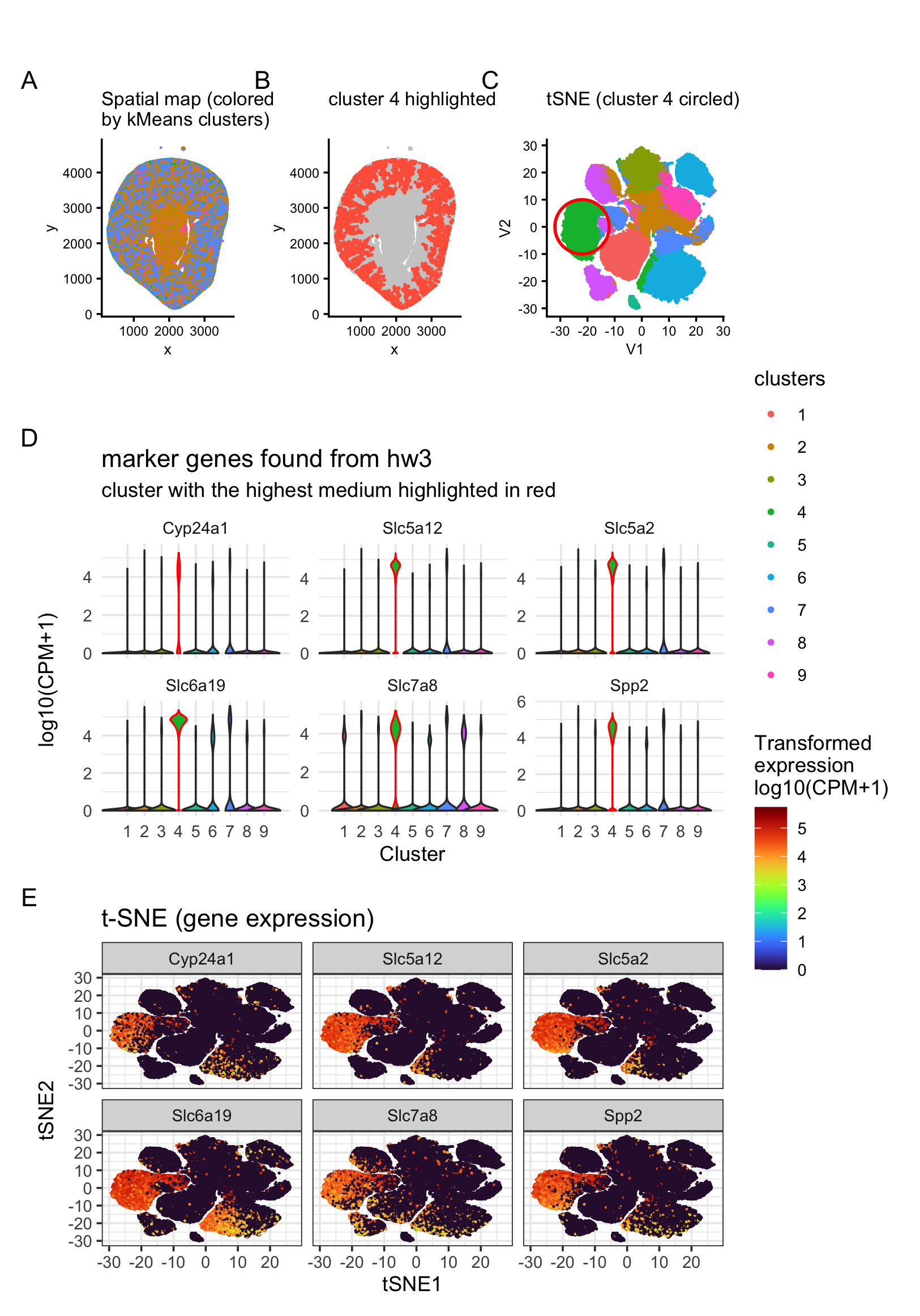
I’ve been analyzing Visium data so far, and this time I switched to Xenium data to try to identify the same cell type I found in HW3 using Visium. However, because there are some fundamental differences between these two technologies, it’s hard to match cells/spots perfectly. More specifically, Visium is lower resolution and each spot can contain multiple cells, so the signal is more “robust” for a simple classifier. In HW3 I grouped spots into 3 categories and focused on the cortical tubule region as my area of interest. Xenium, on the other hand, has single-cell resolution, so it can support more refined clustering. Also, not all marker genes I found from Visium are detected in Xenium. Given these technical constraints, I followed the steps below to identify the same cell type in the Xenium dataset.
My normalization and preprocessing steps are adopted from Dr. Fan’s class code. I also asked AI/GPT to proofread my written description, and I adapted Henry Aceves’s HW3 idea of circling the cluster of interest.
I performed standard normalization, selected the number of PCs based on the elbow plot, and then ran tSNE followed by k-means clustering. Unlike Visium where I used k = 3, here I used k = 9 because it reaches a local minimum and captures a reasonable amount of variation. This also matches my expectation that Xenium should support more groups than Visium due to its higher resolution.
To find the matching cell type, I first took the overlap of marker genes for the cortical tubule spots from HW3, then visualized the top 6 most abundant/obvious markers on the tSNE plot and violin plots (Panels D and E). From Panel D, cluster 4 shows the highest normalized median expression across these markers compared to other clusters. Clusters 6 and 7 also show elevated expression for some markers. This pattern is even clearer in Panel E that cluster 4 consistently has high marker expression, while clusters 6 and 7 (especially the regions adjacent to cluster 4) show some higher-expression cells, but not as strongly as the main cluster 4 group.
Thus, based on these results, it is most likely that the cortical tubule region identified from Visium mainly corresponds to cluster 4 in Xenium. I then mapped cluster 4 cells back onto the spatial coordinate plot, and it matches the expectation for cortical tubules: cluster 4 localizes toward the outside of the tissue (Panel B).
Jihwan Park et al. ,Single-cell transcriptomics of the mouse kidney reveals potential cellular targets of kidney disease.Science360,758-763(2018).DOI:10.1126/science.aar2131
1
2
3
4
5
6
7
8
9
10
11
12
13
14
15
16
17
18
19
20
21
22
23
24
25
26
27
28
29
30
31
32
33
34
35
36
37
38
39
40
41
42
43
44
45
46
47
48
49
50
51
52
53
54
55
56
57
58
59
60
61
62
63
64
65
66
67
68
69
70
71
72
73
74
75
76
77
78
79
80
81
82
83
84
85
86
87
88
89
90
91
92
93
94
95
96
97
98
99
100
101
102
103
104
105
106
107
108
109
110
111
112
113
114
115
116
117
118
119
120
121
122
123
124
125
126
127
128
129
130
131
132
133
134
135
library(readr)
library(Rtsne)
library(patchwork)
library(dplyr)
library(ggplot2)
library(gridExtra)
library(jcolors)
library(Seurat)
library(tidyverse)
library(viridis)
library(ggpubr)
library(ggforce)

setwd("/Users/tiya/Desktop/BME\ program\ info/Spring\ 2026/gemonic_data_visal/")

dat = read_csv("data/Xenium-IRI-ShamR_matrix.csv") %>%
  data.frame()
dim(dat) #[1] 85880cells   302genes

pos <- dat[,c('x', 'y')] #position data frame
rownames(pos) <- dat[,1]
gexp <- dat[, 4:ncol(dat)] #gene expression data frame
rownames(gexp) <- dat[,1]

# normalize
totgexp = rowSums(gexp)
mat <- log10(gexp/totgexp * 1e6 + 1)

# PCA
pcs <- prcomp(mat)
df <- data.frame(pcs$x, pos)
plot(pcs$sdev[1:50])
ggplot(df, aes(x=x, y=y, col=PC1)) + geom_point(cex=0.5) #couple observation: different from Visium data, Xinium is much higer in resolution as expected. 2, there are couple outliers 3, PC1 characterize the cortical area
pc = 10

#tSNE
set.seed(2026214)
tsne = Rtsne::Rtsne(pcs$x[, 1:pc], dims = 2, perplexity = 30)

emb = as.data.frame(tsne$Y)

# kmeans
var = numeric(20)
for (k in 1:20) {
  km_result = kmeans(pcs$x[, 1:pc], centers = k)
  var[k] <- km_result$tot.withinss
}

plot(1:20, var, type = "b",
     xlab = "Number of Clusters (k)",
     ylab = "Within-cluster variance",
     main = "Elbow Method")

clusters = as.factor(kmeans(pcs$x[,1:pc], centers=9)$cluster)
df <- data.frame(pcs$x, pos, emb, clusters)

df = df %>% select("PC1", "PC2", "PC3", "x", "y", "clusters", "V1", "V2")
df = cbind(df, mat)

old_marker = c("Slc5a12", "Slc6a19", "Cyp24a1", "Slc7a8", "Spp2", "Slc5a2")

df_long <- df %>%
  select(clusters, all_of(old_marker)) %>%
  pivot_longer(cols = all_of(old_marker),
               names_to = "gene", values_to = "expr") %>%
  mutate(box_col = ifelse(clusters == "4", "cluster4", "other"))

small_axes = theme(
  axis.title = element_text(size = 8),
  axis.text  = element_text(size = 7),
  plot.subtitle = element_text(size = 8),
  plot.title = element_text(size = 10)
)

p1 = ggplot(df_long, aes(x = clusters, y = expr, fill = clusters)) +
  geom_violin(width = 3, aes(color = box_col)) +
  theme_minimal() +
  theme(legend.position = "none") +
  scale_color_manual(values = c(cluster4 = "red", other = "gray20")) +
  labs(x = "Cluster", y = "log10(CPM+1)") +
  facet_wrap(~ gene, scales = "free_y", ncol = 3) +
  labs(title = "marker genes found from hw3",
       subtitle = "cluster with the highest medium highlighted in red")

df_p2 = df %>%
  select(V1, V2, all_of(old_marker)) %>%
  pivot_longer(all_of(old_marker), names_to = "gene", values_to = "expr")

p2 = ggplot(df_p2, aes(x = V1, y = V2, color = expr)) +
  geom_point(size = 0.02) +
  theme_bw() +
  labs(title = "t-SNE (gene expression)", x = "tSNE1", y = "tSNE2", color = "Expr") +
  facet_wrap(~ gene, ncol = 3) +
  scale_color_viridis(option = "H", name = "Transformed\nexpression\nlog10(CPM+1)")


df$highlight_grp = ifelse(clusters %in% c("4"), "highlight", "other")
p3 = ggplot(df, aes(x=x, y=y, col=highlight_grp)) +
  geom_point(data = subset(df, highlight_grp == "other"),
             color = "grey80", size = 0.01) +
  geom_point(data = subset(df, highlight_grp == "highlight"),
             color = "tomato", size = 0.01) +
  theme_classic() +
  coord_fixed() +
  NoLegend() +
  labs(title = "cluster 4 highlighted") +
  small_axes

p4 = ggplot(df, aes(x=V1, y=V2, col=clusters)) +
  geom_point(cex=0.01) +
  guides(color = guide_legend(override.aes = list(size = 1))) +
  theme_classic() +
  coord_fixed() +
  small_axes +
  labs(title = "tSNE (cluster 4 circled)") +
  geom_circle(
    data = data.frame(x0=-22, y0=0, r=10),
    aes(x0=-22, y0=0, r=10),
    inherit.aes = FALSE,
    color = "red", linewidth = 0.8, fill = NA
  )

p5 = ggplot(df, aes(x=x, y=y, col=clusters)) +
  geom_point(cex=0.01) +
  theme_classic() +
  coord_fixed() +
  NoLegend() +
  small_axes +
  labs(title = "Spatial map (colored\nby kMeans clusters)")


(p5 | p3 | p4) / p1 / p2 +
  plot_layout(guides = "collect") +
  plot_annotation(tag_levels = "A")