Identifying Proximal Tubule Cell Populations in Spot-Resolution Spatial Transcriptomics

For these visualizations, I switched over to the spot-resolution Visium dataset from the single-cell Xenium dataset. I was able to successfully apply the same pre-processing pipeline and maintain parameters from homework 3, including a k value of 5 for k-means clustering as determined by an elbow plot.
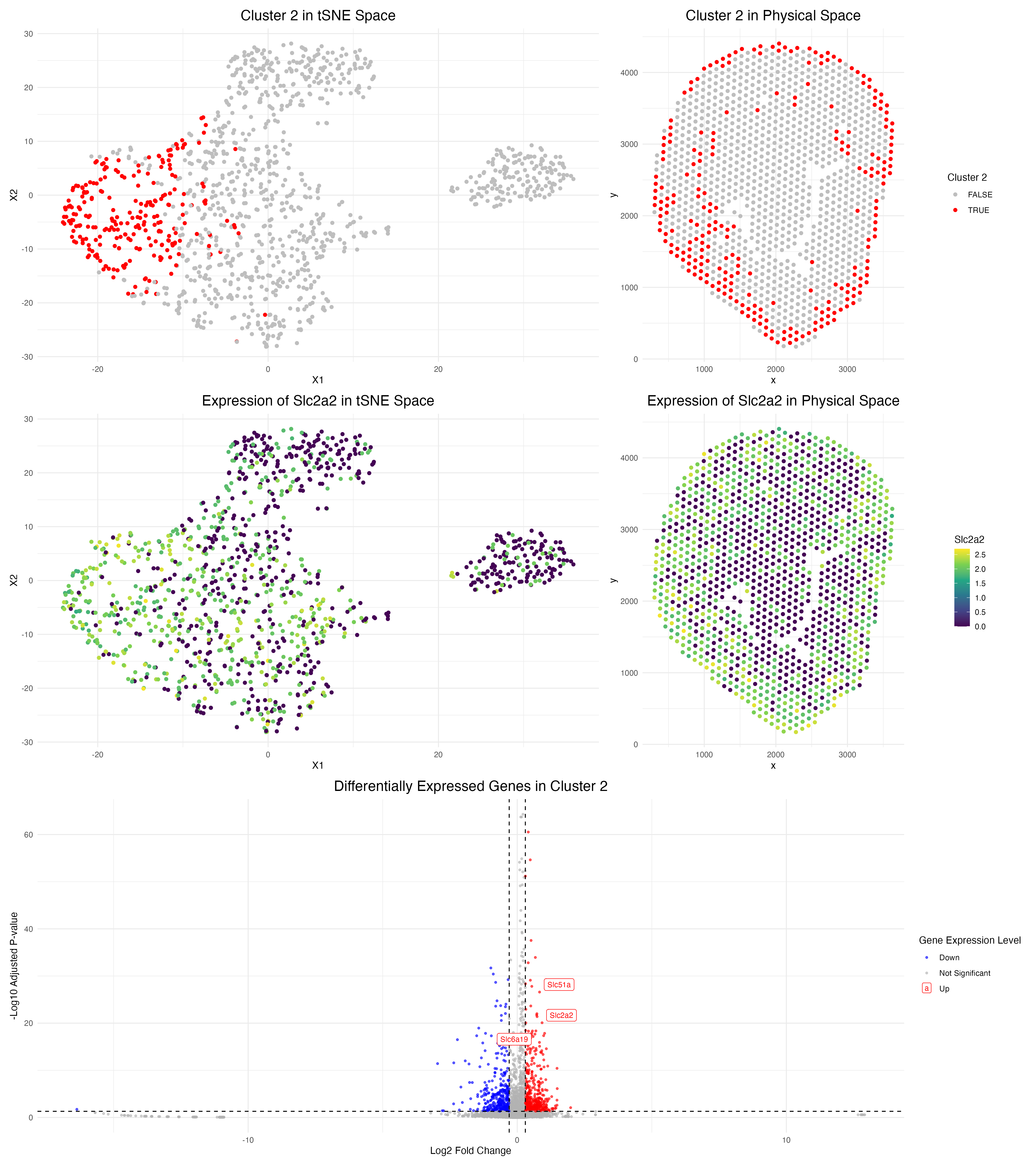
However, I had to alter my methodological approach to how I identified my cluster of interest. In homework 3, I was able to select an appealing cluster of interest (cluster 1 in that case) from its spatial distribution in the tissue and annotate its cell type according to the highly expressed proximal tubule cell marker gene Acmsd.
Since my goal in this homework was to identify the same cluster and cell type, I had to generalize my code. Therefore, I adapted my previous differential expression analysis code to loop through all 5 clusters in the Visium dataset and output the top 10 upregulated genes in each cluster. From there, I was able to cross-reference sources such as the Human Protein Atlas to better understand the cellular and functional identity of each of my clusters.
Ultimately, I was able to identify cluster 2 as the cluster of interest in the Visium sample, as it is highly expressed in Slc2a2, a proximal tubule cell marker according to the Human Protein Atlas. Moreover, as seen in the figures above, the spatial tissue location and tSNE representation of Slc2a2 strongly align with cluster 2, as well as the cortex of the kidney, the same area that cluster 1 of interest occupied in the previous Xenium analysis. Additionally, the high expression of other proximal tubule cell markers, such as Slc51a and Slc6a19, in this cluster further validates the annotation of this cluster.
Ultimately, although I utilized different marker genes (Acmsd vs. Slc2a2) between the Visium and Xenium datasets to identify the proximal tubule cells, both clusters are strongly enriched in the overall functionality of this cell type in solute carrying within the proximal tubules. This difference in gene expression within the clusters is likely a reflection of the overall gene detection capabilities of single-cell vs. spot resolution spatial transcriptomics.
Another change I made to this code was the parameters used for my volcano plot data visualization. In homework 3, I labeled the top 12 genes labeled by p-value. However, this approach created a cluttered and less effective volcano plot for my Visium dataset in terms of conveying genes with biological significance at hand, so I decided to only label my 3 genes of interest: Slc2a2, Slc51a, and Slc6a19 that support the proximal tubule labeling of cluster 2. In general, to label the differentially upregulated genes in the cluster, I also lowered the log fold change threshold from 0.6 to 0.3 since spot-level data seemed to produce smaller fold change values due to the mixture of cell types in each spot.
Resources: https://www.proteinatlas.org/ENSG00000163581-SLC2A2/single+cell https://www.proteinatlas.org/ENSG00000163959-SLC51A/single+cell https://www.proteinatlas.org/ENSG00000174358-SLC6A19/single+cell
Code
1
2
3
4
5
6
7
8
9
10
11
12
13
14
15
16
17
18
19
20
21
22
23
24
25
26
27
28
29
30
31
32
33
34
35
36
37
38
39
40
41
42
43
44
45
46
47
48
49
50
51
52
53
54
55
56
57
58
59
60
61
62
63
64
65
66
67
68
69
70
71
72
73
74
75
76
77
78
79
80
81
82
83
84
85
86
87
88
89
90
91
92
93
94
95
96
97
98
99
100
101
102
103
104
105
106
107
108
109
110
111
112
113
114
115
116
117
118
119
120
121
122
123
124
125
126
127
128
129
130
131
132
133
134
135
136
137
138
139
140
141
142
143
144
145
146
147
148
149
150
151
152
153
154
155
156
157
158
159
160
161
162
163
164
165
166
167
168
169
170
171
172
173
174
175
176
177
178
179
180
181
182
183
184
185
186
187
188
189
190
191
192
193
194
195
196
197
198
199
200
201
202
203
204
## HW 4 CODE: Adapting Xenium Code for Visium Analysis ##

# Load in Data (Spot Resolution Visium Data) ---------------------------------------------
data <- read.csv('/Users/gracexu/genomic-data-visualization-2026/data/Visium-IRI-ShamR_matrix.csv')
pos <- data[,c('x', 'y')]
rownames(pos) <- data[,1]
gexp <- data[, 4:ncol(data)]
rownames(gexp) <- data[,1]
gexp[1:5,1:5]
dim(gexp) # 1224 x 19465

# Load in required packages ------------------------------------------------------------------------------------------
library(ggplot2)
library(patchwork)

# Normalize Data (Library-size normalization --> Counts per million --> Log transformation) ---------------------------------------------
totgexp <- rowSums(gexp)
head(totgexp)
head(sort(totgexp, decreasing = TRUE))
mat <- log10(gexp / totgexp * 1e6 + 1)
dim(mat)

# PCA (Linear dimension reduction) ------------------------------------------------------------------------------------------
pcs <- prcomp(mat, center = TRUE, scale = FALSE)
names(pcs)
head(pcs$sdev)
plot(pcs$sdev[1:50])
toppcs <- pcs$x[, 1:10] # Keep top PCs as the top 10 PCs

# Run tSNE ------------------------------------------------------------------------------------------------------------------------
set.seed(123) # for reproducibility

tsne <- Rtsne::Rtsne(toppcs, dims = 2, perplexity = 30)
emb <- tsne$Y
df <- data.frame(emb, totgexp)
names(df)
ggplot(df, aes(x=X1, y=X2, col=totgexp)) + geom_point(size = 1)

# k-Means Clustering ------------------------------------------------------------------------------------------------------------------------

## Find optimal k value by computing within sum of squares (wss)
k_vals <- 1:20
wss <- numeric(length(k_vals))

for (i in seq_along(k_vals)) {
  km <- kmeans(toppcs, # run on top 10 PCs
               centers = k_vals[i],
               nstart = 20, #nstart reduces randomness
               iter.max = 100)
  wss[i] <- km$tot.withinss
}

# make a dataframe holding k values & corresponding wss scores
df <- data.frame(
  k = k_vals,
  wss = wss
)

# make an elbow plot --> k = 5 seems like the best choice again here
ggplot(df, aes(x = k, y = wss)) +
  geom_line() +
  geom_point() +
  labs(
    title = "Elbow Plot for Determining Optimal k",
    x = "Number of Clusters (k)",
    y = "Total Within Sum of Squares"
  ) +
  theme_minimal()

## Run k means with center of 5
km <- kmeans(toppcs, centers = 5)
names(km)

cluster <- as.factor(km$cluster)

df <- data.frame(pos, emb, cluster, toppcs)
# tSNE
ggplot(df, aes(x=X1, y=X2, col=cluster)) + geom_point(size = 0.5)
# PCA
ggplot(df, aes(x=PC1, y=PC2, col=cluster)) + geom_point(size = 0.5)
# Spatial Plot of Clusters
ggplot(df, aes(x = x, y = y, col = cluster)) +
  geom_point(size = 0.5) +
  coord_fixed() +
  theme_minimal()

# Differential Expression Analysis: LOOPING OVER ALL CLUSTERS ------------------------------------------------------------------------------------------------------------------------
# Create an empty list to store the results
results_list <- list()

for (clusterofinterest in 1:5) {
  in_cluster <- df$cluster == clusterofinterest

  # Calculate the log fold change (expression in cluster / expression not in cluster)
  mean_in  <- colMeans(mat[in_cluster, ])
  mean_out <- colMeans(mat[!in_cluster, ])
  logFC <- log2((mean_in + 1e-6) / (mean_out + 1e-6))

  # Run Wilcox Test for all genes in cluster of interest
  pvals <- sapply(colnames(mat), function(gene) {
    wilcox.test(mat[in_cluster, gene], mat[!in_cluster, gene])$p.value
  })

  # Adjust p-values for multiple testing (Benjamini-Hochberg)
  pvals_adj <- p.adjust(pvals, method = "BH")

  # Store results for the cluster of interest
  results_list[[clusterofinterest]] <- data.frame(
    gene = colnames(mat),
    logFC = logFC,
    pval_adj = pvals_adj,
    cluster = clusterofinterest
  )
}

# Print the top upregulated genes for each cluster
for (i in 1:5) {
  cat("\n--- Cluster", i, "top markers ---\n")
  top <- results_list[[i]]
  top <- top[order(top$pval_adj), ]
  print(head(top[top$logFC > 0.6, c("gene", "logFC", "pval_adj")], 10))
}

# It appears that Cluster 2 matches Cluster 1 from HW3 based on the expression of Slc2a2 (a marker for proximal tubule cells)
clusterofinterest = 2

# Visualization Creation ------------------------------------------------------------------------------------------
## 1. Cluster of interest in reduced dimensional space ------------------------------------------------------------------------------------------
### tSNE
p1 <- ggplot(df, aes(x = X1, y = X2, col = cluster == clusterofinterest)) +
  geom_point(size = 0.5) +
  scale_color_manual(values = c("grey", "red")) +
  labs(color = paste("Cluster 2")) +
  theme_minimal() +
  ggtitle("Cluster 2 in tSNE Space") +
  theme(plot.title = element_text(hjust = 0.5, size = 16), legend.position = "none")
p1

## 2. Cluster of interest in physical space ------------------------------------------------------------------------------------------
p2 <- ggplot(df, aes(x = x, y = y, col = cluster == clusterofinterest)) +
  geom_point(size = 0.5) +
  scale_color_manual(values = c("grey", "red")) +
  labs(color = paste("Cluster 2")) +
  theme_minimal() +
  ggtitle("Cluster 2 in Physical Space") +
  coord_fixed()  +
  theme(plot.title = element_text(hjust = 0.5, size = 16))
p2

## 3. Differentially expressed genes for your cluster of interest ------------------------------------------------------------------------------------------
# create a volcano plot visualizing differentially expressed genes in cluster 2

# only label the genes of interest
genes_of_interest <- c("Slc2a2", "Slc51a", "Slc6a19")
genes_to_label <- volcano_df[volcano_df$gene %in% genes_of_interest, ]

# create volcano plot
p3 <- ggplot(volcano_df, aes(x = logFC, y = neglog10p, col = express)) +
  geom_point(alpha = 0.6, size = 0.8) +
  geom_hline(yintercept = -log10(0.05), linetype = "dashed") +
  geom_vline(xintercept = c(-0.3, 0.3), linetype = "dashed") +
  geom_label_repel(data = genes_to_label, aes(label = gene),
                   size = 3, max.overlaps = 30) +
  scale_color_manual(values = c("Up" = "red", "Down" = "blue", "Not Significant" = "grey70")) +
  labs(title = "Differentially Expressed Genes in Cluster 2",
       x = "Log2 Fold Change",
       y = "-Log10 Adjusted P-value",
       col = "Gene Expression Level") +
  theme_minimal() +
  theme(plot.title = element_text(hjust = 0.5, size = 16))
p3

## 4. DEG in reduced dimensional space
### tSNE
### gene of interest = Slc2a2
df_expr <- df
df_expr$Slc2a2 <- mat[, 'Slc2a2']
p4 <- ggplot(df_expr, aes(x = X1, y = X2, col = Slc2a2)) +
  geom_point(size = 0.5) +
  scale_color_viridis_c() +
  theme_minimal() +
  ggtitle(paste("Expression of Slc2a2 in tSNE Space"))  +
  theme(plot.title = element_text(hjust = 0.5, size = 16), legend.position = "none")
p4

## 5. Visualizing one of these DEG in space
p5 <- ggplot(df_expr, aes(x = x, y = y, col = Slc2a2)) +
  geom_point(size = 0.5) +
  scale_color_viridis_c() +
  theme_minimal() +
  ggtitle(paste("Expression of Slc2a2 in Physical Space")) +
  coord_fixed()  +
  theme(plot.title = element_text(hjust = 0.5, size = 16))
p5

# Combine all plots
(p1 | p2) / (p4 | p5) / p3

# Save plot
ggsave("/Users/gracexu/genomic-data-visualization-2026/homework_submission/HW4_Plots.png", width = 16, height = 18, dpi = 300)

# AI Help Prompts:
## How can I adapt my current code that performs differential gene expression analysis to loop through all of the clusters in my dataset, printing the top 10 upregulated genes in each cluster?