Identification of kidney collecting duct principal cells through dimensionality reduction, k-means clustering, and differential expression analysis

1. Figure description
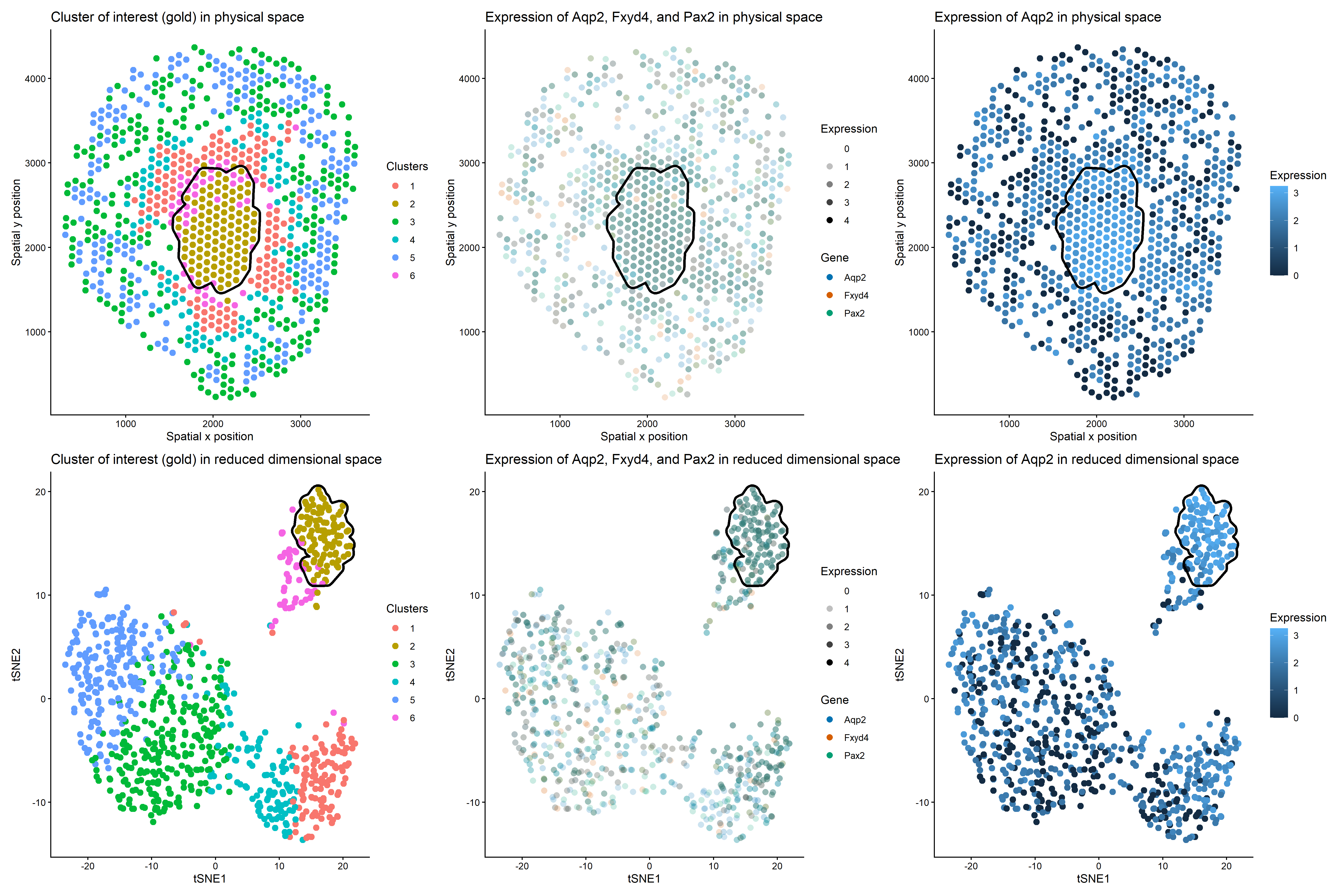
This multi-panel data visualization uses principal component analysis (PCA), t-distributed stochastic neighbor embedding (tSNE), k-means clustering, and differential expression analysis to characterize a cluster of interest based on gene expression patterns. The previously analyzed data set used a high-resolution imaging approach while this current data set used a spot-based sequencing approach. The goal was to identify the same cell type (kidney collecting duct principal cells) in both data sets.
In the top left plot, spots are visualized in physical tissue space and colored by cluster identity. The chosen cluster of interest, Cluster 2, is labeled with a gold hue. In the top middle plot, spatial expression patterns of three genes (Aqp2, Fxyd4, and Pax2) are shown across the tissue. These genes are differentially upregulated in the cluster of interest, showing increased expression in regions overlapping with Cluster 2. In the top right plot, the spatial expression of Aqp2 alone is shown with expression levels encoded by color saturation on a blue scale. Higher levels of expression localize to regions corresponding to the cluster of interest.
In the bottom left plot, spots are visualized in reduced dimensional space using tSNE (after performing PCA on the data). The cluster of interest, Cluster 2, is once again labeled with a gold hue. In the bottom middle plot, expression patterns of Aqp2, Fxyd4, and Pax2 are projected onto tSNE space, demonstrating increased expression within the same region as Cluster 2. In the bottom right plot, the expression of Aqp2 alone is visualized in tSNE space with expression levels encoded by color saturation on a blue scale. Similar to the top plots, higher levels of Aqp2 expression localize to regions corresponding to Cluster 2.
2. Characterization of cluster of interest
Cluster 2 is most consistent with kidney collecting duct principal cells based on the differentially upregulated expression of characteristic genes in regions that correlate with the cluster of interest. Kidney collecting duct principal cells are specialized cells found in the nephron that contribute to homeostasis by regulating water reabsorption [1]. Studies have identified Aqp2, Fxyd4, and Pax2 as well-established markers for this specific cell type since they play roles in reabsorption and signaling pathways [1,2,3,4,5,6]. Aqp2 was used as a marker gene in both data sets because it is the primary marker of collecting duct principal cells. However, two of the other genes used in the imaging data set were not present in the sequencing data set after subsetting and differential expression analysis. Alternative markers that were differentially expressed in the sequencing data set were selected while keeping Aqp2 consistent across both analyses.
Similar to the last assignment, log-transformation and normalization were first performed to make the data more Gaussian and reduce variation in total gene expression counts per spot. Since this current data set includes almost twenty thousand genes, only the top five hundred genes with highest variance were analyzed to maximize efficiency when later finding differentially upregulated genes. Similar to the last assignment, analysis was focused on epithelial cell populations, so spots with cells expressing a widely used surface marker called EpCAM were subsetted prior to dimensionality reduction [7]. This allowed for more precise characterization of epithelial cell clusters.
Afterward, PCA and tSNE were performed. The previous imaging data set contained a more limited gene panel on a cell-by-cell basis, so PCA was sufficient to capture the main biological variation. For this more complex sequencing data set, tSNE was also used to visualize any nonlinear relationships and local neighborhood structures among spots. Next, an elbow plot was created to determine the optimal k value for k-means clustering based on total withinness. The last data set had an optimal k value of 7-10, but this current data set had an optimal k value of 4-6. The lower number of transcriptionally distinct cell clusters in the spot-based data set could stem from the reduced resolution of spot-based sequencing. Each spot captures transcripts from multiple neighboring cells, which could make it more difficult to separate spots into clusters since many spots could contain similar cell types.
K-means clustering was then performed. In reduced dimensional space, Cluster 2 formed a distinct grouping, suggesting that these spots have cells that share transcriptional similarities. Visualizing Aqp2, Fxyd4, and Pax2 in tSNE space showed that these three genes are strongly enriched within this cluster, and performing differential expression analysis via the Wilcoxon Rank Sum Test confirmed this observation. All three genes have some of the lowest p-values, indicating they are highly differentially upregulated in the cluster of interest as compared to all other clusters. Furthermore, spatial mapping shows that expression of all three genes colocalizes with Cluster 2 in physical space, too, as emphasized by the black cluster outline.
Note that in the imaging data set, the three genes showed clearer upregulation because gene expression is measured at higher resolution. In the sequencing data set, each spot contains multiple cells, which can reduce the contrast between clusters and make gene expression appear less distinct. This may be why the three genes are still enriched in Cluster 2 in the sequencing data set, but the differences between Cluster 2 and all other clusters appear less pronounced.
3. List of references
- https://journals.physiology.org/doi/full/10.1152/ajprenal.00053.2009
- https://www.pnas.org/doi/10.1073/pnas.1710964114
- https://pmc.ncbi.nlm.nih.gov/articles/PMC8050063/#MOESM1
- https://cellxgene.cziscience.com/cellguide/CL_1001431
- https://www.proteinatlas.org/ENSG00000075891-PAX2
- https://genular.atomic-lab.org/details-gene/5076
- https://www.biocompare.com/Editorial-Articles/617826-A-Guide-to-Epithelial-Cell-Markers/
4. Code
1
2
3
4
5
6
7
8
9
10
11
12
13
14
15
16
17
18
19
20
21
22
23
24
25
26
27
28
29
30
31
32
33
34
35
36
37
38
39
40
41
42
43
44
45
46
47
48
49
50
51
52
53
54
55
56
57
58
59
60
61
62
63
64
65
66
67
68
69
70
71
72
73
74
75
76
77
78
79
80
81
82
83
84
85
86
87
88
89
90
91
92
93
94
95
96
97
98
99
100
101
102
103
104
105
106
107
108
109
110
111
112
113
114
115
116
117
118
119
120
121
122
123
124
125
126
127
128
129
130
131
132
133
134
135
136
137
138
139
140
141
142
143
144
145
146
147
148
149
150
151
152
153
154
155
156
157
158
159
160
161
162
163
164
165
166
167
168
169
170
171
172
173
174
175
176
177
178
179
180
181
182
183
184
185
186
187
188
189
190
191
192
193
194
195
196
197
198
199
200
201
202
203
204
205
206
207
208
209
210
211
212
213
214
215
216
217
218
219
220
221
222
223
224
225
226
227
228
229
230
231
232
233
234
235
236
237
238
239
240
241
242
243
244
245
246
247
248
249
250
# Read data
data <- read.csv('C:/Users/jamie/OneDrive - Johns Hopkins/Documents/Genomic Data Visualization/Visium-IRI-ShamR_matrix.csv.gz')

# Each row represents one spot
# First column represents spot names
# Second and third columns represent x and y spatial positions of spots
# Fourth and beyond columns represent expression of specific genes in spots
data[1:5,1:5]

# Split up spatial data and gene expression data

# Create spatial data frame with second and third columns of old data frame
# Set row names of spatial data frame as first column of old data frame
pos <- data[,c('x','y')]
rownames(pos) <- data[,1]
head(pos)

# Create gene expression data frame with fourth and beyond columns of old data frame
# Set row names of gene expression data frame as first column of old data frame
gexp <- data[,4:ncol(data)]
rownames(gexp) <- data[,1]
gexp[1:5,1:5]

# How many total genes are detected per spot?
# Since rows represent spots, add all gene expression counts for each row
totgexp <- rowSums(gexp)
head(totgexp)

# Spots with highest total gene expression counts
head(sort(totgexp, decreasing = TRUE))

# Spots with lowest total gene expression counts
head(sort(totgexp, decreasing = FALSE))

# Data has high variation in total gene expression counts per spot

# Obtain proportional representation of each gene's expression in each spot
# Normalize by counts per million with pseudo-count of 1 to avoid getting undefined values
# Log-transform makes data more Gaussian
mat <- log10(gexp/totgexp * 1e6 + 1)
head(mat)
newtotgexp <- rowSums(mat)

# Spots with highest total gene expression counts
head(sort(newtotgexp, decreasing = TRUE))

# Spots with lowest total gene expression counts
head(sort(newtotgexp, decreasing = FALSE))

# Variation in data has been reduced
# Create subset of top 500 genes with highest variance to narrow down data
vg <- apply(mat, 2, var)
vargenes <- names(sort(vg, decreasing = TRUE)[1:500])
matsub <- mat[, vargenes]

# Identify spots with epithelial cells using Epcam expression above 0
epicells <- rownames(matsub)[matsub[,'Epcam'] > 0]
head(epicells)

# Subset gene expression and spatial data to spots with epithelial cells to narrow down our focus
mat_epi <- matsub[epicells, ]
head(mat_epi)
pos_epi <- pos[epicells, ]
head(pos_epi)

# Make PCs with default settings and set seed to eliminate randomness
set.seed(35)
pcs <- prcomp(mat_epi, center = TRUE, scale = FALSE)
df_pcs <- data.frame(pcs$x, pos_epi)
library(ggplot2)
ggplot(df_pcs, aes(x=x, y=y, col=PC1)) + geom_point(size=2.5)

# Run tSNE on first 10 PCs to capture variation of data
tn <- Rtsne::Rtsne(pcs$x[, 1:10], dim=2)
emb <- tn$Y
rownames(emb) <- rownames(mat_epi)
colnames(emb) <- c('tSNE1', 'tSNE2')

# Create elbow plot for number of clusters vs. total within-cluster sum of squares
centers <- 1:40
tot_withinss <- numeric(length(centers))

for (i in centers) {
  km <- kmeans(mat_epi, centers = i)
  tot_withinss[i] <- km$tot.withinss
}

plot(centers, tot_withinss, type = "b",
     xlab = "Number of centers (k)",
     ylab = "Total within-cluster sum of squares",
     main = "Elbow Plot for k-means")

# Variation in total within-cluster sum of squares starts to decrease around clusters 4-6

# K means clustering
# First set centers to 4 due to the results of the elbow plot, then check plots and adjust accordingly
# Set seed to any number to keep cluster of interest labeled the same color
set.seed(123)
clusters <- as.factor(kmeans(pcs$x[,1:10], centers=6)$cluster)
df_clusters <- data.frame(emb, pcs$x, pos_epi, clusters)

# Cluster of interest is cluster 2
# Create black outline around cluster of interest
library(ggforce)
cluster2_df <- df_clusters[df_clusters$clusters == 2, ]

# Compute centroid in physical space
centroid <- colMeans(cluster2_df[, c("x", "y")])

# Distance of each point to centroid
cluster2_df$dist_to_centroid <- sqrt(
  (cluster2_df$x - centroid["x"])^2 +
    (cluster2_df$y - centroid["y"])^2
)

# Keep only non-outlier points for hull
cluster2_hull <- cluster2_df[
  cluster2_df$dist_to_centroid <= quantile(cluster2_df$dist_to_centroid, 0.98),
]

# Repeat for tSNE space
cluster2_tsne <- df_clusters[df_clusters$clusters == 2, ]

# Compute centroid in tSNE space
centroid_tsne <- colMeans(cluster2_tsne[, c("tSNE1", "tSNE2")])

# Distance of each point to centroid
cluster2_tsne$dist_to_centroid <- sqrt(
  (cluster2_tsne$tSNE1 - centroid_tsne["tSNE1"])^2 +
    (cluster2_tsne$tSNE2 - centroid_tsne["tSNE2"])^2
)

# Keep only non-outlier points for hull
cluster2_tsne_hull <- cluster2_tsne[
  cluster2_tsne$dist_to_centroid <=
    quantile(cluster2_tsne$dist_to_centroid, 0.98),
]

g1 <- ggplot(df_clusters, aes(x=x, y=y, col=clusters)) +
  geom_point(size=2.5) +
  geom_mark_hull(data = cluster2_hull, aes(x = x, y = y), inherit.aes = FALSE, color = "black", fill = NA, linewidth = 1.2, expand = unit(2, "mm")) +
  labs(x='Spatial x position', y='Spatial y position', title='Cluster of interest (gold) in physical space', color='Clusters') +
  theme_classic()

g4 <- ggplot(df_clusters, aes(x=tSNE1, y=tSNE2, col=clusters)) +
  geom_point(size=2.5) +
  geom_mark_hull(data = cluster2_tsne_hull, aes(x = tSNE1, y = tSNE2), color = "black", fill = NA, linewidth = 1.2, expand = unit(2, "mm")) +
  labs(x='tSNE1', y="tSNE2", title='Cluster of interest (gold) in reduced dimensional space', color='Clusters') +
  theme_classic()

# Compare gene expression in spots of cluster of interest vs. spots of all other clusters
clusterofinterest <- names(clusters)[clusters == 2]
othercells <- names(clusters)[clusters != 2]

# Loop to compare expression of all genes in cluster of interest vs. other clusters
out <- sapply(colnames(mat_epi), function(gene) {
  x1 <- mat_epi[clusterofinterest, gene]
  x2 <- mat_epi[othercells, gene]
  wilcox.test(x1, x2, alternative = 'greater')$p.value
})
out

# Find genes with smallest p values
sort(out, decreasing=FALSE)

# Aqp2 has very small p value and serves as marker for kidney collecting duct principal cells (type of epithelial cell)
df_aqp2 <- data.frame(emb, pcs$x, pos_epi, clusters, gene=mat_epi[,'Aqp2'])

g3 <- ggplot(df_aqp2, aes(x=x, y=y, col=gene)) +
  geom_point(size=2.5) +
  geom_mark_hull(data = cluster2_hull, aes(x = x, y = y), inherit.aes = FALSE, color = "black", fill = NA, linewidth = 1.2, expand = unit(2, "mm")) +
  labs(x='Spatial x position', y="Spatial y position", title='Expression of Aqp2 in physical space', color = "Expression") +
  theme_classic()

g6 <- ggplot(df_aqp2, aes(x=tSNE1, y=tSNE2, col=gene)) +
  geom_point(size=2.5) +
  geom_mark_hull(data = cluster2_tsne_hull, aes(x = tSNE1, y = tSNE2), inherit.aes = FALSE, color = "black", fill = NA, linewidth = 1.2, expand = unit(2, "mm")) +
  labs(x='tSNE1', y="tSNE2", title='Expression of Aqp2 in reduced dimensional space', color = "Expression") +
  theme_classic()

# Fxyd4 has very small p value and serves as marker for kidney collecting duct principal cells (type of epithelial cell)
df_fxyd4 <- data.frame(emb, pcs$x, pos_epi, clusters, gene=mat_epi[,'Fxyd4'])
# ggplot(df_fxyd4, aes(x=x, y=y, col=gene)) + geom_point(size=2.5) + labs(x='Spatial x position', y="Spatial y position", title='Expression of Fxyd4 in physical space', color = "Expression") + theme_classic()
# ggplot(df_fxyd4, aes(x=tSNE1, y=tSNE2, col=gene)) + geom_point(size=2.5) + labs(x='tSNE1', y="tSNE2", title='Expression of Fxyd4 in reduced dimensional space', color = "Expression") + theme_classic()

# Pax2 has very small p value and serves as marker for kidney collecting duct principal cells (type of epithelial cell)
df_pax2 <- data.frame(emb, pcs$x, pos_epi, clusters, gene=mat_epi[,'Pax2'])
# ggplot(df_pax2, aes(x=x, y=y, col=gene)) + geom_point(size=2.5) + labs(x='Spatial x position', y="Spatial y position", title='Expression of Pax2 in physical space', color = "Expression") + theme_classic()
# ggplot(df_pax2, aes(x=tSNE1, y=tSNE2, col=gene)) + geom_point(size=3) + labs(x='tSNE1', y="tSNE2", title='Expression of Pax2 in reduced dimensional space', color = "Expression") + theme_classic()

# Make combined dataframe for all three genes
df_all <- data.frame(
  emb,
  pcs$x,
  pos_epi,
  clusters,
  Fxyd4 = mat_epi[,'Fxyd4'],
  Pax2 = mat_epi[,'Pax2'],
  Aqp2   = mat_epi[,'Aqp2']
)

# Convert to long format
library(tidyr)

df_long <- pivot_longer(df_all,
                        cols = c(Fxyd4, Pax2, Aqp2),
                        names_to = "gene",
                        values_to = "expression")

# Set three genes to different colors that mix favorably
gene_colors <- c(
  Aqp2  = "#0072B2",  # blue
  Fxyd4 = "#D55E00",  # vermillion
  Pax2  = "#009E73"   # teal
)

# Plot all genes on same axes overlayed on top of each other
g5 <- ggplot(df_long, aes(x = tSNE1, y = tSNE2, col = gene, alpha = expression/2.5)) +
  geom_point(size = 2.5, shape = 16) +
  geom_mark_hull(data = cluster2_tsne_hull, aes(x = tSNE1, y = tSNE2), inherit.aes = FALSE, color = "black", fill = NA, linewidth = 1.2, expand = unit(2, "mm")) +
  scale_color_manual(values = gene_colors) +
  labs(x='tSNE1', y='tSNE2', title='Expression of Aqp2, Fxyd4, and Pax2 in reduced dimensional space', color = "Gene", alpha='Expression') +
  scale_alpha_continuous(range = c(0, 1), limits = c(0, 4)) +
  theme_classic()

g2 <- ggplot(df_long, aes(x = x, y = y, col = gene, alpha = expression/2.5)) +
  geom_point(size = 2.5, shape = 16) +
  geom_mark_hull(data = cluster2_hull, aes(x = x, y = y), inherit.aes = FALSE, color = "black", fill = NA, linewidth = 1.2, expand = unit(2, "mm")) +
  scale_color_manual(values = gene_colors) +
  labs(x='Spatial x position', y='Spatial y position', title='Expression of Aqp2, Fxyd4, and Pax2 in physical space', color = "Gene", alpha='Expression') +
  scale_alpha_continuous(range = c(0, 1), limits = c(0, 4)) +
  theme_classic()

# Create and save multi-panel data visualization
library(patchwork)
panel <- g1 + g2 + g3 + g4 + g5 + g6

ggsave("hw4_jlim75.png", panel,
       width = 18, height = 12, dpi = 300)

# Prompts to ChatGPT
# How can I create a subset of spots from my data based on the expression of an epithelial cell marker called Epcam?
# How can I write a for-loop in R that calculates tot_withinss for centers 1 through 20 so that I can create an elbow plot using these numbers?
# How can I keep my cluster of interest labeled the same color no matter how many times I re-create the plots by re-running ggplot?
# How can I create a black outline only around my cluster of interest for plots g4, g5, and g6 to harness the Gestalt Principle of Enclosure in R?
# How can I exclude points that are extreme cluster outliers from within this black outline?
# How can I combine three different data frames into one data frame for the purposes of overlaying data onto one plot?
# How can I set the scale for gene expression levels so that an expression level of 0 corresponds with a completely transparent point?
# How can I set the three genes to three visibly distinct colors that produce a favorable color when mixed together in regions of co-expression?
# How can I increase the dimensions of my saved png file so that the six graphs are not squished together?