Visium Dataset: Finding PT epithelial cells

#Use/adapt your code from HW3 to identify the same cell-type in the other dataset. Create a multi-panel visualization and write a description to convince me you found the same cell-type
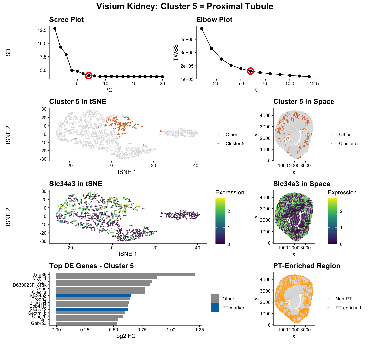
To identify the same proximal tubule (PT) epithelial cell population in the Visium dataset that I previously found in the Xenium dataset, I applied the same analysis workflow: CPM normalization + log transform, PCA, k-means clustering, and differential expression testing. The elbow plot supported k = 7 for Xenium and k = 6 for Visium, which is expected because Visium spots (55 µm) capture transcripts from multiple neighboring cells, making clusters less sharply separated than in single-cell resolution Xenium.
Because of this spot mixing, I did not identify PT by simply selecting the cluster with the highest total PT marker expression, since multiple clusters can show PT signal from mixed spots. Instead, I defined the PT cluster as the one transcriptionally characterized by PT markers, meaning PT genes rank highly among that cluster’s differentially expressed (DE) genes. I ran one-sided Wilcoxon rank-sum tests comparing each cluster to all other spots and ranked genes by log2 fold change with Benjamini–Hochberg (BH) correction. BH correction was important for interpretability. In my analysis I found that the difference between raw and BH-adjusted significance is large across all clusters. For example, Cluster 6 had over 4000 genes significant at p < 0.05 but only about 1400 after BH correction. This reduction reflects removal of likely false positives due to multiple testing. Because cell-type identification relies on interpreting top-ranked differentially expressed genes, using BH correction provides a more rigorous and reliable definition of cluster identity.
I felt that the definition and approach mentioned above cleanly distinguished a true PT-defined cluster from clusters that merely contain PT signals. In Xenium, Cluster 5 was supported by canonical PT markers (e.g., Slc5a2, Slc34a1, Lrp2, Cubn, Slc22a6) ranking near the top of the DE list. In Visium, after evaluating all six clusters, Cluster 5 showed multiple PT markers ranked among the top DE genes (e.g., PT genes appearing at ranks 7, 11, and 16 with three PT markers in the top 20), while other clusters had their best PT marker ranked ~152 or lower, indicating those clusters are defined by other biology and only pick up PT transcripts due to mixing. This is why Cluster 5 is the most defensible PT cluster in Visium: PT markers are not just present, they define the cluster’s transcriptomic identity.
Additional evidence supports that this is the same cell type across technologies. Both datasets show expression of canonical PT markers such as Slc5a2, Slc34a3, Slc5a12, Lrp2, and Cubn, and both show enrichment for PT-associated transport/metabolic genes (Gatm, Pck1, Miox, Slc6a19, Slc13a3) consistent with PT function. Quantitatively, the mean expression of Slc5a2 was similar across datasets (2.79 in Xenium vs 2.69 in Visium), showing agreement despite different measurement resolutions. Spatially, the PT cluster looks compact in Xenium but more distributed in Visium, which is expected because PT tubules are anatomically distributed and Visium spots aggregate local neighborhoods rather than single cells. To make the spot-mixing effect explicit, I included a panel showing “PT-enriched regions” (high total PT signal). This highlights that multiple clusters can be PT-enriched, but only Cluster 5 is PT-defined by DE ranking. Overall, the convergence of DE marker ranking, marker biology, quantitative consistency, and expected spatial behavior supports that Visium Cluster 5 corresponds to the same PT epithelial population identified in Xenium.
#You will likely need to change your code from HW3. Write a description of what you changed and why you think you had to change it. To adapt my HW3 Xenium pipeline to the Visium dataset, I made several changes driven by differences in spatial resolution and the number of observations. First, I selected fewer clusters in Visium (k = 6 instead of Xenium k = 7) because the elbow plot flattened sooner, consistent with Visium’s spot-based measurements producing fewer sharply separable transcriptional groups. Second, I used fewer principal components for downstream embedding and clustering (top 7 PCs) because variance dropped off sooner and including additional low-variance PCs added noise rather than improving separation. Third, I changed how I identified the PT cluster: in Xenium, PT identity was clear from strong marker specificity, but in Visium multiple clusters show PT signal due to spot mixing. Therefore, I added a cluster-by-cluster screening step where I computed DE rankings for each cluster and selected the cluster whose identity is defined by PT markers (best PT marker rank + most PT markers in the top 20), rather than selecting based only on total marker expression.
I also adjusted my visualization decisions to better match Visium’s smaller number of spatial points: because Visium has far fewer data points (spots) than Xenium (cells), increasing point size/opacity improves readability without causing heavy overplotting. Finally, I retained (didn’t change) BH correction during differential expression because thousands of genes are tested per cluster; without correction, the number of “significant” genes becomes inflated and the ranked marker lists become noisier, which makes cell-type identification less reliable in an already mixed spot-based dataset.
References: https://academic.oup.com/bioinformatics/article/40/9/btae509/7734914 https://pmc.ncbi.nlm.nih.gov/articles/PMC6683720/ https://www.statisticshowto.com/benjamini-hochberg-procedure/ https://jef.works/genomic-data-visualization-2026/course https://www.r-bloggers.com/2023/07/the-benjamini-hochberg-procedure-fdr-and-p-value-adjusted-explained/ https://www.cores.emory.edu/eicc/_includes/documents/sections/resources/RNAseq_Methodology.html https://pmc.ncbi.nlm.nih.gov/articles/PMC8722798/ https://maayanlab.cloud/Harmonizome/gene/SLC5A2 https://www.nature.com/articles/s41467-025-62599-9
AI prompts: “Can you help me write R code that loops through clusters, ranks genes by log2 fold change, and determines which cluster has the best-ranked PT markers?” “In Visium data, multiple clusters show high expression of my PT marker genes because spots contain mixed cell types. How can I compute a “total PT expression score” per cluster and visualize PT-enriched regions separately from the transcriptionally defined PT cluster?” “After computing differential expression results sorted by log2 fold change, how can I determine the rank positions of a predefined list of marker genes within that sorted table and count how many appear in the top 20?”
##Code
1
2
3
4
5
6
7
8
9
10
11
12
13
14
15
16
17
18
19
20
21
22
23
24
25
26
27
28
29
30
31
32
33
34
35
36
37
38
39
40
41
42
43
44
45
46
47
48
49
50
51
52
53
54
55
56
57
58
59
60
61
62
63
64
65
66
67
68
69
70
71
72
73
74
75
76
77
78
79
80
81
82
83
84
85
86
87
88
89
90
91
92
93
94
95
96
97
98
99
100
101
102
103
104
105
106
107
108
109
110
111
112
113
114
115
116
117
118
119
120
121
122
123
124
125
126
127
128
129
130
131
132
133
134
135
136
137
138
139
140
141
142
143
144
145
146
147
148
149
150
151
152
153
154
155
156
157
158
159
160
161
162
163
164
165
166
167
168
169
170
171
172
173
174
175
176
177
178
179
180
181
182
183
184
185
186
187
188
189
190
191
192
193
194
195
196
197
198
199
rm(list = ls())
set.seed(42)

library(ggplot2)
library(Rtsne)
library(dplyr)
library(patchwork)
library(tidyr)

#Load data
data <- read.csv("~/Desktop/GDV/Visium-IRI-ShamR_matrix.csv.gz", check.names = FALSE)
positions <- data[, c("x", "y")]
rownames(positions) <- data[, 1]
gene_exp <- data[, 4:ncol(data)]
rownames(gene_exp) <- data[, 1]
gene_exp <- as.matrix(gene_exp)
mode(gene_exp) <- "numeric"

#Normalize
total_gene_exp <- rowSums(gene_exp)
total_gene_exp[total_gene_exp == 0] <- 1
mat <- log10(gene_exp / total_gene_exp * 1e6 + 1)

#PCA
PCs <- prcomp(mat, center = TRUE, scale = FALSE)
scree_df <- data.frame(PC = 1:20, SD = PCs$sdev[1:20])

pScree <- ggplot(scree_df, aes(x = PC, y = SD)) +
  geom_point(size = 2) +
  geom_line() +
  geom_point(data = subset(scree_df, PC == 7), color = "red", size = 4, shape = 1, stroke = 2) +
  theme_classic() +
  labs(title = "Scree Plot", x = "PC", y = "SD") +
  theme(plot.title = element_text(face = "bold"))

top_PCs <- PCs$x[, 1:7]

#K-means clustering
twss <- sapply(1:12, function(k) {
  kmeans(top_PCs, centers = k, nstart = 10, iter.max = 50)$tot.withinss
})
twss_df <- data.frame(K = 1:12, TWSS = twss)

pElbow <- ggplot(twss_df, aes(x = K, y = TWSS)) +
  geom_point(size = 2) +
  geom_line() +
  geom_point(data = subset(twss_df, K == 6), color = "red", size = 4, shape = 1, stroke = 2) +
  theme_classic() +
  labs(title = "Elbow Plot", x = "K", y = "TWSS") +
  theme(plot.title = element_text(face = "bold"))

set.seed(42)
km <- kmeans(top_PCs, centers = 6, nstart = 50, iter.max = 50)
clusters <- as.factor(km$cluster)

#tSNE
tsne <- Rtsne(top_PCs, dims = 2, perplexity = 30, check_duplicates = FALSE)
emb <- tsne$Y
colnames(emb) <- c("tsne1", "tsne2")
spot_data <- data.frame(emb, clusters, positions)

#Define PT markers
pt_markers_canonical <- c("Slc5a2", "Slc34a1", "Slc34a3", "Lrp2", "Cubn")
pt_markers_transport <- c("Slc22a6", "Slc22a8", "Slc22a12", "Slc22a13", "Slc5a12", "Slc13a3", "Slc6a19", "Slc6a18", "Slc16a9", "Slc7a13")
pt_markers_metabolic <- c("Pck1", "Pck2", "Gatm", "Miox", "Acsm1", "Acsm2", "Acsm3", "Gldc", "Hal", "Aldob")
pt_markers_structural <- c("Aqp1", "Kap", "Kng1", "Anpep", "Enpep")
pt_markers_additional <- c("Dao", "Uox", "Bhmt", "Hpd", "Mep1a", "Napsa")
all_pt_markers <- c(pt_markers_canonical, pt_markers_transport, pt_markers_metabolic, pt_markers_structural, pt_markers_additional)
all_pt_markers <- unique(all_pt_markers)
all_pt_markers <- all_pt_markers[all_pt_markers %in% colnames(mat)]

#Identify PT cluster
cluster_results <- data.frame()

for(clust in levels(clusters)) {
  in_spots <- which(clusters == clust)
  out_spots <- which(clusters != clust)

  pvals <- sapply(colnames(mat), function(gene) {
    wilcox.test(mat[in_spots, gene], mat[out_spots, gene], alternative = "greater")$p.value
  })

  padj <- p.adjust(pvals, method = "BH")
  log2fc <- log2((colMeans(mat[in_spots, ]) + 0.01) / (colMeans(mat[out_spots, ]) + 0.01))

  de <- data.frame(gene = colnames(mat), log2fc = log2fc, padj = padj)
  de_sorted <- de %>% arrange(desc(log2fc)) %>% filter(padj < 0.05)

  pt_ranks <- de_sorted %>%
    mutate(rank = row_number()) %>%
    filter(gene %in% all_pt_markers)

  best_pt_rank <- ifelse(nrow(pt_ranks) > 0, min(pt_ranks$rank), 999)
  pt_in_top20 <- sum(pt_ranks$rank <= 20)

  cluster_results <- rbind(cluster_results, data.frame(
    cluster = clust,
    best_pt_rank = best_pt_rank,
    pt_in_top20 = pt_in_top20
  ))
}

cluster_results <- cluster_results %>% arrange(best_pt_rank)
pt_cluster <- as.character(cluster_results$cluster[1])

#Differential expression for PT cluster
in_spots <- which(clusters == pt_cluster)
out_spots <- which(clusters != pt_cluster)

pvals <- sapply(colnames(mat), function(gene) {
  wilcox.test(mat[in_spots, gene], mat[out_spots, gene], alternative = "greater")$p.value
})

padj <- p.adjust(pvals, method = "BH")
mean_in <- colMeans(mat[in_spots, , drop = FALSE])
mean_out <- colMeans(mat[out_spots, , drop = FALSE])
log2fc <- log2((mean_in + 0.01) / (mean_out + 0.01))

de <- data.frame(gene = colnames(mat), log2fc = log2fc, padj = padj, mean_in = mean_in)
de_sorted <- de %>% arrange(desc(log2fc)) %>% filter(padj < 0.05)

marker_gene <- "Slc34a3"

#Spot mixing analysis
pt_totals <- data.frame()
for(clust in levels(clusters)) {
  total_pt <- mean(rowSums(mat[clusters == clust, all_pt_markers]))
  pt_totals <- rbind(pt_totals, data.frame(cluster = clust, total_pt = total_pt))
}
pt_totals <- pt_totals %>% arrange(desc(total_pt))

secondary_threshold <- quantile(pt_totals$total_pt, 0.75)
secondary_clusters <- as.character(pt_totals$cluster[pt_totals$total_pt > secondary_threshold & pt_totals$cluster != pt_cluster])

#Prepare data for plotting
spot_data$is_pt <- clusters == pt_cluster
spot_data$marker_expr <- mat[, marker_gene]
spot_data$is_pt_region <- clusters %in% c(pt_cluster, secondary_clusters)

#Panels with smaller point sizes
pC <- ggplot(spot_data, aes(tsne1, tsne2, color = is_pt)) +
  geom_point(size = 0.5, alpha = 0.7) +
  scale_color_manual(values = c("grey85", "#D55E00"), labels = c("Other", paste("Cluster", pt_cluster))) +
  theme_classic() +
  labs(title = paste("Cluster", pt_cluster, "in tSNE"), x = "tSNE 1", y = "tSNE 2", color = "") +
  theme(plot.title = element_text(face = "bold"))

pD <- ggplot(spot_data, aes(x, y, color = is_pt)) +
  geom_point(size = 0.6, alpha = 0.7) +
  scale_color_manual(values = c("grey85", "#D55E00"), labels = c("Other", paste("Cluster", pt_cluster))) +
  coord_fixed() +
  theme_classic() +
  labs(title = paste("Cluster", pt_cluster, "in Space"), x = "x", y = "y", color = "") +
  theme(plot.title = element_text(face = "bold"))

top15 <- head(de_sorted, 15)
top15$gene <- factor(top15$gene, levels = rev(top15$gene))
top15$is_pt_marker <- top15$gene %in% all_pt_markers

pE <- ggplot(top15, aes(x = gene, y = log2fc, fill = is_pt_marker)) +
  geom_col() +
  coord_flip() +
  scale_fill_manual(values = c("grey60", "#0072B2"), labels = c("Other", "PT marker")) +
  theme_classic() +
  labs(title = paste("Top DE Genes - Cluster", pt_cluster), x = "", y = "log2 FC", fill = "") +
  theme(plot.title = element_text(face = "bold"))

pF <- ggplot(spot_data, aes(tsne1, tsne2, color = marker_expr)) +
  geom_point(size = 0.5, alpha = 0.7) +
  scale_color_viridis_c(option = "viridis") +
  theme_classic() +
  labs(title = paste(marker_gene, "in tSNE"), x = "tSNE 1", y = "tSNE 2", color = "Expression") +
  theme(plot.title = element_text(face = "bold"))

pG <- ggplot(spot_data, aes(x, y, color = marker_expr)) +
  geom_point(size = 0.6, alpha = 0.7) +
  scale_color_viridis_c(option = "viridis") +
  coord_fixed() +
  theme_classic() +
  labs(title = paste(marker_gene, "in Space"), x = "x", y = "y", color = "Expression") +
  theme(plot.title = element_text(face = "bold"))

pH <- ggplot(spot_data, aes(x, y, color = is_pt_region)) +
  geom_point(size = 0.6, alpha = 0.7) +
  scale_color_manual(values = c("grey85", "orange"), labels = c("Non-PT", "PT-enriched")) +
  coord_fixed() +
  theme_classic() +
  labs(title = "PT-Enriched Region", x = "x", y = "y", color = "") +
  theme(plot.title = element_text(face = "bold"))

#Final figure
final_figure <- (pScree | pElbow) / (pC | pD) / (pF | pG) / (pE | pH) +
  plot_annotation(
    title = paste("Visium Kidney: Cluster", pt_cluster, "= Proximal Tubule"),
    theme = theme(plot.title = element_text(size = 16, face = "bold", hjust = 0.5))
  )

print(final_figure)