HW4

Discussion
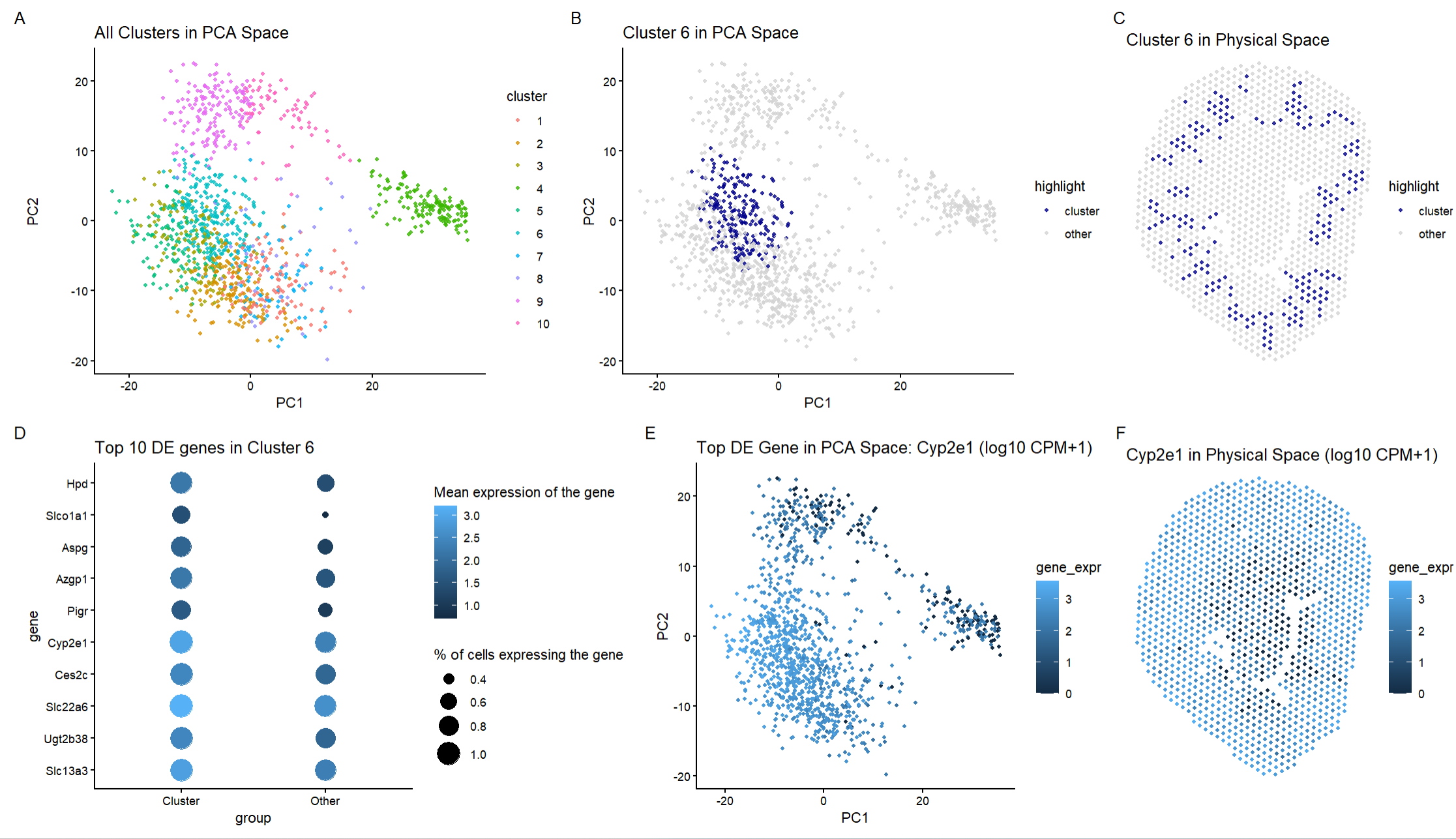
For the previous homework assignments, I was using the Xenium dataset. For this assignment, I switched to the Visium dataset. To identify the same cell type that I found in HW3 (proximal tubule epithelial cells), I made the following changes to the code: I changed the number of clusters. For the Xenium dataset, I used 12 clusters but for the Visium dataset I used 10 clusters. Xenium provides single-cell resolution which means that each data point represents an individual cell. This enables subtle differences to be determined between more closely related cell types. Therefore, there is higher resolution which helps in identifying more distinct clusters. However, Visium captures gene expression from multi-cell spots where each spot contains many several cells. This means that the gene expression is averaged across multiple cells. This leads to the differences that are discerned in the Xenium data not as noticeable which leads to fewer clusters. Thus, reducing the number of clusters to 10 for Visium reflects the lower spatial resolution of the method. I used all the genes in the dataset rather than limiting the number of genes to the top 250. This is because Visium has lower resolution and restricting the number of genes to the top 250 could remove potentially important biological signals. Using more genes improves the cluster separation in lower resolution data. I changed panels E and F to depict the gene Cyp2e1 so I could compare the same gene across two different datasets. Upon comparison, this gene is expressed similarly in both datasets in both PCA space and spatially. This helps visually support that I have found the same cell type in this homework as I did for the last homework.
To figure out the same spatial location that I found in HW3, I went through each cluster using the code for Panel 3. Cluster 6 is the cluster that matches most closely with the spatial location that I found in the Xenium dataset which is why I chose this cluster.
I used the same code framework for this assignment as I did for HW3. Panel A shows all the clusters in PCA space after k means clustering, Panel B highlights cluster 6 in space to show that it forms a compact and transcriptionally district group, Panel C maps cluster 6 to the physical tissue space which allows for anatomical organization to be determined. Panel D shows the top 10 differentially expressed genes in cluster 6 compared to all other clusters using a dot plot (the dot size = percent expressing, color = mean expression), Panel E shows the gene Cyp2e1 in PCA space, and Panel F shows the gene Cyp2e1 in physical space.
In the Xenium dataset, cluster 6 was identified as proximal tubule epithelial cells based on the strong differential expression of Cyp2e1, Slc22a6, Slc7a13, Cyp4b1, Inmt, Acsm3, Adh1, Papss2 (all genes that are expressed in proximal tubule epithelial cells) and the spatial location of the cluster as this cluster was found where the cortical tubular structures of the kidney are located. Looking at the Visium data, I found the following genes to overlap with the Xenium data: Cyp2e1 and Slc22a6 which are genes that are expressed in proximal tubule epithelial cells. Additionally, the other genes that are differentially expressed like Hpd, Slco1a1, Aspg, Azgp1, Pigr, Ugt2b38, and Slc13a3 are all found in proximal tubule epithelial cells. Hpd is critical for preventing tyrosinemia and renal toxicity from amino acid buildup in proximal tubule epithelial cells. Azgp1 promotes lipid mobilization and anti-inflammatory signaling which protects proximal epithelial cells during metabolic stress or injury. Slc13a3 reabsorbs Krebs cycle intermediates like succinate and glutamate which helps fuel proximal tubule epithelial energy metabolism. Thus, looking at the types of genes that are expressed in this cluster, this cluster contains proximal tubule epithelial cells which are the same cells that I found in my previous homework.
Next, looking at the spatial configuration of the genes (Panel C), the cluster I found in the Visium matches closely to the cluster I found in the Xenium dataset. In the Xenium dataset, cluster 6 formed a ring-like structure that was consistent with the proximal tubules. In the Visium dataset, cluster 6 is also found in a ring-like structure that follows the tubular structure of the proximal tubules. Although Visium does have lower spatial resolution, the anatomical distribution is consistent with how the proximal tubules look in the kidney.
Ultimately, based on looking at the genes expressed and the spatial organization of the data, I believe that I have identified the same cell type in the Visium data as I did in the Xenium data.
https://pmc.ncbi.nlm.nih.gov/articles/PMC8722798/ https://esbl.nhlbi.nih.gov/Databases/MusRNA-Seq/ https://www.nature.com/articles/s41598-020-65154-2
Code
```r
library(ggplot2) library(patchwork) library(dplyr)
read in data
data <- read.csv(“C:/Users/gtbud/Downloads/Visium-IRI-ShamR_matrix.csv.gz”)
pos <- data[,c(‘x’, ‘y’)] rownames(pos) <- data[, 1] gexp <- data[, 4: ncol(data)] rownames(gexp) <- data[, 1]
totgexp <- rowSums(gexp) mat <- log10(gexp / totgexp * 1e6 + 1)
df <- data.frame(pos, totgexp)
vg <- apply(mat, 2, var) vargenes <- names(sort(vg, decreasing=TRUE)) matsub <- mat[, vargenes]
PCA
pcs <- prcomp(matsub)
plot(pcs$sdev[1:50], type=”b”, main=”Scree plot (first 50 PCs)”)
k means elbow plot to figure out the number of clusters to use
X <- pcs$x[, 1:10] Ks <- 2:25 wss <- sapply(Ks, function(k) kmeans(X, centers = k)$tot.withinss)
elbow_df <- data.frame(K = Ks, WSS = wss)
ggplot(elbow_df, aes(K, WSS)) + geom_point() + theme_classic() + ggtitle(“k means clustering”)
k means clustering and set seed so that clusters are always the same
set.seed(1) km <- kmeans(X, centers = 10)
clusters <- factor(km$cluster) names(clusters) <- rownames(mat)
PCA + dataframes
pc_df <- data.frame( PC1 = pcs$x[,1], PC2 = pcs$x[,2], cluster = clusters )
space_df <- data.frame( x = pos$x, y = pos$y, cluster = clusters )
go through to find cluster
cluster_of_interest <- “6”
pc_df$highlight <- ifelse(pc_df$cluster == cluster_of_interest, “cluster”, “other”) space_df$highlight <- ifelse(space_df$cluster == cluster_of_interest, “cluster”, “other”)
differential expression
in_cells <- names(clusters)[clusters == cluster_of_interest] out_cells <- names(clusters)[clusters != cluster_of_interest]
mat_in <- mat[in_cells, , drop = FALSE] mat_out <- mat[out_cells, , drop = FALSE]
mean_in <- colMeans(mat_in) mean_out <- colMeans(mat_out) logFC <- mean_in - mean_out
pct_in <- colMeans(mat_in > 0) pct_out <- colMeans(mat_out > 0)
genes <- colnames(mat) pval <- sapply(genes, function(g) wilcox.test(mat_in[, g], mat_out[, g])$p.value)
de <- data.frame( gene = genes, logFC = logFC[genes], pct_in = pct_in[genes], pct_out = pct_out[genes], pval = pval )
de$padj <- p.adjust(de$pval, method = “BH”) de$neglog10p <- -log10(de$padj) de <- de[order(-de$logFC, de$padj), ]
identify the top 10 genes
head(de, 10)
top_gene <- “Cyp2e1” top10_genes <- de$gene[1:10]
make the dot plot for visualization
dot_df <- do.call(rbind, lapply(top10_genes, function(g) { data.frame( gene = g, group = c(“Cluster”, “Other”), mean_expr = c( mean(mat[in_cells, g]), mean(mat[out_cells, g]) ), pct_expr = c( mean(mat[in_cells, g] > 0), mean(mat[out_cells, g] > 0) ) ) }))
dot_df$gene <- factor(dot_df$gene, levels = rev(top10_genes))
p4_dotplot <- ggplot(dot_df, aes(group, gene)) + geom_point(aes(size = pct_expr, color = mean_expr)) + scale_size(range = c(2, 8)) + theme_classic() + ggtitle(“Top 10 DE genes in Cluster 6”) + labs(size = “% of cells expressing the gene”, color = “Mean expression of the gene”)
overlays for gene expression
pc_df$gene_expr <- mat[rownames(pc_df), top_gene] space_df$gene_expr <- mat[rownames(space_df), top_gene]
make the visualization
p1_all_clusters <- ggplot(pc_df, aes(PC1, PC2, color = cluster)) + geom_point(size = 1, alpha = 0.8) + theme_classic() + ggtitle(“All Clusters in PCA Space”)
p2_highlight_cluster <- ggplot(pc_df, aes(PC1, PC2, color = highlight)) + geom_point(size = 1, alpha = 0.8) + scale_color_manual(values = c(other = “lightgrey”, cluster = “darkblue”)) + theme_classic() + ggtitle(paste(“Cluster”, cluster_of_interest, “in PCA Space”))
p3_cluster_space <- ggplot(space_df, aes(x, y, color = highlight)) + geom_point(size = 1, alpha = 0.8) + scale_color_manual(values = c(other = “lightgrey”, cluster = “darkblue”)) + coord_fixed() + theme_void() + ggtitle(paste(“Cluster”, cluster_of_interest, “in Physical Space”))
p5_gene_pca <- ggplot(pc_df, aes(PC1, PC2, color = gene_expr)) + geom_point(size = 1) + theme_classic() + ggtitle(paste(“Top DE Gene in PCA Space:”, top_gene, “(log10 CPM+1)”))
p6_gene_space <- ggplot(space_df, aes(x, y, color = gene_expr)) + geom_point(size = 1) + coord_fixed() + theme_void() + ggtitle(paste(top_gene, “in Physical Space (log10 CPM+1)”))
combine all the panels
final_plot <- (p1_all_clusters | p2_highlight_cluster | p3_cluster_space) / (p4_dotplot | p5_gene_pca | p6_gene_space) + plot_annotation(tag_levels = “A”)
final_plot
This code was repurposed and changed based on the code I used in HW3
The beginning of the code was done in class with Prof. Fan (setting up the data to work with it, PCA, and k means)
AI was used to learn how to create my dot plot for my top 10 DE genes (How do I create a dot plot for my differentially expressed genes in R?)
AI was used to set-up the R syntax to figure out my differentially expressed genes (How do I find differentially expressed genes in my dataset?)