Identifying Tissue Type in Spleen

Description
My full analysis followed a similar pipeline to the previous homework assignments. I began by performing quality control by removing cells in the bottom 1% of total protein expression in the dataset, so that they would not skew the analysis down the line. I then normalized protein expression by scaling each cell by its total protein signal followed by a log transform. After that, I filtered to remove any invalid cells after the log transform.
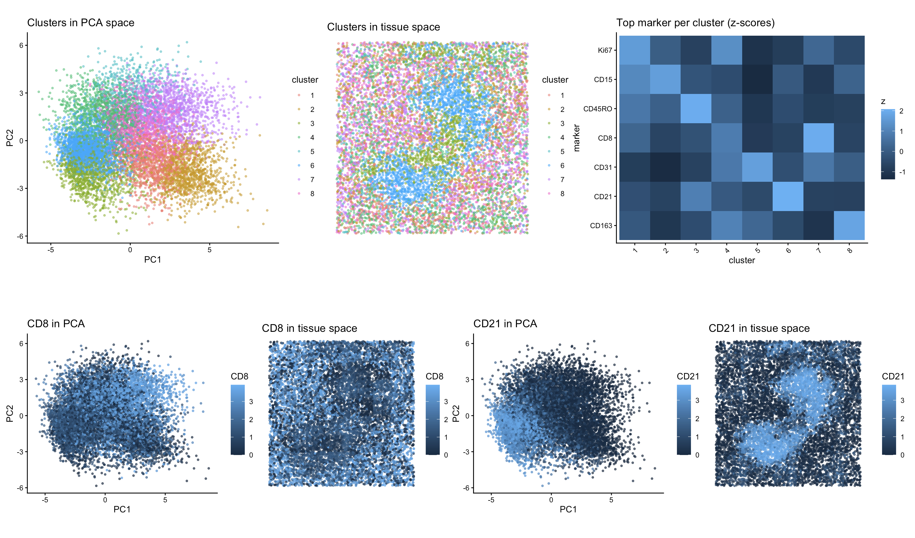
To decide the number of PCs to include, I made a scree plot, and chose to use the first 10 PCs for the remainder of my analysis. I then created a plot of withinness for different numbers of centroids to use in kmeans clustering, and determined that 8 would be a good value to use because of what I observed in the elbow plot. I then created my first two panels, where I visualized all 8 clusters in PCA space (top left) and in tissue space (top center).
To determine the tissue type of the sample, I performed differential expression analysis by comparing each cluster to all remaining cells using a Wilcoxon rank-sum test to identify proteins that were significantly enriched within that cluster relative to the rest of the dataset. I then extracted the top marker protein for each cluster and created a heat map visualizing the relative expression of those proteins across all 8 clusters (top right). Based on that heat map, I was able to observe that cluster 6 had high expression of CD21 with relatively low expression of other marker proteins, and cluster 7 had high expression of CD8 with relatively low expression of other marker proteins. Both of those proteins are associated with lymphocytes. I then chose to visualize how each of those proteins were expressed in the dataset both in PCA space and in physical tissue space (bottom row).
CD21 is a marker associated with B cells, while CD8 is a marker associated with cytotoxic T cells. Visualization of CD21 expression showed spatially localized regions with high expression that formed structures that seemed follicle-like within the tissue. The CD8 expression was more broadly distributed, which is consistent with T-cell populations that surround or intersperse between B-cell follicles. These two markers represent distinct immune cell types with complementary spatial distributions.
Based on the cell types that I was able to visualize, I believe that this tissue sample primarily represents white pulp. The presence of CD21-positive B cells forming discrete follicle-like regions, together with surrounding CD8-positive T cells, is consistent with how white pulp is organized in the spleen, which is characterized by lymphocyte-rich follicles and adjacent T-cell zones. Even though there were other immune markers in the dataset, the most clearly identifiable structure corresponded to lymphoid follicles, which supports the interpretation that this sample is white pulp.
Sources:
- https://www.neobiotechnologies.com/resources/cd21-b-cell/?srsltid=AfmBOoo_ORwLdvuYmKCePJj40T4tfenWiDfQVeH74copCUj2Tu8TO9g_
- https://www.bio-techne.com/resources/blogs/cd8-alpha-marker-for-cytotoxic-t-lymphocytes
- https://pmc.ncbi.nlm.nih.gov/articles/PMC6495537/
Code (paste your code in between the ``` symbols)
1
2
3
4
5
6
7
8
9
10
11
12
13
14
15
16
17
18
19
20
21
22
23
24
25
26
27
28
29
30
31
32
33
34
35
36
37
38
39
40
41
42
43
44
45
46
47
48
49
50
51
52
53
54
55
56
57
58
59
60
61
62
63
64
65
66
67
68
69
70
71
72
73
74
75
76
77
78
79
80
81
82
83
84
85
86
87
88
89
90
91
92
93
94
95
96
97
98
99
100
101
102
103
104
105
106
107
108
109
110
111
112
113
114
115
116
117
118
119
120
121
122
123
124
125
126
127
128
129
130
131
132
133
134
135
136
137
138
139
140
141
142
143
144
145
146
147
148
149
150
151
152
153
154
155
156
157
158
159
160
161
162
163
164
165
166
167
168
169
170
171
172
173
174
175
176
177
178
179
180
181
182
183
184
185
186
187
188
189
#NOTE: view the final plot in full screen mode or else it looks squished
library(ggplot2)
library(patchwork)
library(dplyr)
library(Rtsne)

data <- read.csv("~/Desktop/codex_spleen2.csv.gz")

pos  <- data[, 2:3]
pexp <- data[, 5:ncol(data)]
area <- data[, 4]

rownames(pos)  <- data[, 1]
rownames(pexp) <- data[, 1]
names(area)    <- data[, 1]


# QC filtering
totpexp <- rowSums(pexp)

#remove bottom 1% of pexp
threshold <- quantile(totpexp, 0.01)
keep <- totpexp > threshold

pexp <- pexp[keep, , drop = FALSE]
pos  <- pos[keep, , drop = FALSE]
area <- area[keep]


# Normalize and log transform
pexp_norm <- pexp / rowSums(pexp)
pexp_norm <- pexp_norm * 10000
pexp_log  <- log10(pexp_norm + 1)

#filter to remove any invalid cells
#I had to add this because I was getting warnings before
keep2 <- is.finite(rowSums(pexp_log))
pexp_log <- pexp_log[keep2, , drop = FALSE]
pos      <- pos[keep2, , drop = FALSE]
area     <- area[keep2]

# PCA, chose 10 PCs based on scree plot
pcs <- prcomp(pexp_log, scale. = TRUE)
X <- pcs$x[, 1:10]

# kmeans
set.seed(1)
k <- 8
km <- kmeans(X, centers = k, nstart = 50)
clusters <- factor(km$cluster)
names(clusters) <- rownames(X)

pc_df <- data.frame(
  PC1 = X[, 1],
  PC2 = X[, 2],
  cluster = clusters
)
rownames(pc_df) <- rownames(X)

space_df <- data.frame(
  x = pos[, 1],
  y = pos[, 2],
  cluster = clusters[rownames(pos)]
)
rownames(space_df) <- rownames(pos)

#plots of all the clusters
p_pca_clusters <- ggplot(pc_df, aes(PC1, PC2, color = cluster)) +
  geom_point(size = 0.8, alpha = 0.5) +
  theme_classic() + coord_fixed() +
  ggtitle("Clusters in PCA space")

p_space_clusters <- ggplot(space_df, aes(x, y, color = cluster)) +
  geom_point(size = 0.8, alpha = 0.5) +
  theme_void() + coord_fixed() +
  ggtitle("Clusters in tissue space")


# DE comparing each cluster to the rest
mat <- pexp_log

de_one_cluster <- function(cl){
  in_cells  <- names(clusters)[clusters == cl]
  out_cells <- names(clusters)[clusters != cl]

  mat_in  <- mat[in_cells, , drop = FALSE]
  mat_out <- mat[out_cells, , drop = FALSE]

  mean_in  <- colMeans(mat_in)
  mean_out <- colMeans(mat_out)
  logFC <- mean_in - mean_out

  feats <- colnames(mat)
  pval <- sapply(feats, function(f){
    wilcox.test(mat_in[, f], mat_out[, f], alternative = "greater")$p.value
  })

  de <- data.frame(feature = feats, logFC = logFC, pval = pval)

  #sort by biggest effect then pval
  de <- de[order(-de$logFC, de$pval), ]
  de
}

de_list <- lapply(levels(clusters), de_one_cluster)
names(de_list) <- paste0("Cluster", levels(clusters))

# Top marker per cluster
p_thresh <- 0.05
top_marker_per_cluster <- sapply(names(de_list), function(nm){
  de <- de_list[[nm]]
  de <- de[de$logFC > 0 & de$pval < p_thresh, , drop = FALSE]
  if(nrow(de) == 0) return(NA)
  de$feature[1]
})

top_marker_per_cluster

#Create a heatmap of the top marker in each cluster
marker_set <- na.omit(unique(as.character(top_marker_per_cluster)))

heat_df <- expand.grid(
  marker = marker_set,
  cluster = levels(clusters),
  stringsAsFactors = FALSE
)

heat_df$avg_expr <- mapply(function(mk, cl){
  cells <- names(clusters)[clusters == cl]
  mean(mat[cells, mk])
}, heat_df$marker, heat_df$cluster)

#z-score within each marker for plotting
heat_df <- heat_df |>
  dplyr::group_by(marker) |>
  dplyr::mutate(z = (avg_expr - mean(avg_expr)) / sd(avg_expr)) |>
  dplyr::ungroup()

# order markers by which cluster they came from
marker_order <- top_marker_per_cluster[!is.na(top_marker_per_cluster)]
marker_order <- unique(marker_order)

heat_df$marker <- factor(heat_df$marker, levels = rev(marker_order))

p_heat <- ggplot(heat_df, aes(x = cluster, y = marker, fill = z)) +
  geom_tile() +
  theme_classic() +
  ggtitle("Top marker per cluster (z-scores)") +
  theme(axis.text.x = element_text(angle = 45, hjust = 1)) +
  labs(fill = "z")

#selected markers
geneA <- "CD8"
geneB <- "CD21"

#PCA expression plots
pc_df$exprA <- mat[rownames(pc_df), geneA]
pc_df$exprB <- mat[rownames(pc_df), geneB]

p_geneA_pca <- ggplot(pc_df, aes(PC1, PC2, color = exprA)) +
  geom_point(size = 0.8, alpha = 0.7) +
  theme_classic() + coord_fixed() +
  ggtitle(paste(geneA, "in PCA")) +
  labs(color = geneA)

p_geneB_pca <- ggplot(pc_df, aes(PC1, PC2, color = exprB)) +
  geom_point(size = 0.8, alpha = 0.7) +
  theme_classic() + coord_fixed() +
  ggtitle(paste(geneB, "in PCA")) +
  labs(color = geneB)

#Spatial expression plots
space_df$exprA <- mat[rownames(space_df), geneA]
space_df$exprB <- mat[rownames(space_df), geneB]

p_geneA_space <- ggplot(space_df, aes(x, y, color = exprA)) +
  geom_point(size = 0.8, alpha = 0.7) +
  theme_void() + coord_fixed() +
  ggtitle(paste(geneA, "in tissue space")) +
  labs(color = geneA)

p_geneB_space <- ggplot(space_df, aes(x, y, color = exprB)) +
  geom_point(size = 0.8, alpha = 0.7) +
  theme_void() + coord_fixed() +
  ggtitle(paste(geneB, "in tissue space")) +
  labs(color = geneB)

(p_pca_clusters | p_space_clusters | p_heat ) / (p_geneA_pca | p_geneA_space | p_geneB_pca | p_geneB_space)
Attributions: AI was used to implement the z-score calculations to create the heatmap. Additionally, this code builds on my work from HW4, and all previous attributions still apply.