Identification of splenic white pulp through dimensionality reduction, k-means clustering, and differential expression analysis

1. Figure description
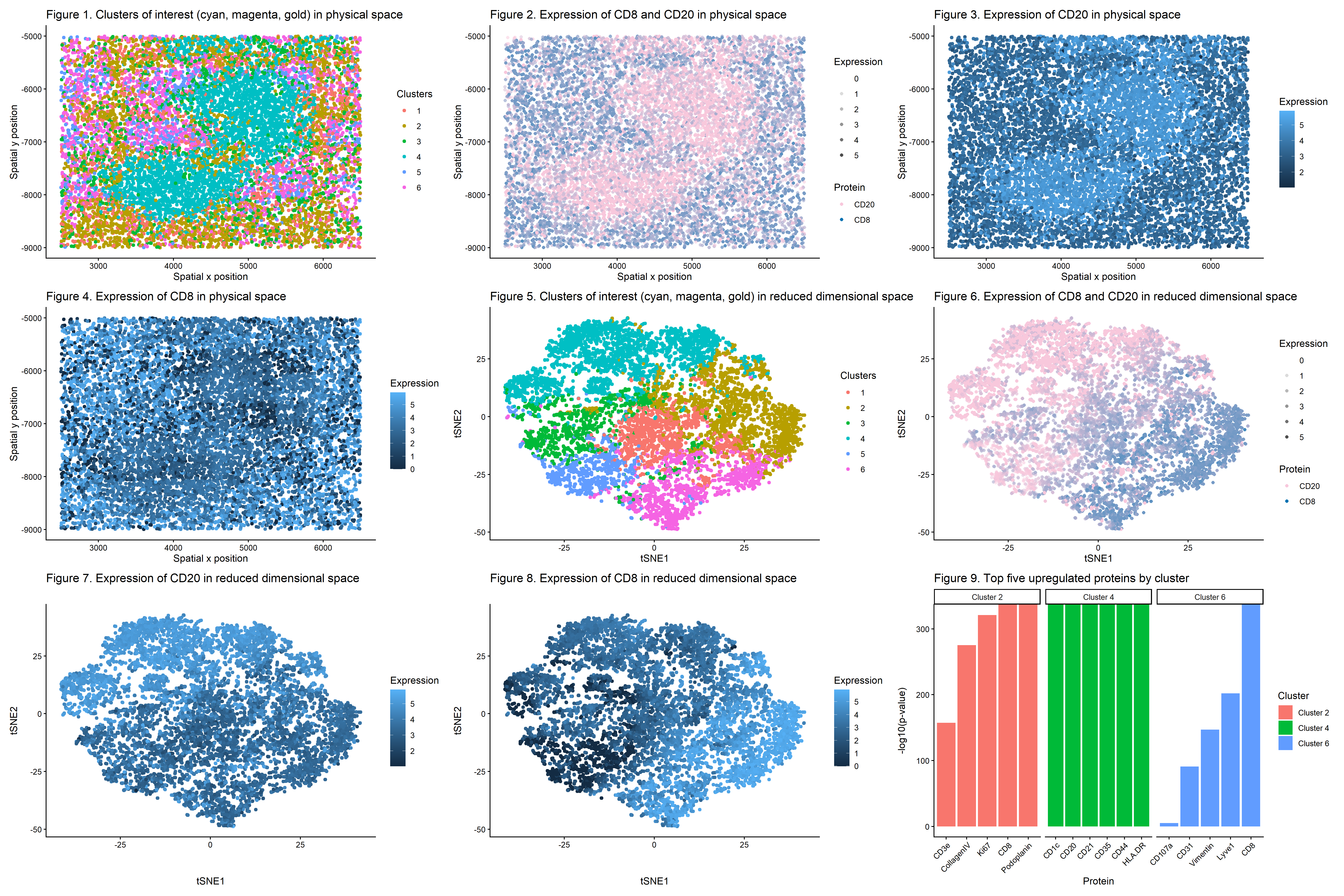
This multi-panel data visualization uses principal component analysis (PCA), t-distributed stochastic neighbor embedding (tSNE), k-means clustering, and differential expression analysis to characterize clusters of interest based on protein expression patterns with the broader goal of identifying the represented splenic tissue structure.
In Figure 1, cells are visualized in physical tissue space and colored by cluster identity. There are three clusters of interest. Cluster 2 is labeled with a gold hue, Cluster 4 is labeled with a cyan hue, and Cluster 6 is labeled with a magenta hue. In Figure 2, spatial expression patterns of two proteins (CD8 and CD20) are shown across the tissue. These proteins are differentially upregulated in the clusters of interest. CD8 shows increased expression in regions overlapping with Clusters 2 and 6 while CD20 shows increased expression in regions overlapping with Cluster 4. In Figure 3, the spatial expression of CD20 alone is shown with expression levels encoded by color saturation on a blue scale. Higher levels of expression localize to regions corresponding to Cluster 4.
In Figure 4, the spatial expression of CD8 alone is shown with expression levels encoded by color saturation on a blue scale. Higher levels of expression localize to regions corresponding to Clusters 2 and 6. In Figure 5, cells are visualized in reduced dimensional space using tSNE (after performing PCA on the data). Once again, Cluster 2 is labeled with a gold hue, Cluster 4 is labeled with a cyan hue, and Cluster 6 is labeled with a magenta hue. In Figure 6, expression patterns of CD8 and CD20 are projected onto tSNE space. CD8 shows increased expression in regions overlapping with Clusters 2 and 6 while CD20 shows increased expression in regions overlapping with Cluster 4.
In Figure 7, the expression of CD20 alone is visualized in tSNE space with expression levels encoded by color saturation on a blue scale. Similar to the previous plots, higher levels of CD20 expression localize to regions corresponding to Cluster 4. In Figure 8, the expression of CD8 alone is visualized in tSNE space with expression levels encoded by color saturation on a blue scale. Similar to the previous plots, higher levels of CD8 expression localize to regions corresponding to Clusters 2 and 6. In Figure 9, the top five upregulated proteins are shown for Clusters 2, 4, and 6 based on p-values from the Wilcoxon Rank Sum Test.
2. Data analysis
Log-transformation and normalization were first performed to make the data more Gaussian and reduce the variation in total protein expression intensities per cell. Correlations between cell area and protein expression were investigated as well as spatial patterns of large cells, but since none were found in this data set, cell area was disregarded in further analysis.
Afterward, PCA and tSNE were performed to capture biological variation and visualize any nonlinear relationships among cells. An elbow plot was created to determine the optimal k value for k-means clustering based on total withinness. This data set had an optimal k value of 10-13, but upon performing k-means clustering, it became apparent that the k value was too large since the cells appeared overclustered. Thus, a k value of 6 was used.
In reduced dimensional space, Cluster 4 formed a distinct grouping, suggesting that these cells share transcriptional similarities. Clusters 2 and 6 also formed distinct groupings. Visualizing CD8 and CD20 in tSNE space showed that both proteins are strongly enriched within their relevant clusters, and performing differential expression analysis via the Wilcoxon Rank Sum Test confirmed this observation. Both proteins have the lowest p-values, indicating they are highly differentially upregulated in the relevant clusters of interest as compared to all other clusters. Furthermore, spatial mapping shows that expression of CD20 colocalizes with Cluster 4 while expression of CD8 colocalizes with Clusters 2 and 6 in physical space, too.
3. Identification of splenic tissue structure
The represented tissue structure is most consistent with splenic white pulp based on the cell types identified by analyzing differentially upregulated protein expression in the clusters of interest. Responsible for adaptive immune responses, the white pulp of the spleen contains germinal centers of B cells surrounded by marginal layers of T cells [1]. Studies have identified CD20 as a well-established marker for B cells and CD8 as a well-established marker for T cells [2,3].
Data analysis supports the presence of two distinct lymphocyte populations, specifically CD20+ B cells and CD8+ T cells, in the tissue structure. Figures 2 and 3 demonstrate that CD20+ B cells form dense, localized regions rather than being dispersed throughout the tissue. This pattern is consistent with B-cell follicles, a feature of splenic white pulp [4]. Based on Figures 2 and 4, CD8 expression shows a complementary but distinct pattern relative to CD20. This means CD8+ T cells occupy adjacent spatial regions, which is consistent with white pulp having T-cell-rich zones near B-cell follicles [5]. In fact, T cells are known to migrate to the boundaries of B-cell follicles during adaptive immune responses [4].
Figure 9 demonstrates that immune cells dominate the clusters of interest in the represented tissue structure. In Cluster 2, CD8 and Podoplanin had the lowest p-values, so they were the most upregulated proteins. Since splenic white pulp is made of lymphatic tissue, the heightened presence of Podoplanin, a marker for lymphatic endothelial cells, provides further evidence of the tissue type [1,6]. Upregulated expression of Ki67 in Cluster 2 indicates immune cell activation, especially T cell activation [7]. Meanwhile, Cluster 4 has other upregulated proteins aside from CD20, namely CD21 and CD35. These proteins are expressed on follicular dendritic cells and B cells, both of which are found in splenic white pulp because they work together to activate the adaptive immune system [8,9]. CD1c is also upregulated in Cluster 4 and serves as a marker for B cells closer to the marginal zones in the white pulp [10]. Finally, CD8 dominates Cluster 6, but there is also expression of Lyve1, another marker for lymphatic endothelial cells [11]. These additional proteins found in the clusters of interest support the identification of the tissue structure as splenic white pulp.
4. List of references
- https://www.ncbi.nlm.nih.gov/books/NBK537307/
- https://pmc.ncbi.nlm.nih.gov/articles/PMC7271567/
- https://www.nature.com/articles/s12276-023-01105-x
- https://www.nature.com/articles/nri1669
- https://pmc.ncbi.nlm.nih.gov/articles/PMC1850570/#f2
- https://genular.atomic-lab.org/details-gene/5076
- https://www.sciencedirect.com/science/article/pii/S0022175916301557
- https://pmc.ncbi.nlm.nih.gov/articles/PMC9939015/
- https://pmc.ncbi.nlm.nih.gov/articles/PMC1939903/
- https://www.researchgate.net/figure/CD1c-as-a-strong-marker-of-splenic-marginal-zone-B-cells-in-humans-Serial-cryosections_fig2_8515380
- https://www.ncbi.nlm.nih.gov/gene/10894
5. Code
1
2
3
4
5
6
7
8
9
10
11
12
13
14
15
16
17
18
19
20
21
22
23
24
25
26
27
28
29
30
31
32
33
34
35
36
37
38
39
40
41
42
43
44
45
46
47
48
49
50
51
52
53
54
55
56
57
58
59
60
61
62
63
64
65
66
67
68
69
70
71
72
73
74
75
76
77
78
79
80
81
82
83
84
85
86
87
88
89
90
91
92
93
94
95
96
97
98
99
100
101
102
103
104
105
106
107
108
109
110
111
112
113
114
115
116
117
118
119
120
121
122
123
124
125
126
127
128
129
130
131
132
133
134
135
136
137
138
139
140
141
142
143
144
145
146
147
148
149
150
151
152
153
154
155
156
157
158
159
160
161
162
163
164
165
166
167
168
169
170
171
172
173
174
175
176
177
178
179
180
181
182
183
184
185
186
187
188
189
190
191
192
193
194
195
196
197
198
199
200
201
202
203
204
205
206
207
208
209
210
211
212
213
214
215
216
217
218
219
220
221
222
223
224
225
226
227
228
229
230
231
232
233
234
235
236
237
238
239
240
241
242
243
244
245
246
247
248
249
250
251
252
253
254
255
# Read data
data <- read.csv('C:/Users/jamie/OneDrive - Johns Hopkins/Documents/Genomic Data Visualization/codex_spleen2.csv.gz')

# Each row represents one cell
# First column represents cell names
# Second and third columns represent x and y spatial positions of cells
# Fourth column represents cell areas
# Fifth and beyond columns represent expression intensities of specific proteins in cells
data[1:8,1:8]

# 10,000 cells with 32 different features
dim(data)

# Separate and preview spatial data
pos <- data[, 2:3]
rownames(pos) <- data[, 1]
head(pos)

# Separate and preview protein expression data
pexp <- data[, 5:ncol(data)]
rownames(pexp) <- data[, 1]
head(pexp)

# Separate and preview area data
area <- data[, 4]
names(area) <- data[, 1]
head(area)

# What is the total protein expression intensity per cell?
# Since rows represent cells, add all protein expression intensities for each row
totpexp <- rowSums(pexp)
head(totpexp)

# Cells with highest total protein expression intensity
head(sort(totpexp, decreasing = TRUE))

# Cells with lowest total protein expression intensity
head(sort(totpexp, decreasing = FALSE))

# Data has high variation in total protein expression intensities per cell
# Obtain proportional representation of each protein's expression in each cell
# Normalize by counts per million with pseudo-count of 1 to avoid getting undefined values
# Log-transform makes data more Gaussian
mat <- log10(pexp/totpexp * 1e6 + 1)
head(mat)
newtotpexp <- rowSums(mat)

# Cells with highest total protein expression intensity
head(sort(newtotpexp, decreasing = TRUE))

# Cells with highest total protein expression intensity
head(sort(newtotpexp, decreasing = FALSE))

# Variation in protein expression intensity data has been reduced
# Now we should view the distribution of cell areas
library(ggplot2)
df_area <- data.frame(area)
head(df_area)
ggplot(df_area, aes(x = 1, y = area)) + geom_violin()

# A few cells have extremely large areas
# Check if there is correspondence between cell area and total protein expression intensity
# Check if there are spatial patterns of large cells within tissue
df_area_mat <- data.frame(pos, area, newtotpexp)
ggplot(df_area_mat, aes(x = log10(area), y = newtotpexp)) + geom_point()
ggplot(df_area_mat, aes(x = x, y = y, col = log10(area))) + geom_point()

# Plots do not show clear correspondence or spatial patterns, so we do not need to normalize by area
# Now make PCs with default settings and set seed to eliminate randomness
set.seed(35)
pcs <- prcomp(mat, center = TRUE, scale = FALSE)
df_pcs <- data.frame(pcs$x, pos)
ggplot(df_pcs, aes(x=x, y=y, col=PC1)) + geom_point(size=2)

# Run tSNE on first 10 PCs to capture sufficient variation of data while keeping elbow plot smooth
tn <- Rtsne::Rtsne(pcs$x[, 1:10], dim=2)
emb <- tn$Y
rownames(emb) <- rownames(mat)
colnames(emb) <- c('tSNE1', 'tSNE2')
head(emb)

# Create elbow plot for number of clusters vs. total within-cluster sum of squares
centers <- 1:70
tot_withinss <- numeric(length(centers))

for (i in centers) {
  km <- kmeans(mat, centers = i)
  tot_withinss[i] <- km$tot.withinss
}

plot(centers, tot_withinss, type = "b",
     xlab = "Number of centers (k)",
     ylab = "Total within-cluster sum of squares",
     main = "Elbow Plot for k-means")

# Variation in total within-cluster sum of squares starts to decrease around cluster 10

# K means clustering
# First set centers to 10 due to the results of the elbow plot, then check plots and adjust accordingly
# Set seed to any number to keep cluster of interest labeled the same color
set.seed(13)
clusters <- as.factor(kmeans(pcs$x[,1:10], centers=6)$cluster)
df_clusters <- data.frame(emb, pcs$x, pos, clusters)
g1 <- ggplot(df_clusters, aes(x=x, y=y, col=clusters)) + geom_point(size=1.5) + labs(x='Spatial x position', y='Spatial y position', title='Figure 1. Clusters of interest (cyan, magenta, gold) in physical space', color='Clusters') + theme_classic()
g5 <- ggplot(df_clusters, aes(x=tSNE1, y=tSNE2, col=clusters)) + geom_point(size=1.5) + labs(x='tSNE1', y="tSNE2", title='Figure 5. Clusters of interest (cyan, magenta, gold) in reduced dimensional space', color='Clusters') + theme_classic()

# Compare protein expression in cells of cluster of interest vs. cells of all other clusters
clusterofinterest <- names(clusters)[clusters == 4]
othercells <- names(clusters)[clusters != 4]

# Loop to compare expression of all proteins in cluster of interest vs. other clusters
out <- sapply(colnames(mat), function(gene) {
  x1 <- mat[clusterofinterest, gene]
  x2 <- mat[othercells, gene]
  wilcox.test(x1, x2, alternative = 'greater')$p.value
})

# Find genes with smallest p values
sort(out, decreasing=FALSE)

# CD20 has the lowest p value and serves as marker for B cells in splenic white pulp
df_CD20 <- data.frame(emb, pcs$x, pos, clusters, gene=mat[,'CD20'])
g7 <- ggplot(df_CD20, aes(x=tSNE1, y=tSNE2, col=gene)) + geom_point(size=1.5) + labs(x='tSNE1', y="tSNE2", title='Figure 7. Expression of CD20 in reduced dimensional space', color = "Expression") + theme_classic()
g3 <- ggplot(df_CD20, aes(x=x, y=y, col=gene)) + geom_point(size=1.5) + labs(x='Spatial x position', y="Spatial y position", title='Figure 3. Expression of CD20 in physical space', color = "Expression") + theme_classic()

# Compare protein expression in cells of cluster of interest vs. cells of all other clusters
clusterofinterest <- names(clusters)[clusters == 2]
othercells <- names(clusters)[clusters != 2]

# Loop to compare expression of all proteins in cluster of interest vs. other clusters
out <- sapply(colnames(mat), function(gene) {
  x1 <- mat[clusterofinterest, gene]
  x2 <- mat[othercells, gene]
  wilcox.test(x1, x2, alternative = 'greater')$p.value
})

# Find genes with smallest p values
sort(out, decreasing=FALSE)

# Compare protein expression in cells of cluster of interest vs. cells of all other clusters
clusterofinterest <- names(clusters)[clusters == 6]
othercells <- names(clusters)[clusters != 6]

# Loop to compare expression of all proteins in cluster of interest vs. other clusters
out <- sapply(colnames(mat), function(gene) {
  x1 <- mat[clusterofinterest, gene]
  x2 <- mat[othercells, gene]
  wilcox.test(x1, x2, alternative = 'greater')$p.value
})

# Find genes with smallest p values
sort(out, decreasing=FALSE)

# CD8 has the lowest p value and serves as marker for T cells in splenic white pulp
df_CD8 <- data.frame(emb, pcs$x, pos, clusters, gene=mat[,'CD8'])
g8 <- ggplot(df_CD8, aes(x=tSNE1, y=tSNE2, col=gene)) + geom_point(size=1.5) + labs(x='tSNE1', y="tSNE2", title='Figure 8. Expression of CD8 in reduced dimensional space', color = "Expression") + theme_classic()
g4 <- ggplot(df_CD8, aes(x=x, y=y, col=gene)) + geom_point(size=1.5) + labs(x='Spatial x position', y="Spatial y position", title='Figure 4. Expression of CD8 in physical space', color = "Expression") + theme_classic()

# Make combined dataframe for both proteins
df_all <- data.frame(
  emb,
  pcs$x,
  pos,
  clusters,
  CD8 = mat[,'CD8'],
  CD20 = mat[,'CD20']
)

# Convert to long format
library(tidyr)

df_long <- pivot_longer(df_all,
                        cols = c(CD8, CD20),
                        names_to = "protein",
                        values_to = "expression")

# Set both proteins to different colors that mix favorably
protein_colors <- c(
  CD8  = "#0072B2",
  CD20 = "#F8C8DC"
)

# Plot all genes on same axes with different colors
# Use smaller sized points to better visualize co-localization of all proteins/colors
g6 <- ggplot(df_long, aes(x = tSNE1, y = tSNE2, col = protein, alpha = expression)) +
  geom_point(size = 1.5, shape = 16) +
  labs(x='tSNE1', y='tSNE2', title='Figure 6. Expression of CD8 and CD20 in reduced dimensional space', color = "Protein", alpha='Expression') +
  scale_color_manual(values = protein_colors) +
  scale_alpha_continuous(range = c(0, 0.7), limits = c(0, 5)) +
  theme_classic()

g2 <- ggplot(df_long, aes(x = x, y = y, col = protein, alpha = expression)) +
  geom_point(size = 1.5, shape = 16) +
  labs(x='Spatial x position', y='Spatial y position', title='Figure 2. Expression of CD8 and CD20 in physical space', color = "Protein", alpha='Expression') +
  scale_color_manual(values = protein_colors) +
  scale_alpha_continuous(range = c(0, 0.7), limits = c(0, 5)) +
  theme_classic()

# Upregulated proteins in each cluster
clusters_to_test <- c(2, 4, 6)

pvals <- lapply(clusters_to_test, function(cl) {
  cells_in  <- names(clusters)[clusters == cl]
  cells_out <- names(clusters)[clusters != cl]

  data.frame(
    protein = colnames(mat),
    pvalue  = sapply(colnames(mat), function(p) {
      wilcox.test(mat[cells_in, p],
                  mat[cells_out, p],
                  alternative = "greater")$p.value
    }),
    cluster = paste0("Cluster ", cl)
  )
})

pvals_df <- do.call(rbind, pvals)

library(dplyr)
library(ggplot2)

top_pvals <- pvals_df %>%
  group_by(cluster) %>%
  slice_min(pvalue, n = 5) %>%
  ungroup()

g9 <- ggplot(top_pvals,
       aes(x = reorder(protein, -log10(pvalue)),
           y = -log10(pvalue),
           fill = cluster)) +
  geom_col() +
  facet_wrap(~ cluster, scales = "free_x") +
  labs(x = "Protein",
       y = "-log10(p-value)",
       title = "Figure 9. Top five upregulated proteins by cluster",
       fill = 'Cluster') +
  theme_classic() +
  theme(axis.text.x = element_text(angle = 45, hjust = 1))

# Create and save multi-panel data visualization
library(patchwork)
panel <- g1 + g2 + g3 + g4 + g5 + g6 + g7 + g8 + g9

ggsave("hw5_jlim75.png", panel,
       width = 21, height = 14, dpi = 300)

# Prompts to ChatGPT
# How can I write a for-loop in R that calculates tot_withinss for centers 1 through 70 so that I can create an elbow plot using these numbers?
# How can I keep my cluster of interest labeled the same color no matter how many times I re-create the plots by re-running ggplot?
# How can I combine two different data frames into one data frame for the purposes of overlaying data onto one plot?
# How can I set the scale for gene expression levels so that an expression level of 0 corresponds with a completely transparent point?
# How can I set the two genes to two visibly distinct colors that produce a favorable color when mixed together in regions of co-expression?
# How can I increase the dimensions of my saved png file so that the nine graphs are not squished together?
# How can I write a loop in R to calculate the p-values for the top five most upregulated proteins in each cluster?
# How can I make a bar plot with p-values for the most upregulated proteins for three different clusters?