A multipanel data visualization identifying cell types in splenic white pulp

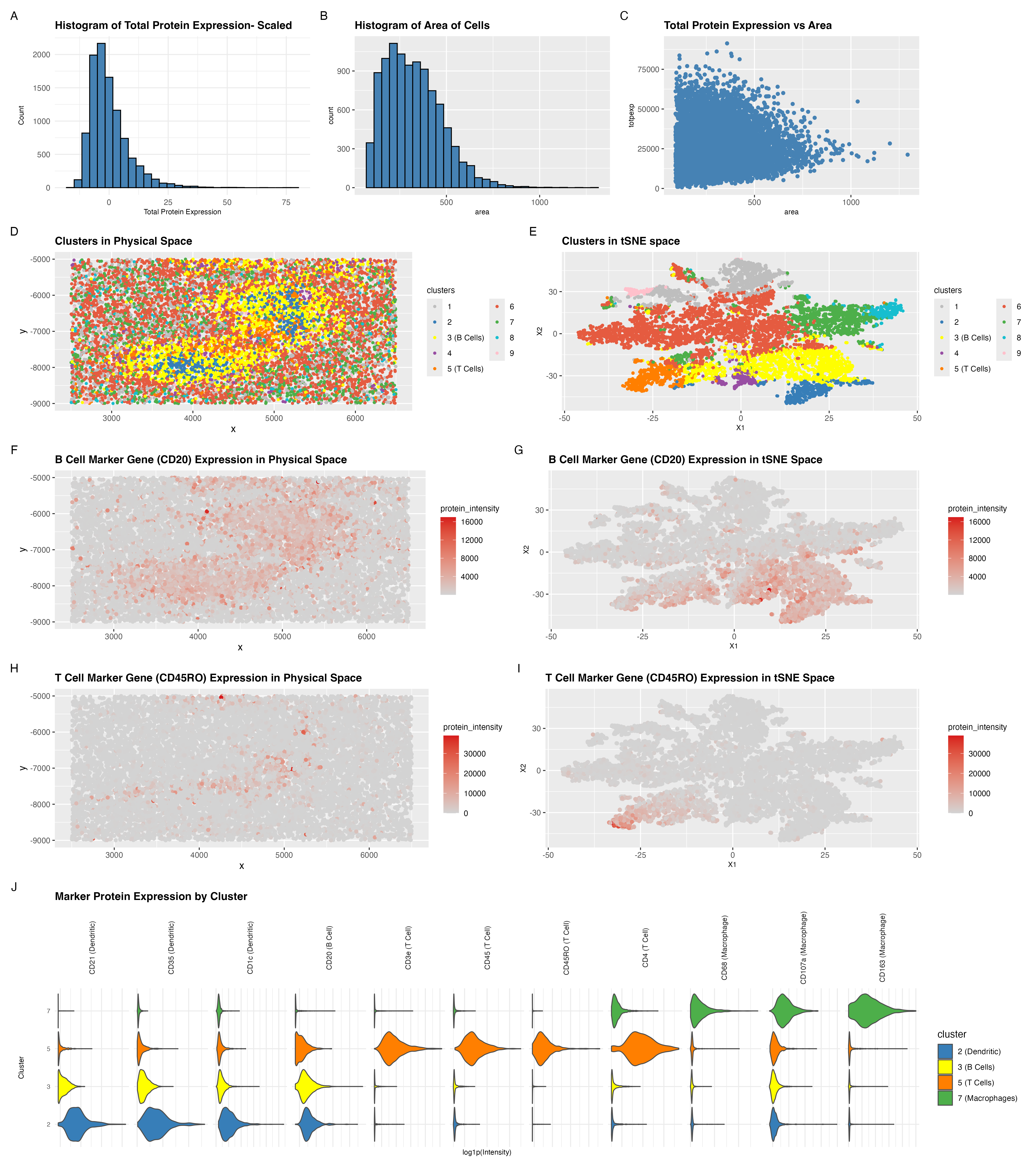
Figure out what tissue structure is represented in the CODEX data. Options include: (1) Artery/Vein, (2) White pulp, (3) Red pulp, (4) Capsule/Trabecula. You will need to visualize and interpret at least two cell-types. Create a data visualization and write a description to convince me that your interpretation is correct.
Tissue Structure- White pulp
I started my analysis by first viewing the total protein expression as a histogram. I then also viewed area as a histogram too. Through the histograms I saw that there were some cells with really large area and some cells with high total protein expression. I then had a question as to whether I must normalize on protein expression and cell area. To see whether this needs to be done I plotted total protein expression against area to see whether the two are correlated. However, as we see in panel C, the distribution shows no tight coupling between the two parameters. Therefore, I decided against normalizing and also against dropping really large cells or cells with high total protein expression as I figured that this must be true biological representation.
For better cluster visualization on tSNE and physical space I saw that z-score based scaling on protein expression per gene helped. However, for differential expression analysis I resorted to using the unscaled protein expression for each gene.
Using k-means clustering on the top 5 principal components, I identified 9 clusters. To determine an appropriate value of k, I used the total withiness parameter and observed it on an elbow plot for different values of k. The decrease in total within-cluster sum of squares becomes marginal beyond k = 9, suggesting diminishing returns from additional clusters. I therefore picked 9 centers for dowstream analysis.
There were two clusters that stood out to me in both spatial and tSNE space, clusters 3 and 5. In addition to these two clusters I also looked at clusters 7 and 2. I looked at 4 clusters to confirm what the majority of cell types in this tissue represent in order for me to determine the tissue type.
Cluster 3 showed strong expression of CD20, a canonical marker for B cells [1]. Cluster 5 showed strong expression of CD45RO, a marker of memory T cells [2]. In panels F–I, I visualized the spatial expression of these markers and confirmed that cells within these clusters consistently express the respective proteins.
Cluster 2 expressed CD1c, a marker of dendritic cells [2], and cluster 7 expressed CD68, a macrophage marker [2].
Panel J shows the gene markers of the 4 identified clusters in a violin plot.
Importantly, CD21 and CD35 were also enriched in clusters associated with B-cell populations as shown in panel J. CD21 and CD35 are complement receptors highly expressed on follicular dendritic cells (FDCs), which form the structural scaffold of lymphoid follicles. The coexistence of CD20+ B cells and CD21/CD35+ follicular dendritic network strongly supports the presence of organized follicular architecture characteristic of splenic white pulp.
As shown in panel D, the spatial localization of CD20+ B-cell clusters and CD45RO+ T-cell clusters into discrete enriched regions supports organized lymphoid follicle formation rather than diffuse immune infiltration. The presence of dendritic cell markers (CD1c) further supports lymphoid organization.
In contrast, red pulp is characterized by diffuse macrophage dominance, typically enriched for CD68+ macrophages without organized CD20+ B cell follicles. Although macrophages are present (cluster 7), they do not dominate the tissue nor exhibit diffuse spatial distribution characteristic of red pulp. Instead, the structured enrichment of B cells, T cells, and follicular dendritic markers is consistent with white pulp architecture.
Therefore, based on cell type composition and spatial organization, the CODEX dataset most strongly represents splenic white pulp.
References
[1] https://www.abcam.com/en-us/technical-resources/research-areas/marker-guides/b-cell-markers [2] https://www.cellsignal.com/pathways/immune-cell-markers-human?srsltid=AfmBOopOEJH03LzIhLkxMlJZoTLc1q_SM5n3GOApTsxnxZGbyik3qSee
5. Code (paste your code in between the ``` symbols)
1
2
3
4
5
6
7
8
9
10
11
12
13
14
15
16
17
18
19
20
21
22
23
24
25
26
27
28
29
30
31
32
33
34
35
36
37
38
39
40
41
42
43
44
45
46
47
48
49
50
51
52
53
54
55
56
57
58
59
60
61
62
63
64
65
66
67
68
69
70
71
72
73
74
75
76
77
78
79
80
81
82
83
84
85
86
87
88
89
90
91
92
93
94
95
96
97
98
99
100
101
102
103
104
105
106
107
108
109
110
111
112
113
114
115
116
117
118
119
120
121
122
123
124
125
126
127
128
129
130
131
132
133
134
135
136
137
138
139
140
141
142
143
144
145
146
147
148
149
150
151
152
153
154
155
156
157
158
159
160
161
162
163
164
165
166
167
168
169
170
171
172
173
174
175
176
177
178
179
180
181
182
183
184
185
186
187
188
189
190
191
192
193
194
195
196
197
198
199
200
201
202
203
204
205
206
207
208
209
210
211
212
213
214
215
216
217
218
219
220
221
222
223
224
225
226
227
228
229
230
231
232
233
234
235
236
237
238
239
240
241
242
243
244
245
246
247
248
249
250
251
252
253
254
255
256
257
258
259
260
261
262
263
264
265
266
267
268
269
270
271
272
273
274
275
276
277
278
279
280
281
282
283
284
285
286
287
288
289
290
291
292
293
294
295
296
297
298
299
300
301
302
303
304
305
306
307
308
309
310
311
312
313
314
315
316
317
318
319
320
321
322
323
324
325
326
327
328
329
330
331
332
333
334
335
336
337
338
339
340
341
342
343
344
345
346
347
348
349
350
351
352
353
354
355
356
357
358
359
360
361
362
363
364
365
366
367
368
369
370
371
372
373
374
375
376
377
378
379
380
381
382
383
384
385
386
387
388
389
390
391
392
393
394
395
396
397
398
399
400
401
402
403
404
405
406
407
408
409
410
411
412
413
414
415
416
417
418

# read data in
data <- read.csv("~/Documents/genomic-data-visualization-2026/data/codex_spleen2.csv.gz")
# also has a column for area of the cell
# protein expression are no longer counts. They are intensities.
data[1:8, 1:8]

# 10000 different cells. 32 genes
dim(data)

pos <- data[, 2:3]
head(pos)
# the raw intensities. Use this for marker gene detection within clusters
pexp <- data[, 5:ncol(data)]
head(pexp)
rownames(pos) <- rownames(pexp) <- data[,1]
area <- data[,4]
names(area) <- data[,1]
head(area)

totpexp <- rowSums(pexp)
hist(totpexp)

df <- data.frame(
  totpexp= totpexp,
  area,
  pos
)

# visualize area of cells
library(ggplot2)
library(patchwork)

tot_protein_exp_histogram <- ggplot(df, aes(x = totpexp)) +
  geom_histogram(bins = 30, color = "black", fill = "steelblue") +
  theme_minimal() +
  labs(
    title = "Histogram of Total Protein Expression",
    x = "Total Protein Expression",
    y = "Count"
  )
# tot_protein_exp_histogram

# look at the area distribution alone
# biologically you have less very small and really large cells. You should expect a right tail distribution which is what we see
# do not filter anything for now.
area_hist <- ggplot(df, aes(x = area)) +
  geom_histogram(bins = 30, color = "black", fill = "steelblue")+
  labs(
    title = "Histogram of Area of Cells"
  )+
  theme(
    plot.title = element_text(size = 12, face = "bold"),
    axis.title = element_text(size = 8)
  )
# area_hist

area_violin <-ggplot(df, aes(x= area, y= 1)) + geom_violin(color = "black", fill = "steelblue")
# area_violin

# see whethere there is a relationship between area and protein intensities
p_area_totpexp <- ggplot(df, aes(x=area, y=totpexp)) +
  geom_point(color= "steelblue") +
  labs(
    title = "Total Protein Expression vs Area"
  )+
  theme(
    plot.title = element_text(size = 12, face = "bold"),
    axis.title = element_text(size = 8)
  )
# p_area_totpexp


# normalize- scale protein intensities
pexp_log <- log(pexp+1)

# this is what worked
mat <- scale(pexp)

# # this did not work well
# mat <- scale(pexp_log)

# look at total expression after scaling
totpexp_scaled <- rowSums(mat)

df <- data.frame(
  totpexp_scaled
)

tot_protein_exp_scaled_histogram <- ggplot(df, aes(x = totpexp_scaled)) +
  geom_histogram(bins = 30, color = "black", fill = "steelblue") +
  theme_minimal() +
  labs(
    title = "Histogram of Total Protein Expression- Scaled",
    x = "Total Protein Expression",
    y = "Count"
  )+
  theme(
    plot.title = element_text(size = 12, face = "bold"),
    axis.title = element_text(size = 8)
  )


# dimensionality reduction
pcs <- prcomp(mat)
plot(pcs$sdev)

ts <- Rtsne::Rtsne(pcs$x[,1:10], dim=2)
emb <- ts$Y

# clustering- k means
wcss <- numeric()
k_vals <- 1:50   # try k from 1 to 15

for (k in k_vals) {
  km <- kmeans(pcs$x[,1:5], centers = k, nstart = 25)
  wcss[k] <- km$tot.withinss
}

df <- data.frame(
  k = k_vals,
  WCSS = wcss
)

library(ggplot2)
elbow_plot <- ggplot(df, aes(x = k, y = WCSS)) +
  geom_line() +
  geom_point(size = 2) +
  labs(
    title = "Elbow plot for choosing K",
    x = "Number of clusters (k)",
    y = "Total within-cluster sum of squares"
  ) +
  theme_classic() +
  theme(plot.title = element_text(hjust = 0.5))

elbow_plot

# k= 10 according to elbow plot
set.seed(10) # for luster labels to remain the same throughout runs
clusters <- as.factor(kmeans(pcs$x[,1:5], centers= 9)$cluster)
table(clusters)

cluster_colors <- c(
  "grey",  # red
  "#377EB8",  # blue
  "yellow",  # green
  "#984EA3",  # purple
  "#FF7F00",  # orange
  "#E55B40",  # brown
  "#4DAF4A",  # pink
  "#17BECF",   # cyan
  "pink"
)

df <- data.frame(
  pos,
  clusters,
  totpexp,
  pcs$x,
  emb
)

# view cells in physical space
ggplot(df, aes(x=x, y=y))+
  geom_point()

# view cells in pc space
ggplot(df, aes(x=PC1, y=PC2)) + geom_point()

# view cells in tsne space
ggplot(df, aes(x=X1, y=X2))+ geom_point()

# view clusters in physical space
p_clusters_physical <- ggplot(df, aes(x=x, y=y, col=clusters))+
  geom_point(size=1)+
  scale_color_manual(
    values = cluster_colors,
    labels = function(x) ifelse(x == "3", "3 (B Cells)",
                                ifelse(x == "5", "5 (T Cells)", x))
  )+
  labs(
    title = "Clusters in Physical Space"
  )+
  theme(
    plot.title = element_text(size = 12, face = "bold"),
    legend.title = element_text(size = 9)
  )+
  guides(color = guide_legend(ncol = 2))

# view clusters in pc space
p_clusters_pc <- ggplot(df, aes(x=PC1, y=PC2, col=clusters))+
  geom_point()+
  scale_color_manual(values = cluster_colors)+
  labs(
    title = "Clusters in PC Space"
  )+
  theme(
    plot.title = element_text(size = 10)
  )

ggplot(df, aes(x=PC2, y=PC3, col=clusters))+
  geom_point()+
  scale_color_manual(values = cluster_colors)

# view clusters in tSNE space
p_clusters_tsne <- ggplot(df, aes(x=X1, y=X2, col=clusters))+
  geom_point(size=1) +
  scale_color_manual(
    values = cluster_colors,
    labels = function(x) ifelse(x == "3", "3 (B Cells)",
                                ifelse(x == "5", "5 (T Cells)", x))
  )+
  labs(
    title = "Clusters in tSNE space"
  )+
  theme(
    plot.title = element_text(size = 12, face = "bold"),
    legend.title = element_text(size = 9),
    axis.title = element_text(size = 8)
  )+
  guides(color = guide_legend(ncol = 2))


# differentail expression analysis
# identify clusters of interest as 2, 3, 5, 6, 7, 9
clusterofinterest_a <- names(clusters)[clusters == 2]
clusterofinterest_b <- names(clusters)[clusters != 2]

# identify differentially expressed genes
out <- sapply(colnames(mat), function(gene){
  x1 <- pexp[clusterofinterest_a,gene]
  x2 <- pexp[clusterofinterest_b,gene]
  wilcox.test(x1, x2, alternative = "greater")$p.value
})

# the lower the P value, the greater the relative upregulation in x1 compared to x2
sort(out, decreasing = FALSE)[1:28]

# marker genes for each cluster
# cluster 2= CD21          CD35          CD1c (Dendritic cells)
## cluster 3= CD20          CD21          CD35 (B cells)
## cluster 5= CD3e          CD45        CD45RO           CD4 (T cells)
# cluster 6= CD15          Ki67        CD45RO           CD8 (Neutrophil)
## cluster 7= CD68        CD107a         CD163  (macrophages)
# cluster 9=  CD31         CD34     Vimentin ()

# gene expression
df <- data.frame(
  pos,
  protein_intensity= pexp[,'CD20'],
  emb
)

p_bcells <- ggplot(df, aes(x=x, y=y, col= protein_intensity))+geom_point()+
  scale_color_gradient(
    low = "lightgrey",
    high = "#D7191C"
  )+
  labs(
    title = "B Cell Marker Gene (CD20) Expression in Physical Space"
  )+
  theme(
    plot.title = element_text(size = 12, face = "bold"),
    legend.title = element_text(size = 9)
  )

p_bcells_tsne <- ggplot(df, aes(x=X1, y=X2, col= protein_intensity))+geom_point()+
  scale_color_gradient(
    low = "lightgrey",
    high = "#D7191C"
  )+
  labs(
    title = "B Cell Marker Gene (CD20) Expression in tSNE Space"
  )+
  theme(
    plot.title = element_text(size = 12, face = "bold"),
    legend.title = element_text(size = 9),
    axis.title = element_text(size = 8)
  )

df <- data.frame(
  pos,
  emb,
  protein_intensity= pexp[,'CD45RO']
)

p_tcells <- ggplot(df, aes(x=x, y=y, col= protein_intensity))+geom_point()+
  scale_color_gradient(
    low = "lightgrey",
    high = "#D7191C"
  )+
  labs(
    title = "T Cell Marker Gene (CD45RO) Expression in Physical Space"
  )+
  theme(
    plot.title = element_text(size = 12, face = "bold"),
    legend.title = element_text(size = 9)
  )

p_tcells_tsne <- ggplot(df, aes(x=X1, y=X2, col= protein_intensity))+geom_point()+
  scale_color_gradient(
    low = "lightgrey",
    high = "#D7191C"
  )+
  labs(
    title = "T Cell Marker Gene (CD45RO) Expression in tSNE Space"
  )+
  theme(
    plot.title = element_text(size = 12, face = "bold"),
    legend.title = element_text(size = 9),
    axis.title = element_text(size = 8)
  )

marker_genes <- c("CD21","CD35","CD1c",
                  "CD20","CD3e","CD45","CD45RO","CD4",
                  "CD68","CD107a","CD163")

gene_labels <- c(
  "CD21"   = "CD21 (Dendritic)",
  "CD35"   = "CD35 (Dendritic)",
  "CD1c"   = "CD1c (Dendritic)",
  "CD20"   = "CD20 (B Cell)",
  "CD3e"   = "CD3e (T Cell)",
  "CD45"   = "CD45 (T Cell)",
  "CD45RO" = "CD45RO (T Cell)",
  "CD4"    = "CD4 (T Cell)",
  "CD68"   = "CD68 (Macrophage)",
  "CD107a" = "CD107a (Macrophage)",
  "CD163"  = "CD163 (Macrophage)"
)

# keep only genes that exist in your dataset
marker_genes <- marker_genes[marker_genes %in% colnames(pexp)]

# build df_violin long format (base R)
df_violin <- data.frame()
for (g in marker_genes) {
  df_violin <- rbind(
    df_violin,
    data.frame(
      cluster = clusters,
      gene = g,
      intensity = pexp[, g]
    )
  )
}

# keep only clusters 2,3,5,7
df_violin <- df_violin[df_violin$cluster %in% c("2","3","5","7"), ]
df_violin$cluster <- factor(df_violin$cluster, levels = c("2","3","5","7"))
df_violin$cluster <- droplevels(df_violin$cluster)

# plot transform
df_violin$intensity_plot <-scale(df_violin$intensity)

# map gene -> labeled name
df_violin$gene <- gene_labels[df_violin$gene]

# IMPORTANT: enforce facet order == order in gene_labels
gene_order <- unname(gene_labels)               # labels in the order you wrote them
gene_order <- gene_order[gene_order %in% unique(df_violin$gene)]  # keep only present ones
df_violin$gene <- factor(df_violin$gene, levels = gene_order)

# colors for clusters
cluster_colors_subset <- c(
  "2" = "#377EB8",
  "3" = "yellow",
  "5" = "#FF7F00",
  "7" = "#4DAF4A"
)

# plot
p_marker_violins <- ggplot(df_violin, aes(x = intensity_plot, y = cluster, fill = cluster)) +
  geom_violin(scale = "width", trim = TRUE, color = "grey30") +
  scale_fill_manual(
    values = cluster_colors_subset,
    labels = c(
      "2" = "2 (Dendritic)",
      "3" = "3 (B Cells)",
      "5" = "5 (T Cells)",
      "7" = "7 (Macrophages)"
    )
  ) +
  facet_wrap(~ gene, scales = "free_x", nrow = 1) +
  labs(
    title = "Marker Protein Expression by Cluster",
    x = "log1p(Intensity)",
    y = "Cluster"
  ) +
  theme_minimal() +
  theme(
    plot.title   = element_text(size = 12, face = "bold"),
    axis.title.x = element_text(size = 8),
    axis.title.y = element_text(size = 8),
    axis.text.x  = element_blank(),
    axis.ticks.x = element_blank(),
    axis.text.y  = element_text(size = 7),
    strip.text   = element_text(size = 8, angle = 90)
  )


final_plot <- (tot_protein_exp_scaled_histogram | area_hist | p_area_totpexp)/
  (p_clusters_physical| p_clusters_tsne) /
  (p_bcells | p_bcells_tsne)/
  (p_tcells | p_tcells_tsne)/
  (p_marker_violins)+
  plot_annotation(tag_levels = "A")

final_plot


# ggsave("hw5_sjameel1.png",
#       plot = final_plot,
#       width = 16,
#       height = 18,
#       dpi = 300)
6. Resources
I used R documentation and the ? help function on R itself to understand functions.
I used the following for marker gene comparison and identification of cell clusters [1] https://www.abcam.com/en-us/technical-resources/research-areas/marker-guides/b-cell-markers [2] https://www.cellsignal.com/pathways/immune-cell-markers-human?srsltid=AfmBOopOEJH03LzIhLkxMlJZoTLc1q_SM5n3GOApTsxnxZGbyik3qSee