HW5

1. Figure Description
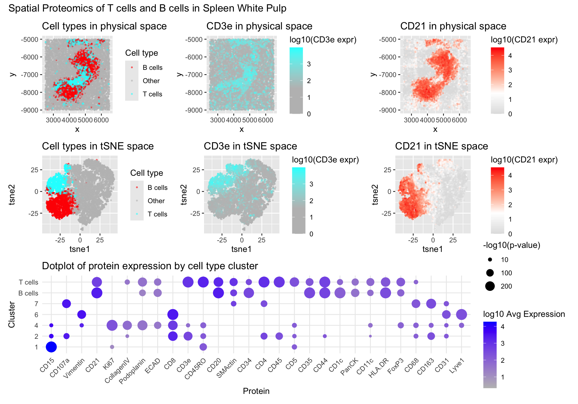
I created a multipanel figure to show the distribution of B cells and T cells in thhe spleen. Throughout, I used the gestalt principle of similarity to identify my cell types of interest by hue, being B cells in red and T cells in cyan. On the top row, I have the spatial distribution of the cells and color encoding cluder. Corresponding to the clusters of interest, I colored CD3e, a very important T cell marker in cyan as well. Then, I colored CD21, a B cell marker in red to correspond with the previous coloration of the clusters. Similarly, in th emiddle row, the same hue encoding and CD3e and CD21 protein expression were plotted, however this time in reduced dimensionality in tSNE space. Throughtout these plots, i also colored the cells that I did not classify in grey to make my cell clusters of interest more salient. Finally in the bottom row, I plotted the differential protein expression of all of the proteins of interest with the size encoding the p-value that a protein was differentially upregulated in this cluster while the saturation of the dot represents the average expression of the gene.
2. Cell type identification
I determined my cluster 3 to represent T cells because of its differential upregulation of key T cell markers like CD3e, CD45RO, CD4, CD45, and CD5. CD3e is a well known marker of all T cells and it is a subunit of the TCR-CD3 complex expressed on virtually all mature T cells and is essential for T cell receptor signaling and activation of both helper and cytotoxic T cells. (https://www.nature.com/articles/s41467-019-12464-3) CD4 is a common identifier of helper T cells, stabilizing MHC class II interactions during antigen recognition (https://www.nature.com/articles/s41467-019-12464-3 ). CD45 is a transmembrane phosphatase expressed broadly on hematopoietic cells but plays a particularly important role in T cell activation by regulating TCR signal transduction. (https://pubmed.ncbi.nlm.nih.gov/9429890/) Finally CD5 is also a very important glycoprotein expressed on all T cells that modulates TCR signaling thresholds and is important for T cell development and activation (https://pmc.ncbi.nlm.nih.gov/articles/PMC5555168/)
I was also able to identify my cluster 5 as B cells because of its high differential expression of CD21, CD20, and CD35 with a noticable lack of T cell markers like CD3e and CD4. CD21 is expressed on mature and transitional B cells, where it forms part of the B cell coreceptor complex with CD19 and enhances B cell activation upon binding complement-opsonized antigens; (https://ashpublications.org/blood/article/115/3/519/27130/Differential-expression-of-CD21-identifies). CD20 is also a B cell-specific transmembrane protein expressed from the pre-B cell stage until mature and memory B cells, playing a role in B cell receptor signaling(https://www.pnas.org/doi/10.1073/pnas.2021342118). Additionally CD35 works with CD20 in the humoral immune response that retains anitgens for B cell stimulation. (https://pmc.ncbi.nlm.nih.gov/articles/PMC9939015/). Finally, although many of the genes were shred between my B and T cell clusters, the lack of CD4, CD45RO, and CD3e supported that these were B lymphocytes instead of T cells.
3. Tissue identification
According to my data, the dominant cell types in the kidney shaped structure in the center of the physical space are lymphocytes. Therefore, I beleive that this structure is most likely white pulp, a lymphocyte rich region of the spleen that acts as a hub for immune activation and response. (https://pubmed.ncbi.nlm.nih.gov/10671220/#:~:text=The%20article%20describes%20a%20technique%20for%20isolating,pulp%20greatly%20exceeding%20that%20into%20lymph%20nodes). In standard histology of the spleen we can see that many of the cells around them are redpulp and I suspect the same here based on the spatial distribution of the B and T cells (https://vmicro.iusm.iu.edu/hs_vm/docs/lab7_6.htm). In red pulp, there is also a noteable lack of lymphocytes and since it the lymphocytes are centered in this data, I assume that is the region of interest. In an artery or vein, we would also not expect to see so many lymphocytes and a hollow area that blood usually flows through. This does not match our spatial structure. Additionally, the density of lymphocytes in the structure does not resemble peripheral blood that is usually only 1% leukocytes (https://www.ncbi.nlm.nih.gov/books/NBK2263/). Similarly, the Capsule/Trabecula of a spleen are that primarily consist of dense connective tissue and smooth muscle. However, markers like Vimentin and SM actin were only sparesly expressed throughout the kidney-shaped structure of interest.
1
2
3
4
5
6
7
8
9
10
11
12
13
14
15
16
17
18
19
20
21
22
23
24
25
26
27
28
29
30
31
32
33
34
35
36
37
38
39
40
41
42
43
44
45
46
47
48
49
50
51
52
53
54
55
56
57
58
59
60
61
62
63
64
65
66
67
68
69
70
71
72
73
74
75
76
77
78
79
80
81
82
83
84
85
86
87
88
89
90
91
92
93
94
95
96
97
98
99
100
101
102
103
104
105
106
107
108
109
110
111
112
113
114
115
116
117
118
119
120
121
122
123
124
125
126
127
128
129
130
131
132
133
134
135
136
137
138
139
140
141
142
143
144
145
146
147
148
149
150
151
152
153
154
155
156
157
158
159
160
161
162
163
164
165
166
167
168
169
library(ggplot2)
library(dplyr)
data <- read.csv('/Users/willli/Documents/BME 25-26/Genomic Data Visualization/genomic-data-visualization-2026/data/codex_spleen2.csv.gz')
data[1:8,1:8]

dim(data)
pos <- data[, 2:3]
head(pos)
pexp <- data[, 5:ncol(data)]
head(pexp)
area <- data[, 4]
names(area) <- rownames(pos) <- rownames(pexp) <- data[,1]

## QC
hist(area, breaks=50)    #looks like a big jump from<100 and long tail > 700
df = data.frame(area)
area <- area[area >= quantile(area, 0.025) & area <= quantile(area, 0.975)] #95% interval to remove outliers
hist(area, breaks = 50)
pexp <- pexp[names(area), ]
pos <- pos[names(area), ]
mat <- log10(pexp+1)

df = data.frame(area, totpexp = rowSums(pexp))
ggplot(df, aes(x=log10(area), y=log10(totpexp))) + geom_point()  #Little correlation with size of cell vs protein so no normalization
ggplot(df, aes(x = 0, y = log10(totpexp))) + geom_violin()

# Pexp vs xy
df = data.frame(area, totpexp = rowSums(pexp), pos)
ggplot(df, aes(x=x, y=y, col=log10(totpexp))) + geom_point(size=0.5)

## Highly variable proteins vs xy
dim(pexp)
hvgs <- names(sort(apply(pexp, 2, var), decreasing=TRUE))[1:10]
df = data.frame(pos, pexp)
ggplot(df, aes(y=1, x=log10(CD15))) + geom_violin()
for(i in hvgs){
  print(ggplot(df, aes(x=x, y=y, col=log10(.data[[i]]))) + geom_point(size=0.5) + labs(title = i))
}
interesting_genes <- c('CD3e', 'CD20', 'CD21')

# PCA
pcs <- prcomp(mat, center=T, scale=F)
toppcs <- pcs$x[, 1:10]
plot(pcs$sdev)
tsne <- Rtsne::Rtsne(toppcs, dims = 2, perpexity = 30)
emb <- tsne$Y
rownames(emb) <- rownames(mat)
colnames(emb) <- c('tsne1', 'tsne2')

clusters <- as.factor(kmeans(toppcs, centers=7)$cluster)

df_all <- data.frame(pos, emb, mat, toppcs, clusters)
rownames(df_all) <- rownames(mat)
ggplot(df_all, aes(x=x, y=y, col=clusters)) + geom_point()
ggplot(df_all, aes(x=tsne1, y=tsne2, col=clusters)) + geom_point()
ggplot(df_all, aes(x=tsne1, y=tsne2, col=CD3e)) + geom_point()
ggplot(df_all, aes(x=x, y=y, col=CD3e)) + geom_point()
ggplot(df_all, aes(x=tsne1, y=tsne2, col=CD21)) + geom_point()
ggplot(df_all, aes(x=x, y=y, col=CD21)) + geom_point()

# wilcox test
proteins <- names(mat)
avg_expr <- matrix(NA, nrow=length(unique(clusters)), ncol=length(proteins),
                   dimnames=list(sort(unique(clusters)), proteins))
sig_out  <- matrix(NA, nrow=length(unique(clusters)), ncol=length(proteins),
                   dimnames=list(sort(unique(clusters)), proteins))
for (cl in sort(unique(clusters))) {
  idx1 <- which(clusters == cl)
  idx2 <- which(clusters != cl)

  for (prot in proteins) {
    x1 <- mat[idx1, prot]
    x2 <- mat[idx2, prot]

    avg_expr[cl, prot] <- mean(x1)
    sig_out[cl, prot] <- -log10(wilcox.test(x1, x2, alternative='greater')$p.value)
  }
}

df_dot <- data.frame(
  cluster = rep(rownames(avg_expr), times=length(proteins)),
  protein = rep(proteins, each=length(unique(clusters))),
  avg_expression = as.vector(avg_expr),
  sig = as.vector(sig_out)
)

dot_plot <- function(df){
  ggplot(df, aes(x=protein, y=as.factor(cluster),
                 color=avg_expression,
                 size=sig)) +
    geom_point(aes(size = ifelse(sig >= 3, sig, NA) )) +
    scale_color_gradient(low='grey', high='blue') +
    scale_size_continuous(breaks=c(10, 100, 200)) +
    theme_minimal() +
    theme(axis.text.x = element_text(angle=45, hjust=1)) +
    labs(x='Protein', y='Cluster',
         color='log10 Avg Expression',
         size='-log10(p-value)',
         title = "Dotplot of protein expression by cell type cluster")
}


df_dot$sig[is.infinite(df_dot$sig)] <- max(df_dot$sig[is.finite(df_dot$sig)])
dot_plot(df_dot)


df_dot$cluster <- recode(df_dot$cluster, '5' = 'B cells', '3' = 'T cells')
df_all$clusters <- recode(df_all$clusters, '5' = 'B cells', '3' = 'T cells')

protein_order <- hclust(dist(t(avg_expr)))$order
ordered_proteins <- colnames(avg_expr)[protein_order]
df_dot$protein <- factor(df_dot$protein, levels=ordered_proteins)

dot_plot_fig <- dot_plot(df_dot)

cells_xy <- ggplot(df_all %>% arrange(desc(clusters != "B cells" | clusters != 'T cells')), aes(x=x, y=y,
                                  col = case_when(
                                    as.character(clusters) == "T cells" ~ "T cells",
                                    as.character(clusters) == "B cells" ~ "B cells",
                                    TRUE ~ "Other"
                                  ))) +
  geom_point(alpha=0.5, size=0.5) +
  scale_color_manual(values = c("B cells" = "red",
                                "T cells" = "cyan",
                                "Other" = "grey")) +
  labs(title='Cell types in physical space', color='Cell type')

cells_tsne <- ggplot(df_all %>% arrange(desc(clusters != "B cells" | clusters != 'T cells')), aes(x=tsne1, y=tsne2,
                                  col = case_when(
                                    as.character(clusters) == "B cells" ~ "B cells",
                                    as.character(clusters) == "T cells" ~ "T cells",
                                    TRUE ~ "Other"
                                  ))) +
  geom_point(alpha=0.5, size=0.5) +
  scale_color_manual(values = c("B cells" = "red",
                                "T cells" = "cyan",
                                "Other" = "grey")) +
  labs(title='Cell types in tSNE space', color='Cell type')


B_cells <- subset(df_dot, cluster %in% 'B cells')
B_cells[B_cells$sig >20 , ]


T_cells <- subset(df_dot, cluster %in% 'T cells')
T_cells[T_cells$sig >20 , ]

CD3e_xy <- ggplot(df_all %>% arrange(desc(clusters != 'T cells')), aes(x=x, y=y, col=CD3e))+geom_point(size=0.5, alpha=0.5) +
  scale_color_gradient2(low='grey', mid='grey', high='cyan', midpoint=median(df_all$CD3e)) +
  labs(title='CD3e in physical space', color='log10(CD3e expr)')
CD3e_tsne <- ggplot(df_all %>% arrange(desc(clusters != 'T cells')), aes(x=tsne1, y=tsne2, col=CD3e))+geom_point(size=0.5, alpha=0.5) +
  scale_color_gradient2(low='grey', mid='grey', high='cyan', midpoint=median(df_all$CD3e)) +
  labs(title='CD3e in tSNE space', color='log10(CD3e expr)')


CD21_xy <- ggplot(df_all %>% arrange(desc(clusters != "B cells")), aes(x=x, y=y, col=CD21))+geom_point(size=0.5, alpha=0.5) +
  scale_color_gradient2(low='grey',  high='red', midpoint=mean(df_all$CD21)) +
  labs(title='CD21 in physical space', color='log10(CD21 expr)')

CD21_tsne <- ggplot(df_all %>% arrange(desc(clusters != "B cells")), aes(x=tsne1, y=tsne2, col=CD21))+geom_point(size=0.5, alpha=0.5) +
  scale_color_gradient2(low='grey', high='red', midpoint=mean(df_all$CD21)) +
  labs(title='CD21 in tSNE space', color='log10(CD21 expr)')

(cells_xy + CD3e_xy + CD21_xy)/(cells_tsne + CD3e_tsne + CD21_tsne)/(dot_plot_fig) +
  plot_annotation(title = "Spatial Proteomics of T cells and B cells in Spleen White Pulp")