EC2-Integrated Spatial Analysis of Proximal Tubule Cell Types Using K-means Clustering and STdeconvolve (K = 5) Across Visium and Xenium

1. Describe your figure briefly.
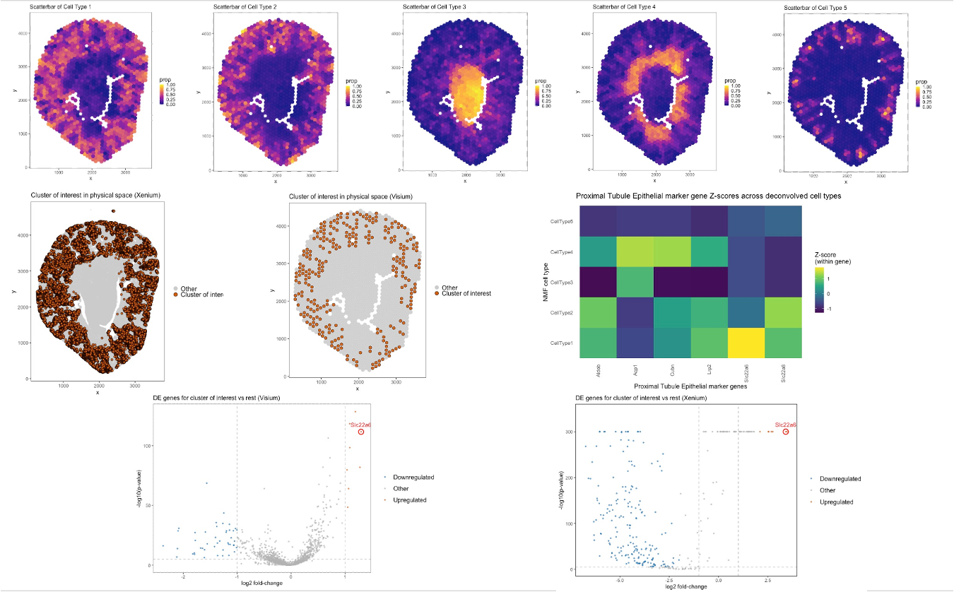
In this analysis, I used K = 5 cell types for both STdeconvolve and K-means clustering to maintain consistency across deconvolution and clustering approaches. The top row of the figure shows five scatterbar plots generated using STdeconvolve, representing the spatial distribution of the inferred deconvolved cell-type proportions across the Visium tissue. Each panel corresponds to one of the five inferred cell types. Among them, Cell Type 1 displays a spatial pattern that closely resembles the cluster of interest identified by K-means clustering. The middle row compares the spatial localization of the cluster of interest across both Xenium and Visium datasets. In both platforms, the cluster of interest exhibits a consistent spatial pattern, primarily localized to the outer cortical region of the tissue. When visually compared with the STdeconvolve scatterbar plots, this region aligns strongly with the high-proportion areas of Cell Type 1, suggesting that Cell Type 1 corresponds to the same biological population captured by clustering. The heatmap visualizes proximal tubule epithelial marker gene loadings (z-scored within gene) across the five deconvolved cell types. Cell Type 1 shows relatively high normalized loading for key proximal tubule markers such as SLC22A6, LRP2, CUBN, AQP1, and SLC22A8, supporting its annotation as a proximal tubule epithelial population. The heatmap further confirms that these markers are preferentially enriched in Cell Type 1 compared to the other four inferred cell types. The bottom row presents volcano plots of differential gene expression associated with the cluster of interest in both Visium and Xenium datasets. In both platforms, Slc22a6 is significantly upregulated in the cluster of interest relative to other clusters, reinforcing its identification as a proximal tubule marker. The consistent upregulation of Slc22a6 across both technologies strengthens the biological interpretation and demonstrates concordance between clustering- and deconvolution-based analyses. Overall, this figure integrates deconvolution, clustering, spatial visualization, and differential expression analysis to demonstrate that Cell Type 1 inferred by STdeconvolve corresponds closely to the cluster of interest identified in both Visium and Xenium data. While clustering assigns each spot to a single group, deconvolution quantifies mixed-cell proportions, providing a complementary and more nuanced representation of spatially resolved proximal tubule epithelial populations.
2. Code (paste your code in between the ``` symbols)
1
2
3
4
5
6
7
8
9
10
11
12
13
14
15
16
17
18
19
20
21
22
23
24
25
26
27
28
29
30
31
32
33
34
35
36
37
38
39
40
41
42
43
44
45
46
47
48
49
50
51
52
53
54
55
56
57
58
59
60
61
62
63
64
65
66
67
68
69
70
71
72
73
74
75
76
77
78
79
80
81
82
83
84
85
86
87
88
89
90
91
92
93
94
95
96
97
98
99
100
101
102
103
104
105
106
107
108
109
110
111
112
113
114
115
116
117
118
119
120
121
122
123
124
125
126
127
128
129
130
131
132
133
134
135
136
137
138
139
140
141
142
143
144
145
146
147
148
149
150
151
152
153
154
155
156
157
158
159
160
161
162
163
164
165
166
167
168
169
170
171
172
173
174
175
176
177
178
179
180
181
182
183
184
185
186
187
188
189
190
191
192
193
194
195
196
197
198
199
200
201
202
203
204
205
206
207
208
209
210
211
212
213
214
215
216
217
218
219
220
221
222
223
224
225
226
227
228
229
230
231
232
233
234
235
236
237
238
239
240
241
242
243
244
245
246
247
248
249
250
251
252
253
254
255
256
257
258
259
260
261
262
263
264
265
266
267
268
269
270
271
272
273
274
275
276
277
278
279
280
281
282
283
284
285
286
287
288
289
290
291
292
293
294
295
296
297
298
299
300
301
302
303
304
305
306
307
308
309
310
311
312
313
314
315
316
317
318
319
320
321
322
323
324
325
326
327
328
329
330
331
332
333
334
335
336
337
338
339
340
341
342
343
344
345
346
347
348
349
350
351
352
353
354
355
356
357
358
359
360
361
362
363
364
365
366
367
368
369
370
371
372
373
374
375
376
377
378
379
380
381
382
383
384
385
386
387
388
389
390
391
392
393
394
395
396
397
398
399
400
401
402
403
404
405
406
407
408
409
410
411
412
413
414
415
416
417
418
419
420
421
422
423
424
425
426
427
428
429
430
431
432
433
434
435
436
437
438
439
440
441
442
443
444
445
446
447
448
449
450
451
452
453
454
455
456
457
458
459
460
461
462
463
464
465
466
467
468
469
470
471
472
473
474
475
476
477
478
479
480
481
482
483
484
485
486
487
488
489
490
491
492
493
494
495
496
497
498
499
500
501
502
503
504
505
506
507
508
509
510
511
512
513
514
515
516
517
518
519
520
521
522
523
524
525
526
527
528
529
530
531
532
533
534
535
536
537
538
539
540
541
542
543
544
545
546
547
548
549
550
551
552
553
554
555
556
557
558
559
560
561
562
563
564
565
566
567
568
569
570
571
572
573
574
575
576
577
578
579
580
581
582
583
584
585
586
587
588
589
590
591
592
593
594
595
596
597
598
599
600
601
602
603
604
605
606
607
608
609
610
611
612
613

library(data.table)
library(ggplot2)
library(patchwork)
library(Rtsne)
library(ggrepel)
library(NMF)
library(reshape2)

set.seed(123)


file <- "/Users/xl/Desktop/JHU2026Spring/Genomic-Data-Visualization/Homework/HW4/Visium-IRI-ShamR_matrix.csv.gz"
dt <- fread(file)
head(dt)
barcode_col <- "V1"
x_col <- "x"
y_col <- "y"
barcodes <- dt[[barcode_col]]

pos <- data.frame(
  aligned_x = dt[[x_col]],
  aligned_y = dt[[y_col]]
)
rownames(pos) <- barcodes

gene_cols <- setdiff(colnames(dt), c(barcode_col, x_col, y_col))
gexp_dt <- dt[, ..gene_cols]
for (cc in colnames(gexp_dt)) if (!is.numeric(gexp_dt[[cc]])) gexp_dt[[cc]] <- as.numeric(gexp_dt[[cc]])

gexp <- as.matrix(gexp_dt)
rownames(gexp) <- barcodes
gexp <- gexp[, colSums(gexp, na.rm = TRUE) > 0, drop = FALSE]


topN <- 1500
gene_order <- order(colSums(gexp), decreasing = TRUE)
topgenes <- colnames(gexp)[gene_order[1:min(topN, ncol(gexp))]]
gsub <- gexp[, topgenes, drop = FALSE]

libsize <- rowSums(gsub)
libsize[libsize == 0] <- 1

norm  <- (gsub / libsize) * 1e4
logexp <- log1p(norm)

pcs <- prcomp(logexp, center = TRUE, scale. = TRUE)

k_final <- 5
km <- kmeans(pcs$x[, 1:15], centers = k_final, nstart = 25)
clusters <- km$cluster

p_kmeans_tissue <- {
  sp <- data.frame(pos)
  sp$cluster <- factor(clusters)
  ggplot(sp, aes(aligned_x, aligned_y, color = cluster)) +
    geom_point(size = 1.2) +
    theme_bw() +
    theme(panel.grid.major = element_blank(), panel.grid.minor = element_blank()) +
    labs(title = "B. k-means clusters on Visium tissue", x = "x", y = "y")
}
p_kmeans_tissue

marker_gene <- "Slc22a6"

interest <- 3
sp <- data.frame(pos)
sp$is_interest <- ifelse(clusters == interest, "Cluster of interest", "Other")
sp$is_interest <- factor(sp$is_interest, levels = c("Other", "Cluster of interest"))

p_interest_phys <- ggplot() +
  geom_point(
    data = subset(sp, is_interest == "Other"),
    aes(aligned_x, aligned_y, fill = is_interest),
    shape = 21, color = "grey80",
    size = 3, alpha = 0.9
  ) +
  geom_point(
    data = subset(sp, is_interest == "Cluster of interest"),
    aes(aligned_x, aligned_y, fill = is_interest),
    shape = 21, color = "black", stroke = 0.4,
    size = 2.4, alpha = 0.95
  ) +
  scale_fill_manual(values = c(
    "Other" = "grey80",
    "Cluster of interest" = "#D55E00"
  )) +
  guides(fill = guide_legend(override.aes = list(alpha = 1, size = 3))) +
  coord_equal() +
  theme_bw() +
  theme(
    panel.grid.major = element_blank(),
    panel.grid.minor = element_blank(),
    plot.title = element_text(size = 12, face = "plain"),
    legend.text = element_text(size = 12),
    legend.title = element_blank(),
    legend.key.size = unit(0.3, "cm")
  ) +
  labs(
    title = "Cluster of interest in physical space (Visium)",
    x = "x", y = "y"
  )

p_interest_phys


cells_interest <- barcodes[clusters == interest]
cells_other    <- barcodes[clusters != interest]

wilcox_p <- sapply(colnames(logexp), function(g) {
  suppressWarnings(wilcox.test(logexp[cells_interest, g],
                               logexp[cells_other, g])$p.value)
})

log2fc <- sapply(colnames(norm), function(g) {
  log2((mean(norm[cells_interest, g]) + 1e-3) /
         (mean(norm[cells_other, g]) + 1e-3))
})

de_df <- data.frame(
  gene = names(wilcox_p),
  pval = as.numeric(wilcox_p),
  neglog10p = -log10(as.numeric(wilcox_p) + 1e-300),
  log2fc = as.numeric(log2fc[names(wilcox_p)])
)
# Upregulated genes
up_df <- subset(de_df, pval < 1e-5 & log2fc > 1)
up_df <- up_df[order(-up_df$log2fc, up_df$pval), ]
head(up_df, 20)
# Volcano-style plot object
de_df$group <- "Other"
de_df$group[de_df$pval < 1e-5 & de_df$log2fc > 1]  <- "Upregulated"
de_df$group[de_df$pval < 1e-5 & de_df$log2fc < -1] <- "Downregulated"

p_volcano <- ggplot(de_df, aes(log2fc, neglog10p, color = group)) +
  geom_point(alpha = 0.6, size = 0.8) +
  geom_point(data = subset(de_df, gene == marker_gene),
             shape = 21, size = 4, stroke = 1.2, color = "red", fill = NA) +
  geom_text(data = subset(de_df, gene == marker_gene),
            aes(label = gene), color = "red", vjust = -1.2, size = 4,
            show.legend = FALSE) +
  geom_vline(xintercept = c(-1, 1), linetype = "dashed", color = "grey") +
  geom_hline(yintercept = -log10(1e-5), linetype = "dashed", color = "grey") +
  scale_color_manual(values = c("Upregulated"="#D55E00", "Downregulated"="#0072B2", "Other"="grey70")) +
  theme_bw() +
  theme(
    panel.grid.major = element_blank(),
    panel.grid.minor = element_blank(),
    plot.title = element_text(size = 12),
    legend.text = element_text(size = 12),
    legend.title = element_text(size = 13),
    legend.key.size = unit(0.8, "cm")
  ) +
  labs(title = paste0("DE genes for cluster of interest vs rest (Visium)"),
       x = "log2 fold-change", y = "-log10(p-value)", color = NULL)

p_volcano

library(NMF)
library(ggplot2)
library(grid)
library(ggrepel)

run_stdeconvolve_like <- function(data_spots_by_genes, k, seed = 123) {
  stopifnot(is.matrix(data_spots_by_genes) || is.data.frame(data_spots_by_genes))
  X <- as.matrix(data_spots_by_genes)          # spots x genes
  stopifnot(all(X >= 0))                       # NMF expects non-negative

  nmf_input <- t(X)                            # genes x spots
  nmf_res <- nmf(nmf_input, rank = k, method = "lee", seed = seed, nrun = 1)

  # Gene signatures: genes x k
  gene_signatures <- basis(nmf_res)
  colnames(gene_signatures) <- paste0("CellType", 1:k)
  rownames(gene_signatures) <- rownames(nmf_input)      # genes

  # Spot proportions: (k x spots) -> (spots x k), then row-normalize
  cell_props <- t(coef(nmf_res))                        # spots x k
  cell_props <- cell_props / rowSums(cell_props + 1e-12)
  colnames(cell_props) <- paste0("CellType", 1:k)
  rownames(cell_props) <- colnames(nmf_input)           # spots

  list(
    cell_type_proportions = as.data.frame(cell_props),  # spots x k
    gene_signatures       = as.data.frame(gene_signatures) # genes x k
  )
}

# ---------------------------
# Run NMF for k = 5
# ---------------------------
k_val <- 5
results <- run_stdeconvolve_like(norm, k_val)

# sanity checks
print(dim(results$cell_type_proportions))  # spots x k
print(dim(results$gene_signatures))        # genes x k

# ---------------------------
# 6) Identify cell type of interest using marker loading
# ---------------------------
marker_gene <- marker_set[1]

gene_signatures <- results$gene_signatures       # genes x k
cell_props      <- results$cell_type_proportions # spots x k

rn  <- rownames(gene_signatures)
idx <- match(marker_gene, rn)
if (is.na(idx)) {
  idx2 <- match(toupper(marker_gene), toupper(rn))
  stopifnot(!is.na(idx2))
  idx <- idx2
  marker_gene <- rn[idx]  # use exact stored name
}

celltype_interest <- which.max(as.numeric(gene_signatures[idx, ]))
cat("NMF cell type of interest (max loading for", marker_gene, "):",
    celltype_interest, "\n")

# ---------------------------
# 7) Plot NMF cell-type proportions on tissue (K = 5 panels)
# ---------------------------
make_ct_plot <- function(ct_idx) {
  df_plot <- data.frame(
    aligned_x = pos$aligned_x,
    aligned_y = pos$aligned_y,
    prop      = cell_props[[ct_idx]]   # safer indexing
  )

  ggplot(df_plot, aes(aligned_x, aligned_y, color = prop)) +
    geom_point(size = 3.2, alpha = 0.95) +
    scale_color_viridis_c(option = "C", limits = c(0, 1)) +
    coord_equal() +
    theme_bw() +
    theme(
      panel.grid.major = element_blank(),
      panel.grid.minor = element_blank(),
      plot.title = element_text(size = 12),
      legend.text = element_text(size = 10),
      legend.title = element_text(size = 12),
      legend.key.size = unit(0.3, "cm")
    ) +
    labs(
      title = paste("Scatterbar of Cell Type", ct_idx),
      x = "x", y = "y", color = "prop"
    )
}

p_ct1 <- make_ct_plot(1)
p_ct2 <- make_ct_plot(2)
p_ct3 <- make_ct_plot(3)
p_ct4 <- make_ct_plot(4)
p_ct5 <- make_ct_plot(5)

p_ct1
p_ct2
p_ct3
p_ct4
p_ct5
library(reshape2)
library(ggplot2)

# Define proximal tubule markers
pt_genes <- c("SLC22A6","LRP2","CUBN","ALDOB","AQP1","SLC22A8")

GS <- as.data.frame(gene_signatures)

# Ensure genes are rows and CellTypes are columns
if (any(toupper(pt_genes) %in% toupper(colnames(GS))) &&
    !any(toupper(pt_genes) %in% toupper(rownames(GS)))) {
  GS <- as.data.frame(t(as.matrix(GS)))
}

rn <- rownames(GS)
genes_keep <- rn[toupper(rn) %in% toupper(pt_genes)]
if (length(genes_keep) == 0) stop("PT markers not found in rownames(gene_signatures).")

hm <- GS[genes_keep, , drop = FALSE]   # genes x CellType
hm_df <- as.data.frame(hm)
hm_df$Gene <- rownames(hm_df)

hm_melt <- reshape2::melt(
  hm_df,
  id.vars = "Gene",
  variable.name = "CellType",
  value.name = "Loading"
)
library(dplyr)
# Z-score within each Gene across CellTypes
hm_melt <- hm_melt %>%
  dplyr::group_by(Gene) %>%
  dplyr::mutate(
    Z = (Loading - mean(Loading, na.rm = TRUE)) / sd(Loading, na.rm = TRUE)
  ) %>%
  dplyr::ungroup()

hm_melt$Z[!is.finite(hm_melt$Z)] <- 0

p_heat_nmf_z <- ggplot(hm_melt, aes(x = Gene, y = CellType, fill = Z)) +
  geom_tile() +
  scale_fill_viridis_c(name = "Z-score\n(within gene)") +
  theme_minimal(base_size = 12) +
  labs(
    title = "Proximal Tubule Epithelial marker gene Z-scores across deconvolved cell types",
    x = "Proximal Tubule Epithelial marker genes",
    y = "NMF cell type"
  ) +
  theme(
    axis.text.x = element_text(angle = 90, hjust = 1, vjust = 0.5),
    panel.grid = element_blank()
  )

p_heat_nmf_z
#-------------------------------------------------------------
#Xenium
#-------------------------------------------------------------

## 0) Load required packages
## ---------------------------
pkgs <- c("data.table", "ggplot2", "patchwork", "Rtsne")

to_install <- pkgs[!pkgs %in% rownames(installed.packages())]
if (length(to_install) > 0) {
  install.packages(to_install, dependencies = TRUE)
}

library(data.table)
library(ggplot2)
library(patchwork)
library(Rtsne)


set.seed(123)

## ---------------------------
## 1) Load data
## ---------------------------
file <- "/Users/xl/Desktop/JHU2026Spring/Genomic-Data-Visualization/Homework/HW4/Xenium-IRI-ShamR_matrix.csv.gz"
dt <- fread(file)

cat("Data dimensions:", dim(dt), "\n")

## 2) Explicitly set columns
barcode_col <- "V1"
x_col <- "x"
y_col <- "y"

stopifnot(all(c(barcode_col, x_col, y_col) %in% colnames(dt)))

barcodes <- dt[[barcode_col]]

pos <- data.frame(
  aligned_x = dt[[x_col]],
  aligned_y = dt[[y_col]]
)
rownames(pos) <- barcodes

## 3) Expression matrix: all remaining columns are genes
gene_cols <- setdiff(colnames(dt), c(barcode_col, x_col, y_col))

# Convert to numeric matrix safely
gexp_dt <- dt[, ..gene_cols]

for (cc in colnames(gexp_dt)) {
  if (!is.numeric(gexp_dt[[cc]])) {
    gexp_dt[[cc]] <- as.numeric(gexp_dt[[cc]])
  }
}

gexp <- as.matrix(gexp_dt)
rownames(gexp) <- barcodes

# Remove all-zero genes
gexp <- gexp[, colSums(gexp, na.rm = TRUE) > 0, drop = FALSE]

cat("Expression matrix dim:", dim(gexp), "\n")

## 4) Feature selection + normalization
topN <- 1500
gene_order <- order(colSums(gexp), decreasing = TRUE)
head(gene_order)
topgenes <- colnames(gexp)[gene_order[1:min(topN, ncol(gexp))]]
gsub <- gexp[, topgenes, drop = FALSE]

libsize <- rowSums(gsub)
libsize[libsize == 0] <- 1

norm <- (gsub / libsize) * 1e4
logexp <- log1p(norm)

## 5) PCA + kmeans
pcs <- prcomp(logexp, center = TRUE, scale. = TRUE)

ks <- 2:20

totw <- sapply(ks, function(k) {
  km_tmp <- kmeans(pcs$x[,1:15], centers = k, nstart = 20)
  km_tmp$tot.withinss
})

elbow_df <- data.frame(k = ks, tot_withinss = totw)

ggplot(elbow_df, aes(x = k, y = tot_withinss)) +
  geom_point(size = 2) +
  geom_line() +
  labs(title = "Elbow plot for choosing k",
       x = "Number of clusters (k)",
       y = "Total within-cluster sum of squares") +
  theme_classic()

k_final <- 10
km <- kmeans(pcs$x[, 1:15], centers = k_final, nstart = 25)
clusters <- km$cluster

pca_df <- data.frame(
  PC1 = pcs$x[,1],
  PC2 = pcs$x[,2],
  cluster = factor(clusters)
)

ggplot(pca_df, aes(PC1, PC2, color = cluster)) +
  geom_point(size = 0.6) +
  labs(title = "PCA of kidney Xenium data colored by k-means clusters",
       color = "Cluster") +
  theme_classic()

sp <- data.frame(pos)
sp$cluster <- factor(clusters)
ggplot(sp, aes(aligned_x, aligned_y)) +
  geom_point(size = 0.8, color = "steelblue") +
  facet_wrap(~ cluster, ncol = 3) +
  labs(title = "Spatial distribution of each cluster",
       x = "x", y = "y") +
  theme_classic()


## 6) Pick a cluster of interest
pca_xy <- pcs$x[, 1:2]
interest <- 10
cat("Cluster of interest:", interest, "\n")

cells_interest <- barcodes[clusters == interest]
cells_other <- barcodes[clusters != interest]

## 7) Differential expression (Wilcoxon)
wilcox_p <- sapply(colnames(logexp), function(g) {
  x <- logexp[cells_interest, g]
  y <- logexp[cells_other, g]
  suppressWarnings(wilcox.test(x, y)$p.value)
})


log2fc <- sapply(colnames(norm), function(g) {
  log2((mean(norm[cells_interest, g]) + 1e-3) /
         (mean(norm[cells_other, g]) + 1e-3))
})

de_df <- data.frame(
  gene = names(wilcox_p),
  pval = as.numeric(wilcox_p),
  neglog10p = -log10(as.numeric(wilcox_p) + 1e-300),
  log2fc = as.numeric(log2fc[names(wilcox_p)])
)

de_df <- de_df[order(de_df$pval, -de_df$log2fc), ]
ggplot(de_df, aes(x = log2fc, y = neglog10p)) +
  geom_point(size = 0.6) +
  geom_vline(xintercept = c(-1, 1), linetype = "dashed") +
  geom_hline(yintercept = -log10(1e-5), linetype = "dashed") +
  labs(title = "Volcano plot: cluster of interest vs others",
       x = "log2 fold-change",
       y = "-log10(p-value)") +
  theme_classic()

sig_up <- de_df[de_df$pval < 1e-5 & de_df$log2fc > 1, ]
head(sig_up, 20)


marker_gene <- "Slc22a6"


## 9) tSNE embedding
tsne_res <- Rtsne(pcs$x[, 1:15], perplexity = 30, check_duplicates = FALSE)
emb <- data.frame(tsne_res$Y)
colnames(emb) <- c("tSNE1","tSNE2")
colnames(emb)
head(emb)
emb$is_interest <- ifelse(clusters == interest, "Cluster of interest", "Other")

## 10) Panels
big_theme <- theme(
  plot.title  = element_text(size = 14, face = "bold"),
  legend.text = element_text(size = 15),
  legend.title = element_text(size = 16),
  axis.title  = element_text(size = 13),
  axis.text   = element_text(size = 8)
)


p1 <- ggplot(emb, aes(tSNE1, tSNE2, color = is_interest)) +
  geom_point(size = 0.8) +
  labs(title = "A. Cluster of interest in tSNE space", color = NULL) +
  theme_classic() +
  theme(
    legend.text = element_text(size = 11)
  ) +
  big_theme
sp <- data.frame(pos)

sp$is_interest <- factor(sp$is_interest, levels = c("Other", "Cluster of interest"))

p2 <- ggplot() +
  # Other layer
  geom_point(
    data = subset(sp, is_interest == "Other"),
    aes(aligned_x, aligned_y, fill = is_interest),
    shape = 21, color = "grey80",
    size  = 0.6, alpha = 0.25
  ) +
  geom_point(
    data = subset(sp, is_interest == "Cluster of interest"),
    aes(aligned_x, aligned_y, fill = is_interest),
    shape = 21, color = "black", stroke = 0.4,
    size  = 1.6, alpha = 0.95
  ) +
  scale_fill_manual(values = c(
    "Other" = "grey80",
    "Cluster of interest" = "#D55E00"
  )) +
  guides(fill = guide_legend(override.aes = list(alpha = 1, size = 3))) +
  coord_equal() +
  theme_bw() +
  theme(
    panel.grid.major = element_blank(),
    panel.grid.minor = element_blank(),
    plot.title = element_text(size = 12, face = "plain"),
    legend.text = element_text(size = 12),
    legend.title = element_blank(),
    legend.key.size = unit(0.3, "cm")
  ) +
  labs(
    title = "Cluster of interest in physical space (Xenium)",
    x = "x", y = "y"
  )

p2
de_df$group <- "Other"
de_df$group[de_df$pval < 1e-5 & de_df$log2fc > 2]  <- "Upregulated"
de_df$group[de_df$pval < 1e-5 & de_df$log2fc < -2] <- "Downregulated"


de_df$label <- ""
de_df$label[de_df$gene == marker_gene] <- marker_gene

p3 <- ggplot(de_df, aes(log2fc, neglog10p, color = group)) +
  geom_point(alpha = 0.6, size = 0.8) +

  # red circle highlight (outline only)
  geom_point(
    data = subset(de_df, gene == marker_gene),
    shape = 21, size = 4, stroke = 1.2,
    color = "red", fill = NA
  ) +

  # annotation text
  geom_text(
    data = subset(de_df, gene == marker_gene),
    aes(label = gene),
    color = "red", vjust = -1.2, size = 4,
    show.legend = FALSE
  ) +

  # thresholds (match p_volcano; adjust if you use different cutoffs)
  geom_vline(xintercept = c(-1, 1), linetype = "dashed", color = "grey") +
  geom_hline(yintercept = -log10(1e-5), linetype = "dashed", color = "grey") +

  # colors
  scale_color_manual(values = c(
    "Upregulated"   = "#D55E00",
    "Downregulated" = "#0072B2",
    "Other"         = "grey70"
  )) +

  # labels (match p_volcano style)
  labs(
    title = paste0("DE genes for cluster of interest vs rest (Xenium)"),
    x = "log2 fold-change",
    y = "-log10(p-value)",
    color = NULL
  ) +

  theme_bw() +
  theme(
    panel.grid.major = element_blank(),
    panel.grid.minor = element_blank(),
    plot.title = element_text(size = 12),
    legend.text = element_text(size = 12),
    legend.title = element_text(size = 13),
    legend.key.size = unit(0.8, "cm")
  )  +
  coord_cartesian(clip = "off") +
  scale_y_continuous(expand = expansion(mult = c(0.05, 0.2)))

p3


#AI prompts used
#“What are the marker genes for proximal tubule epithelial cells?”
#"How to generate a heatmap showing gene expression across different cell types?"