HW EC2

Instructions
Make a new data visualization of the multi-cellular spot resolution spatial transcriptomics sequencing dataset. Compare your result with the clustering and differential expression analysis you did previously in HW3/4. Explain how your results are similar or different. Create a data visualization comparing all three analyses. Write a a brief description of your figure so we know what you are visualizing. You do not need to use the vocabulary terms from Lesson 1.
Description
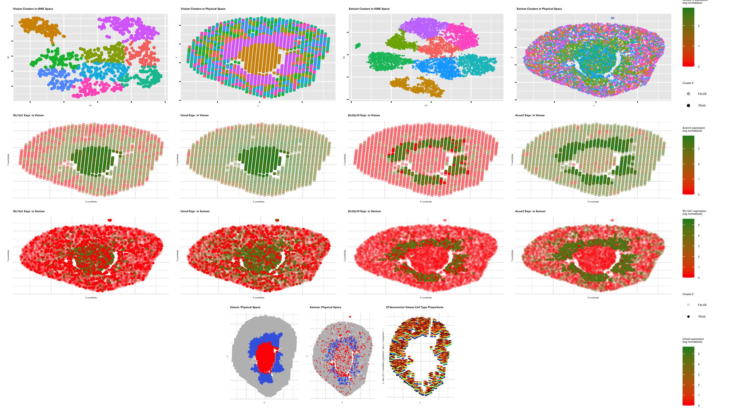
In this data analysis, I first re-did k-means clustering for the Visium and Xenium datasets as I had in homeworks 3 and 4 (following PCA and tSNE and scree plot analysis for optimal PCs and k-clusters). I then conducted differential gene expression analysis on the clusters of interest (defined by transcriptionally-distinct and spatially-resolved clusters viewed when plotting clusters in tSNE and physical space) as was done in HW3 and 4 (with Wilcox test). I then took the upregulated genes that were shared between corresponding clusters in the Visium and Xenium datasets and used that to identify cell types for these clusters of interest. According to various sources, Slc12a1 and Umod are associated with Thick Ascending Loop (TAL) cells (1, 2) and corresponded to the central clusters (Visium cluster 2/Xenium cluster 6), and Slc22a19 and Acsm3 are associated with proximal tubule (PT) cells (3, 4) and corresponded to the cluster surrounding the central cluster (Visium cluster 8/Xenium cluster 3). To then confirm if these same cell types could be identified using STdeconvolve, I ran STdeconvolve analysis on the Visium dataset, excluding genes with very low or consistent expression across the topics generated/original data. I then took the two marker genes we identified for each cluster/cell type seen in the differential gene expression and calculated which topics generated by STdeconvolve had the highest probability/proportion of gene expression for those marker genes, allowing us to identify the topics that most align with the cell types of interest. I then plotted the k means clustering data in tSNE and physical space, gene expression data in physical space for the four marker genes (increasing saturation to highlight the clusters in which that gene was upregulated), clusters of interest as identified cell types, and finally the STdeconvolve cell type proportion data as a scatterbar plot.
The data came out a bit different than expected, likely due to my having to restart my run but failing to save the k means clustering in the same seed, which caused k means clustering to re-run with a new random seed and leading to slightly different analysis results compared to my first run. Overall, however, it appears that similar cell types were identified in the corresponding clusters of interest between the two datasets. A good portion of data was missing in the center of the tissue for the STdeconvolve data - this may be due to our exclusion parameters for gene expression data that may have excluded data from the center of the tissue, making it difficult to identify cell types that were spatially resolved in the same was as was seen in the Visium and Xenium clustering differential gene expression/cell type identification visualizations. In order to create a more comparable STdeconvolve scatterbar plot, I would not exclude as many pixels based on too low or too high gene expression data to hopefully capture the central tissue data and identify the cell types of interest there more accurately.
Sources
1) https://www.proteinatlas.org/ENSG00000074803-SLC12A1 2) https://www.kidney-international.org/article/S0085-2538(18)30349-1/fulltext 3) https://www.uniprot.org/uniprotkb/Q8VCA0/entry 4) https://www.uniprot.org/uniprotkb/Q3UNX5/entry
Code:
```r
Make a new data visualization of the multi-cellular spot resolution spatial transcriptomics sequencing dataset.
Compare your result with the clustering and differential expression analysis you did previously in HW3/4.
Explain how your results are similar or different. Create a data visualization comparing all three analyses.
Your data visualization must comprise at minimum the following
K deconvolved cell-type proportions on the tissue using STdeconvolve, visualized using scatterbar
K-means clustering on the tissue
A visualization of cell-type(s) of interest across both Visium and Xenium
A visualization of differentially upregulated genes associated with the cell-type(s) of interest across both Visium and Xenium using clustering or deconvolution analysis
library(STdeconvolve) library(patchwork) library(ggplot2)
visium <- read.csv(“~/Desktop/Visium-IRI-ShamR_matrix.csv.gz”) xenium <- read.csv(“~/Desktop/Xenium-IRI-ShamR_matrix.csv.gz”) xenium <- xenium[sample(1:nrow(xenium), 10000),] #to reduce data to more manageable size for program/computer
#Visium dataset parsing and normalization of total gene expression (from HW 3) vpositions <- visium[,c(‘x’, ‘y’)] rownames(vpositions) <- visium[,1] v_gene_exp <- visium[, 4:ncol(visium)] rownames(v_gene_exp) <- visium[,1] v_TGE <- rowSums(v_gene_exp) v_mat <- log10(v_gene_exp/v_TGE * 1e6 + 1) #Log transform to make more Gaussian distributed and interpretable, get rid of NaN points
#Xenium dataset normalization of total gene expression (from HW 4) xpositions <- xenium[,c(‘x’, ‘y’)] rownames(xpositions) <- xenium[,1] x_gene_exp <- xenium[, 4:ncol(xenium)] rownames(x_gene_exp) <- xenium[,1] x_TGE <- rowSums(x_gene_exp) x_mat <- log10(x_gene_exp/x_TGE * 1e6 + 1) #Log transform to make more Gaussian distributed and interpretable, get rid of NaN points
From HW3: K means clustering and visualizations of differentially-expressed genes corresponding to cell type(s) of interest for the Visium dataset
1
2
3
4
5
6
7
8
9
10
11
12
13
14
15
16
17
18
19
20
21
22
23
24
25
26
27
28
29
30
31
32
33
34
35
36
37
38
39
40
41
42
43
44
45
46
47
48
49
50
51
52
53
54
55
56
57
58
59
60
61
62
63
64
65
66
67
68
69
70
71
72
73
74
75
76
77
78
79
80
81
82
83
84
85
86
87
88
89
90
91
92
93
94
95
96
97
98
99
100
101
102
103
104
105
106
107
108
109
110
111
112
113
114
115
116
117
118
119
120
121
122
123
124
125
126
127
128
129
130
131
132
133
134
135
136
137
138
#Linear DR: PCA
v_PCs <- prcomp(v_mat, center = TRUE, scale = FALSE)
plot(v_PCs$sdev[1:25]) #dips at some point where PC's are not capturing much more variance in the data; we see plateau at around PC 7

#Nonlinear DR: tSNE on top 7 PCs
v_top_PCs <- v_PCs$x[, 1:7]
set.seed(100)
v_tsne <- Rtsne::Rtsne(v_top_PCs, dims = 2, perplexity = 30)
v_emb <- v_tsne$Y

#K means clustering of tSNE data (from HW 4)
v_k_vals <- 1:15
set.seed(100)
v_tot_withinss <- sapply(v_k_vals, function(k) { #Total withinness for each # of clusters
  km <- kmeans(v_emb, centers = k, iter.max = 100)
  km$tot.withinss
})
plot(v_k_vals, v_tot_withinss, #Plotting total withinness for each # of clusters to determine optimal cluster #
     xlab = "Number of Clusters (k)",
     ylab = "Total Within-Cluster Sum of Squares",
     main = "Elbow Plot for Visium K-means Clustering")
#Based on plot, inflection point @ k = 9 --> selected 9 clusters
set.seed(100)
v_clusters <- as.factor(kmeans(v_emb, centers = 9)$cluster)
v_cell_data <- data.frame(v_emb, v_clusters, v_top_PCs, vpositions)
v_tsne_clusters <- ggplot(v_cell_data, aes(x=X1, y=X2, col=v_clusters)) + geom_point() + labs(title = "Visium Clusters in tSNE Space") #From tSNE plot, looks like cluster 7 is the most transcriptionally-distinct compared to the other clusters, followed by cluster 2
v_pos_clusters <- ggplot(v_cell_data, aes(x=x, y=y, col=v_clusters)) + geom_point() + labs(title = "Visium Clusters in Physical Space") #Cluster 7 occupies the center of the tissue, and cluster 2 occupies the area directly surrounding cluster 7 in the center of the tissue

#Conducting differential gene expression analysis on our clusters of interest (clusters 2 and 8) - from HW5
v_cluster2 <- v_cell_data[v_cell_data$v_clusters == 2, ] #Creating new cluster dataframes to isolate clusters 2 and 8 for differential expression analysis and graphing
v_cluster8 <- v_cell_data[v_cell_data$v_clusters == 8, ]

v_cluster2_cells <- rownames(v_cluster2)
v_non_2_cells <- rownames(v_cell_data)[!rownames(v_cell_data) %in% v_cluster2_cells]
v_out2 <- sapply(colnames(v_mat), function(gene) {
  x1 <- v_mat[v_cluster2_cells, gene]
  x2 <- v_mat[v_non_2_cells, gene]
  wilcox.test(x1, x2, alternative='greater')$p.value
})
v_wilcox_p_values2 <- data.frame(
  gene = names(v_out2),
  p_value = v_out2,
  stringsAsFactors = FALSE
)
v_DE_2 <- v_wilcox_p_values2[order(v_wilcox_p_values2$p_value), ][1:10, ]
v_DE_2
#Upregulated genes: Nccrp1, Ppp1r1b, Slc12a1, Wfdc15b, Ptger3, Scin, Epcam, Ppp1r1a, Slc5a3, Umod

v_cluster8_cells <- rownames(v_cluster8)
v_non_8_cells <- rownames(v_cell_data)[!rownames(v_cell_data) %in% v_cluster8_cells]
v_out8 <- sapply(colnames(v_mat), function(gene) {
  x1 <- v_mat[v_cluster8_cells, gene]
  x2 <- v_mat[v_non_8_cells, gene]
  wilcox.test(x1, x2, alternative='greater')$p.value
})
v_wilcox_p_values8 <- data.frame(
  gene = names(v_out8),
  p_value = v_out8,
  stringsAsFactors = FALSE
)
v_DE_8 <- v_wilcox_p_values8[order(v_wilcox_p_values8$p_value), ][1:10, ]
v_DE_8
#Upregulated genes: Serpina1f, Cyp7b1, Serpina1d, Slc22a19, Acsm3, Mpv17l, Slc22a13, Mep1b, Mep1a, Scd1


#V cluster 2 is like X cluster 6 ***TAL of loop of Henle*** --> Slc12a1, Umod

  #Plotting increased expression of these 2 genes in Visium dataset; with help from Google Gemini (prompt = "How can we create a ggplot point plot showing all spots in the Visium dataset as points, with each point's color corresponding to the log/normalized expression (green = high, red = low) of the Ptger3 gene and the saturation corresponding to cluster 7 (high saturation = cluster 7, low saturation = non-cluster 7)")
  v_Slc12a1 <- v_mat[, "Slc12a1"]
  v_cell_data$Slc12a1 <- v_Slc12a1
  v_cell_data$is_cluster_7 <- v_cell_data$v_clusters == 2

  v_Slc12a1_plot <- ggplot(v_cell_data, aes(x = x, y = y, color = Slc12a1, alpha = is_cluster_2)) +
    geom_point(size = 1.5) +
    scale_color_gradient(low = "red", high = "forestgreen") +
    scale_alpha_manual(values = c("FALSE" = 0.35, "TRUE" = 1.0)) +
    theme_minimal() +
    labs(
      title = "Slc12a1 Expr. in Visium",
      x = "X coordinate",
      y = "Y yoordinate",
      color = "Slc12a1 expression\n(log normalized)",
      alpha = "Cluster 2"
    )

  v_Umod <- v_mat[, "Umod"]
  v_cell_data$Umod <- v_Umod

  v_Umod_plot <- ggplot(v_cell_data, aes(x = x, y = y, color = Umod, alpha = is_cluster_2)) +
    geom_point(size = 1.5) +
    scale_color_gradient(low = "red", high = "forestgreen") +
    scale_alpha_manual(values = c("FALSE" = 0.35, "TRUE" = 1.0)) +
    theme_minimal() +
    labs(
      title = "Umod Expr. in Visium",
      x = "X coordinate",
      y = "Y yoordinate",
      color = "Umod expression\n(log normalized)",
      alpha = "Cluster 2"
    )


  #V cluster 8 is like X cluster 3 ***Proximal tubule cells*** --> Slc22a19, Acsm3r

  #Plotting increased expression of these 2 genes in Visium dataset; with help from Google Gemini (prompt = "How can we create a ggplot point plot showing all spots in the Visium dataset as points, with each point's color corresponding to the log/normalized expression (green = high, red = low) of the Ptger3 gene and the saturation corresponding to cluster 7 (high saturation = cluster 7, low saturation = non-cluster 7)")
  v_Slc22a19 <- v_mat[, "Slc22a19"]
  v_cell_data$Slc22a19 <- v_Slc22a19
  v_cell_data$is_cluster_8 <- v_cell_data$v_clusters == 8

  v_Slc22a19_plot <- ggplot(v_cell_data, aes(x = x, y = y, color = Slc22a19, alpha = is_cluster_8)) +
    geom_point(size = 1.5) +
    scale_color_gradient(low = "red", high = "forestgreen") +
    scale_alpha_manual(values = c("FALSE" = 0.35, "TRUE" = 1.0)) +
    theme_minimal() +
    labs(
      title = "Slc22a19 Expr. in Visium",
      x = "X coordinate",
      y = "Y yoordinate",
      color = "Slc22a19 expression\n(log normalized)",
      alpha = "Cluster 8"
    )

  v_Acsm3 <- v_mat[, "Acsm3"]
  v_cell_data$Acsm3 <- v_Acsm3

  v_Acsm3_plot <- ggplot(v_cell_data, aes(x = x, y = y, color = Acsm3, alpha = is_cluster_8)) +
    geom_point(size = 1.5) +
    scale_color_gradient(low = "red", high = "forestgreen") +
    scale_alpha_manual(values = c("FALSE" = 0.35, "TRUE" = 1.0)) +
    theme_minimal() +
    labs(
      title = "Acsm3 Expr. in Visium",
      x = "X coordinate",
      y = "Y yoordinate",
      color = "Acsm3 expression\n(log normalized)",
      alpha = "Cluster 8"
    )
From HW4: K means clustering and visualizations of differentially-expressed genes corresponding to cell type(s) of interest for the Xenium dataset
1
2
3
4
5
6
7
8
9
10
11
12
13
14
15
16
17
18
19
20
21
22
23
24
25
26
27
28
29
30
31
32
33
34
35
36
37
38
39
40
41
42
43
44
45
46
47
48
49
50
51
52
53
54
55
56
57
58
59
60
61
62
63
64
65
66
67
68
69
70
71
72
73
74
75
76
77
78
79
80
81
82
83
84
85
86
87
88
89
90
91
92
93
94
95
96
97
98
99
100
101
102
103
104
105
106
107
108
109
110
111
112
113
114
115
116
117
118
119
120
121
122
123
124
125
126
127
128
129
130
131
132
133
134
135
136
137
#Linear DR: PCA
x_PCs <- prcomp(x_mat, center = TRUE, scale = FALSE)
plot(x_PCs$sdev[1:25]) #dips at some point where PC's are not capturing much more variance in the data; we see plateau at around PC 10

#Nonlinear DR: tSNE on top 10 PCs
x_top_PCs <- x_PCs$x[, 1:10]
set.seed(100)
x_tsne <- Rtsne::Rtsne(x_top_PCs, dims = 2, perplexity = 30)
x_emb <- x_tsne$Y

#K means clustering of tSNE data
x_k_vals <- 1:15
set.seed(100)
x_tot_withinss <- sapply(x_k_vals, function(k) { #Total withinness for each # of clusters
  km <- kmeans(x_emb, centers = k, iter.max = 100)
  km$tot.withinss
})
plot(x_k_vals, x_tot_withinss, #Plotting total withinness for each # of clusters to determine optimal cluster #
     xlab = "Number of Clusters (k)",
     ylab = "Total Within-Cluster Sum of Squares",
     main = "Elbow Plot for Xenium K-means Clustering")
#Based on plot, inflection point @ k = 8 --> selected 8 clusters
set.seed(100)
x_clusters <- as.factor(kmeans(x_emb, centers = 8)$cluster)
x_cell_data <- data.frame(x_emb, x_clusters, x_top_PCs, xpositions)
x_tsne_clusters <- ggplot(x_cell_data, aes(x=X1, y=X2, col=x_clusters)) + geom_point(size = 0.5, alpha = 0.6) + labs(title = "Xenium Clusters in tSNE Space") #From tSNE plot, looks like clusters 5 and 7 are some of the most transcriptionally-distinct compared to the other clusters
x_pos_clusters <- ggplot(x_cell_data, aes(x=x, y=y, col=x_clusters)) + geom_point(size = 0.5, alpha = 0.6) + labs(title = "Xenium Clusters in Physical Space") #Cluster 5 occupies the center of the tissue, and cluster 7 occupies the area directly surrounding cluster 5 in the center of the tissue

#Conducting differential gene expression analysis on our clusters of interest (clusters 3 and 6) - from HW5
x_cluster3 <- x_cell_data[x_cell_data$x_clusters == 3, ] #Creating new cluster dataframes to isolate clusters 3 and 6 for differential expression analysis and graphing
x_cluster6 <- x_cell_data[x_cell_data$x_clusters == 6, ]

x_cluster3_cells <- rownames(x_cluster3)
x_non_3_cells <- rownames(x_cell_data)[!rownames(x_cell_data) %in% x_cluster3_cells]
x_out3 <- sapply(colnames(x_mat), function(gene) {
  x1 <- x_mat[x_cluster3_cells, gene]
  x2 <- x_mat[x_non_3_cells, gene]
  wilcox.test(x1, x2, alternative='greater')$p.value
})
x_wilcox_p_values3 <- data.frame(
  gene = names(x_out3),
  p_value = x_out3,
  stringsAsFactors = FALSE
)
x_DE_3 <- x_wilcox_p_values3[order(x_wilcox_p_values3$p_value), ][1:20, ]
x_DE_3
#Upregulated genes: Acox2, Acsm3, Agt, Aqp1, Bcat1, Bdh1, Csf1r, Cyp7b1, Fgf1, Haao, Rnf24, Slc22a19, Slc5a8, Slc7a12, Slc7a13, Tmigd1

x_cluster6_cells <- rownames(x_cluster6)
x_non_6_cells <- rownames(x_cell_data)[!rownames(x_cell_data) %in% x_cluster6_cells]
x_out6 <- sapply(colnames(x_mat), function(gene) {
  x1 <- x_mat[x_cluster6_cells, gene]
  x2 <- x_mat[x_non_6_cells, gene]
  wilcox.test(x1, x2, alternative='greater')$p.value
})
x_wilcox_p_values6 <- data.frame(
  gene = names(x_out6),
  p_value = x_out6,
  stringsAsFactors = FALSE
)
x_DE_6 <- x_wilcox_p_values6[order(x_wilcox_p_values6$p_value), ][1:100, ]
x_DE_6
#Upregulated genes: Myl9, Mgp, Tagln, Mrc2, Cxcl12, Col1a2, Col1a1, Gpc6, Spon1, Pde3a, Notch3, Tpm1, Hgf


#V cluster 2 is like X cluster 6 ***TAL of loop of Henle*** --> Slc12a1, Umod

  #Plotting increased expression of these 2 genes in Xenium dataset; with help from Google Gemini (prompt = "How can we create a ggplot point plot showing all spots in the Visium dataset as points, with each point's color corresponding to the log/normalized expression (green = high, red = low) of the Ptger3 gene and the saturation corresponding to cluster 7 (high saturation = cluster 7, low saturation = non-cluster 7)")
  x_Slc12a1 <- x_mat[, "Slc12a1"]
  x_cell_data$Slc12a1 <- x_Slc12a1
  x_cell_data$is_cluster_6 <- x_cell_data$x_clusters == 6

  x_Slc12a1_plot <- ggplot(x_cell_data, aes(x = x, y = y, color = Slc12a1, alpha = is_cluster_6)) +
    geom_point(size = 1) +
    scale_color_gradient(low = "red", high = "forestgreen") +
    scale_alpha_manual(values = c("FALSE" = 0.15, "TRUE" = 1.0)) +
    theme_minimal() +
    labs(
      title = "Slc12a1 Expr. in Xenium",
      x = "X coordinate",
      y = "Y yoordinate",
      color = "Slc12a1 expression\n(log normalized)",
      alpha = "Cluster 6"
    )

  x_Umod <- x_mat[, "Umod"]
  x_cell_data$Umod <- x_Umod

  x_Umod_plot <- ggplot(x_cell_data, aes(x = x, y = y, color = Umod, alpha = is_cluster_6)) +
    geom_point(size = 1) +
    scale_color_gradient(low = "red", high = "forestgreen") +
    scale_alpha_manual(values = c("FALSE" = 0.15, "TRUE" = 1.0)) +
    theme_minimal() +
    labs(
      title = "Umod Expr. in Xenium",
      x = "X coordinate",
      y = "Y yoordinate",
      color = "Umod expression\n(log normalized)",
      alpha = "Cluster 6"
    )


#V cluster 8 is like X cluster 3 ***Proximal tubule cells*** --> Slc22a19, Acsm3r

  #Plotting increased expression of these 2 genes in Visium dataset; with help from Google Gemini (prompt = "How can we create a ggplot point plot showing all spots in the Visium dataset as points, with each point's color corresponding to the log/normalized expression (green = high, red = low) of the Ptger3 gene and the saturation corresponding to cluster 7 (high saturation = cluster 7, low saturation = non-cluster 7)")
  x_Slc22a19 <- x_mat[, "Slc22a19"]
  x_cell_data$Slc22a19 <- x_Slc22a19
  x_cell_data$is_cluster_3 <- x_cell_data$x_clusters == 3

  x_Slc22a19_plot <- ggplot(x_cell_data, aes(x = x, y = y, color = Slc22a19, alpha = is_cluster_3)) +
    geom_point(size = 1) +
    scale_color_gradient(low = "red", high = "forestgreen") +
    scale_alpha_manual(values = c("FALSE" = 0.15, "TRUE" = 1.0)) +
    theme_minimal() +
    labs(
      title = "Slc22a19 Expr. in Xenium",
      x = "X coordinate",
      y = "Y yoordinate",
      color = "Slc22a19 expression\n(log normalized)",
      alpha = "Cluster 3"
    )

  x_Acsm3 <- x_mat[, "Acsm3"]
  x_cell_data$Acsm3 <- x_Acsm3

  x_Acsm3_plot <- ggplot(x_cell_data, aes(x = x, y = y, color = Acsm3, alpha = is_cluster_3)) +
    geom_point(size = 1) +
    scale_color_gradient(low = "red", high = "forestgreen") +
    scale_alpha_manual(values = c("FALSE" = 0.15, "TRUE" = 1.0)) +
    theme_minimal() +
    labs(
      title = "Acsm3 Expr. in Xenium",
      x = "X coordinate",
      y = "Y yoordinate",
      color = "Acsm3 expression\n(log normalized)",
      alpha = "Cluster 3"
    )
STdeconvolve to identify cell types
#Using STdeconvolve documentation (https://jef.works/STdeconvolve/getting_started.html)
#With help from Google Gemini (prompt = “Execute STdeconvolve analysis on gene expression data and position data for the Visium dataset - convert gene expression data (not normalized, raw counts) to appropriate data type for cleanCounts, then look for overdispersed genes, then run fitLDA with matrix of pixels by overdispersed genes, then extract theta and beta matrices and exclude cell types that take up less than 5% of the pixel.”) v_counts <- as.matrix(v_gene_exp) #Turning raw gene expression data into matrix v_counts_clean <- cleanCounts(v_counts, #New matrix that excludes genes and pixels with low expression min.lib.size = 100, #Had to lower after initial run so as to not exclude data in center of tissue; with help from Google Gemini (prompt = “Why is the center of my tissue missing data? How can I bring this back to make it more comparable to the prior differential gene analysis I did? ) min.reads = 25) v_corpus <- restrictCorpus(v_counts_clean, #With help from Google Gemini (prompt = “Instead of doing getOverdispersedGenes can you use restrictCorpus instead”) removeAbove = 1.0, removeBelow = 0.05, alpha = 0.05, #Significance level plot = TRUE, verbose = TRUE) v_ldas <- fitLDA(v_corpus, Ks = seq(8, 11, by = 1), #Since optimal cluster number was earlier found to be 9 per scree plot, we can see if this analysis finds optimal clusters to be near 9 (or identifies a fewnew clusters) using bounds 8 and 12 for K plot = TRUE, verbose = TRUE) v_opt_lda <- optimalModel(models = v_ldas, opt = “min”) #Selecting optimal model (lowest perplexity) v_opt_lda #We see the optimal # of topics/cell types is 10 (perplexity minimized as seen in outputted graph from fitLDA) #Highlighting theta (cell types in pixels) and beta (gene expression for each cell type) information v_results <- getBetaTheta(v_opt_lda, perc.filt = 0.05, betaScale = 1000) #Excluding cell types taking up less than 5% of pixel v_celltypeprop <- v_results$theta v_celltypegexp <- v_results$beta
#With help from Google Gemini (prompt = “Using the beta data, identify the topics corresponding with our clusters/cell types of interest from our prior differential gene expression analysis by assessing which topics contain the following genes in the highest proportions: Slc22a19 and Acsm3, and Slc12a1 and Umod”) c2_markers <- c(“Slc22a19”, “Acsm3”) #Genes we identified as differentially upregulated in these Visium clusters through prior DGE analysis c8_markers <- c(“Slc12a1”, “Umod”)
1
2
3
4
5
6
7
8
c2_scores <- rowSums(v_celltypegexp[, colnames(v_celltypegexp) %in% c2_markers, drop=FALSE]) #Identifying topic that has highest proportion/probability of gene expression for the Visium cluster 2 markers identified through DGE analysis
topic_c2_id <- names(which.max(c2_scores))
c8_scores <- rowSums(v_celltypegexp[, colnames(v_celltypegexp) %in% c8_markers, drop=FALSE]) #Identifying topic that has highest proportion/probability of gene expression for the Visium cluster 7 markers identified through DGE analysis
topic_c8_id <- names(which.max(c8_scores))
cat("Cluster 2 corresponds to Topic:", topic_c2_id, "\n")
cat("Cluster 8 corresponds to Topic:", topic_c8_id, "\n")
topic_c2_id <- names(which.max(c2_scores))
topic_c8_id <- names(which.max(c8_scores))
#With help from Google Gemini (prompt = “Using the scatterbar package, visualize the cell type proportions for each of the pixels using the v_celltypeprop data converted to the proper data type. Label topic 2 as “Cluster 2/Proximal tubule cells” and topic 9 as “Cluster 7/TAL of Loop of Henle” in the color-code legend.”) library(scatterbar)
1
2
3
4
5
6
7
8
9
10
11
12
13
14
15
16
17
18
19
v_CTprop_df <- as.data.frame(v_celltypeprop) #Creating dataframe with theta/cell type proportion data to pass to scatterbar package
colnames(v_CTprop_df)[colnames(v_CTprop_df) == "2"] <- "Cluster 2/PT"  #Renaming topics as their corresponding Visium clusters/cell types
colnames(v_CTprop_df)[colnames(v_CTprop_df) == "9"] <- "Cluster 8/TAL"

v_xy <- data.frame( #Redefining x and y position coordinates to work for scatterbar package
  x = vpositions[rownames(v_CTprop_df), "x"],
  y = vpositions[rownames(v_CTprop_df), "y"]
)
rownames(v_xy) <- rownames(v_CTprop_df)

p_scatterbar <- scatterbar(dat = v_CTprop_df, xy = v_xy) + #Using scatterbar package to create scatterbar plot
  theme_minimal() +
  coord_fixed() +
  scale_fill_viridis_d(option = "turbo") +
  labs(
    title = "STdeconvolve Visium Cell Type Proportions",
    fill = "Cell Type / Topic"
  )
p_scatterbar
Visualizing cell types of interest in Visium and Xenium datasets
With help from Google Gemini (prompt = “Can you visualize cluster 2 and cluster 8 from Visium and cluster 3 and cluster 8 from Xenium in physical space (one plot for Visium data, one plot for Xenium data), where the Visium cluster 2 and Xenium cluster 6 are shown in the same color, Visium cluster 8 and Xenium cluster 3 are shown in a different/contrasting color, and all other clusters are shown in the same shade of grey? Label each cluster in the legend”)
1
2
3
4
5
6
7
8
9
10
11
12
13
14
15
16
17
18
19
20
21
22
23
24
25
26
27
28
29
30
31
32
33
34
35
36
37
38
#Parsing Visium data based on previously-identified clusters/cell types of interest
v_cell_data$spatial_group <- "Other"
v_cell_data$spatial_group[v_cell_data$v_clusters == 2] <- "Group 1 (Visium C2 / Xenium C6)"
v_cell_data$spatial_group[v_cell_data$v_clusters == 8] <- "Group 2 (Visium C8 / Xenium C3)"
v_cell_data$spatial_group <- factor(v_cell_data$spatial_group,
                                    levels = c("Group 1 (Visium C2 / Xenium C6)",
                                               "Group 2 (Visium C8 / Xenium C3)",
                                               "Other"))

#Parsing Xenium data based on previously-identified clusters/cell types of interest
x_cell_data$spatial_group <- "Other"
x_cell_data$spatial_group[x_cell_data$x_clusters == 6] <- "Group 1 (Visium C2 / Xenium C6)"
x_cell_data$spatial_group[x_cell_data$x_clusters == 3] <- "Group 2 (Visium C8 / Xenium C3)"
x_cell_data$spatial_group <- factor(x_cell_data$spatial_group,
                                    levels = c("Group 1 (Visium C2 / Xenium C6)",
                                               "Group 2 (Visium C8 / Xenium C3)",
                                               "Other"))

#Color-code by clusters/cell types of interest, with all other clusters/cell types shown in grey
cluster_colors <- c("Group 1 (Visium C2 / Xenium C6)" = "red",
                    "Group 2 (Visium C8 / Xenium C3)" = "royalblue",
                    "Other" = "grey")

#Visium cell type plot
v_plot <- ggplot(v_cell_data, aes(x = x, y = y, color = spatial_group)) +
  geom_point(size = 1.5) +
  scale_color_manual(values = cluster_colors) +
  theme_minimal() +
  coord_fixed() +
  labs(title = "Visium: Physical Space", color = "Cluster Pair")

#Xenium cell type plot
x_plot <- ggplot(x_cell_data, aes(x = x, y = y, color = spatial_group)) +
  geom_point(size = 0.3, alpha = 0.7) +
  scale_color_manual(values = cluster_colors) +
  theme_minimal() +
  coord_fixed() +
  labs(title = "Xenium: Physical Space", color = "Cluster Pair")
#With help from Google Gemini (prompt = “How to make it so this all scales in a way where the data itself is possible to read” ) r1 <- (v_tsne_clusters + v_pos_clusters + x_tsne_clusters + x_pos_clusters) + plot_layout(nrow = 1) r2 <- (v_Slc12a1_plot + v_Umod_plot + v_Slc22a19_plot + v_Acsm3_plot + x_Slc12a1_plot + x_Umod_plot + x_Slc22a19_plot + x_Acsm3_plot) + plot_layout(ncol = 4, byrow = TRUE) r3 <- (v_plot + x_plot + p_scatterbar) + plot_layout(nrow = 1) final_dashboard <- (r1 / r2 / r3) + plot_layout(heights = c(1, 2, 1), guides = “collect”) & theme( legend.text = element_text(size = 4), legend.title = element_text(size = 4), plot.title = element_text(size = 4, face = “bold”), axis.text = element_blank(), # Remove axis numbers to save space axis.title = element_text(size = 3) ) final_dashboard
’’’