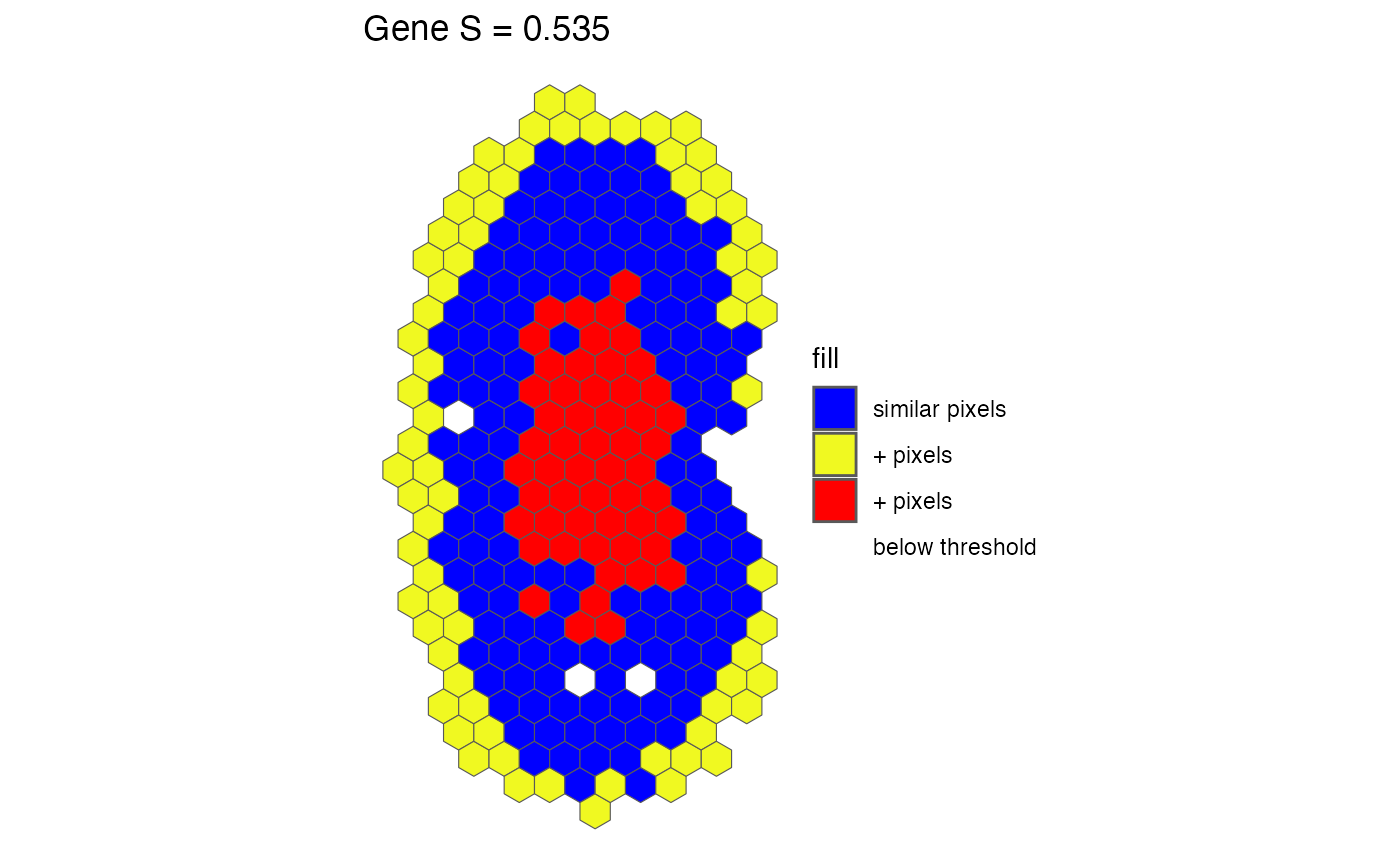
Generates a spatial plot of pixel classifications for a given gene.
pixelClass.RdThis function visualizes the spatial distribution of gene expression similarity by classifying pixels into three categories: below threshold, similar, and not similar. The plot is generated using spatial geometry from the SpatialExperiment object.
Arguments
- input
A list. Results from `spatialSimilarity()`. This includes the similarity table, log-transformed pixel data, and analysis parameters.
- gene
Character. The name of the gene to visualize.
- assayName
A character string or numeric specifying the assay in the Spatial Experiment to use. Default is
NULL. If no value is supplied forassayName, then the first assay is used as a default
Value
A ggplot2 spatial plot displaying classified pixels, where:
bluePixels classified as similar (within the fold-change threshold).
yellowPixels with greater expression in dataset X than Y.
redPixels with greater expression in dataset Y than X.
greyPixels with gene expression below the threshold in both experiments.
The plot is generated using `sf` (simple features) for spatial representation and is overlaid with pixel classifications. The plot title includes the gene name and its similarity score.
Examples
data(speKidney)
##### Rasterize to get pixels at matched spatial locations #####
rastKidney <- SEraster::rasterizeGeneExpression(speKidney,
                assay_name = 'counts', resolution = 0.2, fun = "mean",
                BPPARAM = BiocParallel::MulticoreParam(), square = FALSE)
s <- spatialSimilarity(list(rastKidney$A, rastKidney$B))
pixelClass(s, "Gene")
#> Coordinate system already present.
#> ℹ Adding new coordinate system, which will replace the existing one.