Getting Started with STcompare
Vivien Jiang
Kalen Clifton
Jean Fan
getting-started-with-STcompare.RmdIntroduction
Spatial transcriptomic (ST) technologies enable the investigation of how tissue organization relates to cellular function by profiling the spatial location of cells within a tissue and the gene expression profiles associated with those locations. As ST technologies are increasingly applied in the context of disease characterization and translational research, identifying genes that spatially change in their expression patterns in diseased tissues as compared to healthy controls could reveal localized molecular variation associated with pathological processes, offering insights into disease mechanisms as well as aiding in the discovery of diagnostic biomarkers.
Attempts at such comparative analysis of ST datasets can be performed using traditional non-spatial bulk or single cell transcriptomics analysis approaches such as differential gene expression (DGE) analysis, comparing the mean expression of genes between two datasets by fold-change. However, this type of DGE analysis does not consider the spatial information. As such, a gene can be identified as not differentially expressed across two datasets by having the same mean gene expression, but the gene can still have two distinct spatial patterns of expression. On the other hand, a gene can be identified as differentially expressed across the two datasets by having very different mean gene expression but have spatial expression patterns that are highly similar. By not considering spatial information, traditional DGE analysis fails to characterize such cases. To demonstrate these cases, we simulated ST datasets where one pair of genes has different radial expression patterns but the same mean expression, while the other pair has same radial expression patterns but different mean expression.
Clifton K, Jiang V, Singh S, Matsuura R, Rabb H, Fan J., STcompare: Comparative spatial transcriptomics data analysis to characterize differentially spatially patterned genes. bioRxiv 2025.11.21.689847. doi: https://doi.org/10.1101/2025.11.21.689847
Install
require(remotes)
remotes::install_github('JEFworks-Lab/STcompare')
In this tutorial we will walk through applying
STcompare’s two differential spatial comparison tests to
simulated kidney datasets:
Spatial Correlation: Person correlation assumes that each sample is independent and identically distributed random variables. However, in terms of gene expression, the gene expression of one cell influences the gene expression of the neighboring cells. Spatial Correlation computes the empirical p-value instead to consider the dependent relationship. We will show why the p-value null distribution correction is needed in the Spatial Correlation test.
Spatial Fold Change: Computes a Similarity score for each gene in the comparison, compares the change in expression at matched locations.
Simulated Pattern Kidney
Here we load the simulated kidney data speKidney that we
will use to demonstrate spatialCorrelation and
spatialSimilarity
speKidney is a list of three
SpatialExperiment objects representing three simulated
single-cell kidney datasets named A, B, and C. A SpatialExperiment
object store spatial transcriptomics data, combining gene expression
matrices with the spatial coordinates of each spatial location. Each
element of speKidney contains assays:
gene-by-cell expression matrices and spatialCoords: x–y
spatial coordinates for each spatial location.
data("speKidney")
head(speKidney)
#> $A
#> class: SpatialExperiment
#> dim: 1 1229
#> metadata(0):
#> assays(1): counts
#> rownames(1): Gene
#> rowData names(0):
#> colnames(1229): cell1 cell2 ... cell1228 cell1229
#> colData names(1): sample_id
#> reducedDimNames(0):
#> mainExpName: NULL
#> altExpNames(0):
#> spatialCoords names(2) : x y
#> imgData names(0):
#>
#> $C
#> class: SpatialExperiment
#> dim: 1 1297
#> metadata(0):
#> assays(1): counts
#> rownames(1): Gene
#> rowData names(0):
#> colnames(1297): cell1 cell2 ... cell1296 cell1297
#> colData names(1): sample_id
#> reducedDimNames(0):
#> mainExpName: NULL
#> altExpNames(0):
#> spatialCoords names(2) : x y
#> imgData names(0):
#>
#> $B
#> class: SpatialExperiment
#> dim: 1 1242
#> metadata(0):
#> assays(1): counts
#> rownames(1): Gene
#> rowData names(0):
#> colnames(1242): cell1 cell2 ... cell1241 cell1242
#> colData names(1): sample_id
#> reducedDimNames(0):
#> mainExpName: NULL
#> altExpNames(0):
#> spatialCoords names(2) : x y
#> imgData names(0):
Looking at the row dimensions and names, we can see that each dataset
contains one gene called Gene. Looking at the column
dimensions and names, we can see that the three samples vary slightly in
the number of spatial locations, i.e. cells.
Next we plot the spatial patterns of gene expression for each dataset.
# This function takes the Spatial Experiment Object and creates a plot
# of the spatial patterns of gene expression.
plotSpatialPatterns <- function(spatialExperimentObj, name) {
  df <- cbind(
    as.data.frame(spatialCoords(spatialExperimentObj)),
    as.data.frame(colData(spatialExperimentObj))
  )

  df$Gene <- as.numeric(assay(spatialExperimentObj, "counts")["Gene", ])

  ggplot(df, aes(x = x, y = y, color = Gene)) +
    geom_point(size = 0.6) +
    coord_equal() +
    theme_bw() +
    theme(
      panel.grid.major = element_blank(),
      panel.grid.minor = element_blank()
    ) +
    scale_color_viridis(option = "D") +
    labs(
      x = "x",
      y = "y",
      color = "Gene",
      title = paste("Simulated Kidney", name)
    )
}

pA <- plotSpatialPatterns(speKidney$A, "A")
pB <- plotSpatialPatterns(speKidney$B, "B")
pC <- plotSpatialPatterns(speKidney$C, "C")

pA + pB + pC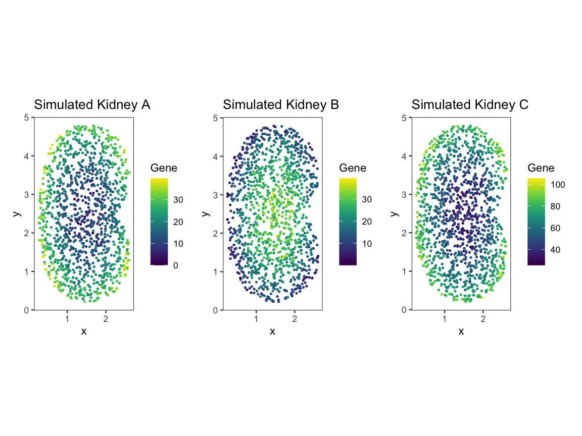
Upon plotting the gene expression spatial patterns for each dataset, we can see that A and B share gene expression magnitude but differ in spatial pattern, and A and C share spatial pattern but differ in gene expression magnitude.
Mean comparision is not sufficient
Traditionally, these simulated kidneys would be compared using differential gene expression (DGE) analysis such as comparing the average of the mean expression.
# Convert the counts for each kidney (A, B, C) into one dataframe.
# Each kidney’s expression counts are extracted from the "counts" assay and stored as a numeric vector.
df <- data.frame(
  value = c(
    as.numeric(assay(speKidney$A, "counts")),
    as.numeric(assay(speKidney$B, "counts")),
    as.numeric(assay(speKidney$C, "counts"))
  ),

  # Create a "sample" column showing which kidney each pixel belongs to.
  # The `rep()` call ensures that the correct number of labels (A/B/C) is assigned
  # based on the length of each counts vector.
  sample = factor(rep(
    c("A", "B", "C"),
    times = c(
      length(as.numeric(assay(speKidney$A, "counts"))),
      length(as.numeric(assay(speKidney$B, "counts"))),
      length(as.numeric(assay(speKidney$C, "counts")))
    )
  ))
)

# Plot a boxplot comparing the distribution of pixel intensities across the 3 kidneys.
# This represents a traditional magnitude-only comparison,
# which cannot distinguish pattern similarity/differences.
compare_box_plot <- ggplot(df, aes(x = sample, y = value, fill = sample)) +
  geom_boxplot(outlier.shape = 16, outlier.size = 1.5, alpha = 0.7) +
  labs(x = "Sample", y = "Pixel Intensity", title = "Expression Magnitude Across Samples") +
  theme_minimal(base_size = 14) +
  theme(legend.position = "none")
compare_box_plot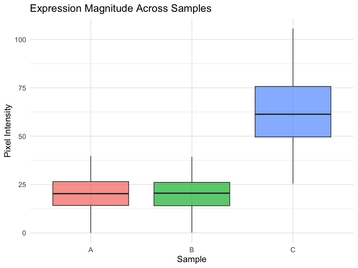
Comparing the mean between A and B does not capture the spatial gene expression difference. Comparing the means between A and C tells us the expression magnitudes have a fold difference, but it does not capture how the gene expression patterns in A and C are similarly spatially organized.
- We will use
spatialCorrelationGeneExptest to quantify the correlation in gene expression pattern between (A and B) and (A and C). Where we expect (A and B) will have a significant negative correlation and we expect (A and C) will have a significant positive correlation. - And we will use
SpatialSimilaritytest to quantify the difference in gene expression magnitude at matched spatial locations not reflected by DGE between (A and B)
Using STcompare
Input formatting
Tissue Alignment
ForSTcompareto produce meaningful comparisons, the tissues must first be spatially aligned so that corresponding structures are matched across samples. TheSTalignpackage can be used to align two tissues. STalign TutorialRasterization
STcomparetakes a list ofSpatialExperimentobjects and requires them to have matched spatial locations. UseSErasterto rasterize multiple samples onto the same coordinate system, allowingSTcompareto pairwise compare across any number of samples. SEraster formatting tutorial
Since our simulated data is already aligned we first use
SEraster to rasterize this list of simulated kidneys,
stored as SpatialExperiment objects, onto the same
coordinate plane.
rastKidney <- SEraster::rasterizeGeneExpression(speKidney,
                assay_name = 'counts', resolution = 0.2,
                square = FALSE)

# After rasterization, the output is a SpatialExperiment object, but the spatial units are now raster pixels rather than individual cells or spots. The assay has been converted to pixelval, and additional metadata (num_cell, cellID_list, geometry) records which original cells contributed to each pixel.
head(rastKidney)
#> $A
#> class: SpatialExperiment
#> dim: 1 282
#> metadata(0):
#> assays(1): pixelval
#> rownames(1): Gene
#> rowData names(0):
#> colnames(282): pixel52 pixel53 ... pixel416 pixel417
#> colData names(6): num_cell cellID_list ... geometry sample_id
#> reducedDimNames(0):
#> mainExpName: NULL
#> altExpNames(0):
#> spatialCoords names(2) : x y
#> imgData names(0):
#>
#> $C
#> class: SpatialExperiment
#> dim: 1 287
#> metadata(0):
#> assays(1): pixelval
#> rownames(1): Gene
#> rowData names(0):
#> colnames(287): pixel51 pixel52 ... pixel417 pixel431
#> colData names(6): num_cell cellID_list ... geometry sample_id
#> reducedDimNames(0):
#> mainExpName: NULL
#> altExpNames(0):
#> spatialCoords names(2) : x y
#> imgData names(0):
#>
#> $B
#> class: SpatialExperiment
#> dim: 1 279
#> metadata(0):
#> assays(1): pixelval
#> rownames(1): Gene
#> rowData names(0):
#> colnames(279): pixel53 pixel65 ... pixel416 pixel417
#> colData names(6): num_cell cellID_list ... geometry sample_id
#> reducedDimNames(0):
#> mainExpName: NULL
#> altExpNames(0):
#> spatialCoords names(2) : x y
#> imgData names(0):

# These are the plots to visualize what the kidneys looks like
pA <- plotRaster(rastKidney$A, plotTitle = "Rasterized Kidney A")
pB <- plotRaster(rastKidney$B, plotTitle = "Rasterized Kidney B")
pC <- plotRaster(rastKidney$C, plotTitle = "Rasterized Kidney C")

pA + pB + pC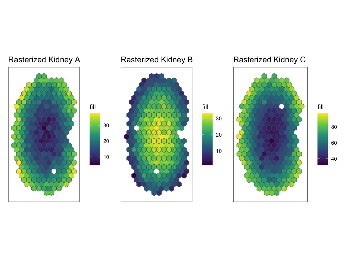
Spatial correlation
Now, we will use spatialCorrelationGeneExp to understand
correlation of expression across pixels.
As input spatialCorrelationGeneExp takes a list of two
SpatialExperiment objects. First, we will compare A and
B.
# From the list of rasterized kidneys, rastKidney, we will take a subset of rastKidney
# rastGexpListAB is a list of two kidneys, A and B
rastGexpListAB <- list(A = rastKidney$A, B = rastKidney$B)

# spatialCorrelationGeneExp takes input of a list of two SpatialExperiment objects -- rastGexpListAB
# nThreads, the default is 1, should be set to the number of cores available to allow for parallel computing
scAB <- spatialCorrelationGeneExp(rastGexpListAB, nThreads = 1)

# correlationCoef is showing a negative linear relationship
# Both the naive and the permuted p-values (pValuePermuteY and pValuePermuteX) are showing that the correlation is significant
head(scAB)
#>      correlationCoef   pValueNaive pValuePermuteX pValuePermuteY
#> Gene      -0.9472813 5.652003e-136              0              0
#>      deltaStarMedianX deltaStarMedianY   deltaStarX   deltaStarY
#> Gene              0.2              0.2 0.2, 0.2.... 0.2, 0.2....
#>      nullCorrelationsX nullCorrelationsY
#> Gene      -0.16074....      -0.08458....
As output spatialCorrelationGeneExp returns:
-
correlationCoefPearson’s correlation coefficient shows the strength and direction of a linear relationship between the two objects -
pValueNaiveis the analytical p-value naively assuming independent observations, often time not accurate -
pValuePermuteXis the p-value when creating an empirical null from permutations of observations in X -
pValuePermuteYis the p-value when creating an empirical null from permutations of observations in Y – we recommend using the higher ofpValuePermuteYorpValuePermuteX, as a more accurate p-value thanpValueNaive -
deltaStarMedianXthe median delta star (the delta which minimizes the difference between the variogram of the permutation and the variogram of observations) across permutations of X -
deltaStarMedianYthe median delta star across permutations of Y -
deltaStarXis list of delta star for all permutations of X -
deltaStarYis list of delta star for all permutations of Y -
nullCorrelationsXis a list of correlation coefficients for Y and all permutations of X -
nullCorrelationsYis a list of correlation coefficients for X and all permutations of Y
Because correlationCoef = -0.9472813 and
pValuePermuteX and pValuePermuteY < 0.05,
we can conclude that gene expression at matched pixel locations is
negatively correlated in A and B as expected.
We can also visualize our results with
plotCorrelationGeneExp. In the title we include the
empirical p-value p_E as the higher of
pValuePermuteY or pValuePermuteX.
# visualization of the negative correlation
# plotCorrelationGeneExp needs the list of rasterized SpatialExperiment objects, the table from spatialCorrelationGeneExp of the same objects,
# and the gene name you are trying to plot. In the case, the gene name is "Gene".
expAB <- plotCorrelationGeneExp(rastGexpListAB, scAB, "Gene")
expAB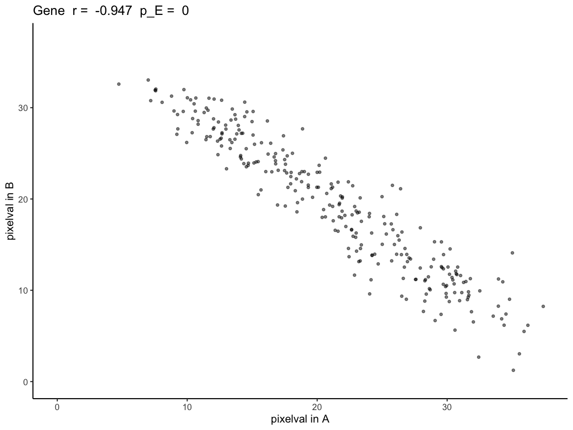
We can repeat the analysis for A and C.
# From the list of rasterized kidneys, rastKidney, we will take a subset of rastKidney
# rastGexpListAC is a list of two kidneys, A and C
rastGexpListAC <- list(A = rastKidney$A, C = rastKidney$C)

# correlationCoef is showing a positive linear relationship
# Both the naive and the permuted p-values (pValuePermuteY and pValuePermuteX) are showing that the correlation is significant
scAC <- spatialCorrelationGeneExp(rastGexpListAC)
head(scAC)
#>      correlationCoef   pValueNaive pValuePermuteX pValuePermuteY
#> Gene       0.9431531 1.409195e-133              0              0
#>      deltaStarMedianX deltaStarMedianY   deltaStarX   deltaStarY
#> Gene              0.2              0.2 0.2, 0.4.... 0.2, 0.2....
#>      nullCorrelationsX nullCorrelationsY
#> Gene      -0.00632....      0.052321....

# visualization of the positive correlation
# plotCorrelationGeneExp needs the list of rasterized SpatialExperiment objects, the table from spatialCorrelationGeneExp of the same objects,
# and the gene name you are trying to plot. In the case, the gene name is "Gene".
expAC <- plotCorrelationGeneExp(rastGexpListAC, scAC, "Gene")
expAC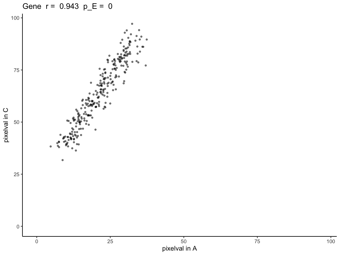
Because correlationCoef = 0.9431531 and
pValuePermuteX and pValuePermuteY < 0.05,
we can conclude that gene expression at matched pixel locations is
positively correlated in A and C.
Why we generate empirical p-values through permutations
Next, we will demonstrate how using the analytical p-value, which naively assumes spatial locations are independent observations, when interpreting Pearson’s correlation coefficients results in a high false positive rate when the datasets that are compared have spatial autocorrelation.
simRanPatternRasts is a list of 100 simulated
SpatialExperiment objects representing kidney-shaped
datasets, each containing one independently generated spatially
patterned (i.e spatially autocorrelated) gene with no correlation
between datasets. Each dataset consists of N = 5000 simulated cells
distributed within a kidney-shaped region, with spatial coordinates and
expression values generated from Gaussian random fields. All of the
objects in simRanPatternRasts are already rasterized onto
the same coordinate plane.
Using the kidney 1 and kidney 7 in the
simRanPatternRasts dataset, we plot the spatial gene
expression patterns and run spatialCorrelationGeneExp
expecting the two datasets to have no significant correlation.
# using plotRaster from the SEraster package to visualize kidney 1 and 7
plotRaster(simRanPatternRasts[[1]], plotTitle = "simRanPatternRasts Kidney 1")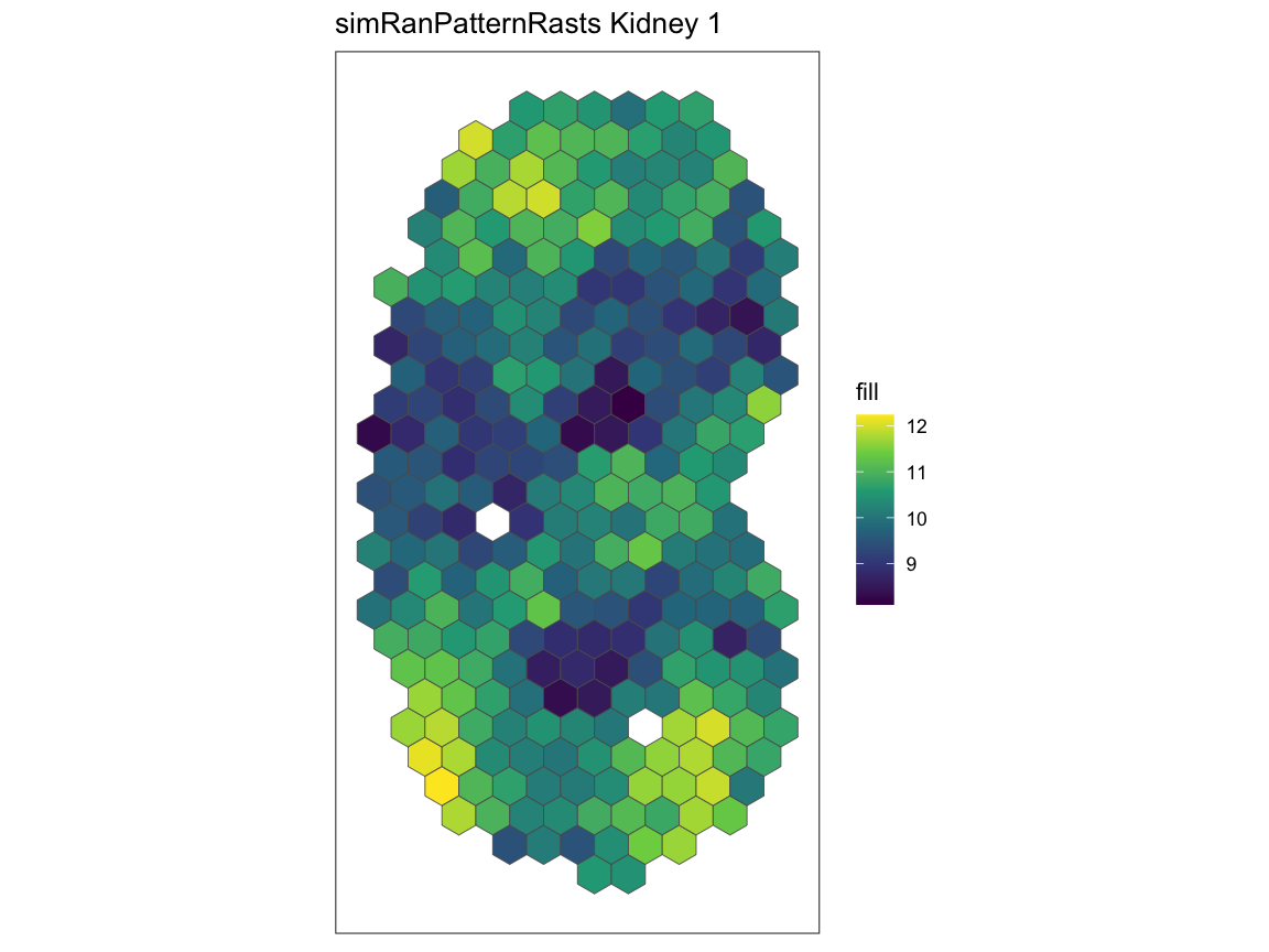
plotRaster(simRanPatternRasts[[7]], plotTitle = "simRanPatternRasts Kidney 7")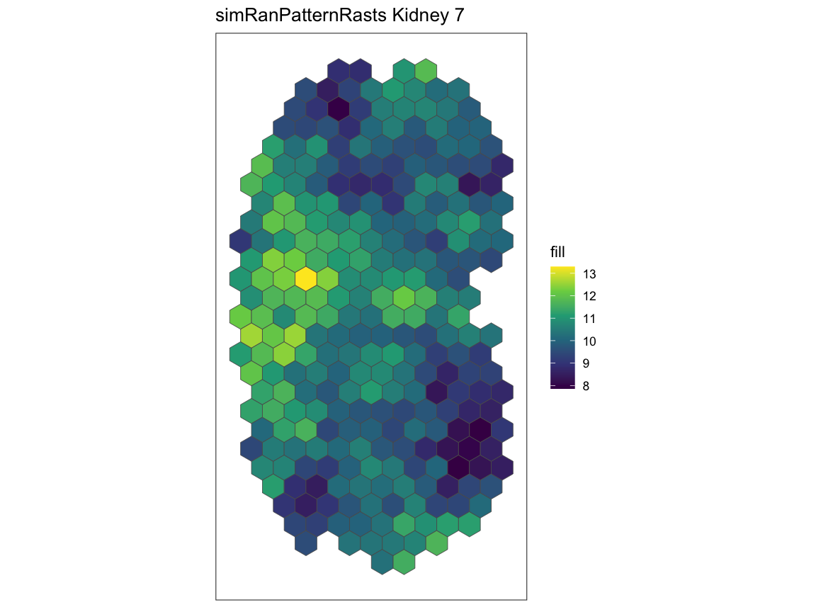
# taking a subset of simRanPatternRasts
# rastGexpList is a list of rasterize SpatialExperiment objects kidney 1 and kidney 7
rastGexpList <- list(kidney_1 = simRanPatternRasts[[1]], kidney_7 = simRanPatternRasts[[7]])

# finding the correlation and the p-value of kidney 1 and kidney 7
sc <- spatialCorrelationGeneExp(rastGexpList)

# the naive p-value is showing that the correlation is significant
# while both of the permuted p-values are showing not significant p-values
head(sc)
#>   correlationCoef  pValueNaive pValuePermuteX pValuePermuteY deltaStarMedianX
#> 1      -0.2189486 0.0002533931            0.3           0.28              0.1
#>   deltaStarMedianY   deltaStarX   deltaStarY nullCorrelationsX
#> 1              0.3 0.1, 0.3.... 0.3, 0.4....      0.120499....
#>   nullCorrelationsY
#> 1      0.119433....

# the plot further shows that there isn't a correlation between kidney 1 and kidney 7
plotCorrelationGeneExp(rastGexpList, sc, "1")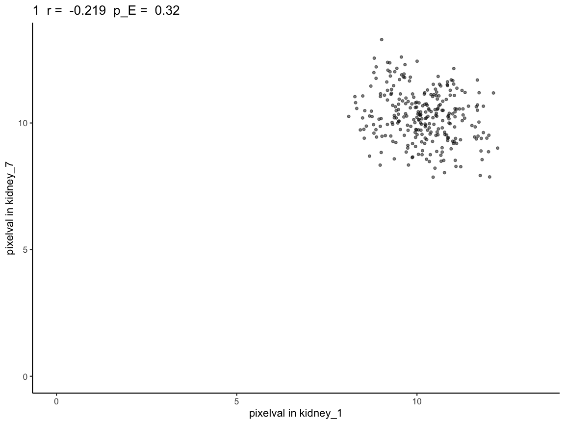
We see that the naive p-value is in the significant range (p-value < 0.05). However, based on the way the kidneys are simulated (simulated to have no correlation), this should not be the case, which is reflected in the permuted p-values. Unlike the naive p-value, the permuted p-values do not show significant correlation.
Additionally, for each pairwise kidney SpatialExperiment object in
the list of 100 random simulations, the corrected p-value can be
computed using spatialCorrelationGeneExpIterPermutation for
each pair. To reduce runtime for the tutorial, we provide the output
from running this function as
simRanPatternResults.RData.
# Full script to generate the precomputed vignette results available at:
# system.file("scripts", "simRanPatternSpatialCorrelation.R", package = "STcompare")

# load data generated from the script
load(system.file("extdata", "simRanPatternResults.RData", package = "STcompare"))

# Var1 and Var2 is every pairwise combination between the 100 kidneys
# cors is the correlation coefficient of that pair
# corspv is the naive p-value for that pair
# corspv_correct is the permuted p-value for that pair (chosen to be the higher of pValuePermuteY and pValuePermuteX)
head(cors_df)
#>   Var1 Var2        cors       corspv corspv_corrected
#> 2    2    1 -0.04158115 0.4922707721             0.85
#> 3    3    1  0.09066560 0.1343915793             0.54
#> 4    4    1  0.05189013 0.3931009641             0.74
#> 5    5    1  0.11116927 0.0651509396             0.54
#> 6    6    1  0.10915193 0.0722938990             0.54
#> 7    7    1 -0.21894862 0.0002533931             0.28

cors_df <- na.omit(cors_df)

# apply BH correction for the naive p-value
cors_df$corspv_bh <- p.adjust(cors_df$corspv, method = "BH")

# Avoid log(0)
cors_df$corspv_bh[cors_df$corspv_bh == 0] <- 1e-10
cors_df$corspv_corrected[cors_df$corspv_corrected == 0] <- 1e-10

# -log10
cors_df$log_bh <- -log10(cors_df$corspv_bh)
cors_df$log_corrected <- -log10(cors_df$corspv_corrected)

plot_df <- data.frame(
  analytical_pval  = cors_df$log_bh,
  emperical_pval = cors_df$log_corrected
)
plot_df_long <- melt(plot_df, variable.name = "type", value.name = "neglog10_pval")


plt <- ggplot(plot_df_long, aes(x = type, y = neglog10_pval, color = type)) +
  geom_boxplot() +
  geom_hline(
    yintercept = -log10(0.05),
    linetype = "dashed",
    linewidth = 0.5
  ) +
  theme_classic() +
  labs(
    x = "P-value type",
    y = "-log10(p-value)",
    title = "BH-corrected Analytical p-value (pA) vs BH-corrected Emperical p-value (pE)"
  ) +
  theme(
    legend.position = "none",
    axis.text.x = element_text(size = 12),
    axis.text.y = element_text(size = 12),
    axis.title = element_text(size = 14),
    plot.title = element_text(size = 15)
  )
plt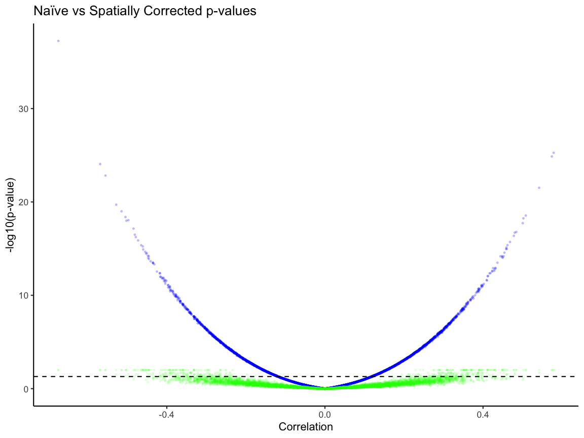
# percentage of signficant pairs based on the BH corrected niave p-value
niave_sig <- plot_df[plot_df$analytical_pval > -log10(0.05), ]
niave_sig_per <- dim(niave_sig)[1] / dim(plot_df)[1]
niave_sig_per
#> [1] 0.4280808
dim(niave_sig)[1]
#> [1] 4238

emperical_sig <- plot_df[plot_df$emperical_pval > -log10(0.05), ]
emperical_per <- dim(emperical_sig)[1] / dim(plot_df)[1]
emperical_per
#> [1] 0.03878788
dim(emperical_sig)[1]
#> [1] 384

dim(plot_df)
#> [1] 9900    2
Based on the boxplot, the dotted line represent the significance (p-value < 0.05). The median for the niave p-value is higher than the corrected one and there are pairs that are above the significance line in the niave p-value plot than in the emperical p-value. Without p-value correction, we observe that ~43% of these analytical p-values are less than 0.05, while after correcting for p-value only ~4% of the empirical p-values are less than 0.05.
Spatial fold change
Now, we use spatialSimilarity to understand the
magnitude changes across matched spatial locations.
Here, we find the spatialSimilarity pairwise between (A and B) and (A
and C) in rastKidney.
First, we will compare A and B. Let x be the expression of pixel in A and y be the expression of that same pixel in B. Then a pixel is defined as similar if |log2(y/x)| < b. As default we set b = 1 so that pixels are similar if there is a less than two-fold change.
Then the similarity score S is the proportion of similar pixels over the total number of pixels.
# spatialSimilarity also takes in a list of 2 SpatialExperiment objects you want to compare between
# t1 and t2 are the thresholding value for the first and second object in the list.
# The threshold is used to remove pixels that have no or little expression for a given gene in the pixel.
# Failure to remove those those pixels will result in a trivial similarity score due to noise.
# If t1 and t2 aren't provided, minQuantile is used to threshold based on the quantile of expression.
# The default for minQuantile is 0.05, meaning by default the pixels at the bottom 5% are removed.
# minPixels is the percentage of pixels left after thresholding. The default is 0.1.
# When there is not enough pixels left, the similarity score will also be trivial.
# foldChange is the number of fold that are considered similar. The default is 1 fold.

# compare kidney A and B
sAB <- spatialSimilarity(
  list(A = rastKidney$A, B = rastKidney$B)
)

# compare kidney A and C
sAC <- spatialSimilarity(
  list(A = rastKidney$A, C = rastKidney$C)
)
To visualize the results of comparing A and C with
spatialSimilarity we use the linearRegression
and pixelClass functions.
# To get the linear regression and the pixel classification plots,
# the inputs are the spatialSimilarity output and the gene name

# The Linear regression shows the areas in which gene expression
# each pixels falls, the pixel is either: higher in B, similar, higher in A
lrAB <- linearRegression(input=sAB, gene = "Gene")
lrAB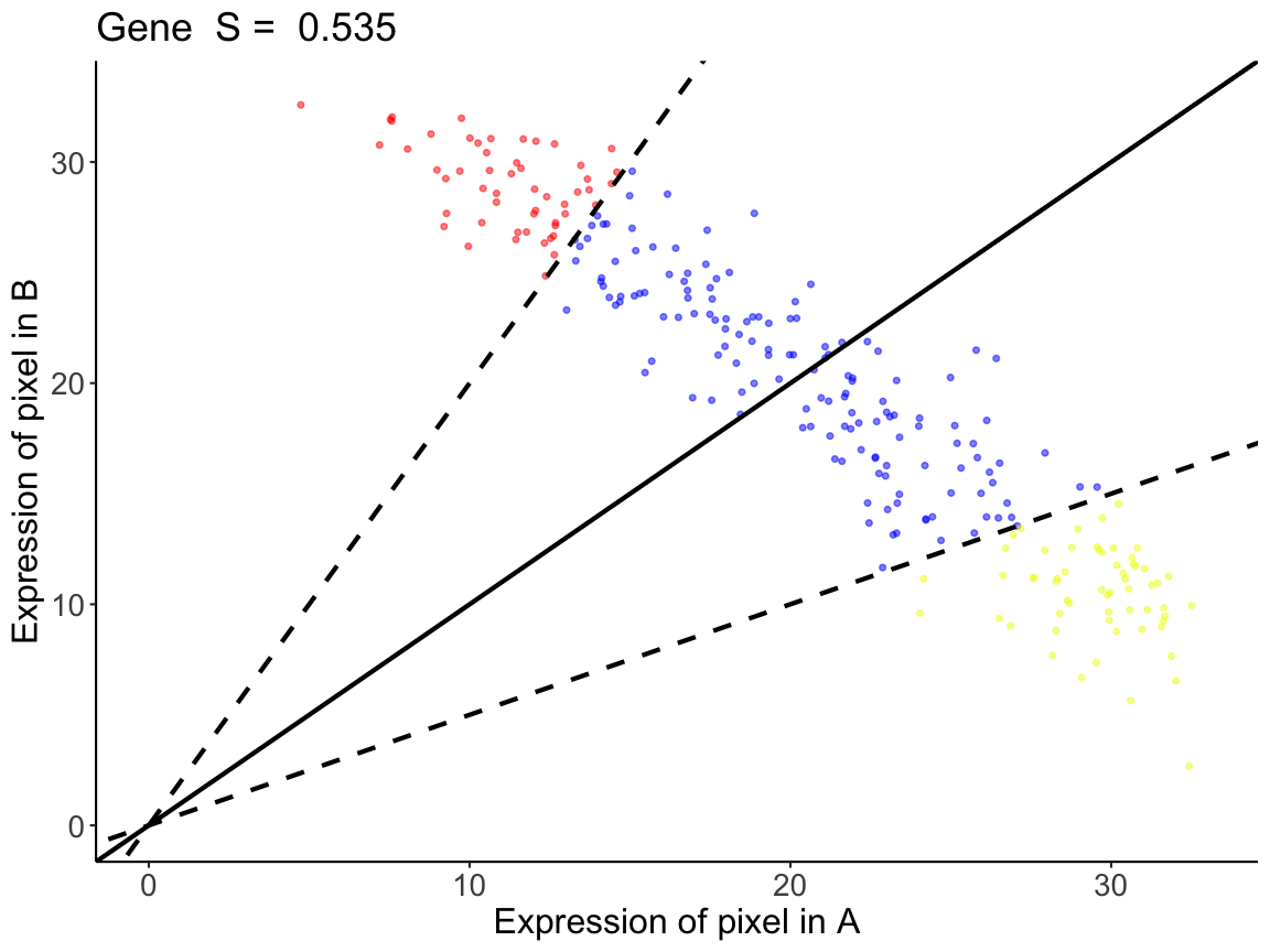
# Similar to the linear regression plot, the pixel classification plot takes
# the plot of the rasterized kidney and classifies each pixel with the pixels
# that are below the threshold are gray
pcAB <- pixelClass(input=sAB, gene="Gene")
pcAB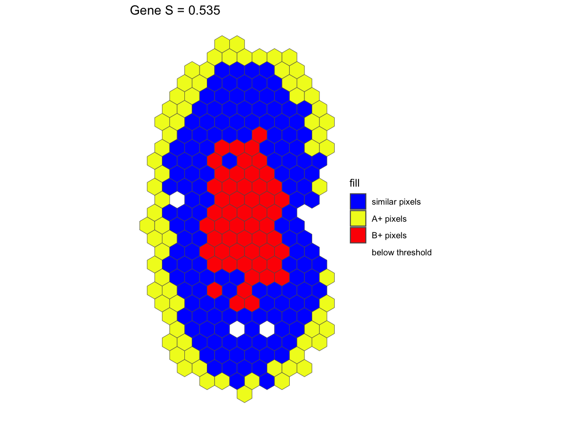
For gene Gene in the comparison between A and B, we see
that A and B has a similarity score of S=0.535. This means that 53.5% of
the intersecting pixels between A and B are within a two-fold change
We can also visualize the results of comparing A and C.
# all the pixels have higher expression in C than in A,
# and are outside of the similar expression boundaries

lrAC <- linearRegression(input=sAC, gene = "Gene")
lrAC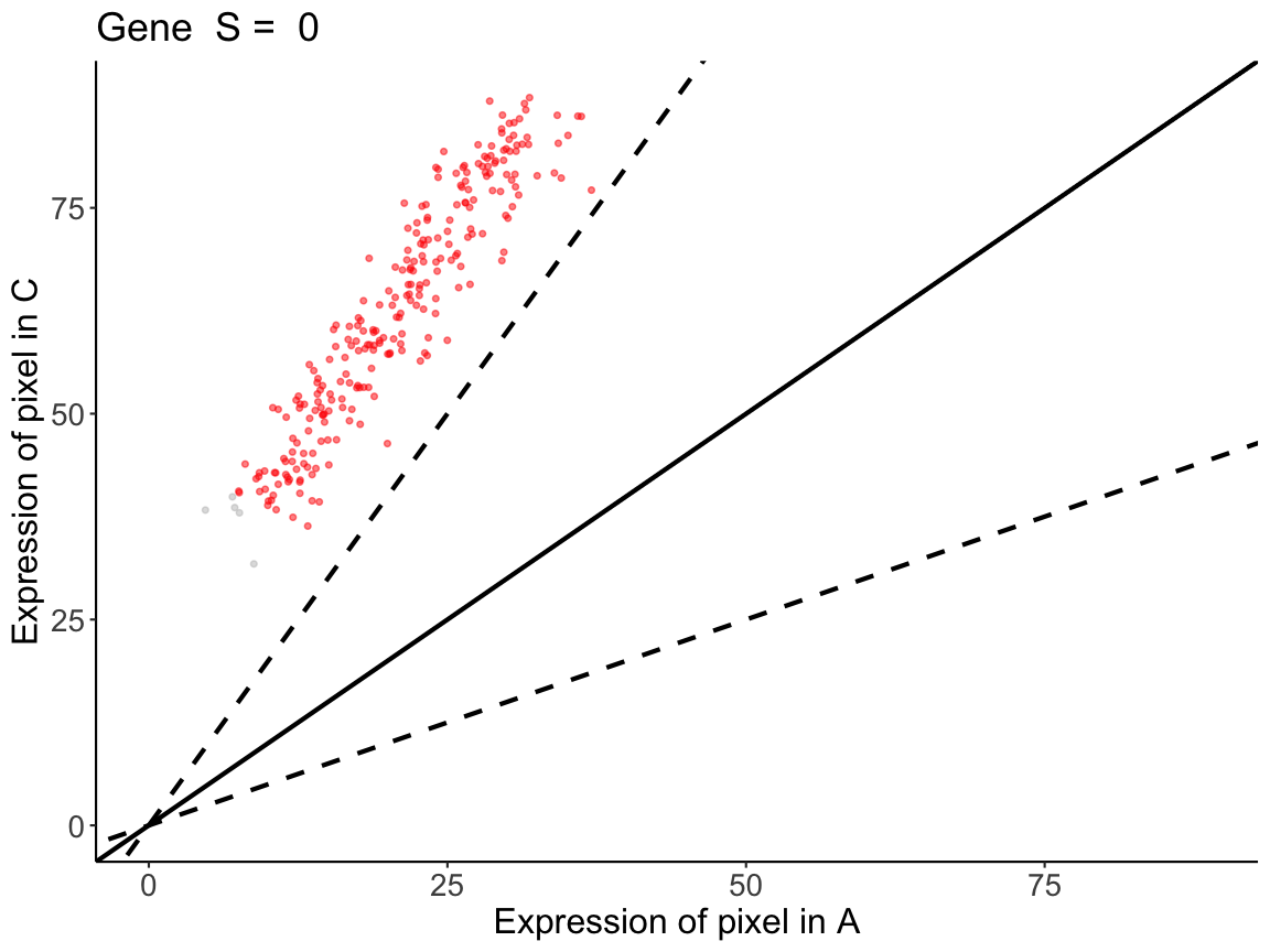
pcAC <- pixelClass(input=sAC, gene="Gene")
pcAC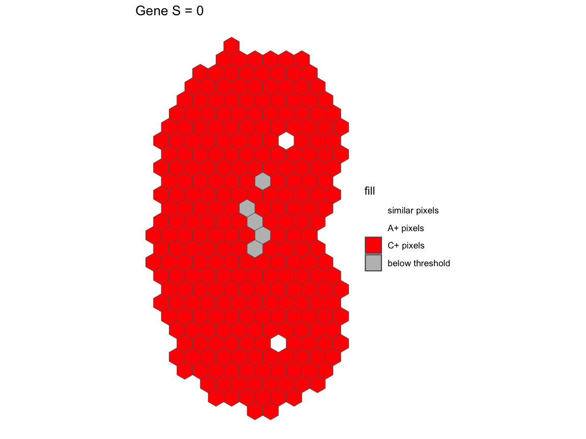
All the pixels have over 2-fold increase in C relative to the same pixels in A.
Conclusion
In spatial data, changes in expression pattern and magnitude can be independent observations.
- A and B are negatively correlated but have similar magnitude at matched spatial locations
- A and C are positively correlated but do not have similar magnitude at matched spatial locations
We demonstrate that STcompare can be used to identify
these differences that would otherwise not have been detected using mean
gene expression magnitude comparison. We also demonstrate that
STcompare generates empirical p-values, providing p-value
correction that is needed to take into account that gene expression in
each pixel is not independent from that of its neighbors’.