Homework1 Submission

Some descriptions for my display
-
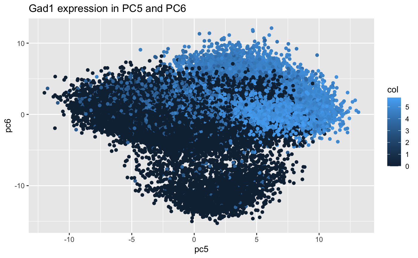
We are visualizing gene expression data which is quantitative data.
-
I’m using points as a geometric primitive; position and color as visual channels.
-
I’m trying explore the relationship between two principle component (pc5 and pc6) and the expression of gene ‘Gad1’. So each point refers to a cell with certain Gad1 expression. The x-coordinate of points indicates the loading for pc5. We could see that cells with high Gad1 expression tend to have a more positive loading for pc5, which means the expression of Gad1 may have great influence on pc5. However, we don’t see that trend in pc6.
-
I used “similarity” principle. The points with similar maturation of colors are perceived as a group in a rough way. e.g Gad1 high expressing group or Gad1 low expressing group.
MY PERCEPTION FOR THE PLOT: As the plot shows, we could summarize that the gene expression of Gad1 contributes much to pc5. The same result is shown by the “pcs$rotation[‘Gad1’,1:10]” command, the value for pc5 is 0.27890229 which is positive and relatively of large absolute value.
knitr::opts_chunk$set(echo = TRUE)
library(ggplot2)
data<-read.csv('MERFISH_Slice2Replicate2_halfcortex.csv.gz')
gexp <- data[, 4:ncol(data)] #get gene expression information
rownames(gexp) <- data[,1]
numgenes <- rowSums(gexp) #how many genes are captured
normgexp <- gexp/rowSums(gexp)*1e6 #normalization (gene expression in 1e6 cells)
mat <- log10(normgexp+1)
pcs <- prcomp(mat) # PCA analysis for the gene expression matrix
save(pcs, file="Merfish_pcs.RData")
head(sort(pcs$rotation[,1], decreasing=TRUE))# My perception: sort out the most influential genes for pc1
pcs$rotation['Gad1',1:20]
df <- data.frame(pc5 = pcs$x[,5],
                 pc6 = pcs$x[,6],
                 col = log10(normgexp[, 'Gad1']+1))
ggplot(data = df,
       mapping = aes(x = pc5, y = pc6)) +
  geom_point(mapping = aes(col=col)) +
  ggtitle("Gad1 expression in PC5 and PC6")