Visualization of a Spleen Tissue and is Identification

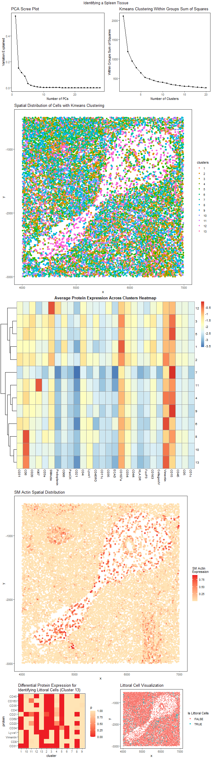
We are given a spatial protein expression dataset identify its originality. The figures shown above should be labeled A to G from left to right and from top to bottom.
Figure A. Scree Plot of Variation Explained by Different Number of PCs. This plot is a scree plot of the variation that could be explained by different number of PCs. This helps choose the number of PC to be used for clustering.
Figure B. Elbow Plot of Within Group Sum of Squares of Different K Choice for K means clustering. This plot help explains the variation explained within each cluster for different choice of K in the algorithm. This helps choose the final K.
Figure C. Spatial Distribution of Cell Clusters with K means Clustering. From Figure B, we choose K = 13 to perform K means clustering. This image uses position to visualize the spatial distribution of cells in the x, y coordinate and uses the color hue visual channel to encode the cluster of cells.
Figure D. Average Protein Expression Across Clusters Heatmap. This heatmap visualizes the average protein expression in each cluster. There is a cluster with high expression of SM Actin, which correspond to some cells in the middle cavity. These cells express this protein because are migrating cells.
Figure E. The Spatial Distribution of SM Actin Protein Intensity. To see these migrating cells, we visualize the SM Actin distribution, where high expression are colored in red. We see that most of the cells are in the middle cavity and have a migration pattern.
Figure F. The Differential Expression of Proteins for Identifying Littoral Cells. This is a differential protein expression intensity heatmap in different clusters. Red color indicate significant high expression of certain proteins (p value close to zero). Cluster 13 has cells matching the protein expression description for littoral cells.
Figure G. The Sptail Distribution of Littoral Cells. This plot visualize the cluster 13, which are identified to be littoral cells with protein expression level.
To process the data, first we normalize protein expression with total protein expression across cells.
PCA helps reduce dimension and remove correlations when we later use it to cluster the cells. Based on the scree plot of PCA, we choose first 9 PCs to be used for later clustering because the first 9 PCs explain most of the variations, and the scree plot’s line doesn’t change much after 9.
Then we want to choose the number k for kmeans clustering. The elbow plot of Within Group Sum of Squares help us choose k for kmeans clustering algorithm to cluster cells. It explain the variation within clusters for different choice of k, although it is lower the better, in the plot, since the variation explained doesn’t drop much after K = 13, we choose this as our K for K means clustering.
We visualize the spatial distribution of different cell types but the cell types distribution are scattered around and don’t tell much information about structure. We then visualize the average protein expression across cluster heatmap to obtain more information. We see that almost all clusters have high expression of Vimentin and CD15, which are common proteins expressed in immune cells. Since the tissue is spleen, it must be from an area where immune cells are present, so it won’t be the outer muscle area. However, a group of cells in the cavity express high level of SM Actin which are commonly seen in smooth muscle cell. To explain this contradiction, there is a study that shows that this protein is also expressed in migrating cells, which tell us the cells in the middle cavity are migrating.
Then we hypothesize that this structure might be trabecular in the spleen where cells migrate in them, and the circle in it might be the cross section of a blood vessel. The trabecular is usually surrounded by red pulp in the spleen, so we hypothesis that cells around it might be red pulp.
To further investigate this hypothesis, we try to identify a cell type that is unique in red pulp. From a study we know the littoral cells are usually seen in red pulp of the spleen, and they usually express CD31, CD8, Vimentin, Lyve1 but not other proteins shown in Figure F. The other proteins are omitted here because they are not discussed in the paper. We identify cluster 13 as littoral cells, and we visualize them in green in Figure G. Since in the figure C it is hard to visualize them, we have an extra visualize here to make them more salient.
Therefore, we conclude that the tissue is from spleen’s red pulp with a trabecular in the middle. The limitation is that the dataset doesn’t have marker for red blood cells, otherwise if the tissue contain large amount of red blood cell genes we can verify that the tissue is red pulp instead of white pulp in spleen, because white pulp usually contain immune cells only but no red blood cells.
Acknowledgement:
I collaborated with Alice Chen.
References:
https://vetmed.tamu.edu/peer/wp-content/uploads/sites/72/2020/08/17.-Structure-of-Lymphoid-System-Components.pdf
Ogembo, J. G., Milner, D. A., Jr, Mansfield, K. G., Rodig, S. J., Murphy, G. F., Kutok, J. L., Pinkus, G. S., & Fingeroth, J. D. (2012). SIRPα/CD172a and FHOD1 are unique markers of littoral cells, a recently evolved major cell population of red pulp of human spleen. Journal of immunology (Baltimore, Md. : 1950), 188(9), 4496–4505. https://doi.org/10.4049/jimmunol.1103086
1
2
3
4
5
6
7
8
9
10
11
12
13
14
15
16
17
18
19
20
21
22
23
24
25
26
27
28
29
30
31
32
33
34
35
36
37
38
39
40
41
42
43
44
45
46
47
48
49
50
51
52
53
54
55
56
57
58
59
60
61
62
63
64
65
66
67
68
69
70
71
72
73
74
75
76
77
78
79
80
81
82
83
84
85
86
87
88
89
90
91
92
93
94
95
96
97
library(Rtsne)
library(ggplot2)
library(gridExtra)
library(scattermore)
library(pheatmap)

## Load Data
data = read.csv("D:/JHU-SP22/genomic-data-visualization/hw_YZ/codex_spleen_subset.csv", row.names = 1)
pos = data[, 1:2]
area = data[, 3]

## Normalization
pexp = data[, 4:ncol(data)]
totalpexp = rowSums(pexp)
exp_mat = pexp / totalpexp

set.seed(2048)

## PCA
pcs = prcomp(exp_mat)
var_explained = pcs$sdev^2 / sum(pcs$sdev^2)
df1 = as.data.frame(var_explained)
df1$r = 1:nrow(df1)
p1 = ggplot(df1, aes(x = r, y = var_explained)) + geom_line() + geom_point() +
  xlab("Number of PCs") + ylab("Variation Explained") + ggtitle("PCA Scree Plot") +
  theme_bw() + theme(panel.grid.major = element_blank(), panel.grid.minor = element_blank())

## Kmeans Clustering
pc_selected = pcs$x[, 1:9]
wss = (nrow(pc_selected) - 1) * sum(apply(pc_selected, 2, var))
for (i in 2:20) wss[i] = sum(kmeans(pc_selected, centers=i)$withinss)
df2 = as.data.frame(wss)
df2$r = 1:nrow(df2)
p2 = ggplot(df2, aes(x = r, y = wss)) + geom_line() + geom_point() +
  xlab("Number of Clusters") + ylab("Within Groups Sum of Squares") +
  ggtitle("Kmeans Clustering Within Groups Sum of Squares") +
  theme_bw() + theme(panel.grid.major = element_blank(), panel.grid.minor = element_blank())

num_clusters = 13
clusters = kmeans(pc_selected, centers = num_clusters)$cluster

## Spatial Distribution of cells
p3 = ggplot(pos, aes(x = x, y = y)) +
  geom_scattermore(aes(col = as.factor(clusters)), pointsize = 2) + theme_bw() +
  theme(panel.grid.major = element_blank(), panel.grid.minor = element_blank()) +
  labs(color="clusters") + ggtitle("Spatial Distribution of Cells with Kmeans Clustering")

## Average Protein Expression Across Clusters
avg_exp_mat = data.frame()
for (i in 1:num_clusters)
{
  t = log10(colMeans(exp_mat[as.factor(clusters) == i, ]))
  avg_exp_mat = rbind(avg_exp_mat, t)
  print(mean(area[as.factor(clusters) == i]))
  print(i)
}
colnames(avg_exp_mat) = colnames(exp_mat)
p4 = pheatmap(avg_exp_mat, cluster_rows = T, cluster_cols = F, main = "Average Protein Expression Across Clusters Heatmap")
p4 = as.ggplot(p4)
## Visualizing Spatial Distribution of SM Action
p5 = ggplot(pos, aes(x = x, y = y)) +
  geom_scattermore(aes(col = exp_mat$SMActin), pointsize = 2) + scale_color_gradient(low = "#FFE4B5", high = "#ED1C24") + theme_bw() +
  theme(panel.grid.major = element_blank(), panel.grid.minor = element_blank()) +
  labs(color="SM Actin \nExpression") + ggtitle("SM Actin Spatial Distribution")

## Visualizing Littoral Cells

diff_exp_mat = data.frame()
for (i in 1:num_clusters)
{
  group = as.factor(clusters) == i
  for (g in c("CD31", "CD8", "CD20", "CD68", "CD21", "CD4", "Lyve1", "CD35", "CD163", "Vimentin", "CD45", "CD34"))
  {
    result = wilcox.test(exp_mat[group, g], exp_mat[!group, g], alternative = "greater")
    t = c(i, g, result$p.value)
    diff_exp_mat = rbind(diff_exp_mat, t)
  }
}
colnames(diff_exp_mat) = c("cluster", "protein", "p")
diff_exp_mat$cluster = as.factor(diff_exp_mat$cluster)
diff_exp_mat$protein = as.factor(diff_exp_mat$protein)
diff_exp_mat$protein = factor(diff_exp_mat$protein, levels = c("CD31", "CD8", "Vimentin", "Lyve1", "CD34", "CD20", "CD68", "CD21", "CD4",  "CD35", "CD163", "CD45"))
diff_exp_mat$p = as.numeric(diff_exp_mat$p)

p6 = ggplot(diff_exp_mat, aes(cluster, protein, fill = p)) + geom_tile() +
  scale_fill_gradient(low = "#ED1C24", high = "#FFE4B5") +
  ggtitle("Differential Protein Expression for \nIdentifying Littoral Cells (Cluster 13)") + theme_bw()

p7 = ggplot(pos, aes(x = x, y = y)) +
  geom_scattermore(aes(col = as.factor(clusters) == 13), pointsize = 2) + theme_bw() +
  theme(panel.grid.major = element_blank(), panel.grid.minor = element_blank()) +
  labs(color="Is Littoral Cells") + ggtitle("Littoral Cell Visualization")

png("yuqiz.png", width = 700, height = 2500)
grid.arrange(arrangeGrob(p1, p2, ncol=2), p3, p4, p5, arrangeGrob(p6, p7, ncol=2), ncol = 1, heights=c(1, 2, 2, 2, 0.8),
             top = "Identifying a Spleen Tissue")
dev.off()