Comparing Galr1 and Galr2 expression frequencies

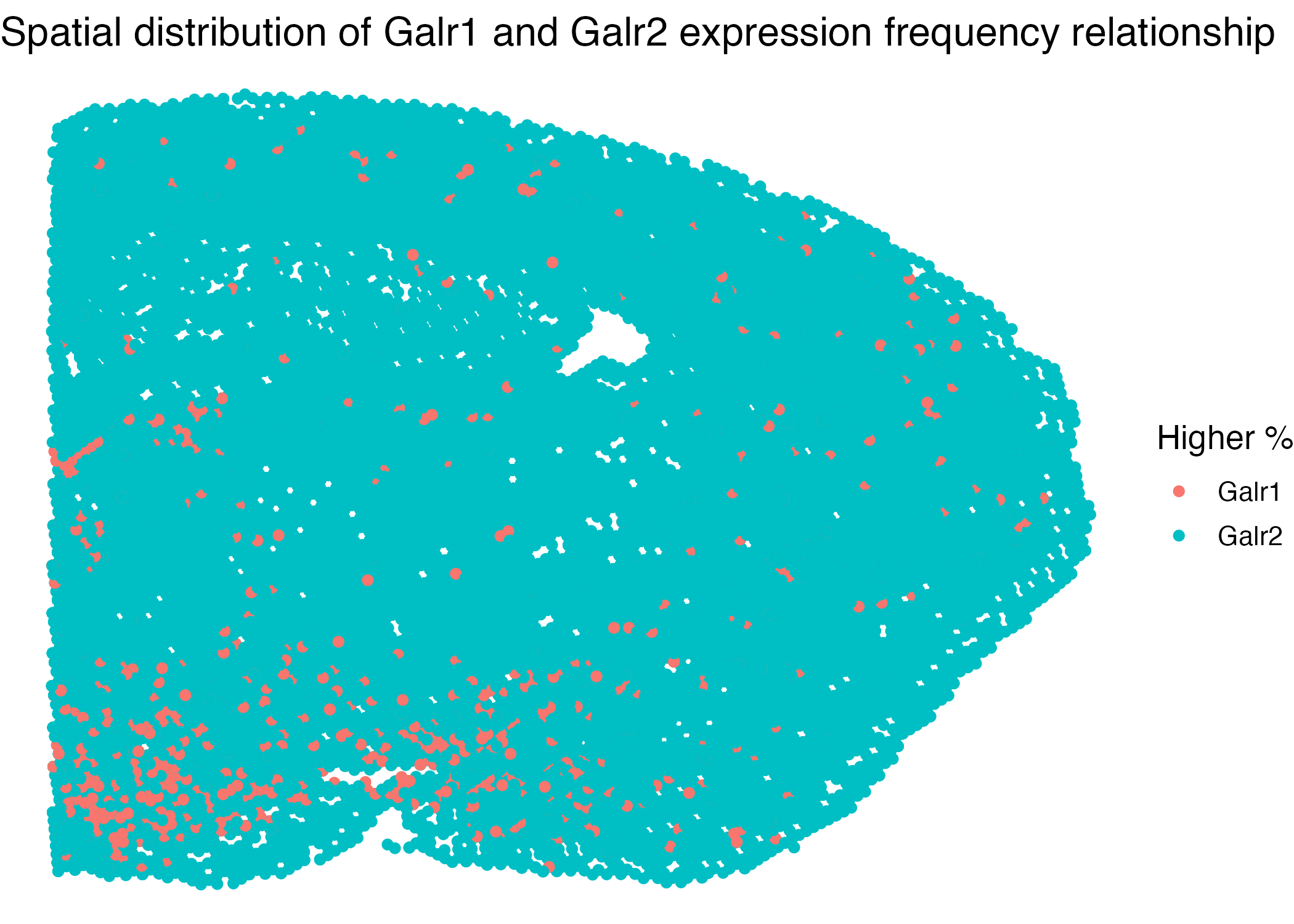
This visualization compares the Galr1 and Galr2 expression frequencies across different brain areas. The expression frequencies are quantitative, computed by dividing the counts over the total RNA counts per cell. Next, we want to categorize all cells into two types: whether its Galr1 expression frequency is higher than that of Galr2. Each category is represented by the same color, either green or red. Our graph illustrates that the lower-left region of the brain slice has more cells with higher Galr1 expression frequency than that of Galr2, which is unique from other areas of the brain. We could also see that cells with this property are close in space.
##loading data
data <- read.csv('~/Documents/GitHub/genomic-data-visualization /data/MERFISH_Slice2Replicate2_halfcortex.csv.gz')

#loading packages
library(ggplot2)
library(tidyverse)
library(dplyr)

galr1 = (data$Galr1/rowSums(data[,4:486]))
galr2 = (data$Galr2/rowSums(data[,4:486]))
gt2 = galr1 <= galr2
df2 = as.data.frame(cbind(data$x,data$y,as.factor(gt2)))
ggplot(data=df2) +
  geom_point(aes(x=V1,y=V2,color=gt2))+
  theme_void(base_size=15) +
  scale_color_discrete(labels=c('Galr1','Galr2'))+
  labs(color='Higher %')

ggsave('ziqifu_hw1.png',pt,height=5,width = 7,bg='#ffffff')