Different Ways to Visualize Structure for Visium Data

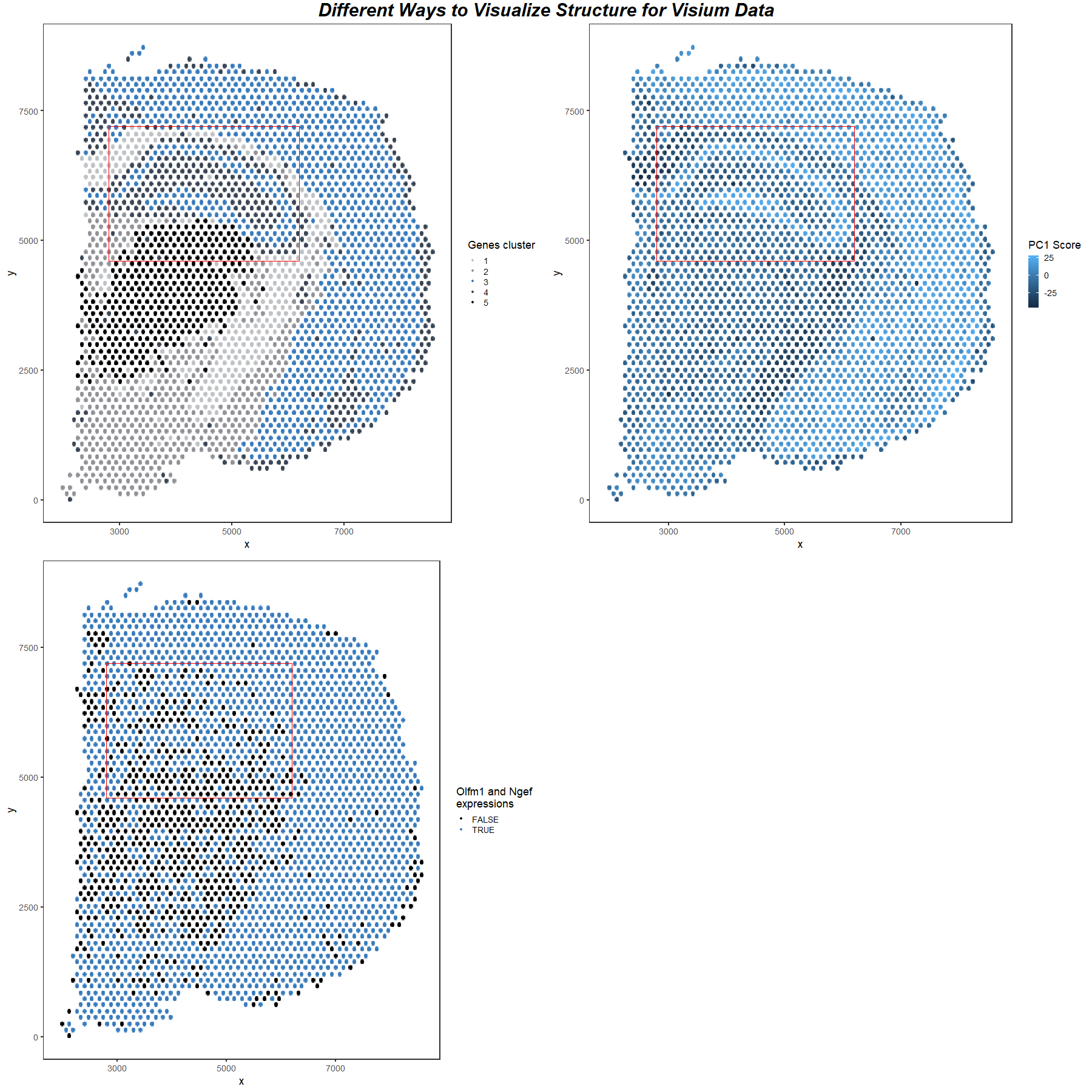
For all three images, I am visualizing the position of cells in the Visium Dataset, which is quantitative data. In image 1, I am also visualizing the Kmeans clustering grouping data, which is categorical data. I image 2, I am also visualizing the PC1 score, which is quantitative data. In image 3, I am also visualizing whether there are gene expressions of both Olfm1 and Ngef in the cell, which is categorical data.
The Kmeans clustering is performed using normalized gene expression. Once seen that group 3 contains cells of a special structure in the dataset, I found the representative up-regulated genes by searching through all the genes to find the most significantly up-regulated genes in group 3.
I use the geometric primitive of points to represent cells. The position visual channel is used to encode cell locations. The color visual (hue) channel is used to encode Kmeans clustering grouping data in image 1, the PC1 score in image 2, and the gene expression condition in image 3.
I use the gestalt principle of similarity and enclosure to highlight one of the structures revealed by three different methods. The structure is represented by blue color in all three images, so the same hue makes the audience more likely to perceive that they are the same structure. The area is enclosed by a red box in 3 images, and since items enclosed are more likely to be perceived as a whole group, these show that the area contains an important structure. Therefore, although in the 3rd image it is not shown clearly, the audience can still see agreement between the 3 images.
Therefore, in this explanatory data visualization, I try to make salient that there is an agreement between 3 different methods when revealing a particular structure in the spatial transcriptomic dataset.
1
2
3
4
5
6
7
8
9
10
11
12
13
14
15
16
17
18
19
20
21
22
23
24
25
26
27
28
29
30
31
32
33
34
35
36
37
38
39
40
41
42
43
44
45
46
47
48
49
50
51
52
53
54
55
56
57
58
59
60
61
62
63
64
65
66
67
68
69
library(ggplot2)
library(gridExtra)
library(Rtsne)
library(scattermore)

visium_data = read.csv("~/genomic-data-visualization/data/Visium_Cortex_varnorm.csv.gz",
                       row.names = 1)
visium_data_gene = visium_data[, c(3:ncol(visium_data))]
# Normalization:
visium_data_gene_normal = visium_data_gene/rowSums(visium_data_gene)*1e6
visium_data_gene_normal = log10(visium_data_gene_normal + 1)

set.seed(1024)

# PCA and Kmeans Clustering
pcs = prcomp(visium_data_gene_normal)

gene_cluster_result = kmeans(visium_data_gene_normal, centers = 5)

df = visium_data[, 1:2]
df$genes_col = gene_cluster_result$cluster
df$genes_col = as.factor(df$genes_col)
df$pc1_col = pcs$x[, 1]

group = df$new_genes_col == 3

# Find Most significant Upregulated Genes in the group
min_p_val = 1
g1 = ""
g2 = ""
for (g in colnames(visium_data_gene_normal)) {
  test_stat = wilcox.test(visium_data_gene_normal[group, g], visium_data_gene_normal[!group, g], alternative = "greater")
  if (test_stat$p.value < min_p_val)
  {
    min_p_val = test_stat$p.value
    g2 = g1
    g1 = g
  }
}

# Color with gene clusters
p1 = ggplot(df, aes(x = x, y = y)) +
  geom_scattermore(aes(col = genes_col), pointsize = 2) + theme_bw(base_size = 22) +
  theme(panel.grid.major = element_blank(), panel.grid.minor = element_blank()) +
  geom_rect(data=df, mapping=aes(xmin=2800, xmax=6200, ymin=4600, ymax=7200),
            color="red", alpha=0) + labs(color = "Genes cluster") +
  scale_color_manual(values=c("#BFC2C5", "#919198", "#387bbc", "#394454", "black"))

# Color with PC1 score
p2 = ggplot(df, aes(x = x, y = y)) +
  geom_scattermore(aes(col = pc1_col), pointsize = 2) + theme_bw(base_size = 22) +
  theme(panel.grid.major = element_blank(), panel.grid.minor = element_blank()) +
  geom_rect(data=df, mapping=aes(xmin=2800, xmax=6200, ymin=4600, ymax=7200),
            color="red", alpha=0) + labs(color = "PC1 Score")

# Color with gene expression
p3 = ggplot(df, aes(x = x, y = y)) +
  geom_scattermore(aes(col = visium_data_gene[[g1]] * visium_data_gene[[g2]] > 0), pointsize = 2) +
  theme_bw(base_size = 22) + labs(color=paste(g1, "and", g2, "\nexpressions")) +
  theme(panel.grid.major = element_blank(), panel.grid.minor = element_blank()) +
  geom_rect(data=df, mapping=aes(xmin=2800, xmax=6200, ymin=4600, ymax=7200),
            color="red", alpha=0) +
  scale_color_manual(values=c("black", "#387bbc"))

png("yuqiz.png", width = 1800, height = 1800)
grid.arrange(p1, p2, p3, ncol = 2,
             top = textGrob("Different Ways to Visualize Structure for Visium Data",
                            gp = gpar(fontsize=30,font=4)))
dev.off()