Cells Expressing Gad1 in MERFISH Data Grouped by PCA

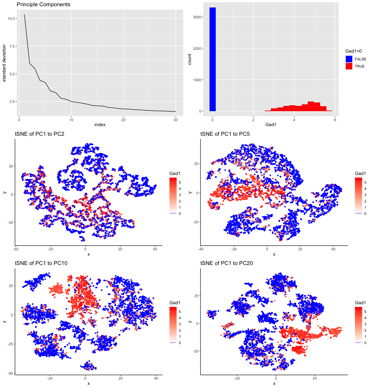
My multipanel visualization includes six individual plots. The origin of the data for all plots is the MERFISH dataset (42519 cells x 486 genes) which has been downsampled to 5000 cells. Also, the gene expression has been normalized by cell to gene counts per million genes and then log10 transformed with pseudocounts of 1.
In the first plot, I am visualizing the standard deviation (quantitative data) of the first 30 principle components (ordinal data) from principle component analysis (PCA). The geometric primitive used is a line. The visual channels used are position and angle. Position on the x axis encodes the index of the principle component. Position on the y axis encodes the value of the standard deviatin at each index. The angle of each line segment conveys how steepily the standard deviation of the principle compenents changes. What I want to make salient with this visualization is how much variance is captured by the first 30 principle components. I used the Gesalt pricinple of contintuity by choosing line segments instead of points to plot this data.
The second plot is a histogram of the expression of Gadl throughout the 5000 cells. I am visualizing cell counts (quantitative data) at levels of gene expression (quantitative data). Also, I am visualizing ordinal data with the categories being zero expression of Gad1 and nonzero expression of Gad1. The geometric primitive used is area. On the x axis, I am using the visual channel of position to encode the log10 transformation of the copies of Gad1 per million of genes in a cell. On the y axis, I am using the visual channel of position to encode the count of cells that have a certain number of copies of Gad1. The other visual channel that is utilized is color, specifically the hues blue and red. The area that represents cells with no Gad1 expression is colored blue. The areas that correspond to cells with some Gad1 expression are colored red, utilizing the Gesalt principle of similarity to be perceived as one group. What I want to make salient with this visualization is the proportion of cells that express Gad1 (<2000 cells).
The third through sixth visualizations are tSNE plots of different numbers of principle components from PCA done on the downsampled MERFISH gene expression data with cells labeled by Gad1 expression. The geometric primitive is a point for each of these plots. The visual channel of position is used on the axes to encode the values of the two features resulting from the tSNE dimensionality reduction. The other visual channel that is used is color, both as hue and saturation. The hues blue and red are used to distinguish the cells with no Gad1 expression and some Gad1 expression, respectively. In the red hue, saturation is used to encode the range of Gad1 expression with high saturation corresponding to high expression of Gad1. Again, I am utilizing the Gesalt principle of similarity via color to encourage perception of grouping. Also, on the tSNE plot another principle, proximity, is meaningful. Nearby points should be perceived as related cells. As a collection, these visualizations were developed as an exploratory exercise. I wanted to explore the data to make salient how many principle components would be needed to get a distinct cluster that could be defined by Gad1 expression.
References:
- https://r-charts.com/distribution/histogram-group-ggplot2/
- https://stackoverflow.com/questions/18487369/ggplot-set-scale-color-gradientn-manually/44736761
#load libraries
library(Rtsne)
library(ggplot2)
library(scattermore)
library(gridExtra)

#load MERFISH data
data <- read.csv('~/Dropbox/JHU/Courses/genomic-data-visualization/data/MERFISH_Slice2Replicate2_halfcortex.csv.gz')

#downsample to 5000
vi <- sample(data[,1],5000)
ds <- data[data$X %in% vi,]

#make matrix of position
pos <- ds[, c('x','y')]
rownames(pos) <- ds[,1]
plot(pos, pch='.') #change geometric primitive to point

#make matrix of gene expression data without position
gexp <- ds[, 4:ncol(ds)]
rownames(gexp) <- ds[,1]

# for each gene, count how many cells express that gene
cellexp <- colSums(gexp != 0)

cdata <- data.frame(cellexp)
ggplot(data = cdata, mapping = aes(x=log10(cellexp))) +
  geom_histogram(mapping = aes(y=stat(count/sum(count))),
                 binwidth = 1, bins = 4, boundary=0, closed="right",
                 color="black", fill="white") +
  labs(title="Prevalence of Genes by Orders of Magnitude", x="log10(# of cells expressing a gene)", y = "proportion of genes")

head(cellexp[order(cellexp, decreasing = TRUE)])

#CPM normalize
numgenes <- rowSums(gexp)
normgexp <- gexp/numgenes*1e6

#add pseudocounts to do log
mat <- log10(normgexp+1)

mydf <- data.frame(mat)
colors <- c("blue", rep("blue",19))
phist <- ggplot(data = mydf,
       mapping = aes(x = Gad1)) +
  geom_histogram(mapping = aes(fill = mydf['Gad1'] > 0), bins = 20) +
  scale_fill_manual("Gad1>0",values = c("blue", "red"))
phist


###############
#PCA
pcs <-prcomp(mat)
save(pcs, file="MERFISH_pcs_5000.RData")
df <- data.frame(x=c(1:30), y=pcs$sdev[1:30])
p <- ggplot(data = df,mapping = aes(x=x,y=y) ) + geom_line() +
  labs(title="Principle Components", x="index", y = "standard deviation")
p

###############
# tSNE
set.seed(0)
emb <- Rtsne(pcs$x[,1:2], dims=2, perplexity = 30)$Y
rownames(emb) <- rownames(mat)
head(emb)
dim(emb)
df1 <- data.frame(x=emb[,1],
                 y=emb[,2],
                 col = mat[,'Gad1'])

p1 <- ggplot(data=df1, mapping = aes(x=x, y=y)) +
  geom_point(mapping = aes(col = col), size=1) +
  theme_classic() +
  scale_color_gradientn("Gad1", colours =
                          c("blue", "white","red"), values = c(0,0.01,1)) +
  labs(title="tSNE of PC1 to PC2")
p1

emb2 <- Rtsne(pcs$x[,1:5], dims=2, perplexity = 30)$Y
rownames(emb2) <- rownames(mat)
head(emb2)
dim(emb2)
df2 <- data.frame(x=emb2[,1],
                 y=emb2[,2],
                 col = mat[,'Gad1'])

p2 <- ggplot(data=df2, mapping = aes(x=x, y=y)) +
  geom_point(mapping = aes(col = col), size=1) +
  theme_classic() +
  scale_color_gradientn("Gad1", colours =
                          c("blue", "white","red"), values = c(0,0.01,1)) +
  labs(title="tSNE of PC1 to PC5")

p2


emb3 <- Rtsne(pcs$x[,1:10], dims=2, perplexity = 30)$Y
rownames(emb3) <- rownames(mat)
head(emb3)
dim(emb3)
df3 <- data.frame(x=emb3[,1],
                  y=emb3[,2],
                  col = mat[,'Gad1'])

p3 <- ggplot(data=df3, mapping = aes(x=x, y=y)) +
  geom_point(mapping = aes(col = col), size=1) +
  theme_classic() +
  scale_color_gradientn("Gad1", colours =
                          c("blue", "white","red"), values = c(0,0.01,1)) +
  labs(title="tSNE of PC1 to PC10")

p3

emb4 <- Rtsne(pcs$x[,1:20], dims=2, perplexity = 30)$Y
rownames(emb4) <- rownames(mat)
head(emb4)
dim(emb4)
df4 <- data.frame(x=emb4[,1],
                  y=emb4[,2],
                  col = mat[,'Gad1'])

p4 <- ggplot(data=df4, mapping = aes(x=x, y=y)) +
  geom_point(mapping = aes(col = col), size=1) +
  theme_classic() +
  scale_color_gradientn("Gad1", colours =
                          c("blue", "white","red"), values = c(0,0.01,1)) +
  labs(title="tSNE of PC1 to PC20")

p4

## for arranging plots side by side
grid.arrange(p, phist, p1, p2, p3, p4, ncol=2)
