Identifying Splenic Tissue By Spatial Proteomics

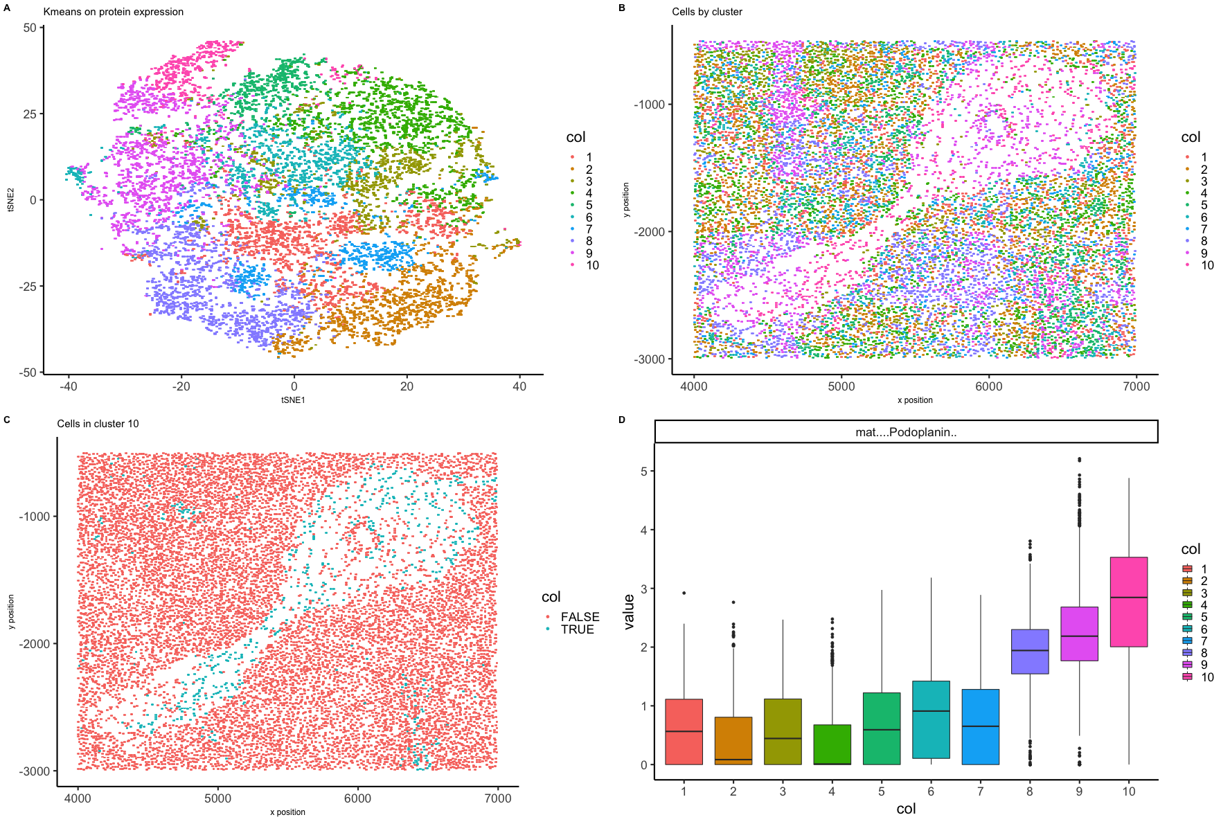
Expression of 28 proteins has been measured in 11512 spleen cells by fluorescence intensity. Each cell area and position in the tissue sample has also been recorded. Fluorescence intensity has been normalized by area and given in counts per thousand units. tSNE was performed on the first ten principle components from PCA on the protein expression matrix to display the data in low dimensional space. Cells were grouped by kmeans clustering on the protein expression data into ten clusters and visualized on the low dimensional embeddings (Figure A). Cells were plotted as they appear positionally in the tissue sample labeled by clusters (Figure B). Cells in the white space seem unique at least regarding placement, so the cluster that contains most of those cells, cluster 10, was chosen for further analysis. Figure C shows where all cells in cluster 10 are positioned in the splenic tissue sample. Boxplots were created to show differential expression across the ten clusters for all 28 proteins. Figure D showcases a set of boxplots in which protein expression was upregulated in cluster 10 compared to the other clusters. Podoplanin is upregulated in cluster 10 and in the spleen is known to be expressed by perivasculature cells such as macrophages. If cells in cluster 10 are in splenic vasculature, the sample may be a crosssection of a splenic artery.
References:
- https://journals.biologists.com/jcs/article/132/5/jcs222067/48/Podoplanin-regulates-the-migration-of-mesenchymal
#load libraries
library(Rtsne)
library(ggplot2)
library(scattermore)
library(gridExtra)
library(reshape2)
library(cowplot)
library(Hmisc)
library(tidyr)

#load mystery spleen data
data <- read.csv('~/Dropbox/JHU/Courses/R_genomic_data_visualization/codex_spleen_subset.csv.gz')
head(data)

#downsample to 5000
#set.seed(0)
#vi <- sample(data[,1],10000)
#ds <- data[data$X %in% vi,]
ds <- data

#make matrix of position
pos <- ds[, c('x','y')]
rownames(pos) <- ds[,1]
plot(pos, pch='.')

#make matrix of area
area <- ds[,'area']

# histogram of area for cells
histdf <- data.frame(area)
rownames(histdf) <- ds[,1]
phist <- ggplot(data = histdf,
                 mapping = aes(x=area)) +
  geom_histogram(mapping = aes(), binwidth = 100,boundary=0, closed="right") +
  theme_classic(base_size=22) +
  labs(title="Histogram of cell area", x="area", y = "count")
phist

#plot position of cells colored by cell area
v <- c(0, 100/max(area), 800/max(area), 1)
area_col <- c("gray", "white", "red","black")

dfpo <- data.frame(x = pos[,1],
                  y = pos[,2],
                  cell_area = area)
ppo <- ggplot(data = dfpo, mapping = aes(x = x, y = y)) +
  geom_scattermore(mapping = aes(col = cell_area), pointsize=1) +
  scale_color_gradientn("area", colours = area_col, values = v) +
  theme_classic(base_size=22) +
  labs(title="Cells by area", x = "x position" , y = "y position")+
  theme(axis.title=element_text(size=12), plot.title = element_text(size=15))
ppo

# histogram and position plot looking at area
grid.arrange(phist, ppo, ncol=2)
#save
png("area_plots.png", width = 2134, height = 1000)
grid.arrange(phist, ppo, ncol=2)
dev.off()


#make matrix of gene expression data without position
gexp <- ds[, 5:ncol(ds)]
rownames(gexp) <- ds[,1]
head(gexp)

# histograms of expression for all proteins
# use tidyr to make long data to make histograms
data_long <- gexp %>%
  pivot_longer(colnames(gexp)) %>%
  as.data.frame()
head(data_long)

ggp1 <- ggplot(data_long, aes(x = value)) +    # Draw each column as histogram
  geom_histogram() +
  facet_wrap(~ name, scales = "free")
ggp1

#save histograms at readable size
png("histograms.png", width = 2500, height = 1500)
ggp1
dev.off()

#normalize intensity by area, counts per thousand
normgexp <- gexp/area*1e3
head(normgexp)

# histograms of normalized expression of all proteins
# use tidyr to make long data to make histograms
normgexp_long <- normgexp %>%
  pivot_longer(colnames(normgexp)) %>%
  as.data.frame()
head(normgexp_long)

ggp2 <- ggplot(normgexp_long, aes(x = value)) +    # Draw each column as histogram
  geom_histogram() +
  facet_wrap(~ name, scales = "free")
ggp2

#save histograms at readable size
png("histograms_norm.png", width = 2500, height = 1500)
ggp2
dev.off()


#add pseudocounts to do log of normalized expression
mat <- log10(normgexp+1)

# histograms of log normalized expression of all proteins
# use tidyr to make long data to make histograms
mat_long <- mat %>%
  pivot_longer(colnames(mat)) %>%
  as.data.frame()
head(mat_long)

ggp3 <- ggplot(mat_long, aes(x = value)) +    # Draw each column as histogram
  geom_histogram() +
  facet_wrap(~ name, scales = "free")
ggp3

#save histograms at readable size
png("histograms_norm_log.png", width = 2500, height = 1500)
ggp3
dev.off()

###############
#PCA
# on log normalized expression of all proteins
set.seed(0)
pcs <-prcomp(mat)
head(pcs)
summary(pcs)
df <- data.frame(x=c(1:28), y=pcs$sdev[1:28])
p <- ggplot(data = df, mapping = aes(x=x,y=y) ) + geom_line() +
  labs(title="Principle Components", x="index", y = "standard deviation")
p

#loading on PCs?

###############
# tSNE
set.seed(0)
# variables: 10 principle components and perplexity set at 30
emb <- Rtsne(pcs$x[,1:10], dims=2, perplexity = 30)$Y
rownames(emb) <- rownames(mat)
head(emb)
dim(emb)

###############
# kmeans on gene expression
# variables: 10 centers
set.seed(0)
com <- kmeans(mat, centers=10)

#plot kmeans clusters on tSNE dimensions
dfk <- data.frame(x = emb[,1],
                  y = emb[,2],
                  col = as.factor(com$cluster))
pk <- ggplot(data = dfk,
             mapping = aes(x = x, y = y)) +
  geom_scattermore(mapping = aes(col = col),
                   pointsize=1) + theme_classic(base_size=22) +
  labs(title="Kmeans on protein expression", x = "tSNE1" , y = "tSNE2") +
  theme(axis.title=element_text(size=12), plot.title = element_text(size=15))
pk

#plot kmeans clusters with cell positions
dfpo2 <- data.frame(x = pos[,1],
                   y = pos[,2],
                   col = as.factor(com$cluster))
ppo2 <- ggplot(data = dfpo2, mapping = aes(x = x, y = y)) +
  geom_scattermore(mapping = aes(col = col), pointsize=1) +
  theme_classic(base_size=22) +
  labs(title="Cells by cluster", x = "x position" , y = "y position")+
  theme(axis.title=element_text(size=12), plot.title = element_text(size=15))
ppo2

grid.arrange(pk, ppo2, ncol=2)

#pick an interesting cluster based on cell position
cluster_ex <- 10

#plot cell positions with interesting cluster labeled
dfpo3 <- data.frame(x = pos[,1],
                    y = pos[,2],
                    col = as.factor(com$cluster) == cluster_ex)

ppo3 <- ggplot(data = dfpo3, mapping = aes(x = x, y = y)) +
  geom_scattermore(mapping = aes(col = col), pointsize=1) +
  theme_classic(base_size=22) +
  labs(title="Cells in cluster 10", x = "x position" , y = "y position")+
  theme(axis.title=element_text(size=12), plot.title = element_text(size=15))
ppo3

grid.arrange(pk, ppo2, ppo3, ncol=3)

#save
png("kmeans.png", width = 2134, height = 1246)
grid.arrange(pk, ppo2, ppo3, ncol=3)
dev.off()

#########
# Differential protein expression
# Box plots by cluster for proteins expressed with distribution peak above 3
protein_short_list <- c('CD107a','CD15','CD163','CD34', 'CD4', 'CD8', 'Vimentin','SMActin')
dfcs <- reshape2::melt(
  data.frame(id=rownames(mat),
             mat[, protein_short_list],
             col=as.factor(com$cluster)))

pcs <- ggplot(data = dfcs,
              mapping = aes(x=col, y=value, fill=col)) +
  geom_boxplot() +
  theme_classic(base_size=22) +
  facet_wrap(~ variable)
pcs

#save boxplot at readable size
png("boxplots.png", width = 2134, height = 1246)
pcs
dev.off()

# Box plots by cluster for proteins not in above group
dfcs2 <- reshape2::melt(
  data.frame(id=rownames(mat),
             mat[, !(colnames(mat) %in% protein_short_list)],
             col=as.factor(com$cluster)))

pcs2 <- ggplot(data = dfcs2,
              mapping = aes(x=col, y=value, fill=col)) +
  geom_boxplot() +
  theme_classic(base_size=22) +
  facet_wrap(~ variable)
pcs2

#save boxplot at readable size
png("boxplots2.png", width = 2134, height = 1246)
pcs2
dev.off()

#pick an interesting cluster based on cell position
cluster_ex2 <- 7

#plot cell positions with interesting cluster labeled
dfpo4 <- data.frame(x = pos[,1],
                    y = pos[,2],
                    col = as.factor(com$cluster) == cluster_ex2)

ppo4 <- ggplot(data = dfpo4, mapping = aes(x = x, y = y)) +
  geom_scattermore(mapping = aes(col = col), pointsize=1) +
  theme_classic(base_size=22) +
  labs(title="Cells in interesting cluster", x = "x position" , y = "y position")+
  theme(axis.title=element_text(size=12), plot.title = element_text(size=15))
ppo4


# Box plots by cluster for podoplanin, highly expressed in cluster 10
dfcs3 <- reshape2::melt(
  data.frame(id=rownames(mat),
             mat[, 'Podoplanin'],
             col=as.factor(com$cluster)))

pcs3 <- ggplot(data = dfcs3,
              mapping = aes(x=col, y=value, fill=col)) +
  geom_boxplot() +
  theme_classic(base_size=22) +
  facet_wrap(~ variable)
pcs3

row_1<- plot_grid( pk, ppo2, ncol=2, nrow=1, rel_widths = c(1,1), labels = c('A','B'))
row_2<- plot_grid( ppo3, pcs3, ncol=2, nrow=1, rel_widths = c(1,1), labels = c('C','D'))
plot_grid(row_1, row_2, nrow= 2)

#save summary of plots
png("final.png", width = 1776, height = 1190)
plot_grid(row_1, row_2, nrow= 2)
dev.off()