Investigating a Cell Type in MERFISH Dataset
We are given a spatial gene expression dataset with MERFISH technology. We will cluster the cells and try to identify a group of cells to understand their cell type based on gene expression
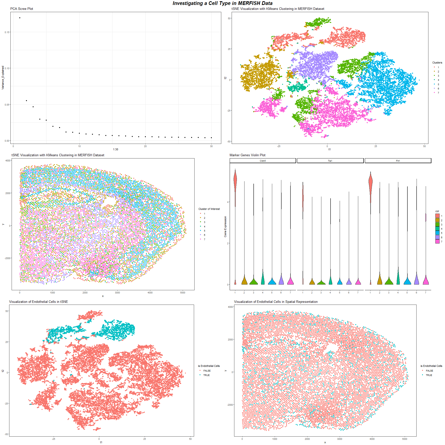
Figure A. Scree Plot of Variation Explained by Different Number of PCs. This plot is a scree plot of the variation that could be explained by different number of PCs. This helps choose the number of PC to be used for clustering.
Figure B. Spatial Distribution of Cell Clusters with K means Clustering. We choose K = 7 to perform K means clustering. This image uses position to visualize the spatial distribution of cells in the x, y coordinate and uses the color hue visual channel to encode the cluster of cells.
Figure C. Cell Clusters with K means Clustering Visualization in tSNE Space We choose K = 7 to perform K means clustering. This image uses position to visualize value of tSNE 1 and tSNE 2 and uses the color hue visual channel to encode the cluster of cells.
Figure E. The Violin Plot of Endothelial Cell Marker Genes. We look at cluster 1 and performed differential gene expression analysis on this cluster to identify the genes up regulated in the cluster. We found genes that are endothelial cells up regulated in this cluster. Then we visualize some of them, namely, Cldn5, Tie1, Flt1, as violin plot across all clusters and see that only this cluster has high expression of these endothelial cells markers. So this group of cells are endothelial cells.
Figure F. The Spatial Distribution of Endothelial Cell. This image uses position to visualize the spatial distribution of cells in the x, y coordinate and uses the color hue visual channel to encode the cluster of cells that are identified as endothelial cells. Endothelial cells are scattered around in the whole dataset.
Figure F. The tSNE Space Visualization of Endothelial Cell. This image uses position to visualize value of tSNE 1 and tSNE 2 of cells and uses the color hue visual channel to encode the cluster of cells that are identified as endothelial cells.
To process the data, first I normalize protein expression with total protein expression across cells.
PCA helps reduce dimension and remove correlations when I later use it to cluster the cells. Based on the scree plot of PCA, I choose first 10 PCs to be used for later clustering because the first 9 PCs explain most of the variations, and the scree plot’s line doesn’t change much after 10.
Then I choose k = 7 for kmeans clustering since this produce clear structure in the spatial data visualization and produce stable result in the tSNE space.
I am interested in the identity of cluster 1. I performed differential gene expression analysis on the cluster and found that in the upregulated genes, there are genes that are endothelial cell markers. Then I verify this by using a violin plot to visualize the gene expression of some of them, namely, Cldn5, Tie1, Flt1, as violin plot across all clusters and see that only this cluster has high expression of these endothelial cells markers. So this group of cells are endothelial cells.
From the spatial distribution of cells visualization, we found that endothelial cells are scattered around in different areas in the brain.
References:
https://panglaodb.se/markers.html?cell_type=%27Endothelial%20cells%27
1
2
3
4
5
6
7
8
9
10
11
12
13
14
15
16
17
18
19
20
21
22
23
24
25
26
27
28
29
30
31
32
33
34
35
36
37
38
39
40
41
42
43
44
45
46
47
48
49
50
51
52
53
54
55
56
57
58
59
60
61
62
63
64
65
66
67
68
69
70
71
72
73
74
75
76
77
78
79
80
81
82
83
84
85
86
87
88
89
90
library(ggplot2)
library(Rtsne)
library(gridExtra)
library(scattermore)
data = read.csv("D:/JHU-SP22/genomic-data-visualization/data/MERFISH_Slice2Replicate2_halfcortex.csv.gz",
                       row.names = 1)
data = data[sample(1:nrow(data), 20000), ]
data_gene = data[, c(3:ncol(data))]

# Normalization:
data_gene_normal = data_gene/rowSums(data_gene)*1e6
data_gene_normal = log10(data_gene_normal + 1)

# PCA
pcs = prcomp(data_gene_normal)

var_explained = pcs$sdev^2 / sum(pcs$sdev^2)
var_explained = as.data.frame(var_explained[1:30])
colnames(var_explained) = c("Variance_Explained")

p1 = ggplot(data = var_explained, mapping = aes(x = 1:30, y = Variance_Explained)) +
  geom_point() + theme_bw() + ggtitle("PCA Scree Plot")

# tSNE
tsne_result = Rtsne(pcs$x[, 1:10], perplexity=30)

# Kmeans Clustering
k_clusters = kmeans(pcs$x[, 1:10], centers = 7)

summarized_df = data[, c(1:2)]
summarized_df$t1 = tsne_result$Y[, 1]
summarized_df$t2 = tsne_result$Y[, 2]
summarized_df$clusters = as.factor(k_clusters$cluster)

p2 = ggplot(data = summarized_df, mapping = aes(x = t1, y = t2)) +
  geom_point(mapping = aes(color = clusters), size = 1.5) + theme_bw() +
  theme(panel.grid.major = element_blank(), panel.grid.minor = element_blank()) +
  ggtitle("tSNE Visualization with KMeans Clustering in MERFISH Dataset") +
  labs(color='Clusters')

p3 = ggplot(data = summarized_df, mapping = aes(x = x, y = y)) +
  geom_point(mapping = aes(color = clusters), size = 1.5) + theme_bw() +
  theme(panel.grid.major = element_blank(), panel.grid.minor = element_blank()) +
  ggtitle("tSNE Visualization with KMeans Clustering in MERFISH Dataset") +
  labs(color='Clusters')

p4 = ggplot(data = summarized_df, mapping = aes(x = t1, y = t2)) +
  geom_point(mapping = aes(color = clusters == 1), size = 1.5) + theme_bw() +
  theme(panel.grid.major = element_blank(), panel.grid.minor = element_blank()) +
  ggtitle("Visualization of Endothelial Cells in tSNE") +
  labs(color='is Endothelial Cells')

p5 = ggplot(data = summarized_df, mapping = aes(x = x, y = y)) +
  geom_point(mapping = aes(color = clusters == 1), size = 1.5) + theme_bw() +
  theme(panel.grid.major = element_blank(), panel.grid.minor = element_blank()) +
  ggtitle("Visualization of Endothelial Cells in Spatial Representation") +
  labs(color='is Endothelial Cells')

# Differential Expression Analysis
up_reg_genes = as.data.frame(ncol(2))
group = summarized_df$clusters == 1
for (g in colnames(data_gene_normal)) {
  test_stat = wilcox.test(data_gene_normal[group, g], data_gene_normal[!group, g], alternative = "greater")
  if (test_stat$p.value < 0.0001)
  {
    up_reg_genes = rbind(up_reg_genes, c(g, test_stat$p.value))
  }
}

colnames(up_reg_genes) = c("gene", "p")
up_reg_genes = up_reg_genes[order(up_reg_genes$p),]

df <- reshape2::melt(
  data.frame(id=rownames(data_gene_normal),
             data_gene_normal[, c("Cldn5", "Tie1", "Flt1")],
             col=summarized_df$clusters))

# Visualize Marker Genes
p6 = ggplot(data = df,
            mapping = aes(x=col, y=value, fill=col)) +
  geom_violin() +
  theme_classic() +
  facet_wrap(~ variable) + ggtitle("Marker Genes Violin Plot") +
  ylab("Gene Expression") + xlab("") + labs(color = "Clusters")

png("yuqiz.png", width = 1800, height = 1800)
grid.arrange(p1, p2, p3, p6, p4, p5, ncol = 2,
             top = textGrob("Investigating a Cell Type in MERFISH Data",
                            gp = gpar(fontsize=20,font=4)))
dev.off()