Comparison of Dimensionality Reduction on Normal, Log10 Transformed and ScaleD Gene Expression

Should I normalize and/or transform the gene expression data (e.g. log and/or scale) prior to dimensionality reduction?
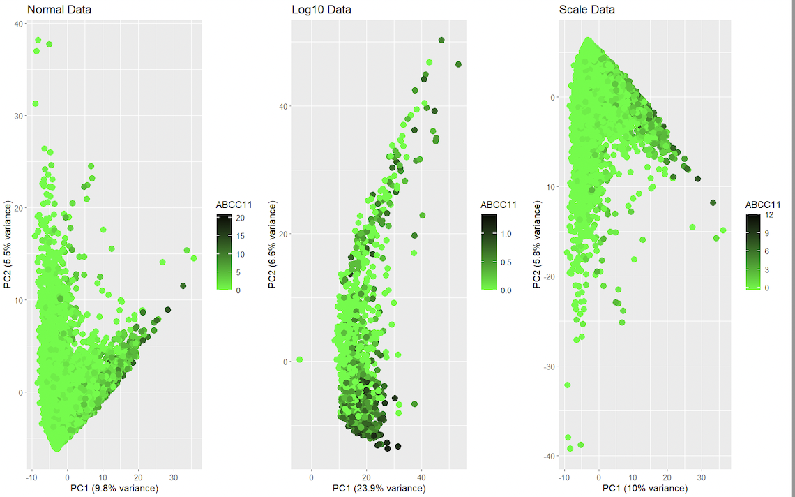
This data visualization renders the first two principal components for gene ABCC11 side by side for comparison from the spatial transcriptomics dataset with regular dataset, log dataset and scale dataset. It visualizes the relationships between gene expression and spatial features. It uses categorical data, and it is salient because the data can be read using visual properties with geometric primitives such as points for encoding. It displays visual changes using hue in color, and uses similarity in color and proximity in data points as the gestalt principles. In gene expression data, it is common to normalize and/or transform the data prior to dimensionality reduction to help mitigate the impact of differences in variability and scale among the genes. This can help ensure that the results of dimensionality reduction, such as the principal components in PCA, accurately reflect the underlying patterns in the data. With scaling, the data is transformed in each gene’s expression with values of mean 0 and standard deviation of 1. With this, genes with larger expressions don’t alter much the results of dimensionality reduction. The logarithm function in the expression is another means for reducing the impact of sudden changes in distributions. The logarithmic transformation helps reduce the variability in the data and makes it more normally distributed, which is desirable for many statistical methods. However, it is important to keep in mind that normalizing and transforming the data can have consequences for the interpretation of the results, as the transformed values may not have a biological interpretation. It’s also important to consider the specifics of the data, as different normalization and transformation techniques may be more appropriate for different data sets.
#code
1
2
3
4
5
6
7
8
9
10
11
12
13
14
15
16
17
18
19
20
21
22
23
24
25
26
27
28
29
30
31
32
33
34
35
36
37
38
39
40
41
42
43
44
45
46
47
48
49
50
51
52
53
54
55
56
57
58
59
60
61
62
63
64
65
66
67
68
69
70
71
72
73
74
75
76
77
78
79
library(ggplot2)
library(gridExtra)

#Load data
df <- read.csv('/Users/YourUsername/Desktop/data/squirtle.csv.gz', row.names = 1)


df <- df[,4:ncol(df)]
total <- rowSums(df)
good.cells <- names(total)[total > 0]
df <- df[good.cells,]

#Perform PCA
pca <- prcomp(df, center = TRUE, scale = TRUE)

df$PC1 <- pca$x[, 1]
df$PC2 <- pca$x[, 2]

#plot first two principal components for ABCC11
p1 <- ggplot(df, aes(x = PC1, y = PC2, color = ABCC11)) +
  geom_point(size = 3) +
  scale_color_gradient(name = "ABCC11", low = "green", high = "black") +
  ggtitle("Normal Data") +
  xlab(paste0("PC1 (", round(pca$sdev[1]^2/sum(pca$sdev^2)*100, 1), "% variance)")) +
  ylab(paste0("PC2 (", round(pca$sdev[2]^2/sum(pca$sdev^2)*100, 1), "% variance)")) +
  scale_color_gradientn(colours = c("green", "black"), values = c(0,1), guide = guide_colorbar(title.position = "top", title.hjust = 0.5)) +
  theme(legend.position = "right")

#normalize/transform data

#log
df_log <- log10(df + 1)

infinite_missing_rows <- apply(df_log, 1, function(x) any(is.infinite(x)) || any(is.na(x)))

#Remove the rows containing infinite or missing values
df_log[infinite_missing_rows, ] <- 0


#Perform PCA
pca_log <- prcomp(df_log, center = TRUE, scale = TRUE)

df_log$PC1 <- pca_log$x[, 1]
df_log$PC2 <- pca_log$x[, 2]

#Plot first two principal components for ABCC11
p2 <- ggplot(df_log, aes(x = PC1, y = PC2, color = ABCC11)) +
  geom_point(size = 3) +
  scale_color_gradient(name = "ABCC11", low = "green", high = "black") +
  ggtitle("Log10 Data") +
  xlab(paste0("PC1 (", round(pca_log$sdev[1]^2/sum(pca_log$sdev^2)*100, 1), "% variance)")) +
  ylab(paste0("PC2 (", round(pca_log$sdev[2]^2/sum(pca_log$sdev^2)*100, 1), "% variance)")) +
  scale_color_gradientn(colours = c("green", "black"), values = c(0,1), guide = guide_colorbar(title.position = "top", title.hjust = 0.5)) +
  theme(legend.position = "right")


#scale
df_scale <- as.data.frame(scale(df, center = TRUE, scale = TRUE))

#Perform PCA
pca_scale <- prcomp(df_scale, center = TRUE, scale = TRUE)

df_scale$PC1 <- pca_scale$x[, 1]
df_scale$PC2 <- pca_scale$x[, 2]

#Plot first two principal components for ABCC11
p3 <- ggplot(df_scale, aes(x = PC1, y = PC2, color = ABCC11)) +
  geom_point(size = 3) +
  scale_color_gradient(name = "ABCC11", low = "green", high = "black") +
  ggtitle("Scale Data") +
  xlab(paste0("PC1 (", round(pca_scale$sdev[1]^2/sum(pca_scale$sdev^2)*100, 1), "% variance)")) +
  ylab(paste0("PC2 (", round(pca_scale$sdev[2]^2/sum(pca_scale$sdev^2)*100, 1), "% variance)")) +
  scale_color_gradientn(colours = c("green", "black"), values = c(0,1), guide = guide_colorbar(title.position = "top", title.hjust = 0.5)) +
  theme(legend.position = "right")


#Combine the three plots into one image
grid.arrange(p1, p2, p3,  ncol = 3)
External resources
Hayden, L. (2018, August 09). R PCA tutorial (principal component analysis). Retrieved February 6, 2023, from https://www.datacamp.com/tutorial/pca-analysis-r Pramoditha, R. (2022, April 25). How to select the best number of Principal Components for the Dataset. Retrieved February 6, 2023, from https://towardsdatascience.com/how-to-select-the-best-number-of-principal-components-for-the-dataset-287e64b14c6d