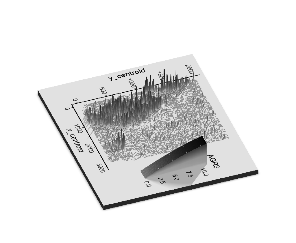
The Spatially Variant Expression Pattern of AGR3

What data types are you visualizing?
I am visualizing quantitative data of the expression count of the AGR3 gene for each cell, and spatial data regarding the x,y centroid positions for each cell.
What data encodings are you using to visualize these data types?
I am using the geometric primitive of points to represent the location of each cell and geometric primitive of lines to represent the expression count of the AGR3 gene.
-
Regarding the geometric primitive of points, to encode the spatial location for each cell, I am using the visual channel of position on the X-Y coordinate system.
-
Regarding the geometric primitive of lines, to encode the magnitude of expression count of AGR3, I am using
-
the visual channel of size and position along the z-axis (the vertical axis) and
-
the visual channel of saturation starting from gray to black.
-
What type of data visualization is this? What about the data are you trying to make salient through this data visualization?
This is an explanatory data visualization. I am trying to make salient the spatially differential expression pattern of AGR3 gene.
What Gestalt principles or knowledge about perceptiveness of visual encodings are you using to accomplish this?
I am using the Gestalt principle of proximity to put my legend on the right side of the main plot, so the audience will understand that the legend and the plot serve different purposes.
Code
##Reference: https://www.rayshader.com/reference/plot_gg.html
##Remark: Need to install XQuartz first https://www.xquartz.org/ for the successful installation of the rayshader package

devtools::install_github("tylermorganwall/rayshader")
library(rayshader)
library(ggplot2)
data = read.csv("pikachu.csv.gz")
mtplot = ggplot(data = data,aes(x = x_centroid,y =y_centroid,col = AGR3)) + geom_point(size = 0.05) +scale_color_gradient(low = 'gray', high = 'black') +theme_classic()
plot_gg(mtplot, width=3.5, multicore = TRUE, windowsize = c(1400,866),
          zoom = 0.60, phi = 40, theta = 70,shadow = TRUE, shadow_darkness = 0.01)
render_snapshot()
(do you think my data visualization is effective? why or why not?)